

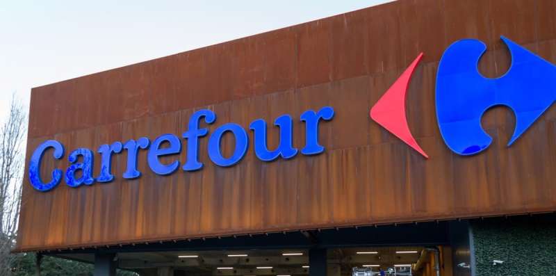
Every curve, every color, a narrative. The Carrefour Logo, a tapestry woven from modern commerce and cultural threads, stands as a triumph of visual branding and brand recognition.
Venture into the realm where artistry meets enterprise, and discover how a symbol transcends to become the face of a retail giant.
This sigil isn’t merely a trademark symbol; it is the pulsing heart of Carrefour’s corporate identity—a beacon guiding a fleet of supermarkets across the globe. Here lies not just a lesson in graphic design, but a masterclass in sustaining brand loyalty.
Unlock the secrets behind this iconic emblem that has weathered the storms of change and emerged timeless. By article’s end, the transformation of the Carrefour brand mark will no longer be an enigma.
Instead, it will unfold as a blueprint—a nuanced understanding of branding strategy and retail marketing, penned from the insights of crafting identities that echo in aisles and shopping carts.
The Meaning Behind the Carrefour Logo
![]()

You ever glance at something and feel a message? Logos do that. They’re like silent poets, whispering tales to those who take a moment. The Carrefour Logo? A modern-day Mona Lisa of branding.
Deep Dive into its Geometry
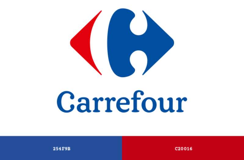
Alright, think maze. Or better yet, think crossroads. “Carrefour” in French literally means crossroads. See it now? Those two arrows facing opposite directions are not just for style, buddy.
They symbolize the idea of choices, directions, and paths. Every time you shop there, you’re at a crossroads, deciding which aisle to hit first. A bit deep? Maybe, but that’s design magic!
The Hidden ‘C’
Now, this is the part I LOVE. Look closer. Between the arrows, there’s a hidden letter. Yep, you guessed it, a ‘C’! Subtle, right? It’s like a little Easter egg. Carrefour is winking at you, and you probably didn’t even notice!
The History of the Carrefour Logo

Beginnings
Oh man, rewind the tape to 1963. No smartphones, no social media, just pure unadulterated creativity. That’s when the Carrefour logo was birthed. It’s like a vintage wine, only getting better with time.
Evolution, Not Revolution
Through the decades, they’ve tweaked it. Not major overhauls, just lil’ touch-ups. Staying true to its essence, but also vibing with the times. Smart, right? It’s like trimming the ends of your hair to let it grow longer.
The Colors of the Carrefour Logo

The Blue and Red Combo
Colors ain’t just about looking pretty. They tell a story. Is the blue in the Carrefour logo? Stands for trust, dependability, and the calm before your shopping storm. Red, on the other hand? That’s your energy, passion, and the sale section calling your name!
Emotional Tug
Colors pull emotions. Every time you see that mix of blue and red, your brain goes: “Ah, a trustworthy place with some zesty deals!” That’s subconscious shopping for ya.
The Font Used in the Carrefour Logo


Simplistic Yet Bold
Fonts are like the voice of the logo. The Carrefour font is straightforward – no frills, no curls. It says: “Hey, we’re confident in who we are. No need to shout.”
Consistency is Key
Even as trends change, the font remains. It’s like that comforting voice telling you, “Come on in, we’re still the same old reliable.”
Cultural Impact and Recognition
Man, a logo that’s recognized worldwide? That’s the dream. Think about it.
You’re in a different country, you spot those familiar arrows and bam! It’s like seeing an old friend in a crowd. The Carrefour logo gives you that homey vibe, no matter where you are.
A Global Phenomenon
From Asia to Europe, this logo’s iconic status is undeniable. That says something about its design. Universal appeal? Check.
The Craftsmanship Behind the Design
Balancing Act
Crafting a logo isn’t a walk in the park. You need balance. Symmetry. The Carrefour logo nails this. The arrows, the colors, the font—it’s harmonious.
Attention to Details
Every curve, every shade, every pixel—meticulously planned. That’s the dedication behind the Carrefour brand. Like an artist with their masterpiece.
FAQ On The Carrefour Logo
Who designed the Carrefour Logo?
The Carrefour Logo wasn’t the brainchild of one, but rather an outcome of collective creativity. Its early inception, though shrouded in the mists of corporate history, is often credited to designers within the company.
Over the years, it has evolved, keeping brand recognition at the forefront.
What does the Carrefour Logo represent?
A dynamic dance of colors and geometry, the logo symbolizes a nexus. Two vibrant arrows pointing inwards signify unity, choice, and the iconic crossroads, after which the brand is named—Carrefour, meaning “crossroads” in French, truly a supermarket symbol for the world.
When was the Carrefour Logo created?
Tracing back timelines, the Carrefour symbol first saw the light in the early 1960s. Since then, it’s been a constant companion to the brand, morphing subtly with the tides of time while keeping its core values and visual identity intact through decades.
Has the Carrefour Logo changed over time?
Indeed, like a river through a landscape, the Carrefour Logo has meandered and reshaped. It carries with it the marks of time, each iteration a refined vision focused on retail marketing efficacy.
The logo’s evolution mirrors a history in graphic design aesthetics and consumer trends.
Why are the colors blue and red used in the Carrefour Logo?
These hues don’t just catch the eye; they tell stories. Blue, a whisper of trust and dependability; red, a bold statement of vitality and passion. Together, they forge a visual branding lever, pushing the concept of retail chain emblems into the public psyche.
What is the significance of the Carrefour Logo hidden arrow?
Ingenious, isn’t it? The negative space within the logo conjures an arrow pointing to the right—subliminal yet persuasive. This hidden gem is a trademark muse, whispering of forward motion, future-focus, and the unseen depths in the world of visual branding.
Is the Carrefour Logo among the most recognized corporate logos?
Spot it from afar, and recognition sparks instantly. A beacon in the consumer retail logos constellation, Carrefour’s mark stands shoulder to shoulder with the greats, its distinct form a testament to successful branding strategy and branding recognition in a crowded marketplace.
How does the Carrefour Logo impact the company’s branding?
It’s the masthead, the flag, a rallying cry. The logo is a corporate identity cornerstone, influencing everything from in-store branding to global advertising campaigns.
It shapes perception, fosters brand loyalty, and steers the retail marketing narrative for Carrefour Group.
What is the psychology behind the Carrefour Logo design?
This is a choreography of marketing psychology and visual cues. The logo’s design leverages contrast, familiarity, and the power of the hidden arrow to entice, engage, and endure.
It’s a visual handshake, an iconic brand logo offering an unspoken promise to shoppers worldwide.
Are there any controversies associated with the Carrefour Logo?
Over time, every symbol faces scrutiny. The Carrefour emblem has had its share of debates—be it from design critiques or the occasional misunderstanding of the logo’s intent.
Still, it remains a steadfast trademark symbol, its essence resonating with clarity above the noise of contention.
Conclusion
Navigating the tapestry of the Carrefour Logo, we’ve pulled back the curtain to reveal a beacon of brand identity steeped in cultural symbolism and commercial sagacity. In an intricately woven narrative, each thread—color, negative space, the subtle yet compelling hidden arrow— contributes to a coherent whole, a visual symphony playing to the tune of global recognition.
- Its evolution reflects an adaptive strategy, moving with the currents of graphic design while holding fast to the corporate identity that defines Carrefour.
- Every change, a strategic step, each element, a carefully thought-out piece of the greater branding strategy.As the curtain falls on this exploration, one thing stands unambiguous: The Carrefour Logo transcends mere graphic elements to become an iconic brand logo. A visual echo of trust, a trademark of consumer connection. It is, undeniably, a masterclass in retail chain emblems, reminding us that, in the alphabet of visual expression, simplicity often speaks volumes.
If you liked this article about the Carrefour logo, you should check out this article about the 7-Eleven logo.
There are also similar articles discussing the Albertsons logo, the Aldi logo, the Circle K logo, and the Costco logo.
And let’s not forget about articles on the Giant logo, the QuikTrip logo, the Safeway logo, and the Sainsbury’s logo.