

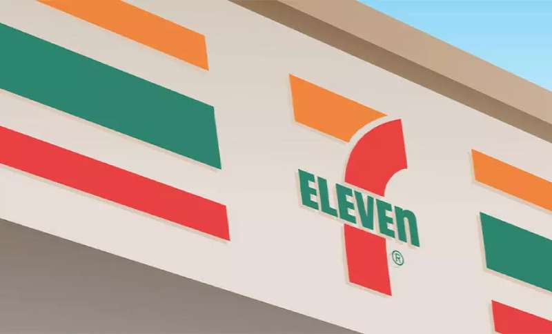
Imagine strolling down the city block when a familiar set of stripes catches your eye—the unmistakable 7-Eleven logo.
Its vibrant colors and bold design are not merely a beacon for quick refreshment but a testament to the power of visual identity in the ever-bustling convenience store industry.
This insignia isn’t just a random mark; it’s a carefully crafted symphony of corporate communication, a story told in hues of green, orange, red, and white. As customers, we perceive these colors, shapes, and symbols on a level often beyond our immediate recognition.
Yet, as a graphic designer, I see the layers, the history, the decisions that forge such an iconic brand image.
In the paragraphs that lie ahead, delve into the realm of design elements that transcend mere aesthetics, where trademark becomes brand equity, and a logo morphs into a cultural staple.
We’ll decode the 7-Eleven logo design evolution, assess its impact on customer perception, and explore the tangible reflection of a logo on marketing strategy.
Uncover the story behind one of the most recognizable logos in retail, and perhaps, learn how to craft a visual identity that stands the test of time just as well.
The Meaning Behind the 7-Eleven Logo
![]()

Hey! Have you ever noticed the bright green, red, and orange logo of 7-Eleven and wondered, “What’s the story here?” Well, buddy, that’s what I’m here to dish about.
The Numbers Game
So, here’s a bit of a brain-boggler. Despite being called “7-Eleven”, the logo doesn’t display these numbers equally.
The ‘n’ in Eleven is in lowercase. Crazy, right? Some folks reckon it’s a design quirk. Others feel it’s a way to catch the eye. And guess what? It works!
That ‘Always Open’ Vibe
Originally, the store’s name reflected its hours, 7 am to 11 pm. A subtle nod to being there when you need them.
Today? Most of their stores are open 24/7. But the name sticks, giving you that feeling of “we’re always here for you.”
The History of the 7-Eleven Logo
![]()

Man, oh, man. This logo’s been on a journey, y’know? Like all of us, it’s gone through some phases.
The Beginning
Imagine it’s the 1920s. Everything’s black and white. The first Tote’m store opens, and it’s all casual. Fast forward to the 1940s, and BAM! They’re now 7-Eleven, telling everyone about their snazzy operating hours.
Evolution, Baby!
Over the decades, the logo’s faced a few tweaks here and there. But one thing remained: its essence. Always fresh, always inviting. Whether it’s the striping introduced in the 60s or the snappy modern look it rocks today.
The Colors of the 7-Eleven Logo
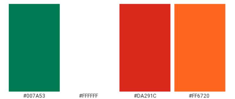

Alright, color talk. Get your shades on!
A Zesty Orange
This ain’t just any orange. It’s energetic. It’s vibrant. It’s all “Hey! Come on in.”
Lush Green
Fresh like the first day of spring. The green in the logo is all about that refreshing feeling.
Bold Red
Deep, bold, and total show-stealer. Red’s all about attention and warmth. And boy, does it do its job!
The Font Used in the 7-Eleven Logo
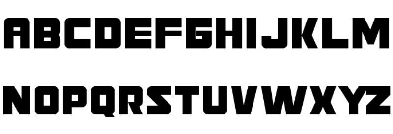

Font. It’s more than just letters. It’s the soul of the word.
Simple Yet Distinct
You won’t find any fancy curlicues here. The 7-Eleven font is straight-up, no-nonsense, but it still has a vibe. Clear, readable, yet playful. That lowercase ‘n’? Genius.
The Global Reach of the 7-Eleven Logo
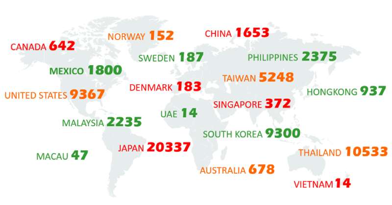

Ever traveled and suddenly spotted that familiar logo? Ah, the comfort!
Universality
Across countries and cultures, the 7-Eleven logo stands strong. A beacon of “Hey, we got what you need.”
Cultural Adaptations
While the core remains, little elements shift to suit local vibes. Japan’s 7-Eleven? Same logo, different feel. It’s all about that global-local magic.
Pop Culture and the 7-Eleven Logo
You’ve seen it in movies, TV shows, maybe even dreamt about it.
Screen Star
It’s appeared in blockbusters, sitcoms, and dramas. The 7-Eleven logo’s a subtle nod to everyday life.
The Slurpee Connection
Come on! Who hasn’t heard of the Slurpee? And when you think Slurpee, what comes to mind? Yep, that logo. It’s etched in our brains.
FAQ On The 7-Eleven Logo
Who Designed the 7-Eleven Logo?
The 7-Eleven logo, with its distinct stripes and bold numeral, was a collective brainchild.
Though specifics are hazy, it’s the product of thoughtful graphic design efforts intended to signify convenience and openness—reflecting the store’s then-revolutionary 7 a.m. to 11 p.m. operating hours.
When Did 7-Eleven First Introduce Its Current Logo?
The current incarnation of the 7-Eleven logo debuted in 1970. It marked a new era for the brand, boasting a modern look that has stood relatively unchanged.
This visual identity successfully encapsulated the brand’s image, securing its memorability across decades.
What Do The Colors in the 7-Eleven Logo Represent?
Cherry-picked for visibility and brand recall, the 7-Eleven logo colors aren’t random. Green symbolizes freshness, red conveys energy, and orange, friendliness—all anchored by white, reflecting clarity and purity in business, just as essential ingredients in corporate branding.
Has the 7-Eleven Logo Ever Been Redesigned?
Indeed, the logo has evolved. Since its inception, the logo has seen a few redesigns, adjusting to the times while maintaining core aesthetics.
Maintaining retail logo evolution norms, each redesign subtly refreshed its visual communication without upending brand continuity.
Is the 7-Eleven Logo Trademarked?
Very much so. The logo is a registered trademark, legally protecting its unique design elements. This shield defends against unauthorized use, ensuring the corporate logo remains synonymous with the 7-Eleven experience.
Why Is the 7-Eleven Logo So Recognizable?
The logo’s recognition is no fluke—it’s a masterful blend of simple geometry, bold color contrast, and historical presence.
The design leverages visual identity principles to etch itself into public consciousness, becoming a navigational landmark and a symbol of convenience.
What Challenges Are Involved in Designing a Logo for a Convenience Store Like 7-Eleven?
The challenge lies in encapsulating convenience, approachability, and brand values into a singular emblem.
A convenience store branding success like the 7-Eleven logo goes beyond design; it must resonate on a cultural and emotional level, driving customer perception effectively.
How Does the 7-Eleven Logo Impact Its Marketing Strategy?
A powerful logo serves as the cornerstone of a marketing strategy. For 7-Eleven, the logo is a stamp of brand recognition, propelling advertising campaigns and shaping promotional materials—all choreographed orchestrations of corporate identity elements.
What Are the Essential Features of the 7-Eleven Logo from a Design Perspective?
Design-wise, the logo nails it with its clean lines, an impactful, easy-to-read numeral, and a thoughtful color trio, ensuring visibility and brand recognition. Its corporate identity elements are a designer’s nod to an effective visual identity.
How Often Should a Company Like 7-Eleven Consider Updating Its Logo?
Tread lightly with updates. The 7-Eleven logo‘s longevity shows that timelessness can trump trendiness.
Only consider an update to reaffirm relevance or revitalize customer intrigue without diluting hard-earned brand equity. Therein lies the art of retail logo evolution.
Conclusion
The journey through the vibrant stripes and solid numerals of the 7-Eleven logo draws to its close, but the impact of this emblem on the canvas of corporate branding lingers. It’s a shining beacon that calls out to the weary traveler or the neighborhood regular, a symbol that stands as a testament to the confluence of design and corporate narrative.
- Remarkable in its simplicity
- Profound in its reach
- Integral to the visual identity
These aren’t just facets of a well-crafted logo but are stitches in the fabric of the convenience store industry. The green, orange, and red hues intertwine to form more than just a mark; they represent a global brand’s image, a navigation point on countless street corners in over 18 countries.
As the page turns, and the reader steps back into the rush of life, the symbol of 7-Eleven remains an anchored reminder of how powerful a marriage between color and form can be – an insignia that transcends time, etching itself into the memory of passersby.
If you liked this article about the 7-Eleven logo, you should check out this article about the Albertsons logo.
There are also similar articles discussing the Aldi logo, the Carrefour logo, the Circle K logo, and the Costco logo.
And let’s not forget about articles on the Giant logo, the QuikTrip logo, the Safeway logo, and the Sainsbury’s logo.