
Every stroke matters. In the pulsating world of brand identity, the font breathes life into a logo, echoing a legacy that transcends mere letters on a page.
Picture the Nike Swoosh; iconic, isn’t it? But pause and consider its silent partner—the Nike font. Together, they forge a visual symphony synonymous with athletic excellence.
Dive into this article, and you’ll unravel the design tapestry of the Nike font. This isn’t just a deep dive; it’s an expedition into the visual branding elements that craft a global sportswear titan’s identity.
You’re not merely reading—you’re interpreting the visual communication language spoken by millions, worn by many, and recognized by all.
By the final punctuation mark, you’ll grasp the finesse of typeface characteristics paired with a brand recognition strategy.
Expect to explore the graphic design nuances and marketing materials that set the scene for Nike’s typographic decisions, compelling enough to make every viewer believe that they too can “Just Do It.”
How did the Nike font get in the logo?
Just do it is the well-known slogan of the Nike company. It was created back in 1988 in an agency meeting. The font that stands behind this brand is the Futura Condensed Extra Black that was done by Paul Renner. Futura is more or less a commercial typeface. The typeface now is also known as the Nike Font as it got so popular.
Actually, the origins of the font started in 1928 when Bauer Type Foundry created the simple clean font. Later on, it was redesigned in 1936 by Paul Renner.
Why did Nike use Futura?
Futura has a powerful design that you can see right away. It can be used for branding elements and we can see how Nike did a great job with this. Together with the logo the font also sends a message towards the viewers.
It’s related to strength because of the bold version used, it shows dynamism as it is inclined together with stability given by the geometry of the Futura. Together with the rest of the image you get a very clear message. The message is that Nike is a very strong brand and if you get their products you will also be associated with that.
Futura Font
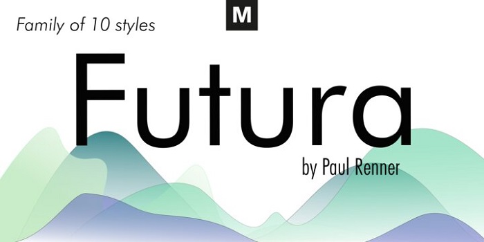

We can say that Futura is the result of the entire twentieth century of Geometric Sanserif. Its forms are ancient and it really looks like something you would see in old sanserif typeface back to 1820. Some of the geometric aspects survived among the big impact brought by Gothics and it still looks modern.
What are some alternatives for the Nike Font?
HK Nova
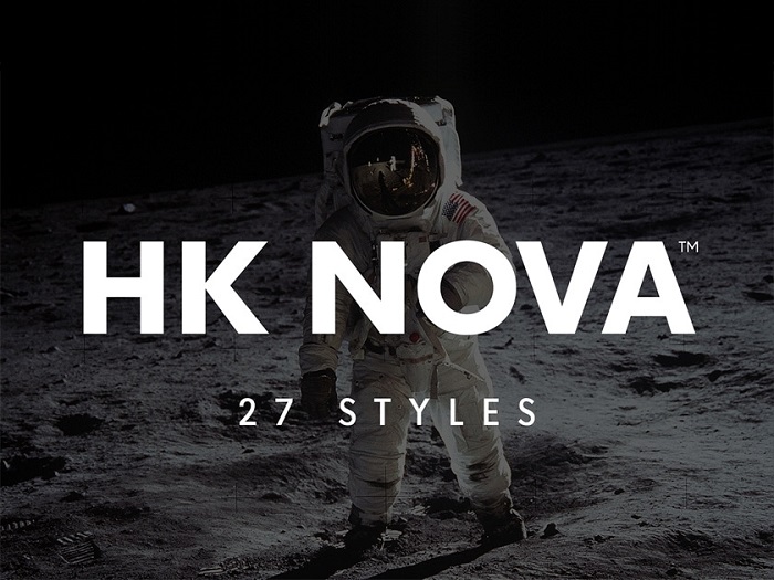

Among the Nike fonts options that we found the HK Nova has a nice geometry and it comes with 27 styles. Download it and see for yourself if it can be your choice.
Renner
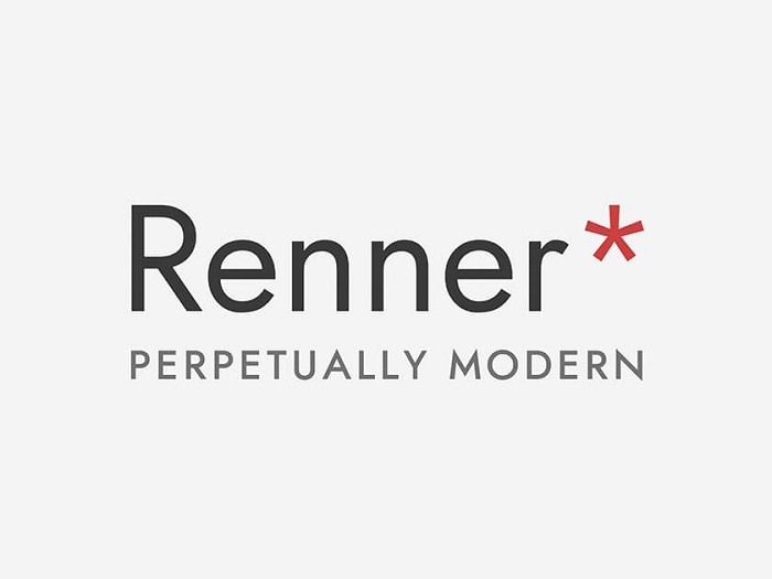
This is a free typeface similar to the Nike font. It was created by Owen Earl and the font wants to keep a similar vibe. The goal of this font is to work for any project, especially in this agitated digital era. Because of this, it starts from the same design that Paul Renner did.
You can see some similarities like the x-height and the fact it has different weights. It works in different languages and it has tabular and proportional numbers. So, stop searching for a Nike font generator and go with Renner.
Didact Gothic

One of the best alternatives that you can go with for the Nike font is the Didact Gothic. You already know it is a sans-serif font. It was created to present each of the letters to showcase each letter like the forms from elementary classrooms.
League Spartan

A simple font that is easy to use. Download this Nike font free alternative and start using it.
Poppins

The typefaces that have geometric shapes are always popular. Poppins is a good example of what a font with traditions means. It goes well for both the Devanagari and Latin systems.
Code Pro
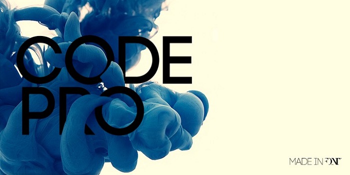
One of the things that we see in this font similar to the Nike logo font is the energy it sends. This is mainly because the typeface is bold and striking. The letterforms are geometric, dense and you can feel the power due to their size.
If you want a font that shows it can dominate this is the one to use. You can also take advantage of its lowercase style when you want to go for a little less intense option. We can also observe that the letters have a bigger space so they get separated from its Uppercase.
Twentieth Century

This geometric sans-serif typeface has been created by Soll Hess. The year it got published was in 1959. This was created with the scope in mind to be a competitor for the Nike font that was having a big success. Similar to Futura this has a slightly larger x-height that works better for body text.
Neuzeit
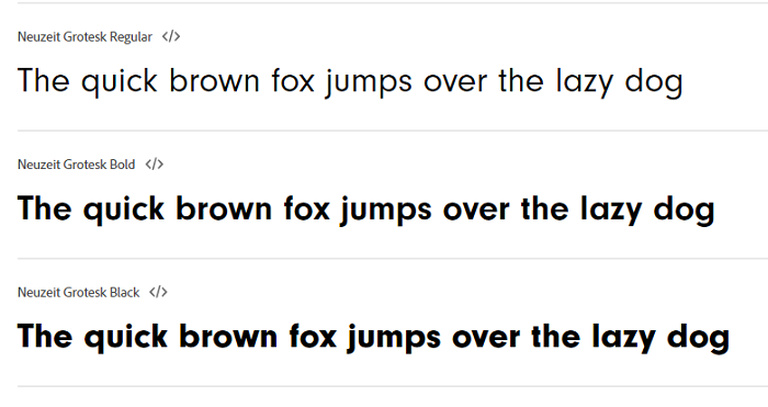

The Neuzeit is a simple sans-serif typeface. Its creator is the German designer called Wilhelm Pischner. The original year when it got launched is 1928. Some updates were released to the font also in the 60s. The idea behind that was to bring more variety to the font options.
ITC Avant Garde
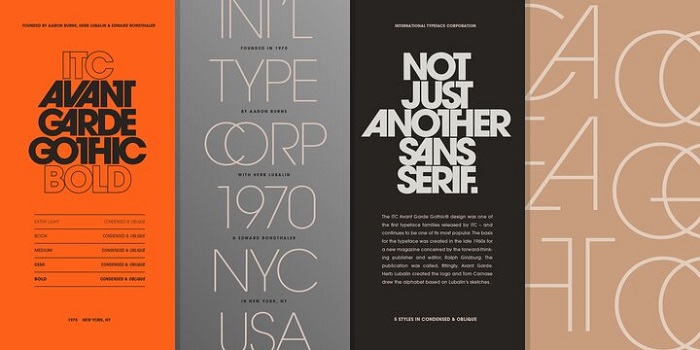
Check this Nike font similar to the typeface. Herb Lubalin is the man that designed it back in 1977. The goal he had was to bring his magazine logo in the typography world.
Intervogue
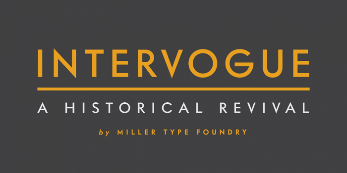
This font was released in the 30s and as you can see it is a geometric sans serif. It has its own details and people liked it a lot during that time when it was called simply Vogue.
Intervogue appeared more recently in order to bring this classic in the digital world. You will see that it has seven different weights that are complete with true obliques.
Harmonia Sans
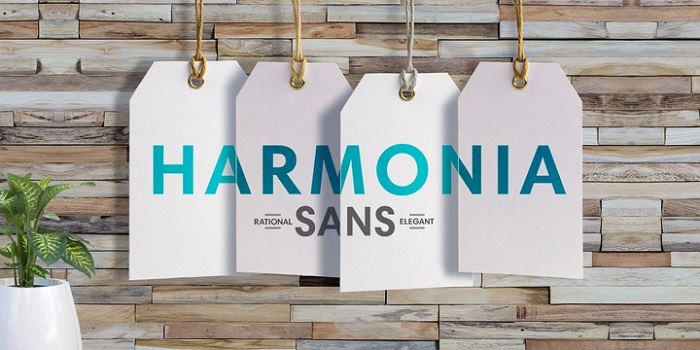
Have a look at this sans-serif font that can be a reliable alternative for the Nike font. The creator of it, Jim Wasco designed it back in 2010. It can be available in five weights and it has condensed and monospaced versions that can be used.
Neutraface
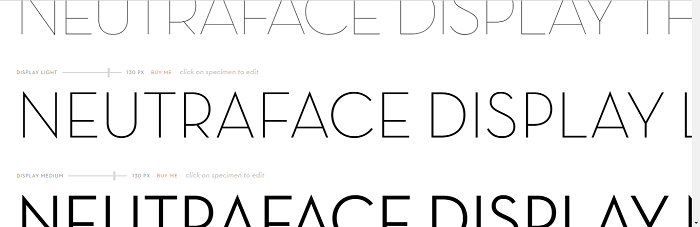

This is a beautiful font that can be used for various projects you might have. It has a sharpness that people are going to appreciate and it can sustain different functional designs.
Erbar-Grotesk

Because it was released in 1926, we can really consider this font as one of the first sans serifs. For sure it can be a Nike font alternative as it has 11 styles to choose from.
FAQ On The Nike Font
What is the Nike font called?
The designation ‘Nike font’ is a bit of a misnomer; the brand predominantly relies on Futura Bold for its impactful presence. A classic, clean typeface that signifies Nike’s commitment to both tradition and innovation.
Can I use the Nike font for personal projects?
It’s a sticky wicket, really. While Futura, the Nike font’s family, is commercially available, its use is licensed. For personal, non-commercial projects, you can utilize the font provided you own it, but mirroring Nike’s exact typography for public use is a no-go.
How does Nike’s font contribute to its brand identity?
Nike’s typography isn’t simply text; it’s a cornerstone of their visual identity. The bold simplicity of the Nike font conveys strength and movement, encapsulating their “Just Do It” ethos and fortifying brand recognition.
Did Nike create its own font?
No, Nike sculpted its brand not by creating but by selecting. They chose Futura Bold, a pre-existing, crafted typeface. Selected for its sharp geometric forms and contemporary vibe, reinforcing Nike’s futuristic and innovative brand image.
Is the Nike font the same for all its products?
Consistency—they key to branding. Nike utilizes similar visual branding elements across its product lines, but certain collections or collaborations might introduce unique typographic flavors while still aligning with the overall brand identity.
What’s the history behind the Nike font choice?
In the labyrinth of design, Nike sought a font embodying athletic excellence and trademarked branding. They landed on Futura, a typeface birthed during the Bauhaus era, symbolizing visual communication precision, mirroring Nike’s own precision in sportswear.
Why is the Nike font often paired with the Swoosh logo?
They say a picture paints a thousand words, but combining a picture with the right words? That’s where magic happens. The Nike font and Swoosh are symbiotic—each amplifies the other, creating an indelible iconic branding moment.
How does the Nike font enhance the company’s marketing materials?
In marketing, impressions are currency. Nike’s font ensures its marketing materials are not only read but felt. It ensures every message they craft carries authority, dynamism, and the spirit of a competitor primed at the starting line.
What makes the Nike font effective for sports branding?
With each curve and line, the Nike font captures the essence of sport—energy, determination, and seamless movement. It’s a font that doesn’t just spell ‘Nike’, it feels like Nike; vibrant, gutsy, a marathon runner in a sprinter’s body.
Has Nike ever changed its font?
Brands evolve, and Nike has dabbled with various typographic styles for different campaigns or sub-brands. Yet, the steadfast allegiance of their main branding lies with Futura Bold.
It is evolution within consistency, keeping the brand’s core identity fonts while exploring new athletic lettering styles where it fits.
Conclusion
As the curtain falls, the resonance of the Nike font lingers, much like the afterglow of a setting sun on a sprinter’s track. This enduring typeface, a progeny of Futura Bold, encapsulates more than a brand—it encapsulates a philosophy, a lifestyle that millions around the globe strive for.
The journey through typographic landscapes reveals more than the anatomy of letters—it unveils the soul of a brand that converses solely through visual communication and brand identity. The bold strokes of the Nike font aren’t mere characters; they are the sinews of a global narrative told on shoes, shirts, and billboards, insisting with silent conviction, “Just Do It.”
Take away the enticing details on advertising campaigns and marketing materials, and it’s clear—the Nike font is not just seen. It’s felt. It drives every heartbeat of the sports branding arena. And in that, it is truly unmatched.
If you liked this article about the Nike font, you should check out this article about the Twitter font.
There are also similar articles discussing the Discord font, the Fortnite font, the Amazon font, and the Overwatch font.
And let’s not forget about articles on the Supreme font, the font for memes, the Roblox font, and the Facebook font.