


Imagine the invisible threads that stitch together the essence of a brand’s digital presence. At its core, the font that Facebook uses—a seemingly minute detail—unravels a story of design decisions that influence how billions perceive information daily.
In this exploration, we delve into the fabric of Facebook’s visual communication: its typography. By decoding the typeface choice, we understand more than just the anatomy of letters—we decipher a brand’s heartbeat.
This piece promises to unfold the secrets behind the selected typeface, its impact on user interface design, and the subtleties that augment readability and user experience.
From the robust arena of web design trends to the intricacies of visual hierarchy, your journey will unravel the meticulous thought process behind a giant’s brand identity.
By the final full stop, typography standards and branding guidelines will no longer be mere buzzwords but tools in your creative arsenal. Dive in, as we dissect the sans-serif silhouette that shapes a global community.
Facebook’s logo font
![]()

One of the most recognizable brands in today’s world is the Facebook logo. And it’s just ridiculously easy! Klavika is similar to the font that is used in the FB logo.
However, to give it a signature logo look, slight changes have been made to the original font. These improvements are so small that 95 percent of Klavika is used for the Facebook logo can be safely specified.
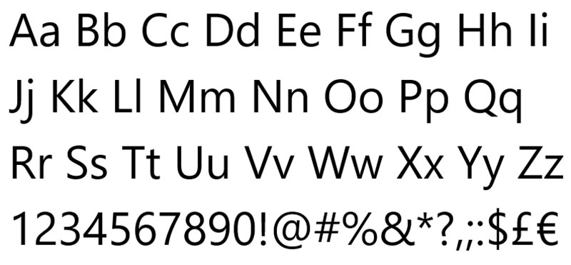
Klavika
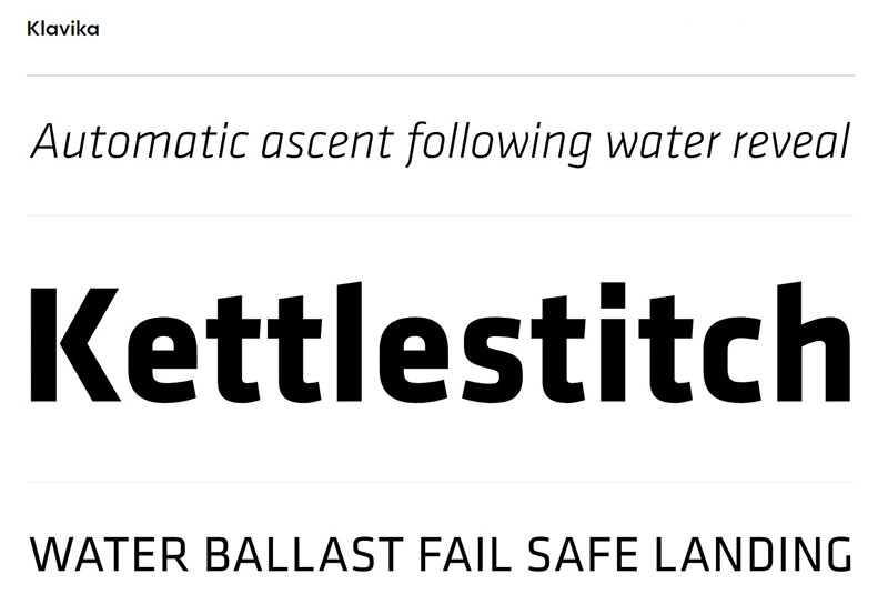

In 2005, Facebook founder Mark Zuckerberg approached a design-making company called the Cuban Council and instructed them to create a Facebook logo. Then, designers from the Cuban Council used Klavika to create the Facebook logo. But in Klavika, they made minor, but significant changes to give the logo its distinctive look.
For 21st-century specifications, Klavika is a full-featured, working horse sans serif. Klavika takes a distinctly hybrid typographic direction, unadorned, modern, and endlessly flexible-a cross of humanistic and geometric influences with allegiances to none.
Crisp and open types keep the font legible in small sizes, whereas large settings are strongly anchored by straight-sided characters. Small caps, old style & tabular numerals, arrows (roman only and stylistic alternatives are included in OpenType features (g, &).
Fonts Similar to Klavika
Ruda
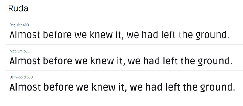

In a few applications, Ruda has quite a few parallels to Klavika and may even be identical. Ruda is a sans serif font initially designed for product labels in a particular sense of use. Ruda incorporates a rather wide x-height, low cap-height, and open shapes designed by Mariela Monsalve and Angelina Sanchez.
Titillium
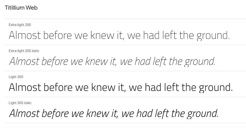

Within the Accademia di Belle Arti di Urbino, Titillium was born as a didactic project of the Master of Visual Design Campi Visivi Course Style Design. The goal of the project is to create a collaborative font that will be published under OFL. A dozen students work on the project each academic year, improving it further, and solving problems.
Neo Sans
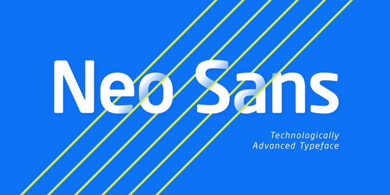

The Neo Sans family is available in six weights, ranging from light to ultra, with companion italics, featuring squared, square sans letterforms. For branding ventures, as well as for editorial or publication design, its forward-looking character makes it an outstanding option.
Colors used on Facebook’s logo font
Through most of its web design and its marketing materials, Facebook uses five different shades of color.
These five hex numbers, from darkest to lightest, are #0e1f56, #3b5998, #6d84b4, #afbdd4 and #d8dfea. The second one, #3b5998, is the most widely recognized Facebook Blue.
Font used by the Facebook app
As for the font they use for the actual text on their social media site, it differs from platform to platform.
They use Segoe UI on Windows machines, whereas they use San Francisco on Apple devices.
Helvetica Neue is used for iOS mobile devices, while Roboto is used for Android devices and so forth. These are sans serif fonts, which indicates they don’t have all the extra fancy stuff, or sans serif fonts, that come with more complex fonts.
Facebook’s font on Windows: Segoe UI

Segoe UI is a sans-serif font. It is used for user interface text as well as some online user support content in Microsoft items, aimed at improving the quality of how all text is perceived by clients throughout all languages. Also, this font is used in many online services, such as animated text generators for video editors, where you can add text to videos or make free gifs for texting.
It is differentiated by its overall pick characters from its precursor Tahoma and the Lucida Grande Mac OS user interface font. Monotype Imaging has developed Segoe UI.
Font Similar to Segoe UI
Frutiger

Frutiger is a series of fonts, named after Adrian Frutiger, their Swiss creator. As a universalist sans-serif typeface, Frutiger is designed to be transparent and superbly written at a range of tiny print sizes.
In architecture, the Frutiger family would be neither strictly geometric nor holistic; its forms are constructed so that each character is recognized rapidly and effortlessly. For signage and show work, such distinctness makes it fine.
While originally intended for the large scale of an airport, the entire family has a warmth and subtlety that in recent years, has made it popular in publications and handbooks for the smaller scale of body text.
Facebook’s font on Apple computers: San Francisco
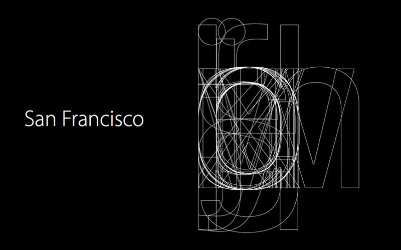

San Francisco is a sans-serif, American neo-grotesque typeface made by Apple Inc. On November 18, 2014, it was initially issued to developers. It was the first new typeface developed in almost 20 years by Apple and was influenced by Helvetica and DIN.
Fonts Similar to San Francisco font
Akkurat
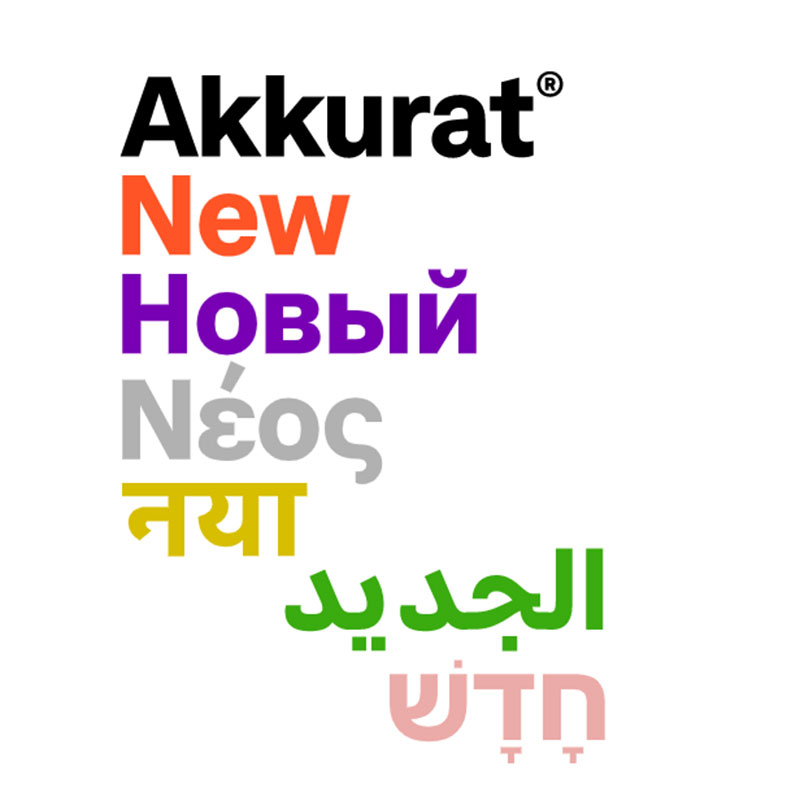

Akkurat is a grotesque sans-serif typeface designed by Laurenz Brunner, a Swiss artist, and published by the Lineto type foundry in 2004. Soon after its publication, it received a great deal of critical acclaim. Even though it has been famous for many years now in the print world, Akkurat is available in three weights, each with corresponding italics: medium, standard, and bold.
Univers
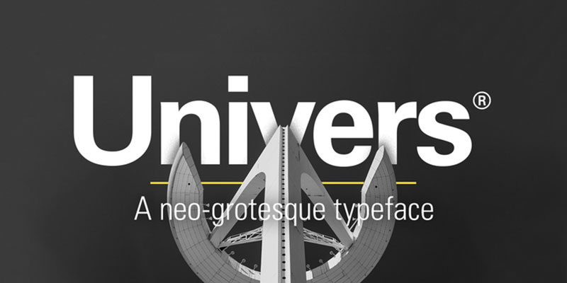
Univers is a neo-grotesque classic Swiss typeface designed by Adrian Frutiger. It was published in 1957, the same year as Folio and Helvetica, two other popular neo-grotesques.
As both were based on the 1896 typeface Akzidenz Grotesk, the style of Univers is somewhat comparable to that of Helvetica. The Universe has an immense number of weights and widths, making it a much more flexible family of forms than Helvetica.
Font used by Facebook on iOS devices: Helvetica Neue
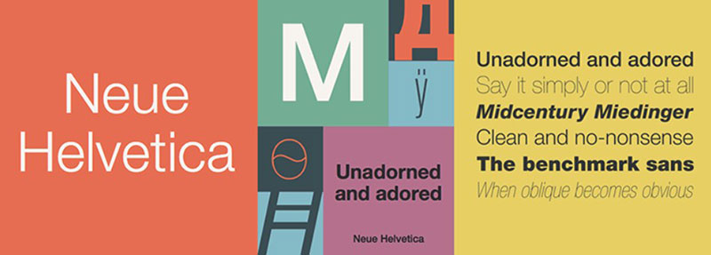

Helvetica Neue is a 1983 reworking of the original typeface, also known as Neue Helvetica. To have a more regulated range of heights and widths with more high-grade readability, it was redesigned. With a broad variety of weights and styles, it is a plain, clean, legible typeface. It enables the importance to be on the content instead of the typeface, due to its design integrity and universality.
Fonts Similar to Helvetica Neue
Acumin

Acumin, designed by Robert Slimbach and released by Adobe in 2015, is a sans-serif font. Slimbach set out to design a new neo-grotesque that could serve as a face of text. Acumin is a big family that is available in five widths, with each width available in nine weights with matching italics, extra-condensed, semi condensed, condensed, regular and broad. This brings out an incredible 90 styles in total.
Aktiv Grotesk

A grotesque sans-serif typeface is Aktiv Grotesk, released by Dalton Maag in 2010. It was dubbed a “Helvetica killer.” The designers of Aktiv Grotesk aspired to create something like Helvetica and Univers by reducing the Helvetica glitches and adding a bit of warmth to Univers. One of my personal favorites is Aktiv Grotesk.
The font on Android devices used by Facebook: Roboto
RobotoTM
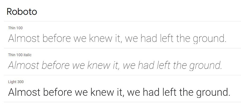

Roboto is a grotesque open-source sans-serif typeface created in 2011 by Christian Robertson and promulgated by Google. Roboto owns a dual existence. It has an automatic skeleton and is mainly geometric in its shapes.
At the same time, friendly and open curves appear in the font. Roboto does not hazard, allowing letters to be settled into their natural width, whereas some grotesques deform their letterforms to force a rigid rhythm. In humanist and serif forms, this allows for a more normal reading rhythm more commonly found.
Font Similar to Roboto
DIN
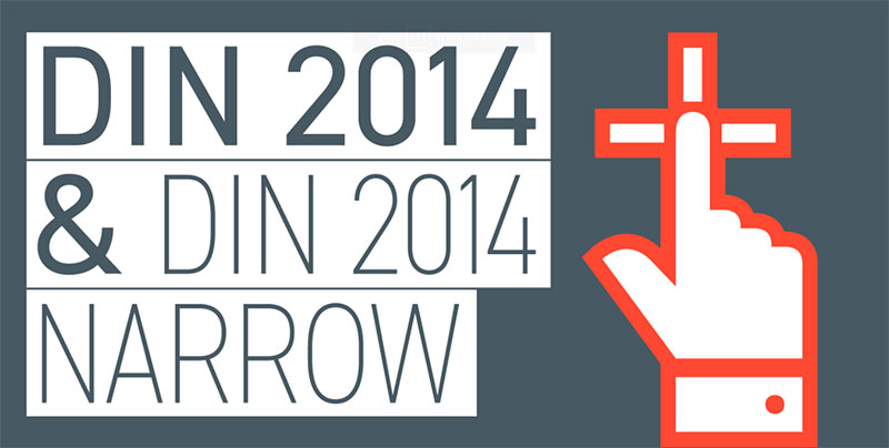

The initial version of the DIN was introduced in 1931 and was designed for use in systematic and construction purposes such as traffic signs. As it was created by an engineer rather than a designer, DIN is known for its intentionally unpolished and embryonic look.
Fonts used by the Facebook Website
If you look at the list, it depends on what’s on your computer. It uses Helvetica or Arial, or whatever your sans-serif default is. Lucida Grande, Tahoma, and Verdana are also identified by the style sheet.
Lucida Grande
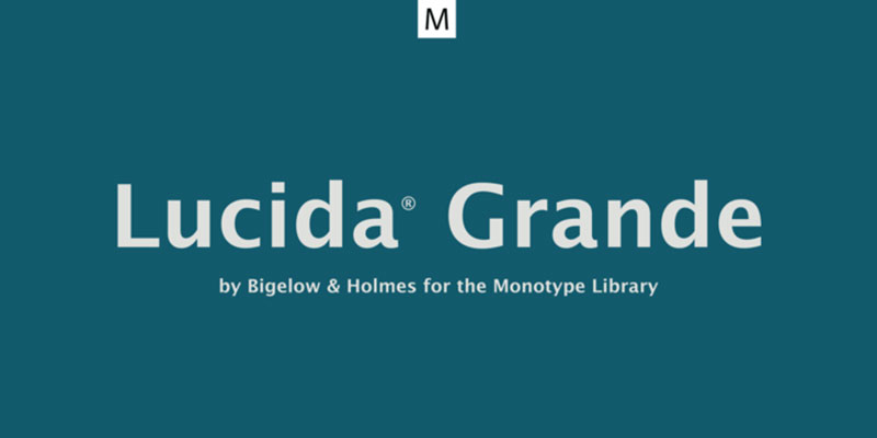
Lucida Grande is a sans-serif humanist font. It is part of the typeface family Lucida, designed by Charles Bigelow and Kris Holmes. It is best known for its deployment from 1999 to 2014 through the macOS user interface, as well as in other Apple apps such as Safari for Windows.
Tahoma
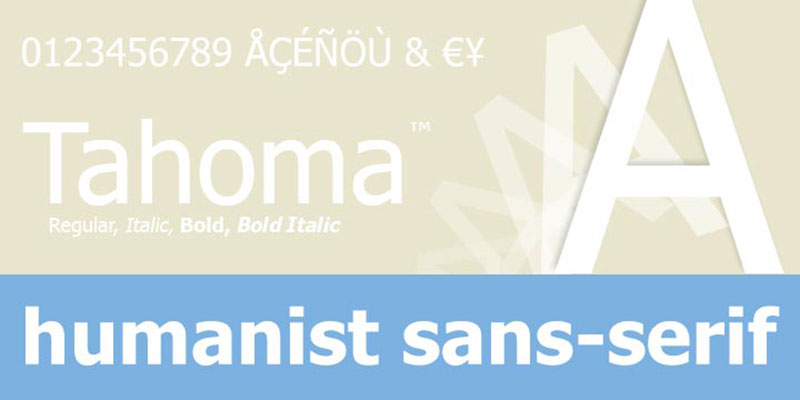
Tahoma is one of the Sans Serif family of Microsoft typefaces. It consists of two (regular and bold) Windows TrueType fonts and has been created to tackle the challenges of on-screen display, particularly in small dialog boxes and menus.
Verdana
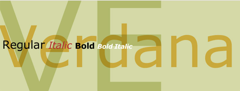

The Verdana font family consists of four TrueType fonts developed specifically to overcome on-screen display challenges. Designed by world-renowned type designer Matthew Carter and hand-inspired by Agfa Monotype‘s Tom Rickner, the head hinting expert, these sans serif fonts are unusual examples of computer screen type design.
Those are all the fonts that Facebook uses. In particular, FB fonts can only be adjusted with the aid of specific additions and Facebook font translators, or generators developed by other companies, which help to change online fonts to be copied and pasted into the FB field.
FAQ On The Font That Facebook Uses
What Font Does Facebook Use in Its Logo?
The current Facebook logo utilizes a custom typeface designed specifically for the company, reflecting its unique brand identity. However, the exact name is not publicly disclosed, distinguishing its proprietary look from common typefaces.
How Has Facebook’s Font Changed Over Time?
Facebook has tweaked its typography occasionally, ensuring alignment with evolving design trends and user interface readability.
Each redesign subtly enhances visual communication, providing a fresh yet recognizable feel, crucial for maintaining user experience consistency.
Is Facebook’s Font Designed for Better Readability?
Yes, Facebook’s font choice prioritizes legibility. The sans-serif style facilitates clarity and ease of reading across various digital devices, adhering to accessibility in design and maintaining high user experience standards.
Can I Legally Use the Facebook Font?
Without access to Facebook’s proprietary typeface, the exact font is off-limits for public use. However, similar web-safe fonts might capture the essence without infringing on font licensing or branding guidelines.
What Are Alternatives to the Facebook Font for My Project?
Alternatives such as Helvetica, Arial, or Google Fonts like Roboto offer comparable legibility and versatility. These can serve as stand-ins respecting font licensing while achieving a clean, user-friendly appearance for digital branding.
How Do Font Choices Impact Brand Identity on Social Media?
Font choices are pivotal to brand identity, shaping user perception and emotional connection. A carefully selected typeface on platforms like Facebook embodies the brand’s values, fostering a cohesive visual hierarchy and enhancing digital branding efforts.
What’s the Role of Typography in Facebook’s User Experience?
Typography in Facebook’s user experience plays a strategic role by improving content readability and navigational ease, two cornerstones of a positive UX design, which in turn affects overall user engagement.
Are There Any Web Fonts Similar to What Facebook Uses?
Yes, several web fonts mimic the clean lines of Facebook’s typography. For example, the practical yet polished character of fonts like Helvetica or Arial aligns well with screen resolution compatibility and mobile-responsive design demands.
How Does Facebook’s Font Choice Affect Accessibility?
Facebook’s font selection upholds the Web Content Accessibility Guidelines (WCAG), facilitating inclusivity and ensuring a diversity of users can comfortably digest content, reinforcing the importance of accessibility in design.
Does Facebook’s Font Style Impact Online Marketing Material Design?
Absolutely. As an extension of brand identity, Facebook’s font style sets a standard for online marketing material design, contributing to the consistency and recognizable presence critical to effective visual communication and digital marketing strategies.
Conclusion
In the intricate dance of design elements, the font that Facebook uses takes center stage, casting its influence subtly but surely across a tapestry of a billion screens. We’ve journeyed through the alleys of typography, dissecting the sans-serif enigma Facebook adopted—a font that, while unnamed, shapes perception, defines accessibility, and carries the brand’s voice to every corner of the globe.
- Key takeaways:
- A custom, unnamed typeface sits at the heart of Facebook’s identity.
- Legibility and brand coherence drive the platform’s typographic choices.
- Facebook’s typography evolution mirrors changes in user interface design and web design trends.
In the pixels and code that make up every character, much is said without a sound. The lessons drawn here reach beyond a mere set of alphabetic symbols; they speak to the core of visual communication.
Grasp these insights to hone your own digital canvas—let the fabric of your design speak volumes, as Facebook’s font does, in silent eloquence.
If you liked this article about the Facebook font, you should check out this article about the Twitter font.
There are also similar articles discussing the Discord font, the Nike font, the Fortnite font, and the Amazon font.
And let’s not forget about articles on the Overwatch font, the Supreme font, the font for memes, and the Roblox font.