


Imagine scrolling through your Twitter feed—there’s an undeniable ease as your eyes glide over the text.
But have you ever paused to wonder about the silent maestro orchestrating this seamless experience? It’s the font that Twitter is using, a subtle hero shaping our social media interactions.
In this digital space where design meets functionality, selecting the right typeface transcends aesthetic appeal; it’s about user experience and brand identity.
As a steward of visual communication, my focus extends beyond mere characters on a screen to the harmony of typography, UI design, and readability.
Dive with me into the world of Twitter’s typographic choices. We’ll uncover the intricacies of Chirp—the custom typeface that has become synonymous with one of the most influential social platforms of our age.
From typeface aesthetics to accessibility standards, this article illuminates the pivotal role font plays in digital branding.
Prepare to unravel the secrets behind Twitter’s font style and its impact on the overarching user experience.
What Font does Twitter use across devices?

Here is an overview of the font for Twitter on Android, Mac, and Windows devices.
- Twitter applies the Roboto font in its Android Version.
- Twitter’s Mac version uses the Helvetica Neue font.
- On the Windows version, Twitter uses Arial and also ‘Segoe UI‘ fonts.
What font does Twitter use for its posts?

Interesting content abounds on Twitter. Users share ideas and thoughts in succinct messages or posts. Twitter refers to each of these posts on the platform as a tweet. Engaging and useful posts can keep one hooked to the site. Yet, stylish fonts make them all the more easy and desirable to read. Twitter text font for its posts range among the following:
- Helvetica Neue: Helvetica Neue is the foremost font for the Twitter web on both smartphones and tablets.
- Segoe UI: This is one font for Twitter that works for Microsoft-based devices.
- Roboto: This clean modern neo-grotesque font for Twitter appears on the Android Twitter web.
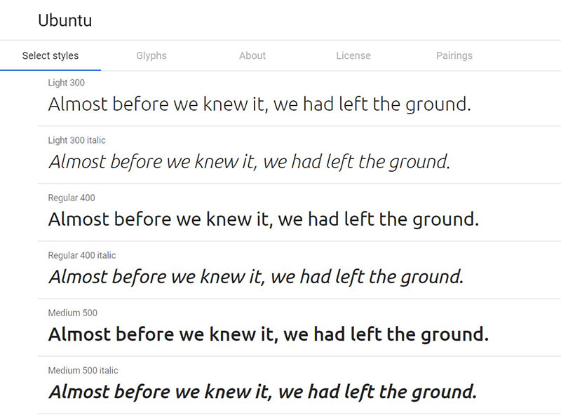
- Ubuntu: Ubuntu, an Open-Type font family, is for desktops – Mac/PCs.
- sans-serif: This is a broad typeface that consists of various fonts for Android. For Twitter’s web interface, mobile devices may use their default sans-serif font.
What Font does Twitter use on Android?
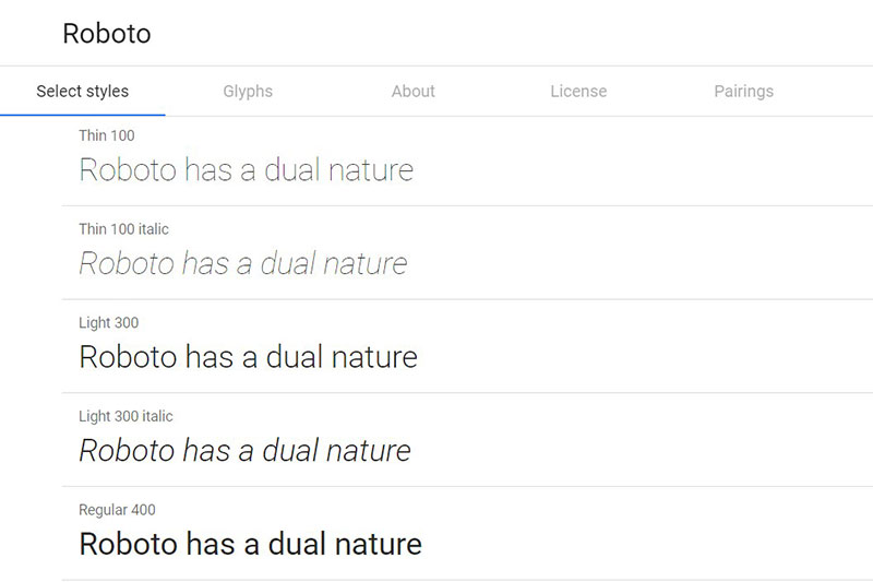
Roboto font
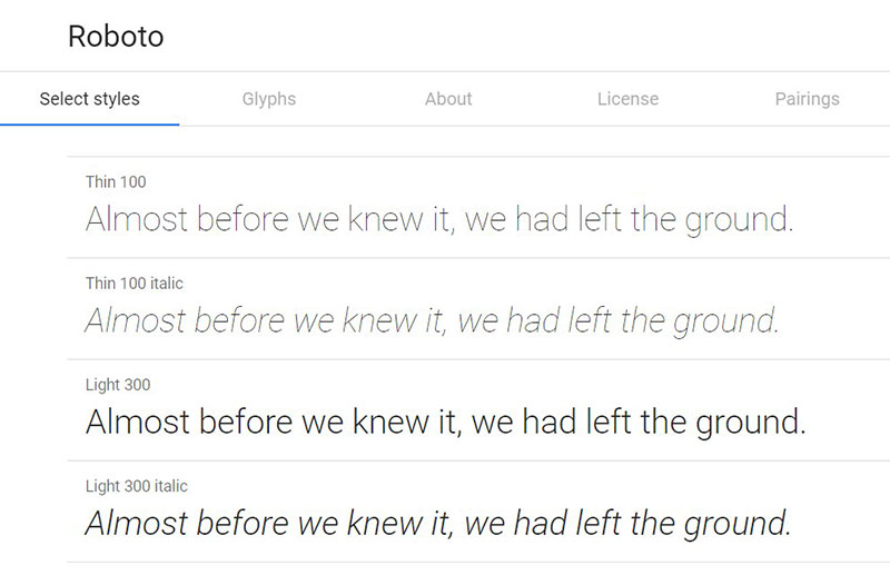

This neo-grotesque font is the default font on the Android operating system. Google released the dual-nature font in 2011 as Android’s system font.
The Roboto font belongs to the sans-serif face. It, however, presents a unique style from many grotesques. This font with 12 styles blends geometric forms with mechanic frames. Curves that are open and friendly are also a part of its feature. There is no rigidity or distortion of rhythm or letterforms with Roboto. This is possible as letters retain their natural width. As such, one can enjoy reading tweets in a natural rhythm.
Alternatives for the Roboto Twitter text font
Akkurat
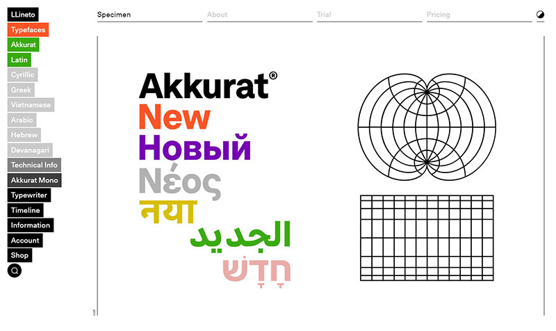

Akkurat is a making of Laurenz Brunner, a Swiss designer. Its release through Lineto – a type foundry – was in 2004.
Like Roboto, this font also belongs to the sans-serif typeface. It has three weight variations – bold, regular, and light. Each of these weight forms has its matching italic font.
DIN
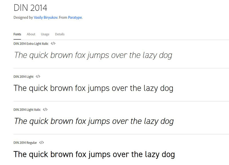

The recent version of the Din font dates to 1995. However, the original came out much earlier – in 1931. The release of the update by Albert-Jan Pool was through FontFont.
The deliberate primitive and unrefined appearance of the font reveals its initial purpose. It was to meet, not only engineering applications but also technical ones. Warnings and traffic signs are an example of this.
What Font does Twitter use in the Mac Version?
Helvetica Neue

Whether referred to as Helvetica Neue or Neue Helvetica, this font is very popular. Tons of websites continue to use the font since the release of its update in 1983. Now, it is second only to Arial on the list of popular website fonts. It holds this spot with usage by more than 25% of sites on the web.
This font for Twitter is very legible and has a uniform style. Also, there are several new styles – extended and condensed, as well as weights. Still, the individual letters in Helvetica Neue have consistent widths and heights.
Similar typeface to Neue Helvetica / Helvetica Neue Twitter text font
IBM Plex Sans
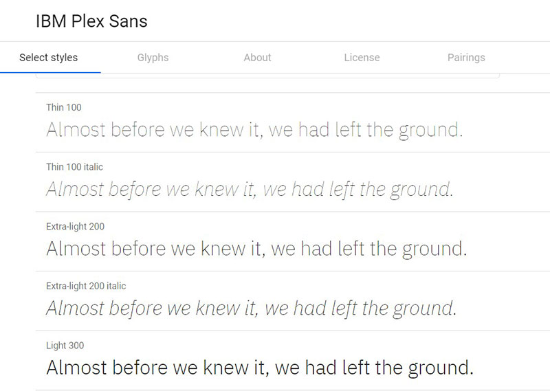

This is a grotesque style font that maintains a friendly outlook, even though neutral. It is a fine mix of engineered details and stylish design. The IBM Plex Sans font has 14 styles.
Muli
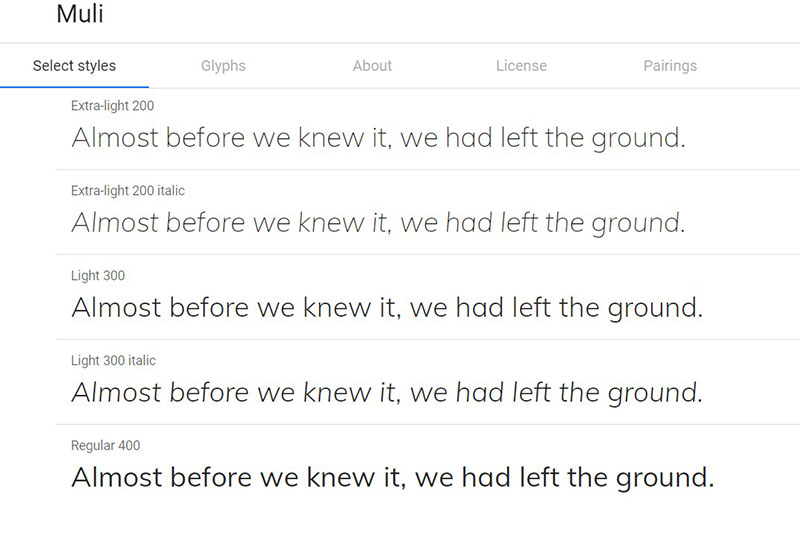

Minimalism is the essence of Muli. The design of this font is suitable for web browsers on different devices. Thus, internet users can use it on their mobile devices, laptops, and desktops. Although it is primarily for display, it also serves as a font for texts. There are also 14 styles of this font.
Roboto

The fact that over 20 million websites over the internet use this font proves its popularity. The font has a style that is aesthetic and with substantial readability. And it matches these features with maintaining a natural outlook. The six weights of the Roboto font are Light, Regular, Bold, Black, Medium, and Italic.
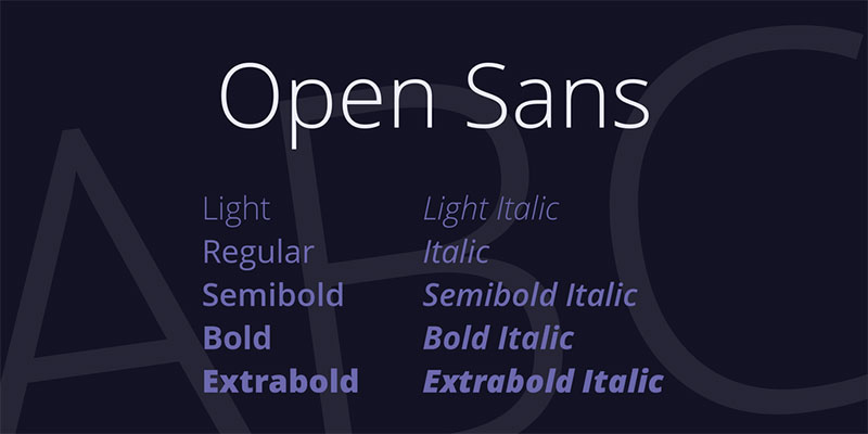
Open Sans
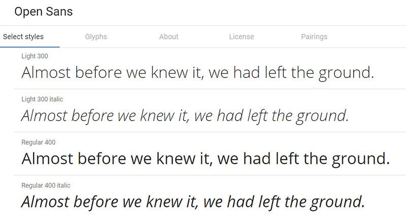

Steve Matteson designed this humanist font in 2011. The font combines friendliness and neutrality with open forms and upright stress. Many of its letters have wide apertures and there are tall lower-case letters. Another key feature of this font of the sans-serif family is its legibility. It also has a true Italic style.
Work Sans
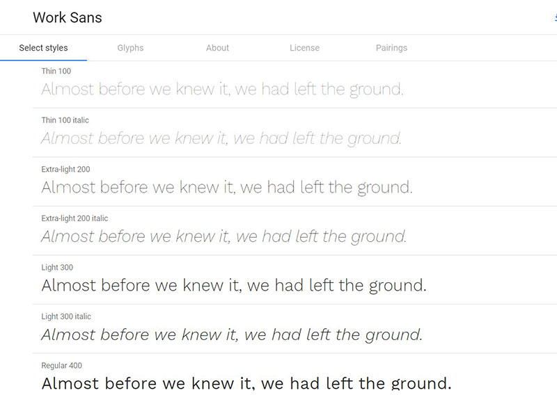

All nine styles of Work Sans are suitable for print design. The font belongs to the family of an early Grotesque-based typeface. Both regular and medium weights in this family are, however, primarily for on-screen text.
What Font does Twitter use in its Windows Version?
Arial

In 1982, Patricia Saunders and Robin Nicholas – designers of Monotype Imaging – designed this typeface. It was to function in IBM laser printers. Thus, the design of Monotype grotesques forms the basis for that of the Arial.
The wide range of applications of the font is one reason behind its popularity. These applications include large print posters, ads, logos, and screen text, to mention some. Currently, about 60% of websites use this font. Hence, the passing decades continue to see the wide usage of the font.
Arial font for Twitter is stylish, as well as easy to read. It maintains its legibility, whether in small or large sizes. The Twitter text font accommodates several narrow widths.
Segoe UI
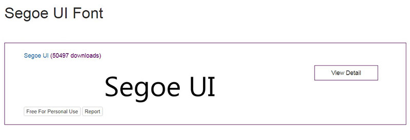

Segoe UI is another font from Monotype Imaging. Microsoft products use this sans-serif face as their user interface (UI) text. It is also useful in user assistance. The difference between this text font and Tahoma – its predecessor is its rounded lettering style. It also shares this difference with Lucida Grande – its Mac counterpart.
One premium feature of the typeface is that it remains consistent across languages. Thus, irrespective of the device or browser language, users can see text in a relatively uniform style.
Similar typeface to Segoe UI Twitter text font
Clear Sans
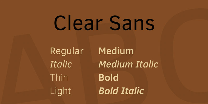

This OpenType font bears similarity with its sans counterparts. Its versatility allows its compatibility with web, screen, and print. It possesses on-screen glanceability and legibility. The characters of this font are “clear”, unambiguous, and minimal. All of these make it suitable for UI design.
There are several variations of the font. They are Regular, Thin, Medium, Light, Bold, and Italic variations. The thin version expresses the thoughtfulness of the font’s design even more. Regardless of the size, Clear Sans presents elegance and sophistication. It is, overall, a fine contemporary blend of professionalism, functionality, and style.
Droid Sans
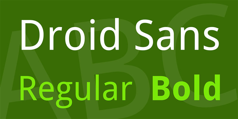
Here is another Steve Matteson creation. The idea behind the font was to allow for usage in small screens, especially mobile handsets. The humanist typeface also belongs to the sans serif family. It remains suitable for web browsers and other on-screen text.
Noto
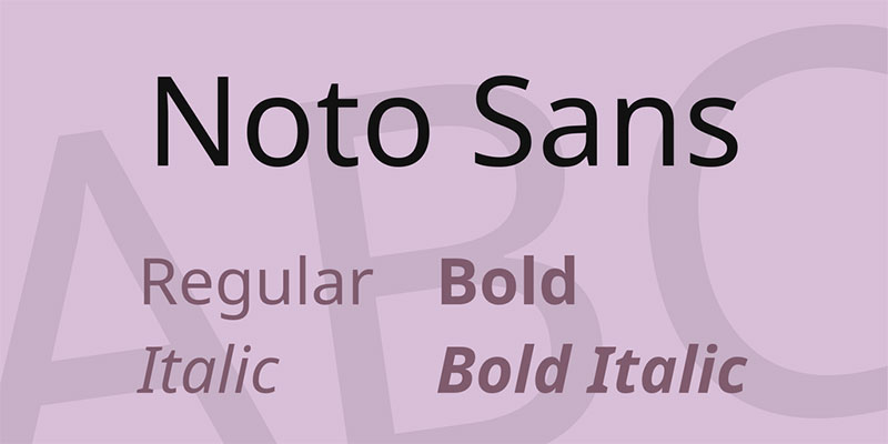
The Noto font family is a solution-driven innovation from Google. It seeks to solve the problem of ‘tofu’. This refers to the little boxes that appear on a device other than the one that generated a text. They signify that the device does not support the original font of the text. The font name itself conveys the idea of “no tofu”.
With Noto, there is umbrella support for virtually all languages and devices. The free font has a unified look and harmonious feel across its various weights and styles.
Open Sans
This font set of 897 characters also comes from the design arsenal of Steve Matteson. Among the characters are the Latin CE, ISO Latin 1, Cyrillic, and Greek sets.
The design of Open Sans is friendly and neutral, with some condensed styles. It also incorporates open forms and upright stress. Its letterforms are legible and it suits both mobile and web interfaces.
FAQ On The Font That Twitter Is Using
What Font Does Twitter Use?
Twitter made a switch to Chirp, a fresh, custom typeface designed to improve legibility and create a unique visual identity.
It blends American Gothic and European Grotesque styles, aiming to optimize the reading experience across millions of screens worldwide.
Why Did Twitter Change Its Font?
Seeking uniqueness in the crowded social media landscape, Twitter aimed for a font that would not only be distinct but also embody its values. The change also underscores their commitment to improved readability and better user experience typography.
Can I Download the Twitter Font?
Chirp, the proprietary font of Twitter, is not publicly available for download as it’s custom designed for the platform. Licensing restrictions typically protect such brand-specific typefaces from being distributed freely.
How Can I Replicate the Twitter Font?
A similar feel to Chirp can be emulated with typography standards like Roobert or Helvetica Neue, though they’re not identical.
These alternatives resonate with Chirp’s clean, modern lines and are available within web font libraries.
What Makes Chirp Unique Compared to Other Fonts?
Chirp uniquely blends design elements from both traditional and contemporary typefaces, ensuring that it stands out yet remains functional. Its crafted quirks in characters like the ‘b’ and ‘w’ lend it a distinctive appearance, enhancing Twitter’s brand visual identity.
How Has Twitter’s New Font Impacted User Engagement?
While subjective, user reception has been mixed. Some praise the font’s fresh approach, while others find adjustability challenging. Overall, the intent behind using Chirp was to foster a more cohesive and engaging user interface for the platform.
What Are the Accessibility Features of Twitter’s Chirp Font?
Chirp addresses accessibility in font choice with clearer distinctions between similar characters and better legibility. Twitter puts emphasis on accessibility standards to ensure inclusivity for users with visual impairments.
How Does Twitter’s Font Choice Reflect Its Branding?
Typography is crucial for branding, and Chirp is designed to marry readability with personality. This reflects Twitter’s constant evolution and its desire to provide a seamless digital experience, resonating with its vibrant brand identity.
Is Chirp Used on Twitter’s Mobile and Desktop Platforms?
Yes, Chirp is used across Twitter’s mobile and desktop platforms, ensuring a consistent and integrated visual and user experience no matter the device.
How Does Chirp Compare to Fonts Used by Other Social Media Platforms?
Chirp has been tailored to fit Twitter’s unique brand, unlike other social networks that may use off-the-shelf fonts. This custom approach allows for differentiated digital text display and brand identity in a sea of social media similarity.
Conclusion
Embarking on this typographic journey reveals just how pivotal the font that Twitter is using is—not merely to its interface but to the very spirit of the platform. Chirp stands as a testament to Twitter’s ingenuity, fusing aesthetics with the critical underpinnings of accessibility and user experience.
It’s crystal clear:
- Chirp isn’t just another typeface—it’s a brand ambassador, a seamless conduit between message and audience.
- Typography shapes perception and interaction, echoing the essence of a platform used by millions to voice their thoughts—concise, clear, impactful.
- The move to a unique typeface voices Twitter’s relentless pursuit of innovation, a nod to its commitment to enhance the digital text display and font readability.
In closing, the narrative woven through the pixels of Chirp speaks volumes, echoing beyond the bounds of the platform—resonating in the domain of digital branding. It underscores an era where design transcends visuals, becoming the very language through which a brand speaks.
If you liked this article about the Twitter font, you should check out this article about the Discord font.
There are also similar articles discussing the Nike font, the Fortnite font, the Amazon font, and the Overwatch font.
And let’s not forget about articles on the Supreme font, the font for memes, the Roblox font, and the Facebook font.