

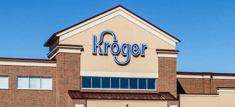
Imagine strolling down the bustling aisles of your neighborhood supermarket. That unmistakable blue and white emblem catches your eye—the Kroger logo, a beacon of consistency in a fast-paced consumer world.
This symbol represents more than just a grocery chain; it’s a cornerstone of retail identity that resonates with millions.
In a landscape where visual branding strategy makes or breaks customer recognition, delving into the Kroger logo’s evolution offers a glimpse into the genius of corporate branding.
Here, nuances of marketing and promotions blend with graphic design in retail, crafting an image that stands the test of time.
This article peels back the layers of the Kroger logo. Unearth the strategies behind successful supermarket branding and witness how a logo serves as the silent ambassador of the Kroger brand values.
Together, we’ll traverse the journey from logo conception to the customer perception of branding—unpacking the artistry behind the emblem that adorns countless shopping bags and storefronts.
The Meaning Behind the Kroger Logo
![]()

When we first gaze at a logo, there’s often more than meets the eye. A logo isn’t just a fancy image or text, it’s a story, a philosophy.
Subconscious Connections
So, let’s talk Kroger. Ever wondered why that logo feels so familiar every time you step into the store?
It’s crafted to connect with us on a subconscious level. For a supermarket giant like Kroger, the logo needs to resonate with trust, reliability, and quality.
The Evolution of Trust
Over the years, as the company evolved, the logo changed to mirror the growth and modernity of the brand, while still holding onto its core essence. By maintaining certain elements, they assure customers that while times may change, their core values remain the same.
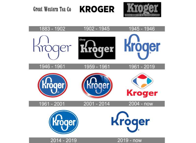
The History of the Kroger Logo

Logos are kinda like wine – they can get better with age, or…not.
The Humble Beginnings
The Kroger logo has seen its fair share of tweaks and twirls. In its initial days, it was straightforward, echoing the simplicity of the time.
The Modernization
As decades rolled by, Kroger underwent rebranding. The logo became more streamlined, capturing the contemporary essence while holding onto its rich history.
The Colors of the Kroger Logo
![]()

Alright, let’s dive into some artsy stuff.
The Blue Hue
The dominant color in the Kroger logo? A calming blue. Blue isn’t just a random choice; it symbolizes trust, loyalty, and stability. Perfect for a supermarket, right? You want to trust where your food’s coming from.
The Font Used in the Kroger Logo


Bold and Steady
The current logo features a custom Kroger font, which is a contemporary evolution of the previous logo.
The font in the Kroger logo is bold, yet straightforward. It signifies strength and dependability. It’s like that one friend who’s always got your back, no drama attached.
Sleek Lines
Over the years, the typography has evolved to be more modern and sleek, yet it hasn’t let go of its robust and reliable aura.
The Adaptability of the Kroger Logo
Logos ain’t just for storefronts anymore.
Digital Presence
With the rise of digital platforms, the Kroger logo had to adapt. It’s not just about looking good on a storefront, but also on a mobile app or website.
Merchandise Magic
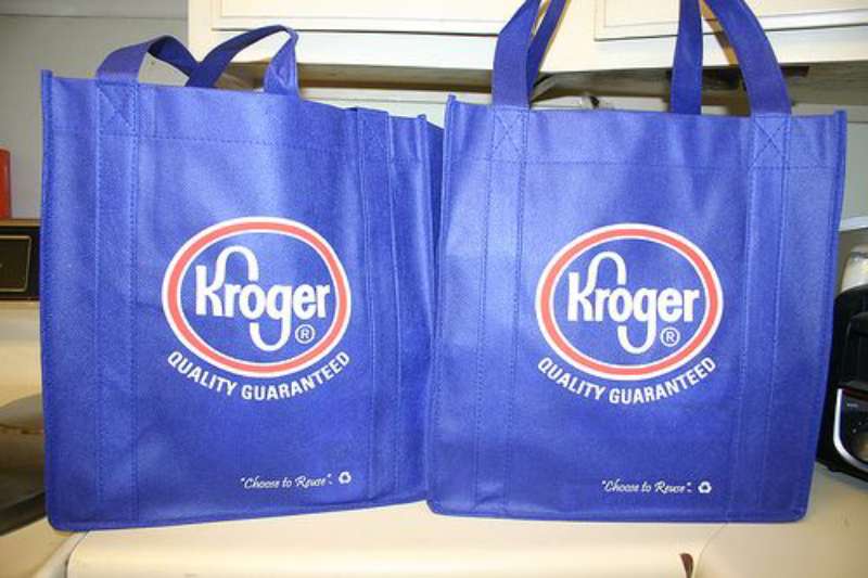

From reusable bags to employee uniforms, the adaptability of the Kroger logo is evident. Its versatility ensures it stands out, no matter where it’s stamped.
The Reception of the Kroger Logo
Last but definitely not least, let’s talk feels.
Customer Perception
Over the years, customers have built a sense of loyalty with the Kroger brand. The logo, being the face of the brand, plays a significant role in this relationship. It’s like seeing a familiar face in a crowd. Comforting, right?
Brand Identity
Kroger’s logo isn’t just another image. It’s a promise, an identity, a silent communicator. It tells you that when you walk through those doors, you’re in for quality, reliability, and a dash of love.
FAQ On The Kroger Logo
What does the Kroger logo represent?
The Kroger logo is more than a simple emblem; it’s a visual representation of the brand’s values and history.
By combining vibrant colors with a simple typographic design, it underscores Kroger Co.’s commitment to delivering quality and value, aiming to evoke a sense of trust and familiarity among its customers.
Has the Kroger logo changed over the years?
Indeed, like most timeless symbols in the retail industry, the logo has evolved. Changes reflect shifts in marketing strategy and corporate identity, ensuring relevance with the times.
The current version, a sleek and modern interpretation of previous designs, emphasizes Kroger’s adaptive and forward-thinking nature.
Why does Kroger use blue and white in their logo?
Blue and white in the Kroger logo serve a dual purpose. Blue conveys professionalism and reliability, while white represents purity and simplicity.
This color choice aids in establishing brand recognition and evokes a clean, friendly, and trustworthy image in the competitive supermarket branding arena.
What was the design inspiration behind the Kroger logo?
The Kroger logo’s design inspiration likely stems from a desire to connect with customers through simplicity and familiarity.
The use of bold, legible type suggests accessibility, while the enclosing shape suggests completeness and a comprehensive shopping experience, resonating well with the brand’s grocery retail market focus.
How does Kroger’s logo contribute to its brand recognition?
A well-crafted logo becomes synonymous with the experiences it represents. Kroger’s logo, with its distinctive visual identity elements, successfully anchors the brand’s image in consumers’ minds, enhancing recognition and inspiring loyalty, all crucial to Kroger’s branding guidelines and standards.
What is the significance of the “K” in the Kroger logo?
The stylized “K” in the logo is not merely a letter; it acts as a distinctive brand marker. Unique and bold, it stands out in advertising campaigns and on product packaging, aiding in instantly identifying Kroger’s private label brands and contributing to a unified corporate communications strategy.
Do customers resonate with the current Kroger logo?
Surveys and market research would suggest that customers do resonate with the current logo. Its consistent visibility in digital coupons, loyalty programs, and community engagement initiatives fosters a recognizable identity, contributing positively to Kroger’s customer service and experience efforts.
Do all of Kroger’s subsidiaries use the same logo?
No, subsidiaries like Fred Meyer retain their individual branding to maintain a connection with their specific customer base while benefiting from the association with the larger Kroger family.
This strategic choice enhances local touchpoints while capitalizing on Kroger’s broader market positioning.
What role did graphic designers play in creating the Kroger logo?
Graphic designers were pivotal, transforming the corporate identity into visual form – a task blending imaginative flair with a rigorous understanding of branding strategy.
Their expertise ensured the logo’s alignment with Kroger’s business objectives, encapsulating the company’s essence into a singular graphic symbol.
How can one distinguish the Kroger logo from other supermarket logos?
Kroger’s logo stands out through its unique typography and color scheme, eschewing complex imagery for a clean and easily recognizable look.
This clear and direct approach differentiates it within the cluttered visual landscape of the grocery store emblem, thereby streamlining the customer recognition process.
Conclusion
Drawing the curtain on our exploration, the Kroger logo emerges as more than just an emblem; it’s a narrative, chronicling progress, purpose, and profound customer connections. Each stroke, color, and curve are meticulous orchestrations, harmonizing supermarket branding and visual marketing in a symphony of design.
Through the chapters of rebranding efforts, we’ve witnessed how this icon carves Kroger’s visual identity into the communal memory, nested within the aisles and checkouts of everyday lives. The logo’s endurance underscores that retail logo design isn’t just an artistic pursuit — it’s an ongoing dialogue with society.
In closing, let this logo be a testament to the symphony of corporate identity and enduring customer recognition. It’s not merely seen; it’s experienced. And each experience reflects back the core of what makes Kroger’s symbol a beacon in grocery store emblems — the unwavering promise of quality on every shelf and in every home.
If you liked this article about the Kroger logo, you should check out this article about the ShopRite Logo.
There are also similar articles discussing the Speedway Logo, the Sprouts Farmers Market Logo, the HEB logo, and the Lidl logo.
And let’s not forget about articles on the Meijer logo, the Metro logo, the Morrisons logo, and the Publix logo.