

A logo encapsulates a brand’s essence, weaving together color, form, and symbolism into a beacon for customer recognition. The Lidl Logo does just that, a herald of affordable quality in a sea of retail giants.
In the bustling aisles of commerce, it stands as a testament to savvy marketing—punctuating every product, every deal, every storefront with a ubiquitous presence.
Delving into this emblem, we uncover layers of graphic design wisdom and marketing acumen. Each curve, each hue resonates with intent, crafting a narrative that resonates on a global scale.
Here, we peel back these layers, revealing the blueprint behind a retail juggernaut’s visual anchor.
By journey’s end, expect illumination—on how the unique blend of brand identity and corporate branding shapes consumer perceptions and, ultimately, a company’s success.
You’ll witness the evolution of a discount retailer’s emblem, interpreting the silent language of a logo that navigates the complex seas of retail branding.
Prepare to explore. A realm where visual identity and trademark design intersect with strategic foresight awaits your keen eye.
The Meaning Behind the Lidl Logo
![]()

You know, logos are like a secret language. At first glance, they might look simple. But there’s often a deeper meaning. Dive with me into the Lidl logo.
Symbolism and Essence
The Lidl logo? It’s more than just a name on a sign. It’s like the visual DNA of the brand. Clean lines. Straightforward. No fuss.
It tells customers, “Hey, we’re all about simplicity and value!” It’s kinda like the store’s mission, but in picture form.
Global Appeal
Think about it. Lidl is all over Europe. Heck, they’re even branching out to the US. That logo? It’s gotta be versatile.
It’s gotta speak to everyone. And guess what? It does. It’s like a universal “hello” – but cooler.
The History of the Lidl Logo
![]()

Let’s jump into the time machine! The Lidl logo has its own story to tell.
Humble Beginnings
Way back, when bell-bottom jeans were the rage, Lidl kicked off in Germany. That first logo? It was like a baby picture – kinda cute, a bit awkward. Over time, though, it evolved. Just like the store.
Changes Over the Decades
The Lidl logo has had its makeovers, just like any celebrity. Changes in style, a little tweak here and there, but always staying true to its roots. Each change? It was like a chapter in Lidl’s epic novel.
The Colors of the Lidl Logo
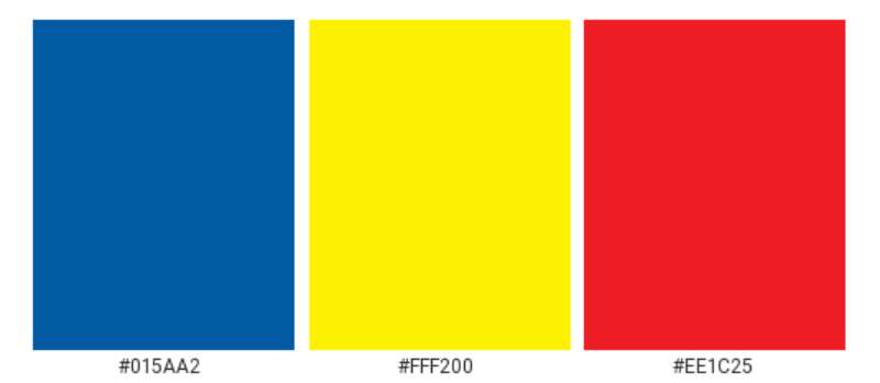

Colors, man! They’re powerful. They evoke emotions, feelings, vibes. Let’s break down the Lidl color palette.
Blue: Trust and Reliability
Blue is chill. It’s the sky. The ocean. It’s trustworthy. Lidl’s blue? It’s like a promise. “You can count on us.”
Red: Passion and Energy
Then there’s the red. Fiery, vibrant, full of life! It’s Lidl saying, “We’re passionate about what we do!”
The Font Used in the Lidl Logo

Fonts are the unsung heroes in the logo game. Let’s shed some light on the Lidl font.
Simplicity is Key
Lidl’s font? Sleek, modern, and totally readable. It’s like the store itself. No frills. Just the good stuff.
Standing Out in the Crowd
The font’s boldness? It’s a statement. It’s Lidl’s way of saying, “Hey world, here we are!”
The Emotion Evoked by the Lidl Logo
Ever look at something and just feel something? Logos do that. Here’s how Lidl nails it.
Familiarity and Comfort
When people spot that Lidl logo? It’s like seeing an old friend. Familiar. Comforting. Like a cozy blanket on a cold day.
Confidence in Shopping
With its clear and straightforward design, it gives off this vibe of, “We got you.” It’s reassuring, you know?
Lidl Logo in Pop Culture
Everything’s connected. And logos? They pop up in the most unexpected places.
The Cultural Impact

From memes to merch, that Lidl logo is everywhere. It’s more than a brand symbol; it’s a part of the pop culture fabric.
Celebrity Endorsements
Did you know some celebs are big Lidl fans? Spotting that logo on a famous person? It’s like seeing your favorite band wear a T-shirt of another band you love.
FAQ On The Lidl Logo
What does the Lidl Logo represent?
The emblem signifies more than mere grocery deals; it conveys affordability intertwined with quality.
Picture this marque as a beacon, guiding thrifty shoppers to a realm where cost-efficiency reigns. It’s a visual shorthand, embodying the brand’s European roots while promising a wallet-friendly shopping experience.
Who designed the Lidl Logo?
Credit the shadowy artists behind corporate veils—specifics, shrouded in confidentiality.
Yet, the logo’s architect surely marveled at graphic design and visual identity, leveraging these tools to concoct a logo that meshes seamlessly with the brand colors and corporate identity that resound throughout Lidl’s branding.
When did Lidl introduce its current logo?
A twist in the narrative: it’s been with us since a revamp swept the old look under the rug. That shift came sometime in the decade past. Since then, it’s been synonymous with the retailer’s emblem, itself a testament to evolution in visual branding.
Has the Lidl Logo changed over time?
Indeed, a tale of transformation is woven into its fibers. With each logo redesign, Lidl’s visual identity morphed, mirroring the company’s growth and market strategy changes.
Each iteration, a stepping stone toward the sleek emblem seen across cityscapes today.
What colors are used in the Lidl Logo?
Hues of blue and yellow dominate, where blue signals reliability and yellow shines optimism.
A harmonious balance that’s become ingrained in Lidl’s brand image, these colors are as fundamental to the supermarket symbol as the lynchpins of a corporate branding scheme.
How does the Lidl Logo impact customer perception?
Subtle yet potent, the visual identity wields power to shape opinions. It’s a vessel for consumer perception, where familiar streaks of blue and yellow trigger associations with bargains and quality—an emblem etched into market consciousness.
What are the differences between the Lidl Logo and competitors’ logos?
Each tells a unique story. Lidl’s logo stands out with its bold colors and simplistic design, juxtaposed with competitors’ varied approaches to brand identity.
This simplicity roots in trademark design, opting for clarity and brand recognition in the battlefield of retail branding.
How often does Lidl update its logo?
Nestled in the past, logos evolve; it’s rare, yet rhythmic in nature. A frequency unchained, Lidl’s visual identity isn’t given to whims—rebranding arises only from strategic necessity.
An emblem’s life is lengthy; changes come with consideration, a dance to the tune of brand image and marketing strategy.
What elements are included in the Lidl Logo?
A seamless blend of typography and imagery: the name, poised in bold, atop a simple, striking outline of a blue and yellow symbol—this supermarket symbol marries simplicity with corporate branding, a testament to trademark design prowess.
How does the Lidl Logo fit into the company’s marketing strategy?
An anchor for Lidl’s advertising campaigns, the logo transcends being merely graphic—it’s paramount.
It’s the silent champion of brand image, a constant across mediums, ensuring brand identity echoes from billboards to digital. This approach fortifies Lidl’s marketing strategy—solid, unmistakable.
Conclusion
As the pages of this narrative draw to a close, ponder the journey traveled and the knowledge unfurled from the Lidl Logo. Merely shapes and colors to an untrained eye, yet each stroke suffused with purpose, it stands apart in the saturated marketplace of supermarket chains.
Here is what to take home:
- The beacon that is the Lidl emblem extends beyond a simple graphic; it’s the heart of brand identity.
- Evoking trust and quality, the colors chosen are not by happenance but are strategically wielded.
- Embracing change when necessary, this logo’s evolution is reflective of rebranding case studies only when business needs beckon.
- The logo’s role within Lidl’s marketing matrix? Foundations—firm, unyielding, and at the core of the company’s success.
In essence, the Lidl Logo is more than a corporate stamp. It’s a lexicon of consumer connection, a testament to graphic design ingenuity, and a shining example of retail branding done right.
If you liked this article about the Lidl logo, you should check out this article about the ShopRite Logo.
There are also similar articles discussing the Speedway Logo, the Sprouts Farmers Market Logo, the HEB logo, and the Kroger logo.
And let’s not forget about articles on the Meijer logo, the Metro logo, the Morrisons logo, and the Publix logo.