

Imagine the bustle of a busy supermarket aisle, each product vying for attention. Among this visual cacophony, one emblem stands out: the Morrisons Logo.
Its vibrant green and yellow hues are a beacon for quality and affordability, a symbol etched in the British collective mindset for decades.
This logo isn’t merely a tag – it encapsulates a saga of corporate identity, evolving with each rebrand and redesign to mirror the needs and values of customers.
It’s a tightrope walk between maintaining brand recognition and steering the visual representation towards contemporary aesthetics.
In this exploration, you’re seated at the drafting table, tracing the lineage of a visual icon that shapes customer loyalty.
From inception to its current iteration, you’ll navigate the labyrinth of graphic design standards, decoding the subtleties ingrained within the supermarket emblem.
Beyond a mere sketch, delve into the brand guidelines and uncover the strategic prowess embedded in retail industry branding.
By the article’s end, a full palette of insights will be yours—ranging from the importance of consistent brand imagery in creating customer perception to the role of packaging design in establishing brand equity.
The Meaning Behind the Morrisons Logo
![]()

Alright, so you wanna dive deep into the Morrisons Logo? Let’s go!
Symbolism
So, here’s the thing. A logo isn’t just a fancy image slapped onto products and storefronts. It’s the face of a brand, man!
It’s like, every line and curve tells a story. When you look at the Morrisons Logo, you’re seeing more than just a name.
You’re catching a glimpse of the values, goals, and identity of the company. It’s all about projecting trust, quality, and community vibes.
The Emotional Connect
Remember when you’d look at a childhood photo and feel all nostalgic? A logo’s kinda like that.
It’s not just about recognition; it’s about feelings. When people spot the Morrisons Logo, they should be thinking fresh products, fair prices, and that good old local grocery store feeling.
The History of the Morrisons Logo

Evolution
The Morrisons journey is like…if the logo had a scrapbook. Over the years, the design has evolved, adapting to the times, but always keeping its core identity intact.
From its humble beginnings to its present-day avatar, the Morrisons Logo has witnessed a transformation, always reflecting the brand’s growth and adaptation to changing market dynamics.
Key Milestones
It’s wild how time flies! Over the decades, Morrisons has introduced tweaks and changes, some subtle and others more noticeable.
These changes aren’t just aesthetic. They often mirror shifts in company strategy, market focus, or consumer expectations.
The Colors of the Morrisons Logo

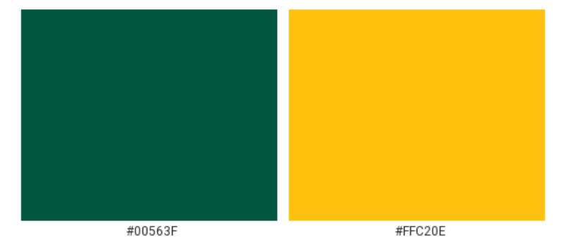
Green and Yellow: More than just hues
Ever notice how the Morrisons Logo has a distinct green and yellow combo? It ain’t random.
Green is all about nature, freshness, and well-being. It gives off that wholesome, earthy vibe – kind of like walking through a fresh produce section.
And the yellow? It’s sunshine, positivity, and warmth. Combined, these colors project a picture of health, freshness, and approachability.
Color Psychology
Colors have this weird power over our brains. They can trigger feelings and emotions, even without us realizing it. The Morrisons Logo, with its choice of colors, aims to evoke feelings of trust, quality, and freshness every time you glance its way.
The Font Used in the Morrisons Logo
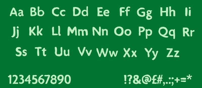
Typeface Tells a Tale
Ever thought about how the letters look? Fonts aren’t just about being readable. They set the mood! The Morrisons Logo uses a font that’s both modern and approachable, giving off friendly and contemporary vibes.
The Unspoken Message
A font can whisper or shout. The choice in the Morrisons Logo speaks of a brand that’s both confident and down-to-earth. It’s not too flashy, but it’s also not too plain – striking that sweet spot of being both reliable and innovative.
Brand Perception and Morrisons Logo
Public’s Eye
Ever heard the phrase, “Perception is reality”? How people see the Morrisons Logo affects how they view the brand. It’s all intertwined! A positive perception can boost brand loyalty, and trust me, that logo plays a huge role in shaping those views.
The Logo’s Role in Marketing

The Morrisons Logo isn’t just about looking pretty on a shopping bag. It’s a marketing tool! From ads to in-store displays, that logo is working hard to attract customers, and subtly telling them, “Hey, we’re about quality and trust.”
Design Inspiration and Morrisons Logo
Drawing from the Roots
Every design has its muse. For the Morrisons Logo, inspiration is drawn from its rich history and values. It’s like taking a step back, thinking about the company’s origins, its journey, and where it wants to go, and then encapsulating all of that in a design.
Modern Trends and Timeless Appeal
Balancing modern aesthetics with timeless appeal is no joke. The Morrisons Logo does that dance, incorporating current design trends while ensuring it doesn’t feel outdated in a few years. The goal? Stay relevant, but also classic.
FAQ On The Morrisons Logo
Why did Morrisons choose green and yellow for their logo?
The colors in the Morrisons Logo, a harmonious blend of green and yellow, were chosen for their psychological effect.
Green symbolizes freshness and vitality, aligning with the brand’s focus on fresh produce. Yellow brings a sense of optimism and attention-grabbing vibrancy, exuding warmth and affordability.
What does the Morrisons logo represent?
At its core, the Morrisons Logo encapsulates the brand’s commitment to quality and customer service.
It stands as a hallmark of familiarity and trust, a beacon guiding customers to a promise of value and a diverse product range within the British retail landscape.
Has the Morrisons logo changed over the years?
Yes, the emblem has undergone evolution, reflecting rebranding initiatives. These changes ensure Morrisons remains pertinent and relatable.
The logo’s design evolution mirrors the brand’s growth and adapts to contemporary graphic design standards and customer perception.
Who designed the latest Morrisons logo?
The latest iteration of the Morrisons Logo was crafted by a bespoke team of graphic designers. These professionals created a visual that conveys both retail logo design sophistication and brand recognition while adhering to modern visual marketing trends.
When was the Morrisons logo last updated?
The most recent update to the Morrisons Logo was a strategic move in the company’s branding strategy.
It symbolized a fresh perspective while respecting the storied brand identity and was implemented to align with evolving market dynamics and customer expectations.
What branding strategy does the Morrisons logo incorporate?
It’s a potent mix of visual appeal and marketing acuity. The Morrisons Logo is the cornerstone of a store branding strategy that champions ease of recognition, customer loyalty, and an overall seamless shopping experience.
Can the Morrisons logo be used by third parties?
The Morrisons Logo is a protected entity—stringently controlled. Usage by third parties requires express permission and adherence to stringent brand guidelines to ensure consistent and correct representation.
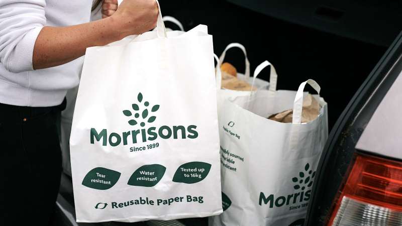
What significance does the tree in Morrisons logo have?
The tree, rooted in the Morrisons Logo, symbolizes growth, stability, and a deep connection with nature—an apt reflection of Morrisons’ commitment to community, sustainability, and fresh, natural produce.
How is the Morrisons logo utilized in their advertising campaigns?
In every marketing campaign, the Morrisons Logo is front and center. It is an icon of customer loyalty and a staple in promotional materials, ensuring brand consistency and cementing the superstore’s image in the public consciousness.
Are customers positively receptive to the Morrisons logo?
Indeed, customers respond favorably. The logo is synonymous with trust and quality. Its consistent use in advertising and on product packaging has bolstered the brand’s image, tying it tightly to positive customer experiences and retention.
Conclusion
In the vibrant tapestry of retail imagery, the Morrisons Logo gleams—a beacon of familiarity. From its inception, it has been more than a mere emblem. It’s the visual shorthand for a promise, one of quality and service.
In dissecting this icon, a revelation emerges: each curve, hue, and font choice is a deliberate stroke of marketing and branding genius. The green and yellow palette, the tree—each speaks volumes without uttering a word.
To conclude, We’ve journeyed beyond the superficial, examining retail industry branding and corporate imagery at a granular level. This logo—an asset woven into the very fabric of the company’s identity—echoes brand equity, transcending the mere graphic to become a symbol with which customers resonate deeply.
With these insights, one leaves not just with an enhanced appreciation for a supermarket sign but with a richer understanding of the power inherent in visual communication. The logo stands tall, a testament to the enduring legacy of the Morrisons experience.
If you liked this article about the Morrisons logo, you should check out this article about the ShopRite Logo.
There are also similar articles discussing the Speedway Logo, the Sprouts Farmers Market Logo, the HEB logo, and the Kroger logo.
And let’s not forget about articles on the Lidl logo, the Meijer logo, the Metro logo, and the Publix logo.