

Imagine strolling through the aisles of your local Supermarket. Suddenly, an emblem—a familiar beacon of value and convenience—catches your eye: the ShopRite logo.
More than just a graphic element, it embodies the essence of a brand that’s become synonymous with grocery shopping for numerous households.
In this deep dive, we unfold the layers behind the visual identity that has solidified ShopRite’s place in the competitive branding landscape.
You’ll explore the potent blend of psychology and design finesse shaping the way consumers interact with the retail chain symbol.
Sail past mere aesthetics; grasp the strategic orchestration of a grocery store branding phenomena that touches on everything from marketing campaigns to customer loyalty programs.
By article’s end, you’ll have gleaned insights into the ShopRite brand identity—a lesson in crafting visuals that resonate and a testament to the orchestrated details that steer consumer behavior within the bustling retail environment.
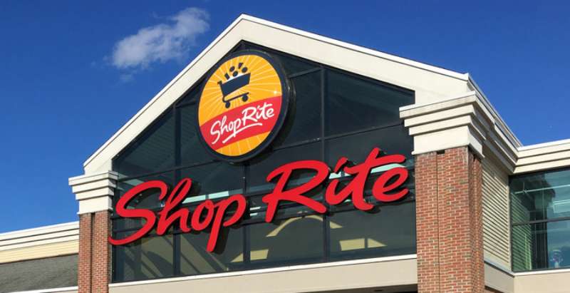
The Meaning Behind the ShopRite Logo
![]()

Okay, let’s dive deep, shall we?
The Core of Simplicity
So, the ShopRite logo? At first glance, you might be like, “Cool, it’s just a logo,” but there’s always more than what meets the eye. Think about it. Logos are like tattoos for businesses.
They tell a story, communicate a vision, and radiate vibes about what the brand stands for. And ShopRite? They’ve mastered the art of storytelling with simplicity.
Symbolism Matters
Ever noticed the emphasis on the word ‘Shop’? It’s not just random. It’s deliberate. It places emphasis on the act of shopping – the experience, the journey. It’s a subtle nod to the central activity they want to be known for.
Wholesome Vibes
The design is wholesome, relatable, and friendly. They’re not trying to be the fanciest store on the block. No, they’re your neighborhood go-to, where you can expect to find what you need, when you need it.
The History of the ShopRite Logo

Humble Beginnings
So, back in the day – and I mean way back – ShopRite started off small. Like, really small. Their logo? Just as modest. It’s evolved over time, adapting to the eras, reflecting design trends and cultural shifts.
The Evolutionary Dance
Through the years, they’ve tweaked and tinkered, trying on new looks, but always staying true to their essence. It’s like watching a friend go through different hairstyles but always being, well, them.
The Colors of the ShopRite Logo


Red, Not Just A Color
Red. Bold, right? It’s not just any red, though. It’s that warm, inviting kind that reminds you of cozy evenings and joyous celebrations. There’s a sense of urgency, a subtle hint that beckons you to come on in and shop.
Balancing Act
Then there’s the white, balancing out the red, giving the logo some breathing space. It’s clean, pure, and has this vibe of clarity.
The Font Used in the ShopRite Logo

Standing Tall and Bold
The font? Oof! It’s bold but not shouty. It’s confident, letting you know that they mean business, but in a cool, calm, and collected way.
The Curve Appeal
And those slight curves in the letters? Gives it a touch of approachability, making it seem friendly. It’s like a warm handshake – firm, yet pleasant.
Iconic Presence
A Logo that Stands Out
In the world of retail, where logos are dime a dozen, ShopRite’s has managed to make its mark. It’s iconic in its own right. It’s not trying to be someone else; it’s proudly its own.
The Emotional Connect
You know, a logo’s real power is when it transcends beyond visuals and taps into emotions.
When people look at the ShopRite logo, they feel something, whether it’s nostalgia, trust, or even just the excitement of a shopping spree waiting to happen.
The Cultural Impact
Beyond the Stores

The ShopRite logo hasn’t just remained confined to their storefronts. It’s seeped into the culture. From being featured in movies, TV shows, and even on merchandise, it’s everywhere!
A Symbol of Trust
For many, the ShopRite logo has become synonymous with reliability. It’s not just a brand; it’s a part of their lives.
It’s where they’ve shopped with their parents, where they’ve picked up their first groceries as adults, and where they continue to find products that resonate with their lifestyles.
FAQ On The ShopRite Logo
Who designed the ShopRite logo?
The ShopRite logo, an anchor in its branding strategy, was crafted by professionals whose identities often remain behind the scenes.
Typically, these emblems are the handiwork of experienced graphic designers or design agencies specializing in corporate imaging and marketing.
What does the ShopRite logo symbolize?
This emblem stands as a testament to ShopRite’s commitment to community and value. The symbol’s colors and design echo the company’s mission to offer convenience and quality to shoppers, embedding itself as a trustworthy figure in the grocery sector.
Has the ShopRite logo changed over time?
Absolutely. Like many entities in the realm of retail graphic design, evolution is key. The logo has undergone redesigns aligning with modern aesthetics and consumer expectations, each iteration strengthening brand recognition in the competitive branding game.
Why is the ShopRite logo effective?
Its effectiveness lies in simplicity and recognition. The supermarket emblem is straightforward yet distinctive, cutting through the visual noise to latch onto consumer consciousness. It’s the fruit of a well-thought-out visual marketing strategy.
What colors are used in the ShopRite logo?
Predominantly red and green, a color palette symbolizing freshness and vitality. These shades resonate with grocery shoppers, evoking thoughts of ripe produce and quality food retailers, all part of ShopRite’s branding.
How often does ShopRite update its logo?
Not on a strict schedule. Updates happen as per market trends and internal decisions. Maintaining brand relevancy within the supermarket industry trends while honoring the retailer’s longstanding identity is key in such decisions.
How can I use the ShopRite logo in my advertising?
Usage is regulated. It often requires explicit permission as logos are legal trademarks. This ensures the supermarket emblem remains untarnished by misuse and supports the solidarity of ShopRite’s brand identity system.
What are the guidelines for printing the ShopRite logo?
ShopRite provides specific brand guidelines that detail sizing, spacing, colors, and more, ensuring the logo’s integrity across various mediums. Following them is crucial for consistency in its visual identity systems.
How does the ShopRite logo compare to other supermarket logos?
While each supermarket emblem has its persona, ShopRite’s is notably direct and amiable, traits essential for establishing a rapport with customers in the grocery shopping landscape.
What should I consider when designing a logo like ShopRite’s?
Think clarity, memorability, and relevance. A successful logo design, like ShopRite’s, not just announces presence, it connects with consumers, signaling the brand’s ethos and what it stands for in a glance.
Conclusion
In this exploration, an emblem—more specifically, the ShopRite Logo—has been unfurled like a banner, revealing the intricate dance between consumer perception and design prowess. A visual touchstone, it anchors the supermarket’s identity, robust and resilient through the shifting sands of retail trends.
We’ve journeyed past mere color schemes and typefaces. Discovering the vital cogs of a branding machine that meshes:
- strategic placement
- legal trademarks
- psychological underpinnings
The logo stands not just as a symbol but as a fortress, safeguarding brand values and cultivating a landscape of trust and recognition amongst an ever-growing forest of competitors.
The takeaway? At the crossroads of design and strategy lies the very soul of corporate identity, a lighthouse guiding consumers back to familiar shores. A logo’s longevity, influenced by smart design and strategic marketing decisions, ensures that even the simplest shopping trip can become etched with the insignia of comfort and reliability.
If you liked this article about the ShopRite logo, you should check out this article about the Speedway logo.
There are also similar articles discussing the Sprouts Farmers Market logo, the Target logo, the Tesco logo, and the Trader Joe’s logo.
And let’s not forget about articles on the Vons logo, the Walmart logo, the Wegmans logo, and the Whole Foods Market logo.