

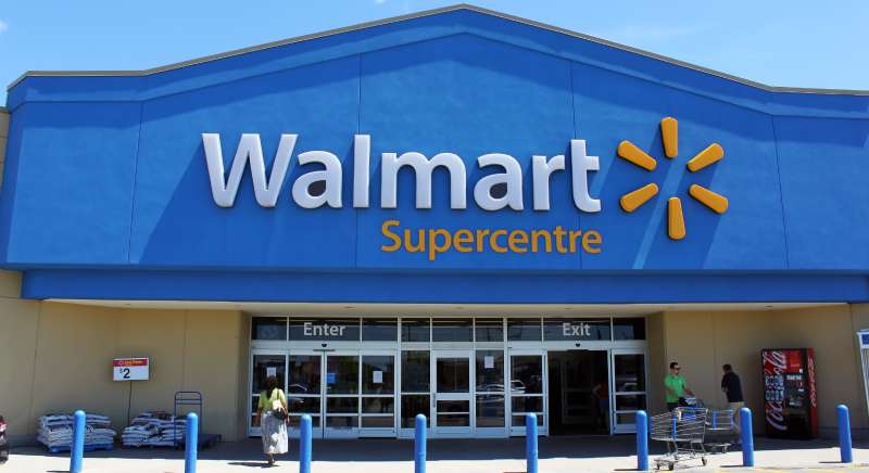
Imagine clinging to a shopping cart, propelled through a bustling store; hues of blue and white dance before your eyes—unmistakably, the Walmart logo. It heralds a world where variety sprawls and bargains beckon, a beacon of everyday value for millions.
This logo, more than a simple emblem, captures the essence of a retail titan’s identity and an enduring symbol of consumer culture.
Embarking on a journey through this icon’s fabric, we uncover the threads of visual branding and corporate identity that weave a tale of transformation.
It’s not merely about why that six-pointed spark resonates with shoppers or how it fits into the canvas of graphic design. It’s about the logo’s story, its evolution, and the profound impact on customer perception.
By the article’s close, grasp the significance behind every curve and color of the Walmart symbol. Chart the course from a retailer’s birth in Bentonville, Arkansas, to the frontiers of global commerce.
Here, unlock the subtleties of marketing collateral and brand loyalty, elements quintessential to the legacy of Sam Walton.
Prepare, for we delve deep into a saga where logos are anything but static insignias; they are dynamos of brand recognition.
The Meaning Behind the Walmart Logo
![]()

Ah, logos. They’re like silent ambassadors, right? They have this sneaky way of speaking volumes about a brand without uttering a single word. And Walmart’s logo? It’s got its secrets too.
Symbolism in Simplicity
Walmart’s current logo is a sunburst or flower-like symbol. Now, it’s not just a pretty doodle. It’s meant to represent the light of inspiration and the bloom of potential.
Walmart wants to come across as a bright spot in your day, a place that brings communities together. It’s all about positivity and making lives better.
The Circle of Trust
Notice the rounded design? Circles, my friends, signify unity, wholeness, and infinity. Walmart’s using that symbolism to hint at their commitment to their customers – infinite dedication, boundless service, and community unity.
The History of the Walmart Logo
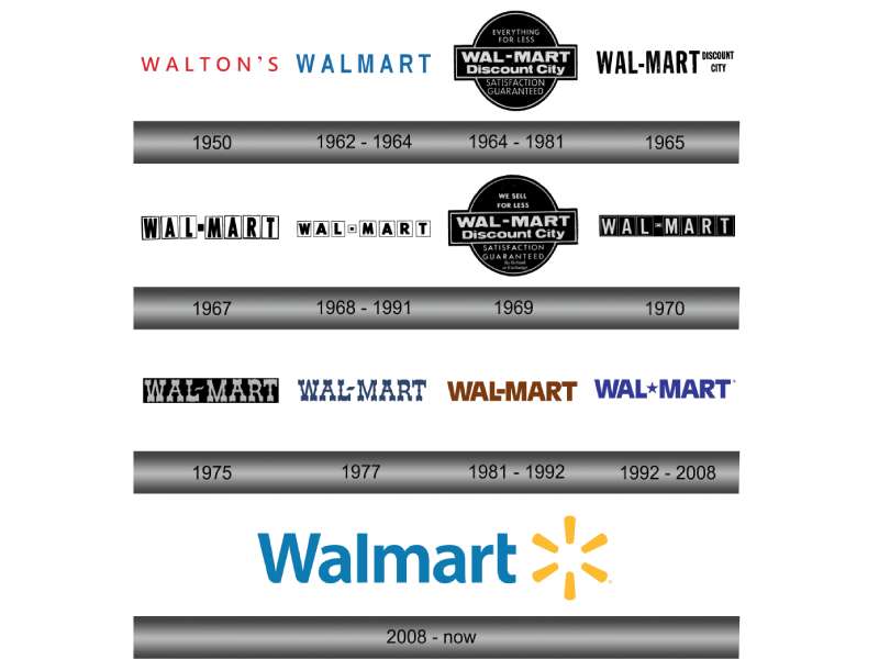

Logos evolve, and Walmart’s logo has had its fair share of makeovers too.
The Early Days
So, back in the day (1962, to be precise), Walmart began its journey with a simple logo: “Wal-Mart” written in a basic, black font. No frills, just straight to the point.
The Evolution
As time danced on, the logo transformed. It saw hyphens, caps, and stars. And, by the early 1990s, we saw a more familiar sight: the capital “WAL-MART” with a star in the middle.
That star, by the way? It wasn’t just a stylish accessory. It signified excellence, quality, and trust.
Modern Refresh
Fast forward to 2008. Walmart introduced the logo we all recognize today: the word “Walmart” followed by the sunburst symbol. Sleek, modern, but still deeply rooted in its values.
The Colors of the Walmart Logo
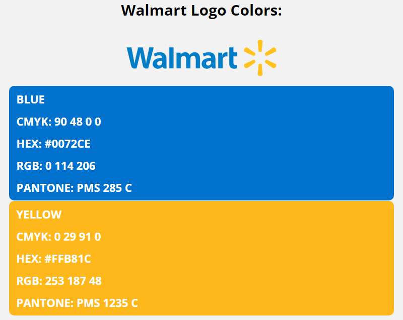

Colors aren’t just colors, especially in logos. They evoke emotions, set moods, and tell stories.
Blue: The Powerhouse
That dominant blue? It’s not just any blue. It’s a symbol of trustworthiness, reliability, and strength. When you see it, Walmart wants you to feel a sense of calm, knowing you’re in good hands.
Yellow: The Cheerleader
Then, there’s the yellow sunburst. Yellow brings warmth, happiness, and optimism. It’s the burst of sunshine on a cloudy day, promising better things.
The Font Used in the Walmart Logo
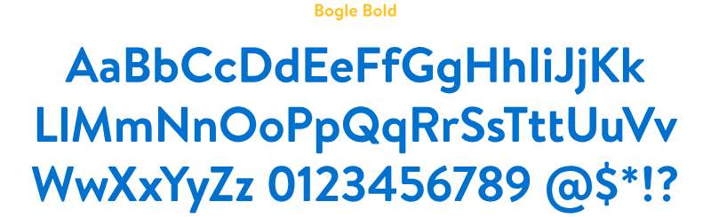

Fonts, my friend, can be the unsung heroes of logo design.
Modern & Approachable
Walmart’s font is sleek and contemporary, but it also has this approachable vibe. It’s like the friendly neighbor you can always rely on – not too formal, but always dependable.
Emotional Impact of the Walmart Logo
A Sense of Belonging
Logos aren’t just about looking cool. They stir feelings. With Walmart’s logo, there’s this essence of inclusivity. It’s like an unspoken invitation, beckoning you to be a part of something bigger.
A Global Identity


For a brand as massive as Walmart, consistency is key. Their logo creates a cohesive identity, ensuring that no matter where you are in the world, that sunburst feels familiar.
The Walmart Logo in Popular Culture
A Cultural Icon
From movies to memes, the Walmart logo has found its place. It’s more than just a brand symbol – it’s a cultural reference, a marker of an era.
The Merchandise Magic
Ever seen those caps, shirts, and mugs with the Walmart logo? Yeah, it’s not just about branding. It’s about belonging. Wearing the logo becomes a badge of pride, a nod to being part of the Walmart family.
FAQ On The Walmart Logo
What does the Walmart logo represent?
The Walmart logo, that iconic spark, represents a beacon for cost-saving and quality shopping experiences.
Symbolic of Sam Walton’s vision, it embodies the company’s ethos: to provide goods at prices that foster customer trust, underpin a strategy of affordability, and endorse a lifestyle—as the slogan goes—of “Save Money. Live Better.”
Why did Walmart choose a spark for its logo?
The spark in the Walmart logo is not just a random design choice—it signifies inspiration and innovation, much like the store aims to bring new value to their customers’ lives.
It’s a visual summation of the lightbulb moment that sparked Sam Walton’s original idea, illuminating savings and possibilities for millions.
When did Walmart introduce its current logo?
Walmart unveiled its current logo with the familiar blue spark in 2008. This marked a significant move toward rebranding campaigns, a transition from its older star symbol.
They aimed to refresh their visual identity system, enhancing the brand’s consumer perception and marketing collateral—ushering in a contemporary Walmart era.
Has the Walmart logo always been blue and white?
Actually, no. The Walmart logo initially sported a frontal design with a brown color scheme. Transitioning over the years, the company embraced a bolder blue and white palette—a strategic nod to trust and cleanliness.
The branding strategy and color scheme play a profound role in visual branding.
What changes has the Walmart logo undergone?
Through the years, the Walmart logo has evolved from a frontier-style design to a cleaner, more modern corporate identity. Changes have included typeface updates, color palette shifts, and the introduction of the iconic blue spark.
Each iteration mirrored the company’s growth and their brand recognition strategies.
Where can you see the Walmart logo?
The Walmart logo graces storefronts globally, from bustling city centers to quaint town squares. Beyond physical stores, it shines on various digital platforms, including the Walmart App and online ecommerce spaces.
Its ubiquitous presence extends from marketing collateral to product branding, like on Great Value items.
How has the Walmart logo impacted the company’s branding?
Since Walmart’s founding in Bentonville, Arkansas, the logo has become a vital part of the corporation’s branding strategy.
Its evolution reflects Walmart’s ambition to remain relevant, relatable, and recognizable—a true embodiment of an iconic logo that has withstood the test of time.
Who designed the Walmart logo?
The Walmart logo was the brainchild of creatives at Lippincott Mercer. It was the result of focused initiatives to enhance the company’s branding strategy.
The agencies collaborated closely with Walmart to produce a logo redesign that would further their visual and corporate identity.
How often has Walmart’s logo changed?
In its over 50-year history, the Walmart logo has changed a few times. Each change aligned with the company’s ongoing rebranding campaigns and reflected shifts in consumer perception and market trends.
The logo has remained a focal point in establishing a stable visual branding presence.
What is the significance of the Walmart logo’s color scheme?
The color scheme of the Walmart logo was chosen carefully. Blue evokes a sense of trust, reliability, and professionalism, virtues that Walmart aspires to.
The use of white adds contrast, creating a clean, approachable look. Together, they encapsulate a brand image that resonates with millions of customers.
Conclusion
From the spark that ignited Bentonville, Arkansas, to the beacon shining on countless Supercenters worldwide, the Walmart logo encapsulates more than just a retailer’s badge—it’s a symbol etched into the core of consumer consciousness. This emblem, drenched in shades of trustworthy blue and pristine white, stands at the intersection where brand loyalty and consumer perception meld into an unmistakable visual language.
In circling back to the start, where a single logo held the gaze of a curious shopper, we close the loop on a narrative steered by design and intent. For here is an indelible mark in the annals of visual branding—an insignia not simply seen but experienced. It is the visual shorthand for a promise of value, a reminder of the legacy birthed from one man’s dream, a tale spun from the fabric of Walmart Inc. itself.
And so, the story of the Walmart logo unfolds—a narrative as rich and layered as the company it represents, a testament to the enduring power of iconic logos in crafting a narrative that resonates far beyond the checkout lanes.
If you liked this article about the Walmart logo, you should check out this article about the ShopRite logo.
There are also similar articles discussing the Speedway logo, the Sprouts Farmers Market logo, the Target logo, and the Tesco logo.
And let’s not forget about articles on the Trader Joe’s logo, the Vons logo, the Wegmans logo, and the Whole Foods Market logo.