

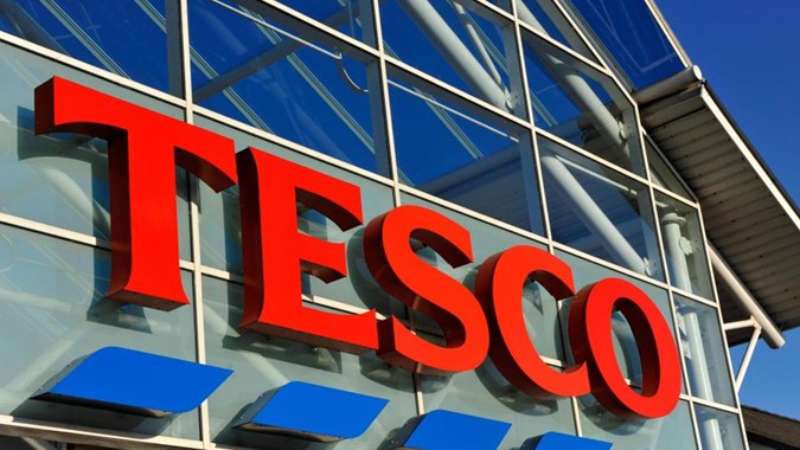
Imagine unboxing a product; the very first sight often lays a realm of unspoken words. Similarly, when strolling down the supermarket aisles, there’s a distinctive emblem that commands recognition—the Tesco Logo.
Embedded in its hues and curves, lies not just an identity but an evolutionary tale of retail magnificence.
As a professional at the helm of the design frontier, I’ve witnessed the transformative power of logos. The Tesco emblem, a beacon in the supermarket space, unfolds a story of branding brilliance and visual strategy.
The intricacies of its design mirror the ethos of a corporate colossus, inviting consumers into a world woven with trust and familiarity.
Within the folds of this article, decipher Tesco’s brand identity, explore the heritage of its symbol, and grasp the gravity of corporate logo evolution.
Unveil the meticulous craftsmanship behind these designs and fathom how a logo solidifies consumer perception and brand equity.
By the closure, anticipate a richer understanding of visual identities, as potent as the impression left by a well-crafted logo—lasting and distinct.
The Meaning Behind the Tesco Logo
![]()

When you think of a brand, you often think of its logo, right? And let’s be real, a logo isn’t just some random doodle. There’s a whole world of meaning behind it!
Symbols and Icons
The Tesco Logo, for starters, isn’t just about the name. It’s about creating a mark, an identity. Like, you know when you see a certain swoosh and immediately think of sneakers? That’s the power of logos.
Tesco’s name combined with its specific styling speaks volumes. It’s about trust, quality, and consistency.
Emotional Connection
Brands ain’t just about selling stuff. They’re about making you feel something. And Tesco, with its logo, makes many of us feel at home.
It’s familiar. It’s friendly. It’s like that one neighbour who always says “good morning!” with a smile. Makes you kinda warm and fuzzy inside, doesn’t it?
The History of the Tesco Logo
![]()

Ah, history! Dive into the past and watch how the Tesco logo has evolved. It’s like binge-watching a series, but for logos!
The Beginnings
So, back in the day – way before smartphones and memes – Tesco started out. The initial logos were, well, quite different from what we see now. Simpler times, simpler designs. But the foundation was laid.
Logo Evolution
Through the years, Tesco’s logo got a few makeovers. Like changing outfits, but cooler. Each change mirrored the times, the trends, and the brand’s growth. It’s been a journey, like going from flared jeans to skinny jeans to whatever comes next!
The Colors of the Tesco Logo
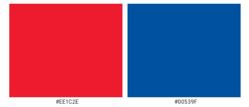

Colors ain’t just colors. They tell a story, set a mood, and yeah, they can make you hungry or relaxed.
Red and Blue
The Tesco Logo sports these two vibrant colors. Red? It screams attention, passion, and energy. Blue? Trust, reliability, and cool calmness. Together? They create a balanced harmony, like jam on toast.
The Font Used in the Tesco Logo
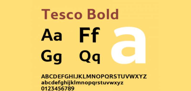

Typeface. Fonts. The way letters look. It’s kinda a big deal.
Styling and Impact
The Tesco logo uses a font that’s straightforward and bold. It’s there, right in your face, saying “Hey, I’m here. Trust me.” No fancy twirls or loops. Just clean, direct, and dependable, like a solid handshake.
Cultural Influence of the Tesco Logo
In our day-to-day, logos become landmarks, identifiers. And Tesco’s, it’s pretty iconic!
Recognition and Association
From TV ads to tote bags, the Tesco Logo has become part of the backdrop. It’s like that famous landmark in your town. You just know it.
Influence on Pop Culture
Ever noticed how some brands sneak into movies, songs, or memes? That’s the Tesco Logo for you. It’s had its share of limelight and cameos. Because, hey, pop culture loves what people love!
The Versatility of the Tesco Logo
A great logo fits everywhere, like your favorite jeans. And Tesco’s? It’s versatile as heck!
On Various Products
From your daily groceries to tech gadgets, the Tesco Logo fits seamlessly. It doesn’t look out of place, whether it’s on a carton of milk or a new headphone set.
Across Platforms

In today’s digital age, logos gotta rock both online and offline. And guess what? The Tesco Logo does just that. Whether it’s a billboard, a website banner, or a tweet – it stands tall and proud. Like a boss!
FAQ On The Tesco Logo
What’s the story behind the Tesco Logo?
The Tesco symbol embodies not just a corporate giant but a procession through history. It mirrors an evolution from simplistic typeface to a modern, emblematic figurehead.
It’s the chronicle of a brand identity sculpted to resonate with consumer loyalty and market shifts.
Has the Tesco Logo changed over time?
Indeed, the Tesco logo is a palimpsest of its former selves, each redesign knitting new threads into retailer trademark lore.
From its typographic beginnings to its contemporary emblem, each alteration reflects visual identity trends and strategic shifts in brand positioning.
What do the Tesco Logo colors represent?
The Tesco palette, a tapestry of red, blue, and white, transcends mere aesthetics. Red evokes warmth and energy, blue broadcasts reliability, and white speaks to purity. Together, they’re a color-coded whisper of brand consistency and a promise of quality.
Who designed the current Tesco Logo?
Shrouded somewhat in corporate secrecy, the designer of the current logo remains inconspicuous.
However, it remains a creation that undoubtedly passed through the discerning hands of adept graphic designers, resulting in a visual communication asset driving market positioning.
What is the significance of the Tesco Logo font?
The font, a bespoke design, fortifies Tesco’s brand identity, ensuring distinction and readability. This branding strategy echoes a signature, turning a wordmark into a symbol of trust.
Does the shape of the Tesco Logo have a meaning?
The emblem’s shape, an encapsulating oval, signifies unity and global continuity. It’s a subtle nod to corporate branding essentials—embracing community and customer inclusiveness.
How does Tesco protect its brand logo?
Through vigilant trademark registration and rigorous legal frameworks, Tesco shields its logo, a bastion of retail industry identity. In this realm, the emblem is sacrosanct, a safeguarded visual identity fiercely defended.
How often does Tesco update its logo?
These renewals aren’t periodic but strategic, induced by shifts in consumer perception or rebranding impetuses. Each update inscribes a new chapter in the Tesco narrative, connecting with consumers through fresh yet familiar visual cues.
Why is the Tesco Logo effective for branding?
Simplicity paired with recognizability renders Tesco’s logo a potent mnemonic device. It encapsulates a visual strategy, harnessing the very essence of the Tesco spirit, resonating with shoppers’ collective memory.
What impact does the Tesco Logo have on consumer perception?
Visual marks, like Tesco’s, wield the power to evoke emotion and consumer loyalty. Acting as a silent ambassador, it reaches beyond the aisles, embedding the promise of quality and brand equity in the consumer’s psyche.
Conclusion
The journey through the visual saga of the Tesco Logo concludes here, yet its impression lingers, echoing in the vast corridors of the retail industry. We’ve unpacked layers, from the bold red that whispers consumer trust to the protective embrace of trademark law that signifies Tesco’s commitment to guarding its emblem with vigilance.
In this chronicle:
- Resilience reflected in design evolutions.
- A font that speaks louder than words.
- Colours resonating with unspoken promises.
And there it stands, not just a logo but a beacon of brand identity, a strategic pawn in the grand game of visual communication. It’s not the mere arrangement of lines and typeface—it’s the embodiment of a promise, a narrative enshrined in red, blue, and white.
Spirited away into the lives of millions, the emblem harks back to Jack Cohen’s brainchild, now a canvas that will continue to evolve, adapt, and invite millions more into Tesco’s perennial promise of quality and value.
If you liked this article about the Tesco logo, you should check out this article about the ShopRite logo.
There are also similar articles discussing the Speedway logo, the Sprouts Farmers Market logo, the Target logo, and the Trader Joe’s logo.
And let’s not forget about articles on the Vons logo, the Walmart logo, the Wegmans logo, and the Whole Foods Market logo.