

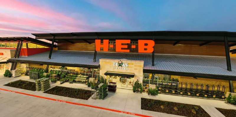
Picture this: A simple, yet captivating symbol that becomes the face of a brand—a graphic not only representing products on shelves but also the pulse of countless households. Within the bounds of Texas, the HEB Logo stands as a beacon of such familiarity.
Strolling down a grocery aisle, it’s the logo that often guides your cart; a silent herald of quality and community trust. It’s a token of brand identity so powerful that it shapes the way we perceive our daily bread, literally and figuratively.
Today, let’s unfurl the story woven into this emblem. From the threads of HEB’s history to the stitches of supermarket industry trends, we’ll decipher how this icon holds sway over hearts and shopping habits alike.
By article’s end, anticipate insights into the craft behind retail graphic design, the subtle dance of colors and shapes that echo a corporation’s heartbeat.
We’ll dissect the layers—visual branding strategies, the emblem’s evolution, and its pivotal role in shaping consumer behavior.
Here’s your exclusive glance behind the curtain of branding—a world where a logo does much more than sit pretty.
The Meaning Behind the HEB Logo

The Essence of Branding
Branding isn’t just slapping on a pretty picture and calling it a day. It’s way more profound.
The HEB Logo is a clear testament to that fact. It encapsulates the brand’s core values, mission, and its promise to its consumers. Every element in the design speaks a language of its own.
A Symbol of Trust
Over the years, the HEB Logo has become synonymous with quality, reliability, and customer satisfaction. It isn’t just about a store; it’s about a community feeling. When you spot that logo, there’s a sense of familiarity, a promise of consistency.
The History of the HEB Logo

From Humble Beginnings
Every iconic logo has its roots, a story of where it began. The HEB Logo started from a simple concept, reflecting the vision of its founders. Over the years, it has evolved, but the essence remains intact.
Milestones and Evolution
Like any dynamic brand, HEB wasn’t static. The logo witnessed tweaks, adjustments, and refinements, marking various milestones in the company’s journey. These changes weren’t just for aesthetics but mirrored the brand’s growth and expansion phases.
The Colors of the HEB Logo


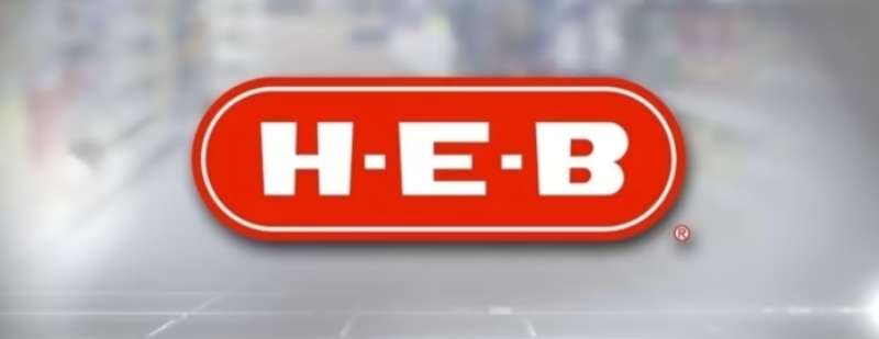
The H-E-B logo predominantly features a striking red badge showcasing the “H-E-B” inscription in a bespoke, extra-bold sans-serif font.
This red hue serves as the brand’s primary color, playing a crucial role in brand recognition and symbolizing what customers associate with H-E-B.
Additionally, black is employed as a secondary color in the brand’s palette. For applications on an H-E-B red backdrop, the logo is consistently presented in white for optimal visibility.
In scenarios where color usage is limited, the logo is rendered in black, ensuring brand consistency across various mediums.
The Font Used in the HEB Logo
Typography Speaks
When you look at the HEB Logo, the font stands out. It’s more than just legible letters. Typography, when done right, communicates much about a brand’s persona.
Why That Particular Font?
Every font has a character, a style. The one in the HEB Logo exudes simplicity, clarity, and modernity. It complements the overall design, ensuring that the logo remains memorable and distinct.
Symbolism in the HEB Logo
More Than Meets the Eye
Often, logos carry subtle symbols or hints that might not be immediately apparent. The HEB Logo, too, has its share of symbolism, further deepening the connection between the brand and its consumers.
Decoding the Subtleties
Whether it’s the alignment, the spacing, or even the positioning of elements, every bit has a story, a rationale. Delving into these nuances can offer fascinating insights into the brand’s thought process.
Impact of the HEB Logo on Branding

Setting a Benchmark
In the realm of retail and beyond, the HEB Logo has set certain standards. Its design principles, adaptability, and recall value serve as a benchmark for others in the industry.
Inspiring Other Brands
Good design inspires, and the HEB Logo has done just that. Its influence can be seen in how emerging brands approach their logo creation, emphasizing storytelling and meaningful design.
FAQ On The HEB Logo
What does the HEB Logo represent?
The HEB Logo encapsulates the essence of a Texan legacy. Its aesthetic is a nod to the brand’s origins, a symbol of consumer trust and retail excellence.
Through simple typography and distinct colors, it conveys both heritage and modernity, fulfilling the chain’s promise of quality and service.
Why has the HEB Logo changed over time?
Over the years, HEB has refashioned its logo to keep pace with the dynamic supermarket industry.
These adjustments reflect brand evolution, staying relevant and visually appealing in an era of constant change while maintaining the core identity that shoppers have grown to love.
What colors are used in the HEB Logo?
HEB employs a down-to-earth palette; the classic red communicates passion and vitality, while white symbolizes purity and simplicity.
Together, these colors forge a visually striking ensemble that bolsters brand recognition against the myriad of grocery retailer logo designs.
How does the HEB Logo influence customer perception?
A logo can subtly speak volumes; the HEB Logo is no different. It’s a visual branding strategy that crafts a narrative, fostering a bond with the consumer.
The emblem instills a sense of familiarity and dependability, qualities that influence customer perception of logos.
What are the elements of the HEB Logo?
The logo’s elements are meticulously orchestrated; its characteristic “H-E-B” lettering in bold, with a single star punctuating the design, symbolizes the Lone Star State.
The icon’s simplicity ensures it’s unmistakable—a keystone of retail graphic design aiming for immediate consumer brand association.
How do other companies in the industry compare to the HEB Logo?
HEB’s logo is distinct within the Texas supermarket chains landscape. It avoids the ornate for clarity—iconic Texas logos resonate through straightforwardness.
While competitor logos vary in complexity, HEB’s brand mark holds its own with iconic, clean typography that is difficult to rival within the retail space.
How often has the HEB Logo been redesigned?
Historically, the HEB logo has undergone several iterations. Each redesign is a testament to the brand’s responsiveness to emerging visual merchandising trends and corporate communications.
However, despite these changes, the logo’s core elements remain, preserving its identity through each transition.
What role does the HEB Logo play in the company’s marketing?
In HEB’s brand marketing, the logo operates as a central figure. It’s present across campaigns, packaging, and store signage, playing a pivotal role in consumer behavior and customer loyalty programs.
It’s the cornerstone of brand identity, reinforcing marketing messages with every appearance.
Can you trademark a logo like the HEB Logo?
Yes, logos are typically trademarked to protect a company’s intellectual property. The HEB Logo is no doubt trademarked, safeguarding it against unauthorized use.
This legal measure ensures the brand image remains exclusive to HEB, signifying the emblem’s—and by extension, the company’s—singular commercial entity.
What makes the HEB Logo effective in brand identification?
The HEB logo’s effectiveness lies in its simplicity, clarity, and connection to Texas roots. It succeeds where overcrowded logos falter—memorability.
An effective company logo importance cannot be overstated; it influences retail success by being easily recognized at a glance, an anchor in the minds of shoppers.
Conclusion
As the journey through the bold red and crisp white of the HEB Logo reaches its conclusion, a canvas of brand identity is laid bare. It stands as a testament to the enduring nature of visual branding strategies in the supermarket industry. The artistry behind this iconic symbol is no mere happenstance; it’s a deliberate crafting of retail graphic design, the star amidst the typography, a beacon of Texas grocery chains.
With every iteration, every subtle tweak and polish, the HEB emblem has upheld its promise of quality, etching into the minds of thousands a consumer brand association that transcends mere product placement on shelves. It magnifies the consumer trust and retail excellence HEB is known for, sustaining a visual dialogue with shoppers that is both familiar and inviting.
Allow the simplicity of its design to linger, a reminder of how a logo, much like a signature, can hold the weight of an intellectual property‘s heritage, its stance in a competitive marketplace, and its unspoken pledge to its community.
If you liked this article about the HEB logo, you should check out this article about the ShopRite Logo.
There are also similar articles discussing the Speedway Logo, the Sprouts Farmers Market Logo, the Kroger logo, and the Lidl logo.
And let’s not forget about articles on the Meijer logo, the Metro logo, the Morrisons logo, and the Publix logo.