

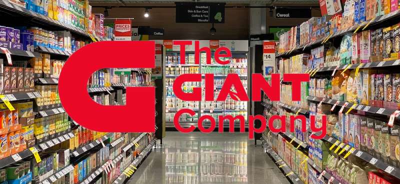
Imagine standing in the fluorescent-lit aisles of your local grocery—shelves brimming with a Technicolor array of products, each vying for your attention. Yet, amidst this visual cacophony, a singular symbol catches your eye: the Giant Company logo. Beyond its simple allure lies a tapestry of design, a subtle dance of shapes and colors playing pivotal roles in conveying a brand’s essence.
In this article, we delve into the realm where aesthetics meet commerce. We wade through the intricacies of supermarket emblem design, scrutinize the visual identity that converts mere foot traffic into loyal customers, and decode how a logo can crystallize corporate branding into a familiar friend on the edge of a shopping cart.
By the end of this piece, you’ll emerge not just with a deeper appreciation of the Giant Company’s visual marketing strategy but also with a keener eye for the nuances that make a logo more than a mere trademark—a beacon for a retail trademark that guides consumers through the countless choices on the grocery landscape.
Our exploration will weave through:
- The evolution of the Giant Company logo and its impact on brand identity.
- The symbiotic relationship between a company crest and customer recognition.
- How the emblem reflects the fresh produce and private label brands under the Giant umbrella.
- Ways in which design influences customer interaction in a supermarket chain and in the digital storefront.
Whether you’re in the business of creating memorable logos or you’re a marketer aiming to imbue your branding strategy with authenticity, you’ll find these insights as indispensable as the checklist you carry on your every grocery run.
The Meaning Behind the Giant Logo
![]()

Dude, logos? They’re like a mirror reflecting a brand’s soul, ya know? And when we talk about the Giant Logo, it’s no different.
The Heart of the Matter
So, logos? They aren’t just random designs. They carry weight, emotion, and a whole lot of storytelling. The Giant Logo? It’s massive. Not just in size but in essence.
It speaks of dominance, influence, and presence. Imagine a Goliath in the room. You can’t miss it, right? That’s what this logo is. It’s there to make a statement and be noticed.
Depth and Layers
Peel back the layers, and you’ll find more than just a giant figure or word. You’ll see ambition, a drive to be the top dog. This logo isn’t just about being big; it’s about dreaming big.
The History of the Giant Logo
Ah, the tales logos could tell if they could speak. They’ve seen eras come and go. Let’s dive into this journey, shall we?
Humble Beginnings
Every behemoth has its origin, a starting point. Our Giant Logo? It didn’t just appear out of nowhere. Like a seed transforming into a colossal tree, it had its moments of evolution, tweaks, and transformations.
Evolution and Change
You know, with time, every brand kinda needs a facelift, some refreshing. The Giant Logo too went through its phases. From initial sketches to a more refined look, the essence remained, but the look? Oh, it evolved.
The Colors of the Giant Logo


Colors, man! They’re more than just, well, colors. They got feelings, vibes, and a whole aura about them.
The Power of Hue
The Giant Logo doesn’t just pick colors from the rainbow. Nah, it’s strategic. Think power, think prominence. These shades are handpicked to scream authority.
Emotion and Color Psychology
Colors evoke feelings, right? The ones in the Giant Logo? They’re chosen to make you feel a certain way. To command respect, evoke trust, or maybe even awe.
The Font Used in the Giant Logo
Ever thought about fonts having personalities? Well, they do!
Bold and Beautiful
The font in the Giant Logo? It’s bold. It’s there, standing tall, demanding your attention. It’s like the life of the party, making sure you don’t miss it.
Delicate Touches
Yet, amidst all the boldness, there’s subtlety. Small intricacies that make it unique, different from the rest. Fonts tell a story, and this one? It’s got layers.
Symbols and Metaphors
Alright, besides the obvious, logos have these hidden treasures. Symbols, metaphors, they’re like Easter eggs for the keen observer.
Imagery That Speaks
The Giant Logo may have images or symbols that are more than meets the eye. They represent values, missions, or even history, telling the brand’s story in silent whispers.
Secrets and Stories
Hidden within might be tales of origin, stories of the founders, or maybe even folklore. Logos can be cryptic like that, waiting for someone to decipher.
Global Impact and Recognition

A logo ain’t just for show. It leaves imprints, marks on the world, in people’s minds.
Brand Recognition
The Giant Logo, due to its size and design, has become iconic. Like, everywhere you go, people recognize it, and associate feelings and experiences with it. It’s a staple, mate.
The Ripple Effect
Once it’s out there, the Giant Logo influences designs, trends, and even pop culture. It’s not just about a company or a brand. It’s a phenomenon. A giant one.
FAQ On The Giant Logo
Who designed the Giant Company logo?
The brains behind the Giant Company logo remain somewhat enshrined in corporate mystery. Typically, with such design endeavors, a team of in-house creatives or an external branding agency is commissioned. Their mantra: meld simplicity with memorability, reflecting the store’s values in a swipe of graphic genius.
What does the Giant Company logo represent?
This logo is a powerful symbol, evoking trust and familiarity. Like a beacon, it stands for the Giant Company’s commitment to fresh produce, customer satisfaction, and community connection. It’s an emblem as much of quality as it is of the comfort of home.
Has the Giant Company logo changed over the years?
Indeed, it has. Like a living entity, it’s evolved. Initially, a straightforward design, over the decades, the twist and turns of commerce have shaped its curves and colors. This evolution reflects adaptability and the brand identity’s alignment with contemporary aesthetics and corporate shifts.
What are the colors in the Giant Company logo, and what do they mean?
Predominantly, it’s a play of red and white. Red pulses with vibrance, grabbing attention, suggesting vitality—like the fresh crimson of an apple. White, meanwhile, whispers cleanliness and order. It’s a visual marketing choice, a dance of hues carefully choreographed.
Is there a connection between the Giant Company logo and its parent company’s branding?
A nod here, a design cue there, the Giant Company logo surely tips its hat to the parent Ahold Delhaize. Yet, it claims its unique spot under the sun—individuality amidst an umbrella corporation, maintaining a connection without losing the sense of self.
How often does Giant use its logo in marketing materials?
Constantly. The logo is the talisman, ever-present across marketing collateral—from brochures to digital storefronts, from circular ads to online banners. It’s integral to the Giant’s branding strategy, a repeating motif designed to print the emblem in minds and hearts.
What elements are included in the current version of the Giant Company logo?
Step closer; observe the elegant font that spells ‘Giant,’ the flourish that adorns it. It’s simplicity woven with sophistication—a name and a gesture, underscored by a sense of bountiful retail tradition and supermarket signage. It’s corporate image refined to its essence.
In what ways does the Giant Company logo enhance customer experience?
Subtly, yet profoundly. Its familiarity breeds a comfortable shopping environment. As customers wander aisles, this icon of brand image serves as a silent guide—a reassurance that the produce and products beneath its watch are of reputable Grocery retail quality.
Can the Giant Company logo be found on their private label products?
Affirmative. This logo graces every package, stamped with the pride of a supermarket chain that stands behind its goods. Like a visual identity seal, it is a declaration of quality, extending the Giant’s promise from the shelf to your table.
What role does the Giant Company logo play in its online presence?
Immensely crucial. In the vast digital arena, this symbol serves as a lighthouse guiding customers to the Giant’s digital domain. From social media marketing to e-commerce platforms like Peapod by Giant, the logo is the digital handshake—familiarity in pixels, trust in a click.
Conclusion
The journey through the vibrant saga of the Giant Company logo reaches its crest here. Much like a well-curated gallery, we’ve perused through an array of hues and forms—each stroke on this corporate canvas weaving a richer narrative, a tale told in the language of visual cues and color psychology.
- The emblem stands dignified, a symbol of a supermarket stronghold.
- Its colors, a quietly loud proclamation of freshness and purity.
- The design acts as a silent salesperson, a fluent speaker of brand identity.
As the digital doors close behind us on this exploration, let us carry forward the understanding that logos are more than mere symbols. They are the heartbeats of companies, the visual whispers of brands. And the Giant Company logo, with its storied past and bold presence, serves as a masterclass in silent communication—etching its essence in the minds of every shopper, one glance at a time.
If you liked this article about the Giant logo, you should check out this article about the 7-Eleven logo.
There are also similar articles discussing the Albertsons logo, the Aldi logo, the Carrefour logo, and the Circle K logo.
And let’s not forget about articles on the Costco logo, the QuikTrip logo, the Safeway logo, and the Sainsbury’s logo.