


Ever notice how the slant of a letter can hurl you headfirst into a world of mutants and mayhem? That’s the power of the X-Men font—a typographic sidekick to the iconic team of Marvel superheroes.
It’s not just an aesthetic choice; it’s a signal to your brain, a visual cue that screams adventure.
In this read, we’re slicing into the heart of graphic design—not with adamantium claws but with the precision of a designer’s keen eye.
We’ll decode the mutant typography that has branded the saga as definitively as the characters themselves.
You’ll emerge with the savvy to leverage superhero lettering in your own daring compositions.
Hold tight—by journey’s end, you’ll have mastered the art of crafting text with the X-Men type design‘s might.
A look at Marvel fonts, typography in branding, and the secrets behind custom typeface creation await. Buckle up; it’s going to be a wild ride through the dynamic realms of visual branding and font licensing.
About The X-Men Movies & The Title Font
Large-scale media property known as “X-Men” was developed from the same-named Marvel comics. In 1963, the first series’ publication cycle started. Stan Lee, a writer, and Jack Kirby, an illustrator, developed it. They imagined a future with regular humans and strong mutants.
In this dimension, the X-Men were a team of superheroes that fought for social harmony among all citizens. The story of the militia team expanded into six volumes after a successful start. A similar plot can be found in animated television shows, films, video games, and manga. The franchise they all represent is the same.
X-Men: The Last Stand (2006)
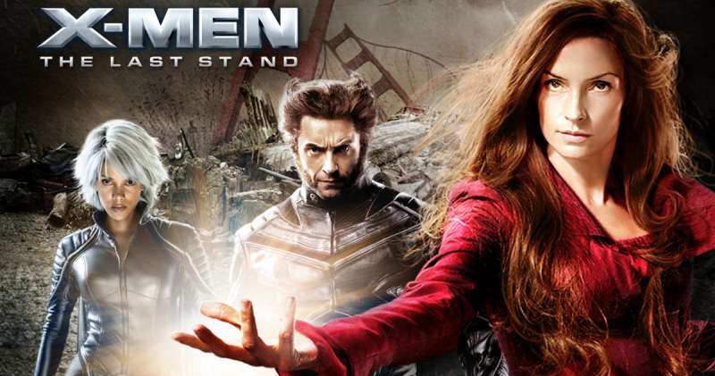

Compugraphic Max Bold is the original typeface. Castcraft Software’s OPTIMirc-Bold digital rendition.
X-Men Origins: Wolverine (2009)
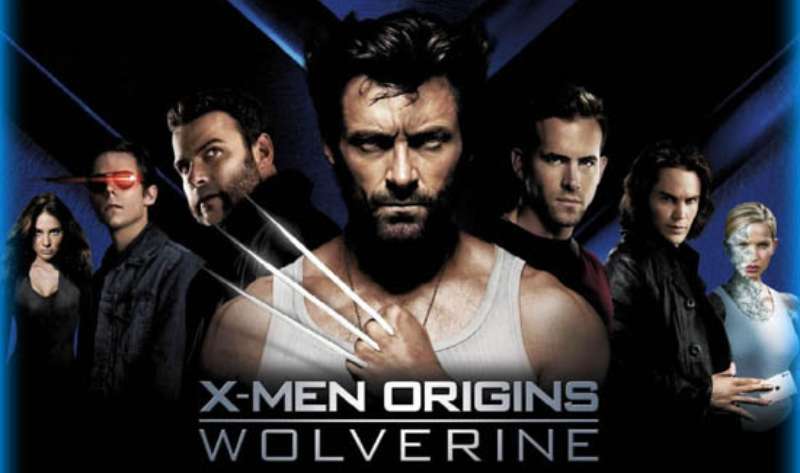

The film, which centers on Wolverine’s early years, is a prequel to the X-Men film series. The poster’s choice of typeface for the movie’s title is strikingly similar to Bank Gothic Bold. Morris Fuller Benton created the sans serif typeface Bank Gothic in 1930 for the American Type Foundry.
The Wolverine (2013)
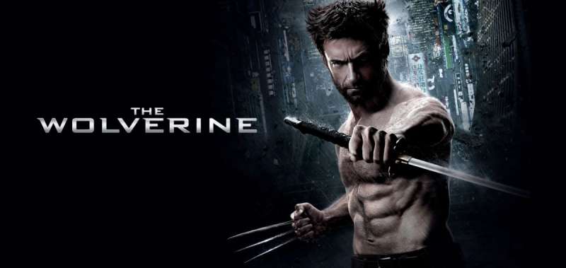

Bank Gothic Bold, a font created by Morris Fuller Benton and distributed by GroupType, is extremely similar to the font used for the movie title in the poster. With six different styles, the Bank Gothic font family has a stunning, elegant look.
X-Men: Days of Future Past (2014)
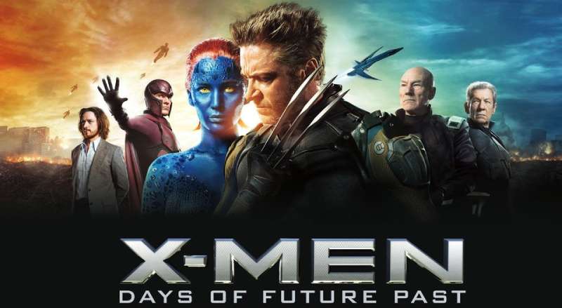

It uses the Bank Gothic font.
X-Men: Apocalypse (2016)
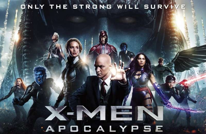

It is a follow-up to 2014’s X-Men: Days of Future Past and the ninth entry in the X-Men movie franchise. The movie’s title is written in the Bank Gothic typeface on the poster. The “X-MAN” portion may differ slightly from Bank Gothic, but it was likely based on it. The middle arm of the “E” was lengthened, and very tiny serifs were added to the letter terminals.
By Bitstream, the Bank Gothic Font Family was released. There are two styles and family package options in Bank Gothic. a group of square caps that were born out of the Bauhaus-inspired fascination in geometric shapes.
Logan (2017)
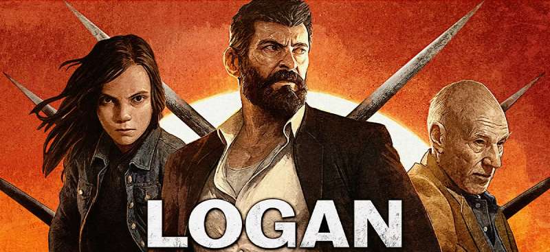

“Maple Bold” is the font used in the Logan movie logo. Erik Olson created this font. made by Font Bureau.
Dark Phoenix (2019)
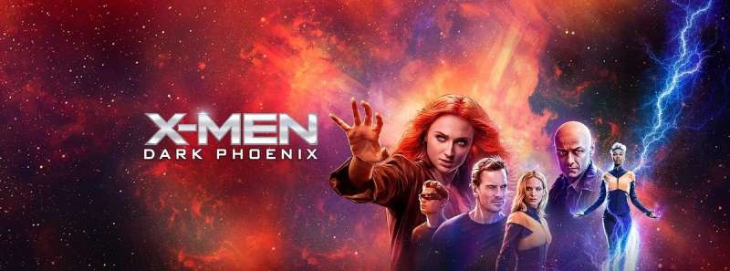

The direct sequel to the 2016 film X-Men: Apocalypse, it is the twelveth entry in the X-Men movie franchise. ITC Caslon 224 Book looks to be the font used for the movie’s title on the poster. Edward Benguiat created the phototype known as ITC Caslon 224, which debuted with ITC in 1982. ITC Caslon 223’s title typeface was expanded upon by the text font.
There are 8 styles and family package options in ITC Caslon No. 224. Caslon conveys a serious, elegant, and linear impression overall. The Caslon font, which is second only to Baskerville in terms of recognition, has undergone countless fresh interpretations, making each Caslon slightly unique.
Alternative Fonts To X-Men Fonts
Wolf’s Bane Bold
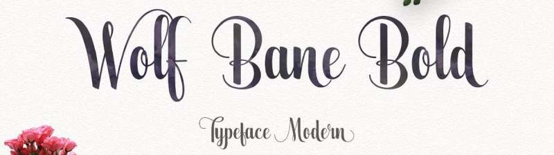

A font called Wolf’s Bane Bold by Iconian Fonts is based on the Wolverine comic book’s title logo. It’s a no-cost font.
A gorgeous and distinctive brush script called Wolfs Bane Bold serves as an example of contemporary calligraphy typefaces and calligraphy writing techniques. can be put to a variety of uses. such as headers, logos, badges, news, posters, wedding invitations, t-shirts, letterhead, signage, and labels.
Marvel Font
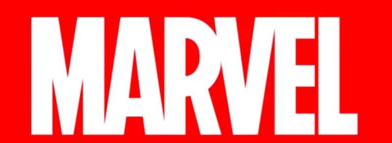

The American comic book company Marvel has a number of internationally renowned comic characters. There are a lot of animated films based on Marvel items that are popular all around the world. Marvel font is a straightforwardly contemporary and upscale sans serif typeface that will give your creative projects a chic appearance.
Benton Sans Compressed Black
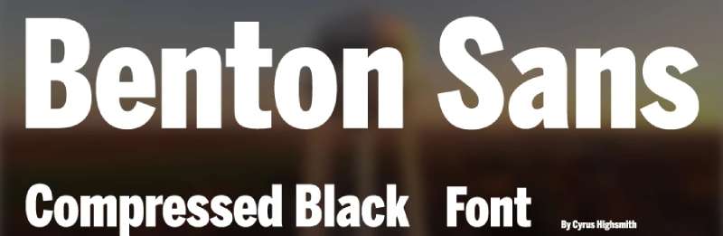

Benton Sans Compressed Black Font, a sans serif typeface created and developed by Cyrus Highsmith. This typeface is referred to as extra compressed. This font is comparable to the Marvel font and is well-known for its bold and italic features. The super font is renowned for being a fresh, modern script with a distinctive touch of sweet calligraphy. It has decorative elements that might be great for an invitation, such as one on a greeting or wedding card. While having a handwritten and unusual design, this typeface yet has a classy appearance.
Neubank NF Bold Font
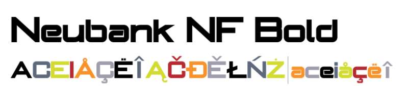

The Bank Gothic family, a twentieth-century classic created by Morris Fuller Benton for ATF, expands upon its solid base and adds a flowing, dynamic lowercase that puts it perfectly at home in the twenty-first century. This font supports both Central European languages (Unicode 1250) and the entire Latin character set (Unicode 1252).
DeLuxe Gothic
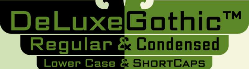

Morris Fuller Benton and Michael Doret created the DeLuxe Gothic Font Family, which was released by Alphabet Soup. There are 8 styles and family package options in DeLuxe Gothic.
HK Grotesk Font
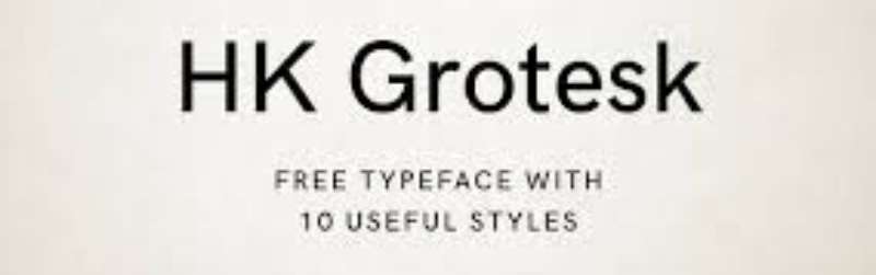

Free Source sans serif typeface HK GroteskTM was created in the style of traditional grotesques. To support a variety of projects, including environmental signage, text faces for books and magazines, interface, websites, and mobile applications, geometry, metrics, punctuation, and OpenType capabilities have been improved.
Stentiga Font


The basic, varied Stentiga font was created by Typodermic Fonts. The typeface has a free licence. Stentiga is a straightforward headline font with geometric shapes. The Stentiga font has 172 distinct glyphs and 198 defined characters.
Muli Font
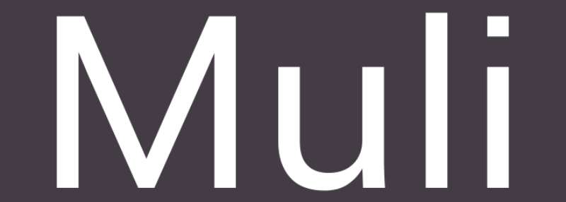

Muli is a simple Sans Serif font. Although Muli is primarily intended for usage as a display typeface, it can also be used for text. Muli has been created so that web browsers on desktop computers, laptops, and mobile devices can use it without restriction across the internet.
Engebrechtre Font


Typodermic Fonts created the simple sans-serif font Engebrechtre. The typeface has a free license. A gonzo-historical early 20th Century emphasized sans invented in 2000 is called Engebrechtre. The Engebrechtre font has 282 distinct glyphs and 289 defined characters.
Barlow Font
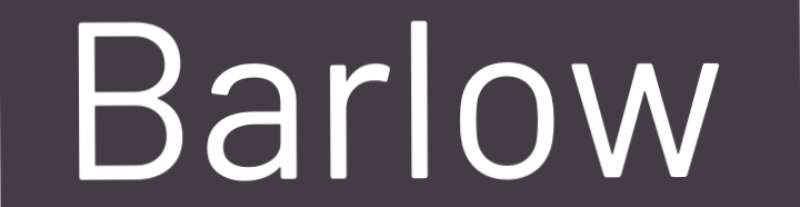

A low-contrast, somewhat rounded grotesk font family is called Barlow. Barlow, who draws inspiration from Californians’ visual aesthetic, shares characteristics with the state’s license plates, road signs, buses, and trains. The Normal family, which includes Semi Condensed, Condensed, and 9 different Roman and Italic weights for each, is a subfamily of the superfamily.
Berlin Font
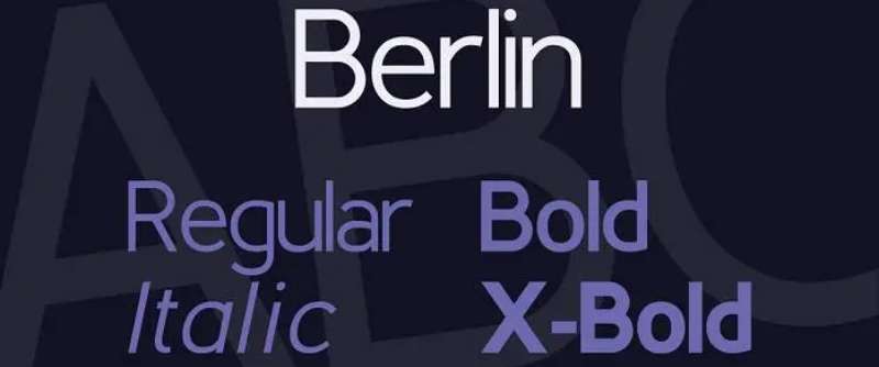

The classic geometric types from the early 20th century served as the inspiration for the display font family called Berlin. It supports (so far) four variations in each of the three weights: standard, bold, and X-bold.
Usage Of X-Men Fonts
This typeface can be used in any context, from standard typing to design development. This font is preferred by designers above others. Several designers use and favor this font for this purpose, not only because it is comfortable for them but also because it has a beautiful appearance. You can use this font in the part below in addition to designing.
- Designing: Wolverine is the most popular character for major designing tasks including business cards, headlines, and brochure layouts.
- Logos: You can use it to create your own logos.
- Websites: This font is used on numerous websites.
- Magazines: The font appears to be positioned over magazines.
FAQ On The X-Men Font
What’s the story behind the X-Men font?
Ah, dive deep into the comics, and you’ll find the X-Men font is as storied as the mutants themselves.
Born in the whirlwind of Marvel Comics ‘ bold era, it’s been reflecting that distinct X-Men vibe—sort of a visual sound effect—making every title a dramatic entrance to the mutant world.
Can I legally use the X-Men font?
Alright, here’s the scoop. Marvel’s got this bad boy locked under font licensing, meaning you need permission to use it commercially. For your personal mutant manifesto, though? You might find free versions or similar comic book typefaces that are above board.
Where can I download the X-Men font?
Hunting for that cinematic text style? A quick web crusade should lead you to design sites with the font. Just keep an eye out for legit sources, yeah? And remember the licensing part—don’t snag something that’ll have Wolverine knocking on your door.
Is the X-Men font suitable for professional design?
For graphic design with a punch? Absolutely. Use it when you want that epic, comic book typeface flair. It’s not for every gig, though—stick to less mutant typography for serious corporate stuff unless you’re branding the next superhero hit.
How can I create a design similar to the X-Men logo?
So you’ve got that creative spark, huh? Start with bold, slanted letters, radiating energy and action. Adobe Creative Suite? Brilliant for experimenting with your own designs. Inject a little of the X-Men logo font’s essence, mix in your originality, and bam! New epic logo.
Are there any free alternatives to the X-Men font?
Funny you should ask, there’s a universe of free fonts inspired by comic sans variant and Marvel fonts out there. Look for those that capture the superhero lettering vibe with a dash of daring. A good start could be browsing sites like DaFont or Google Fonts.
What fonts pair well with the X-Men font?
Pairing fonts, it’s like finding a sidekick for Wolverine. You want something that complements, not clashes. Go for clean sans-serifs or sturdy serifs that don’t steal the spotlight, creating a balance that even Professor X would nod to.
How does the X-Men font contribute to branding?
This font’s all about identity, the kind that wraps an X-Men subtitle font around a brand like a superhero cape. Use it right, and it’s a typographic signature—turning heads, planting your brand in minds with the Phoenix-type rebirth.
What do I need to consider when using the X-Men font in print?
Weight and legibility, my friend. The heavier, more bombastic styles will make those posters jump out. But shrink that down to small print, and you’ll need Cyclops’ visor to read it. Check your balances and ensure that print size keeps it crisp.
How can I customize the X-Men font for my project?
Customizing, eh? You’ve got guts, I like that. Tweak the letter spacing, play with sizes, even warp it a bit for that X-Men type design. Just stay true to the mutant typography‘s soul and you’ll craft something both fresh and familiar, like a new chapter in Marvel Comics history.
Conclusion
And there we have it, folks—the essence of the X-Men font locked down. It’s fascinating, right? How a bunch of lines and curves capture the very spirit of our favorite mutants. It screams Marvel without a single word.
- We touched on the typeface’s origins, its undeniable presence.
- Delved into the murky waters of font licensing, even found a few honest paths for free font crusaders.
- Explored how it anchors itself in graphic design, making every project it touches stand just a bit taller, bolder.
- Suggested font comrades for a tag team and reminded that with great font power comes great branding responsibility.
So wield this font wisely— whether it’s gracing a comic con poster or adding a twist to a logo. Remember, in a world of common sans, the X-Men font is our visual onomatopoeia—snikt, bamf, boom. It turns text into an event. Now, go make those designs uncanny, astonishing, or just plain extraordinary.
If you liked this article about the X-Men font, you should check out this article about the Iron Man font.
There are also similar articles discussing the Guardians of the Galaxy font, the Thor font, the Teenage Mutant Ninja Turtles font, and the Spider-Man font.
And let’s not forget about articles on the Daredevil font, the Doctor Strange font, the Captain Marvel font, and The Avengers font.