


Swinging into the skyline of web design, the iconic Spider-Man font clings to the pulse of pop culture with the same tenacity as our favorite web-slinger to a Manhattan skyscraper. Fonts do more than communicate text; they shout personality.
They spin a visual narrative. And boy, does Spidey’s font weave a story—a tale of thrills, leaps across the skyline, and that signature arachnid charisma.
Envision this: you’re not just reading words; you’re catapulted right into the bustling streets, amidst the sirens and the chaos, where the friendly neighborhood Spider-Man zips by.
That’s the power right at your fingertips. The nuances of superhero typeface, the flair of adventure font aesthetics—they’re your tools and paint and brush.
By article’s end, the mystery behind morphing plain text into spectacular content with the Spider-Man font will unravel faster than our hero slinging his next web.
You’re the designer on the rooftops now: ready, set, swing through custom font creation and the Marvel font style mastery.
About Spider-Man
Spiderman debuted in Amazing Fantasy in August 1962. (a comic book anthology). Since then, the character has appeared in a number of Marvel Comics publications as well as other media. Because Spiderman’s fictitious characters and tales were so well-liked, they were adapted and presented in numerous films, television programs, and video game adaptations. It would be safe to claim that Spiderman and its ground-breaking emblem are largely responsible for Marvel Studios’ success.
One of the most well-known superheroes in the world is the first and youngest in the Marvel universe. Similar to this, the Spider-Man emblem may rank among the most recognizable in the entire world. From beds to water fights to action toys, a variety of everyday products include this well-known superhero.


This article will look at a few of the fonts that have appeared in Spiderman’s logo from 2002 through 2021 across various mediums.
The Spider-Man Logo: Meaning and History
Even those who were unfamiliar with the genre were able to recognize the character’s symbols and attire because they were so well-known. Throughout the development of the brand, the distinctive Spider-Man emblem plays a crucial role.
The character’s original design was created by Stanley Martin Lieber, a playwright and editor for the renowned American publishing house Marvel Comics. Artist Stephen J. (Steve) Ditko, who also designed the Spiderman emblem and costume, brought his concept to life.
1963 – 1979:
![]()

The Spider-Man logo’s original form was a straightforward “Spider-Man” wordmark printed in an uppercase sans-serif font. Yellow with red accents around the border is the color scheme. In addition, the “Spiderman” language was somewhat curled downwards.
1979 – 1985:
![]()

The designers altered the lettering’s style in 1979. They painted the letters white, gave them broad red-orange outlines around them, and organized the title of the comic in an arch. It had an odd light gradient that gave it a cartoonish appearance.
1985 – 1990:
![]()

During this time, the Spider-Man logo became much more rigid. Here, the wordmark resembled a real-life 3D design (like the one introducing 20th Century Fox). The characters are more proportionate and much taller, and the typeface is quite linear. The hues were modified to red with yellow accents.
1994 – 2005:
![]()

This is the “Spider-Man: The Animated Series” wordmark. Finally, they flattened it flat and improved the font to make it appear more menacing and spider-like. They essentially increased the height, roughness, and red edge of the letters. The proper letters were in white.
2005 – Present:
![]()

The Spider-Man emblem that is used now was created in 2005. As opposed to earlier incarnations, the designers paid close attention to the purity and symmetry of the lines this time around, giving it a more contemporary appearance. The wordmark can’t be thought of as completely even, though, because the initial and last characters stick out downward and form a sort of arch. Above the Spider-Man wordmark, a little “Marvel” brand name can occasionally be seen.
Spiderman Logo Font
Basic and italicized fonts make up the Spiderman wordmark, which is almost ever seen. From one episode of the series to the next, different versions of the superhero’s name are seen.
Over the years, numerous different typefaces have been used in Spiderman comics and films, some of which include The Amazing Spider-Man Font, Homoarakhn Font, Speedy Font, and Spider-Man Font.
Spiderman (2002):
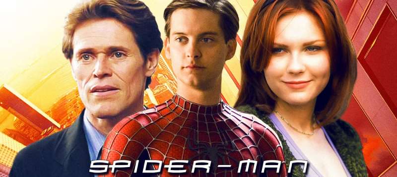

American superhero movie Spiderman was released in 2002. The movie, which is based on the same-named fictitious Marvel Comics character, follows Peter Parker, a high school student who fights criminals after unintentionally developing spider-like abilities. The poster’s usage of Homoarakhn’s font for the film’s title is strikingly similar. Just capital letters, digits, and a few restricted punctuation marks are included in this font.
The Amazing Spider-Man (2012):
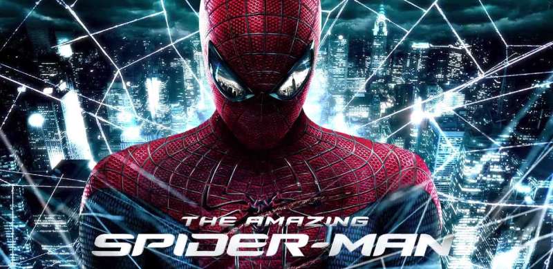

It is a superhero movie from 2012 that is based on Spider-Man from Marvel Comics. A font called Amazing Spider-Man Slant was created by P. A. Vannucci and is based on the Amazing Spider-Man movie’s title logo. It’s a no-cost font.
Also, it has certain softened edges and curves that make it friendlier and more fun than Homoarakhan. The youthful and adventurous attitude of Webb’s films is effectively captured by the typeface.
Spider-Man: Homecoming (2017), Spider-Man: Far from Home (2019), and Spider-Man: No Way Home (2021):
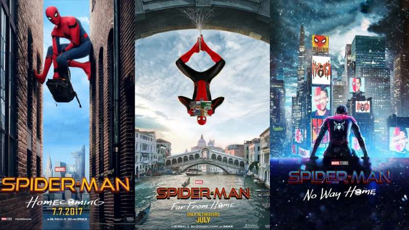

Good Times by Typodermic Fonts is the font used for the title of the movie (the Spider-Man portion). The closest typeface identified is Easy Speech by Jean-Jacques Morello, and the word “Homecoming” is almost certainly hand-lettered. Use Franco Fernández’s Homecoming typeface to generate a copy of the logo by typing “SPIDER-MAN” in capital letters and “Homecoming” in lowercase.
The Far From Homecoming Font by Kade Fisher, which is based on the font used in the subtitles and marketing for these films, is used for Spider-Man: Far from Home and Spider-Man: No Way Home. Compared to Easy Speech Font, this typeface has a sharper, more angular appearance that alludes to Spiderman’s difficulties and hazards in these films. The font also includes certain thickness and spacing variations, which give it a lively, dynamic sense.
Spider-Man: Into the Spider-Verse
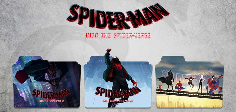

The title of the 2018 animated Spider-Man film, which was directed by Bob Persichetti, Peter Ramsey, and Rodney Rothman, is in a font resembling Veto Bold. Linotype created Veto Bold, a sans-serif font with a straightforward and uncluttered appearance. Also, it has some modest thickness variances that give it personality and flair. The font goes well with the animation’s colorful and lively style.
Alternatives Of Spiderman Font
Hardwired Script
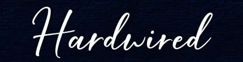

A fresh, pleasant, and simple handwritten script that was hardwired. A considerable deal of care was taken to provide both modern and natural aspects. Although it appears to be a standard font, this one has several benefits. The beautiful thing about this font is that it has a variety of styles that you may choose, including bold, natural handwriting style, distinctive, simple, and elegant.
Love Malia


A calligraphy font by Art Design that is contemporary. The wonderful and organic look of this calligraphy font is fashionable. It is a distinctive typeface with a distinctive vibe. To add more elegance, employ titling to offer varied letter effects. I present to you Love Malia Font. It has handmade calligraphy, ornate characters, and dance lines in a brand-new, contemporary style. Invitations like holiday cards, branding materials, business cards, quotes, and more are excellent.
Miama Nueva
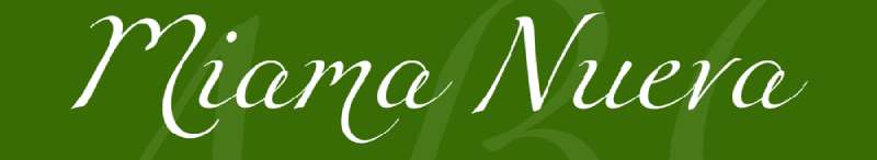

A handwriting and script font with more than 1300 glyphs that supports Latin, Cyrillic, and Greek is called Miama Nueva. It includes LATEX support in full.
Thuressia Script


Akmal Yusar created the Thuressia Script Font Family, which was released by Picatype. There are 1 styles in the Thuressia Script. The Thuressia Script is a friendly, attractive script with many swashes. It has several potential uses. such as book covers, posters, quotes, headlines, signage, labels, product packaging, wedding invitations, and more. The Thuressia Script includes ligatures, OpenType stylistic alternates, and international support for the majority of Western languages.
FAQ On The Spider-Man Font
Is the Spider-Man font free to use?
Nope, not always. The tightrope of font legality is a tricky one. The official Spider-Man typeface, tied up with copyright strings, isn’t free. You might find look-alikes, but tread carefully. Marvel and copyright law don’t swing by unnoticed. If it’s legit, it’ll likely cost ya.
How can I download the Spider-Man font?
Alright, webslinger, buckle up. It’s a jungle of websites out there. Official channels get you the real deal; think Adobe Fonts marketplace or graphic design forums.
Unofficial routes are dicey; check the authenticity and licensing. Always scan for traps—legal or digital bugs.
Can I use the Spider-Man font in my logo?
Absolutely— if you’ve got the rights. Without permission, snagging Marvel’s font style for commercial use is a no-go. Companies guard their visual identity like Spidey guards New York. If you’re after that superhero vibe, custom font creation’s your legal leap forward.
What’s a good alternative to the Spider-Man font?
Seeking a sidekick for Spidey’s font? Look for bold cinematic fonts or action font design with a dash of drama.
Think dynamic, blocky letterforms—something that screams action-packed adventure. Fonts like ‘Bamf’ or ‘Komika Title’ pack a punch and are free superhero fonts to boot.
What software do I need to create Spider-Man-style typography?
No radioactive spiders needed—just some solid graphic design software. Adobe Illustrator’s your traditional hero for this saga of design. For typography, a specialized tool like FontLab might be your trusty Bat… umm, Spider-Utility Belt.
How did the Spider-Man font come about in the comics?
Oh, it leaped straight off the vintage comic book pages. The original font was cooked up in the Marvel kitchen, with a dash of Stan Lee‘s secret sauce and Steve Ditko‘s spice. It’s all part of that unique comic book lettering and pop culture typography flavor.
Is there a Spider-Man font for web design?
For the web? Sure, your design can climb walls with ’em. Google Fonts offers similar vibes—think urban hero typography. Look for something punchy, that’ll stand out but also stick to the screen like, well, you know.
Can I modify the Spider-Man font for personal use?
Spin away! If it’s just for you, nobody’s going to slap your wrist for tweaking some bold cinematic fonts. As long as you’ve scored the original legally, personal projects are your sandbox. Just, ya know, keep it out of the commercial skyline.
Why is the Spider-Man font so popular?
Oh, buddy, this one’s a no-brainer. Spidey is the poster boy of cool. The Marvel font style resonates with that sense of heroic flair and nostalgia. And let’s be honest, who doesn’t get the tingles from good old Peter Parker text charm and adventure font aesthetics?
Where can I learn more about superhero font design?
Easy—head to the halls of knowledge. Online design communities, workshops, forums. Peep into places like Behance or Dribbble where the pros hang out.
Books, too—there’s golden wisdom in those. Ever heard of typographic branding or digital asset management? That’s your ticket to the big leagues.
Conclusion
And just like that, snap, we’ve tangled with the web of intrigue that is the Spider-Man font. Whether it’s the bold whispers of an iconic legacy or the practical know-how of slinging your own typographic web, it’s been quite the ride, huh?
- We’ve scoured the typographic branding landscape.
- Dodged the copyright law tripwires.
- Even dipped our toes in the graphic design software sea.
Inking our last word here, remember, with great fonts comes great responsibility. Use this power—this Marvel font style and its kin—with the respect due to a vigilante of the night (or, uh, day).
So, keep those eyes peeled and the mind open. The next time you spot the shadow of our friendly neighborhood superhero typeface across a page or a screen, give a nod to the artistry and the history it represents. And maybe, just maybe, let it inspire the next chapter in your own design saga.
If you liked this article about the Spider-Man font, you should check out this article about the Iron Man font.
There are also similar articles discussing the Guardians of the Galaxy font, the Thor font, the Teenage Mutant Ninja Turtles font, money fonts, and the Daredevil font.
And let’s not forget about articles on the Doctor Strange font, the X-Men font, the Captain Marvel font, and The Avengers font.