

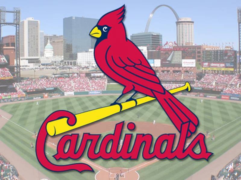
The iconic swoop of the redbird perched on a bat—this emblem is more than mere design; it encapsulates history, culture, and an undying spirit of competition.
Imagine the St. Louis Cardinals logo, a powerful symbol nesting in the heart of Major League Baseball, its wings spread across generations of fans and uniforms.
In the atelier of sports insignia, few resonate with the vibrancy of the Cardinals’ badge, marrying aesthetics and allegiance. Diving into the depths of this celebrated emblem reveals stories inked in tradition, etched into the fabric of the National League and embraced by a sea of redbird followers.
By the end of this exploration, one will grasp the intricate ties between the emblem’s evolution and its role in shaping a team’s identity. One shall uncover the stitching that binds the Cardinals cap insignia to a broader narrative.
Featured will be the artistry behind the scenes, showcasing the symbolism that champions both the game and the graphic elements that define it.
In tracing the logo’s flight, from its historic origins to the contemporary merchandise racks of Busch Stadium, enthusiasts and critics alike will appreciate the craft that goes into immortalizing a franchise’s face.
The Meaning Behind the St. Louis Cardinals Logo
![]()

Yo, let me take you on a journey into the depths of the St. Louis Cardinals logo. It’s not just a pretty picture, my friend.
Birds and Baseball
It’s a bird… on a bat? Yup! The iconic bird perched on a bat is synonymous with baseball in the heartland of America. Birds are symbols of freedom and spirit, and in the context of baseball? It’s all about soaring high and striving for greatness.
The bat, obviously, represents the essence of the game. Combine the two, and bam! You’ve got a symbol that screams passion and ambition in the realm of baseball.
The Cardinal: More than Just a Bird
The Cardinal isn’t any random choice. It’s Missouri’s state bird. Associating the team with the state bird? Genius. It builds a connection with the locals. It’s like saying, “We play for you!” It’s a symbol of pride, unity, and loyalty.
The History of the St. Louis Cardinals Logo
![]()

Sit tight, history buffs! Time to dip our toes into some logo lore.
In the Beginning…
Before the fierce Cardinal we know today, there were earlier versions. The logo has been redefined, reshaped, and revamped multiple times. Yet, the essence remained.
Evolution and Adaptation
Over the years, the logo witnessed tweaks in design and color. Sometimes the bird looked fierce, other times more relaxed. But the central theme? Always constant. It’s a testament to the team’s ability to evolve while staying true to its roots.
The Colors of the St. Louis Cardinals Logo

Color me impressed! The choices here aren’t accidental.
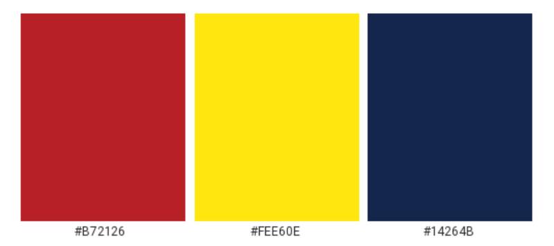
Cardinal Red
Ever notice how vibrant and lively the red is? It’s not just to grab attention. Red symbolizes energy, passion, and action. Perfect for a game as dynamic as baseball.
Navy Accents
The navy offers a stark contrast. It’s there to balance out the intensity of the red. It represents depth, stability, and trust.
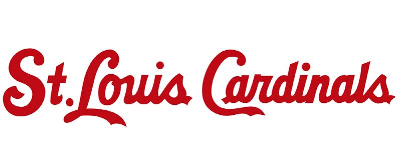
The Font Used in the St. Louis Cardinals Logo

Let’s chat typography!
Classic and Bold
The font used is strong, assertive, and undeniably classic. It stands its ground, much like the team itself. It’s not just letters; it’s a statement. Every curve, every edge speaks of tradition intertwined with modernity.
Imagery and Influence
Oh, the power of imagery!
An Emblem of Spirit
The logo isn’t merely a marketing tool. It’s a beacon for fans. It evokes emotions, memories, and a sense of belonging.
Influence Beyond Baseball


Beyond the stadium, this logo finds its place in merchandise, pop culture, and even in the hearts of those who might not be hardcore baseball enthusiasts. Such is its charm!
Crafting an Icon: Design Perspectives
Art nerds, this one’s for you.
Simplicity is Key
While the design has evolved, it’s always retained a level of simplicity. It’s easily recognizable and instantly associated with the team. That’s the hallmark of a good logo.
Emotional Resonance
A logo isn’t worth its salt if it doesn’t resonate emotionally. The St. Louis Cardinals logo touches the chords of nostalgia, pride, and ambition. It’s not just seen; it’s felt.
FAQ On The St. Louis Cardinals Logo
What’s the Origin of the St. Louis Cardinals Logo?
The emblem’s flight began in the early 1900s. It was the visual whisper of a team forging its identity. A cardinal bird perched on a baseball bat—this became the signature of the St. Louis franchise. A nod to the state bird, it’s a beacon of regional pride and major league aspiration.
How Has the Cardinals Logo Changed Over Time?
Evolving gracefully, the logo has seen nuanced changes. From its monochromatic origins to the vibrant red that adorns today’s uniforms, each iteration adds chapters to the branding elements of the logo.
The birds and bat have been stylized with time but remain equally timeless.
Why Are There Two Birds in the Cardinals Logo?
The twin birds symbolize teamwork and camaraderie. Perched on either side of the bat, they embody the sport’s balance and dynamics. A metaphor that reinforces the concept—alone one can fly, together the St. Louis Cardinals soar.
What Do the Colors in the Cardinals Logo Represent?
Red, navy, and yellow—these aren’t mere shades but colors that champion the team’s vivacity. Red fires up passion, navy anchors tradition, while yellow shines as a beacon of excellence within the sports merchandise design. Together, they rally a visual chant of unity and spirit.
What’s the Significance of the Bat in the Cardinals Logo?
The wooden weapon, home to perched cardinals, isn’t just a tool of the trade. It’s the backbone of every swing, hit, and run—the core of baseball’s craft. This bat, within the logo, is a silent tribute to the essence of the game, to the raw pulse of Major League Baseball.
Has the Cardinals Logo Ever Faced Controversy?
With change comes dissent. Purists might have squabbled over design tweaks, but no major controversies have clouded its legacy. The logo, an enduring sports symbol, has soared largely without turbulence.
Is the Cardinals Logo Trademarked?
Absolutely. As with most professional baseball insignia, the St. Louis Cardinals logo is a trademarked entity. This legal cloak safeguards it against unsanctioned uses, preserving its integrity and lineage in the commercial arena.
Can Local Businesses Use the Cardinals Logo?
Not without explicit permission. The trademarked team logos come with strings attached—legal agreements that regulate their use. Local entities often partner officially to cherish this relationship and foster shared community values under strict branding guidelines.
How Is the Cardinals Logo Used in Marketing?
Strategically. It’s not just an emblem but a hallmark of fan apparel graphics. From murals at Busch Stadium to the sea of merchandise, it’s a cornerstone of the brand’s marketing, a rendezvous point for Cardinals Nation.
What Does the Cardinals Logo Mean to St. Louis?
It’s an identity woven into the city fabric, a historic sports symbol representing more than just baseball—it’s about community, history, and collective pride.
In St. Louis, the Cardinals logo is far beyond a mere graphic. It pulsates with the vigor of a city and the heartbeat of a fandom.
Conclusion
Emerging through countless innings, the St. Louis Cardinals logo stands, not merely as design but testament. Wrapped in the team’s ethos, it champions more than fierce bats and swift fielding—it’s the heartbeat of a franchise, the silent cheer of Redbird fans, the iconic sports emblem of a storied legacy.
In each thread of the jerseys, the embroidery of caps, and the palette that paints Busch Stadium’s walls, this mark signifies unity. It’s a symbol that stitches together generations, a baton passed down through seasons of cheers and challenges.
Today’s discourse, woven with insights, concludes at home base. The Cardinals’ insignia, surveyed from graphic inception to vibrant evolution, narrates a rich history beyond the red stitches of a baseball.
- It conveys belonging.
- It marks triumphs.
- It’s the pride worn on every fan’s chest, a fluent language across the league.
So, each time the bat swings, remember: it’s not just a game—it’s the legacy inscribed within the Cardinals’ wings.
If you liked this article about the St. Louis Cardinals logo, you should check out this article about the Oakland Athletics logo.
There are also similar articles discussing the Cincinnati Reds logo, the San Diego Padres logo, the Detroit Tigers logo, and the Boston Red Sox logo.
And let’s not forget about articles on the Tampa Bay Rays logo, the Seattle Mariners logo, the Pittsburgh Pirates logo, and the Los Angeles Angels logo.