

The brushstrokes of history paint a vivid tale, one where the San Diego Padres logo stands as a beacon, inviting a cascade of memories for baseball aficionados.
It’s more than mere imagery; it’s a narrative intertwined with the city’s pulse, a testament to the timeless bond between team and community.
Embarking on this exploration, we’ll unravel the tapestry of design that encapsulates the essence of a franchise. From the iconic Swinging Friar to the evocative color palette echoing the spirit of San Diego, every element of the logo narrates a chapter of this Major League Baseball saga.
Illuminating the stadium’s mystique, I marry design finesse with sports heritage, deconstructing the visual symphony that is the friars’ team symbol.
Venture with me, as we delve into the intricacies behind the Padres uniform crest—a fusion of art and allegiance.
By the final chapter, you shall have journeyed through the evolution of an emblem, emerging with enriched wisdom on the craftsmanship that heralds fan allegiance, solidifying its place in the annals of MLB lore.
The Meaning Behind the San Diego Padres Logo
Yo, ever stop and think about logos? I mean really think about them? Every curve, every color, every shade – it’s all telling a story. So, what’s the deal with the San Diego Padres logo?
Duality of a Mission
San Diego is renowned for its missions and history. The Padres’ logo embraces this history.
Padres, which translates to “fathers” in Spanish, is a nod to the Spanish Franciscan friars. This connection is more than just a name; it’s a bond to the city’s very fabric.
Swinging the Bat
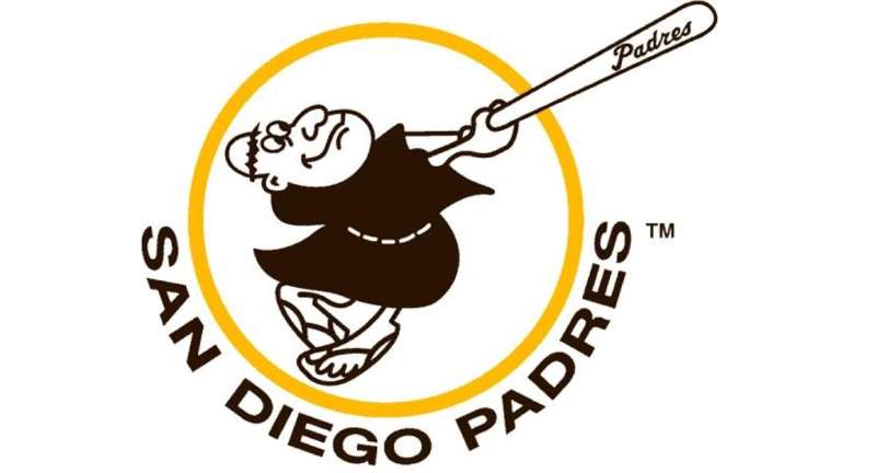

Some versions of the logo featured a swinging friar. This depiction is fun and dynamic, representing the liveliness of the sport and the team’s essence.
The History of the San Diego Padres Logo

Old School Vibes
The Padres have gone through some phases, man. From the late ’60s, their logo journey has been a roller coaster. They began with a simple friar, then moved to the more modern baseball and script, and bounced back to vintage vibes in the recent era.
Evolution, Not Revolution
The logo didn’t radically change overnight. Each tweak, each adjustment, has been a reflection of the times, and of the team’s aspirations. It’s like watching your childhood friend grow up and evolve. Same core, just a different style.
The Colors of the San Diego Padres Logo

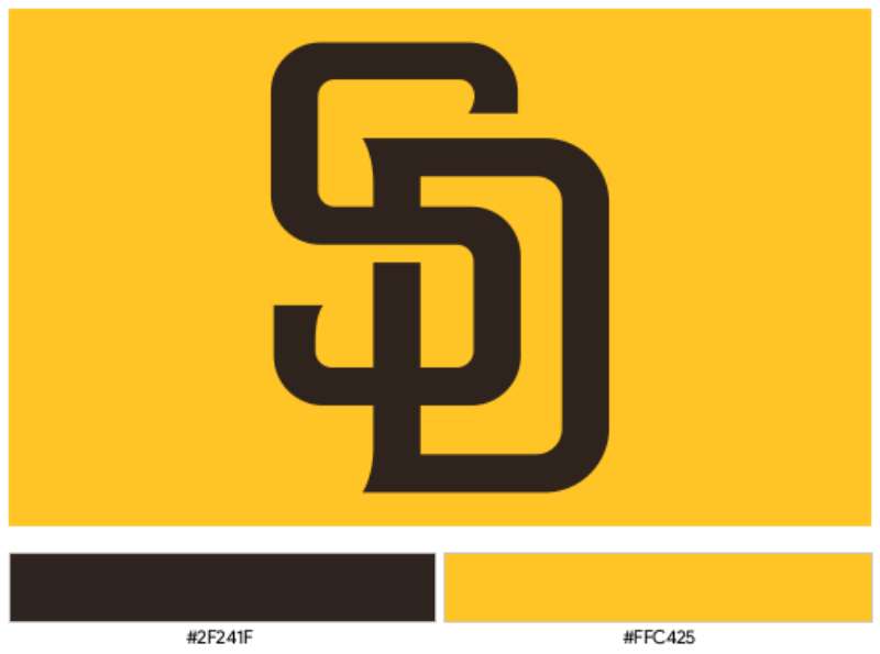
Brown and Gold
The classic. This combo screams retro and gives that unmistakable Padres identity. It’s earthy and warm, with a sprinkle of pizzazz.
The Font Used in the San Diego Padres Logo

Playful Yet Proud
The typography in the Padres logo isn’t your everyday font. It’s playful, echoing the swinging friar’s spirit, yet there’s a pride and strength in those letters. They’re confidently etched, almost as if to say, “Yeah, we’re here to play, but we’re here to win too.”
The Popularity and Recognition
A Fan’s Perspective

As logos go, the Padres have a distinct mark in baseball. Their unique history and connection to San Diego give fans a sense of belonging. You rock that cap, and instantly, you’re part of a tribe.
Global Impact
Beyond just MLB enthusiasts, the Padres logo has seen love globally. From mentions in pop culture to sporting events worldwide, it’s not just a logo; it’s an emblem.
The Artistic Appeal
A Designer’s Dream
From an artistic standpoint, the San Diego Padres logo is a treasure trove. The balance between modernity and retro, the mix of colors, and the font all provide a rich canvas for creativity.
Merch and More
Have you seen the merchandise? The artistic renditions, the fan art, the tattoos! The Padres logo isn’t just for baseball uniforms. It’s become an artistic statement.
FAQ On The San Diego Padres Logo
What’s the history behind the San Diego Padres logo?
The friar swinging a bat vividly captures the San Diego Padres’ spirit. Born alongside the team’s inception into MLB, variations have journeyed from text-heavy insignias to the contemporary, minimalist emblem, reflecting the Padres logo evolution’s bond with San Diego’s cultural and aesthetic shifts.
What do the colors in the Padres logo represent?
Enshrined in hues of navy, white, and recently revived brown, the Padres colors nod to San Diego’s naval heritage and the earthen tones of the Franciscan habit. It’s a confluence of tradition and locality, resonating pride that ripples through the stands of Petco Park.
Why was the Swinging Friar chosen as a mascot?
The Swinging Friar embodies a playful twist on San Diego’s namesake, St. Francis, or “Padre”. His jovial demeanor and baseball prowess forge an unmistakable identity, immortalizing the ethos of the Padres within Major League Baseball’s roster of mascots.
Has the Padres logo changed over the years?
Indeed, akin to a canvas chronicling epochs, the Padres logo has undergone numerous redesigns.
From minimalist to intricate, the logo’s silhouette has transformed, echoing the zeitgeist of each era, and the evolving sports logo copyright domain, yet it retains its quintessential charm.
What elements are included in the current Padres logo?
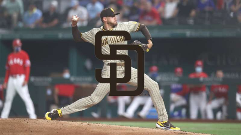
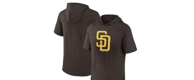
Stripped to the essence of modern design, the current logo spotlights the interlocked “SD”, paying homage to the city of San Diego. A clutch of limited elements—sans any mascot or extraneous details—this insignia exemplifies sports team branding’s sleek, future-forward direction.
How do the Padres fans feel about the logo?
A badge of unison, the Padres logo is cherished among fans. Amidst debates of past and present iterations, it remains a talisman, weaving generations of the Friars’ fanbase with a common thread—a symbol of unity and thrilling ballgames.
What significance does the Padres logo have in San Diego?
More than mere imagery, the Padres emblem signifies San Diego’s fortitude and zest. Like the famed Tony Gwynn, it’s an ever-present icon in the cityscape, revered much like any other historic SEO entity or local landmark, inseparable from the city’s very essence.
How does the Padres gear feature the logo?
Authentic Padres gear lavishly flaunts the logo. From caps to jerseys, it’s a stamp that declares allegiance. Each item intertwines branding guidelines and fan fervor—an armor donned by enthusiasts, whether in the buzzing avenues around Petco Park or beyond.
Can I use the Padres logo for my own merchandise?
Usage is firmly within the grasp of copyright law. Being a professional baseball franchise’s intellectual property, personal merchandise bearing the emblem without explicit permission teeters on infringement—a delicate line better not crossed without proper authorization.
Where can I buy official San Diego Padres merchandise with the logo?
The San Diego Padres Official Store is your destination. Here, amidst shelves lined with baseball merchandise, the logo takes center stage—authenticity guaranteed. It’s a hub where enthusiasm is clad in the friar’s livery, ready for proud display.
Conclusion
In the interplay of shades and lines, the San Diego Padres logo stands emblematic, not merely as a design but as an emblem of pride, mirroring the very soul of San Diego. From the Swinging Friar to the interlocked “SD” — every iteration whispers chapters of a city’s love for its team, an MLB cornerstone.
- The dynamic history illuminated within each logo shift
- The symbiotic relationship between identity and community
These aren’t just visual elements, but narratives woven into the fabric of San Diego’s identity. To gaze upon the logo is to feel the heartbeat of Petco Park, to be transported to the echos of cheer under the sun-drenched sky, revering heroes like Tony Gwynn.
This journey through the visual evolution of the Padres has been nothing short of a voyage into the collective spirit of a city and a sport—a testimony to the power of design in heralding and celebrating the heritage of the San Diego Padres.
If you liked this article about the San Diego Padres logo, you should check out this article about the St. Louis Cardinals logo.
There are also similar articles discussing the Oakland Athletics logo, the Cincinnati Reds logo, the Detroit Tigers logo, and the Boston Red Sox logo.
And let’s not forget about articles on the Tampa Bay Rays logo, the Seattle Mariners logo, the Pittsburgh Pirates logo, and the Los Angeles Angels logo.