

Imagine a symbol that captures the essence of a city, the spirit of a team, and the heartbeat of a passionate fanbase—all woven into the fabric of Major League Baseball’s storied tapestry.
The Los Angeles Angels logo transcends mere design; it’s a powerful insignia rooted in the Anaheim-based team‘s heritage.
Embarking on this exploration, we delve into the intricacies behind the emblem that adorns the caps and jerseys of MLB athletes.
As a fusion of art and athletics, the logo’s red and blue team colors convey a visual narrative rich with identity, pride, and sports franchise history.
What lies beneath this emblematic façade? I will unravel the story of the halo logo design, dissecting its evolution and the profound connection it fosters with Angels baseball supporters.
We’ll examine its influence on team merchandise and its standing in the realm of sports logo history.
By the time we reach our final word, you’ll have gained an immersive understanding of a symbol that’s become an indelible part of Los Angeles culture.
The Meaning Behind the Los Angeles Angels Logo
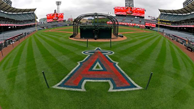
![]()

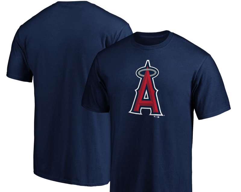
Hey there, design enthusiasts! When you glimpse the Los Angeles Angels logo, do you ever wonder about its deeper meaning? It’s not just any ordinary team emblem—it tells a story.
Symbolism and Identity
Ah, symbolism. That underrated thing that designers adore to weave into their creations. The Los Angeles Angels logo doesn’t disappoint.
The angelic wing and halo bring forth the idea of celestial beings—angels, naturally. This connection to heavenly bodies does more than just match the team’s name—it denotes purity, aspiration, and commitment.
Culture and Locale
Let’s talk SoCal. The logo, with its angelic touch, is a nod to the City of Angels—Los Angeles itself. This helps to create a sense of belonging and represents the deep roots of the baseball team in Cali culture.
The History of the Los Angeles Angels Logo
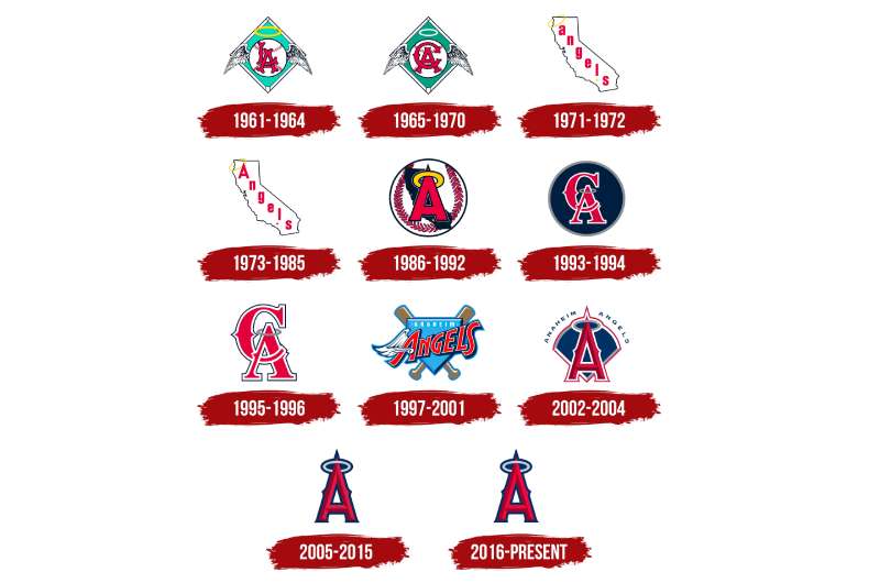

Now, let’s drift back in time. Logos evolve, and the Angels logo has seen its share of transformations.
Early Days
In the beginning, the emblem had a more basic touch—think about the ’60s, where simplicity ruled. It was all about capturing the essence without the razzle-dazzle.
Evolution and Change
Fast-forward a bit. The logo metamorphosed, embracing the modern aesthetic. The halo, the baseball, the typography—all got jazzed up. These changes mirrored not just design trends but also the team’s journey and evolution.
The Colors of the Los Angeles Angels Logo
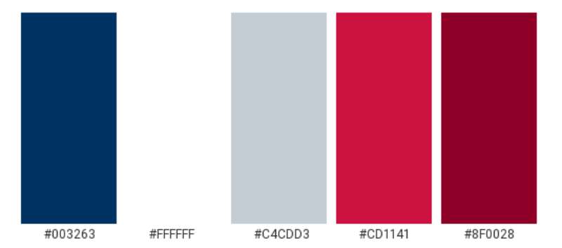

Colors speak louder than words, don’t they?
Red: The Dominant Hue
Red isn’t just for love. In sports, it’s energy, power, and dynamism. That fierce red in the logo? It’s there to bring out the team’s zeal, passion, and unstoppable spirit.
Accent Tones
Though red dominates, there are other subtle hues in there—whites and blues. They balance the vibrancy, bringing in purity (white) and trustworthiness (blue).
The Font Used in the Los Angeles Angels Logo
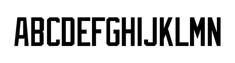

Typography, my favorite subject! Fonts can say a lot without uttering a word.
Bold and Proud
The typeface in the Los Angeles Angels logo is bold and clear. It signifies clarity, purpose, and a no-nonsense approach. It’s as if the team is stating, “We’re here, and we mean business.”
Unique Flourishes
Look closely and you’ll see some unique curves and edges. They give character to the logo, ensuring it’s not just another bland sports emblem.
The Aesthetic Appeal of the Los Angeles Angels Logo
Diving into the beauty of it all.
Balance and Harmony
There’s a zen-like balance in the logo. The imagery and typography, the colors and whitespace—all come together in a harmonious dance.
Modern yet Timeless
While it reflects modern design ethos, there’s a timeless quality to it. It’s not something that’ll feel dated in a few years. It’s here to stay and slay!
The Emotional Connection to Fans

Ah, the heart of the matter.
Beyond Just Design
For the die-hard fans, this logo isn’t just a design. It’s an emblem of hope, dedication, and countless memories.
The Rallying Point
Be it at the stadium or a local bar, that logo unites. It’s a symbol fans rally behind, creating a sense of community and shared purpose.
FAQ On The Los Angeles Angels Logo
What’s the story behind the Los Angeles Angels logo?
The Los Angeles Angels logo is more than an image; it narrates the journey of a franchise that plays under the radiant California sun.
The halo perched atop the ‘A’ epitomizes the ‘Angel’ moniker, symbolizing the city’s guardian spirit. It’s a tale of tradition, constantly evolving yet rooted in its beginnings.
How has the Angels logo evolved over time?
Since 1961, the Angels baseball emblem has undergone transformations, reflecting the team’s growth and era shifts.
From a winged baseball to a haloed ‘A’, the current logo merges red and blue team colors with a clean, modern design that upholds its vintage ancestry while looking onward.
What do the colors in the Angels logo represent?
The Angel’s palette is a vibrant display of MLB team insignia standards. Red symbolizes passion and energy, while blue anchors it with a sense of stability.
Together, these hues embody the dynamism and competitive spirit for which the Anaheim-based team and its fans are known.
Are there hidden meanings in the Angels logo?
While not overtly advertised, thoughtful nuances reside within the logo – the prominent halo signifies celestial beings, merging MLB uniform patches with lore. It’s these subtleties that imbue depth, breathing life into what might otherwise be a static sports emblem.
What’s the significance of the halo in the Angels logo?
In the realm of sports logo history, the halo is an unmistakable token of the Los Angeles Angels. It represents the ‘Angel’ in their name, a clever play on words, and offers an emblematic nod to victory – visualizing the triumphal aura that the team aspires to maintain.
How does the Angels logo impact fan merchandise?
The iconic “A” with its halo has become synonymous with the Los Angeles Angels, making it an essential feature of Angels fan gear.
This recognizable symbol ensures team merchandise appeals to the legions of supporters, encapsulating fandom in a single, celebrated emblem.
When did the Angels first adopt their current logo?
The current Angels logo took flight in the early 2000s, building upon the legacy of past designs. This evolution mirrored the team’s fresh start in the new millennium, offering a modernized baseball sports emblem symbolic of traditional and current Los Angeles.
What was the original Los Angeles Angels logo like?
Upon their inception, the franchise donned a logo reflective of its Los Angeles and ‘angels’ heritage – a seraphim donning a baseball. This representation laid the foundation for future designs that would carry forth the team’s sporting insignia reputation.
Is the Angels logo unique to the team?
Absolutely, the logo’s design is an exclusive beacon for the Los Angeles Angels. While it shares the general characteristics of MLB team insignias, such as bold lettering and thematic elements, the halo-laden ‘A’ sets it apart, a true original in the American League West division.
How does the Angels logo compare to other MLB team logos?
Each Major League Baseball team boasts a distinguished logo; the Angels’ charm lies in its simplicity and symbolic halo.
Such features hold their ground among others, representing the Los Angeles franchise with distinctiveness and a clear sense of place in the California professional baseball scene.
Conclusion
Cascading from the canvas of deep history and onto the field, the Los Angeles Angels logo has stretched its wings as both a beacon and a brand. This emblem—with its haloed ‘A’—wears its legacy with a humble bow to the past and keen gaze toward the future. It stands firm, a testament to the Angeles fan gear that swathes the stands in a sea of red and blue team colors.
In the ebb and flow of MLB uniform patches, it engraves itself as a guardian of the sports franchise identity, enduring through the oscillations of trends and tastes. And as the final word is penned in this narrative, one is reminded—through the strokes of this celebrated insignia—that the Anaheim-based team is a living tapestry, rich with chapters of victories, losses, and undying dreams. The Los Angeles Angels logo, an enduring symbol, bridges generations and ignites the spark of champions with every appearance on and off the field.
If you liked this article about the Los Angeles Angels logo, you should check out this article about the St. Louis Cardinals logo.
There are also similar articles discussing the Oakland Athletics logo, the Cincinnati Reds logo, the San Diego Padres logo, and the Detroit Tigers logo.
And let’s not forget about articles on the Boston Red Sox logo, the Tampa Bay Rays logo, the Seattle Mariners logo, and the Pittsburgh Pirates logo.