


Ever find yourself squinting at a screen? That’s the last thing anyone needs during a Netflix binge or while cranking out an assignment. You see, in the world that constantly buzzes with information, reading shouldn’t be a chore. This piece is your ticket to the realms of easy to read fonts—the unsung heroes that make perusing a page as breezy as a walk in the park.
From the minimalist charms of sans-serif to the lush leads of legible typefaces, I’ll usher you through a library of styles where clarity meets creativity. Wave goodbye to eye strain and hello to typography that talks—without shouting.
In this journey of font simplicity, we’ll decode the secrets of readable type settings and why choosing the right characters is more than about looks—it’s about enhancing readability, heightening accessibility, and designing for everyone. Steer through this read and you’ll emerge with a keen eye for typography best practices that color the world of words beautiful, minus the squint.
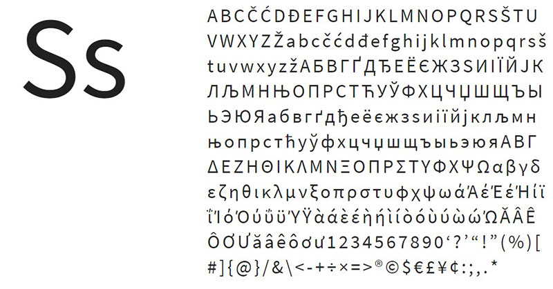
Fonts that are easy to read
Merriweather – Classic but modern
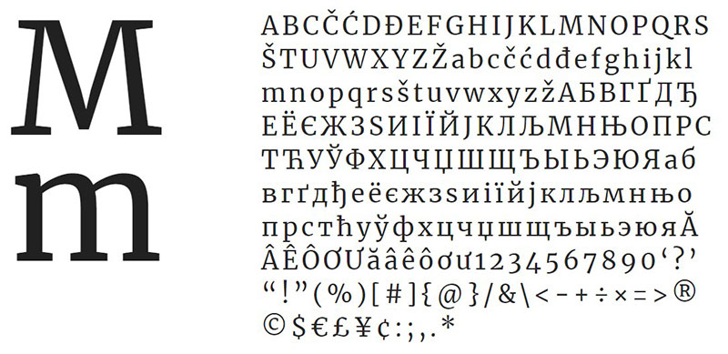

Dive into the typographic charm of Merriweather, an easy-to-read font that’s had a fresh coat of modernity – it’s sleek on your screens but stays grounded with classic roots. It’s a master of balance, boasting strokes that are distinct yet delicate, perfect for those teeny tiny on-screen sizes.
Calendas Plus – A new year begins
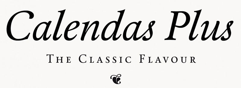

Meet Calendas Plus, crafted with the specific needs of calendars in mind, embodying typographic adaptability in snug spaces. It’s as generous as it is graceful—kickstarting your design journey without spending a dime, with a chance to grab more styles for a font-spanding experience.
Roboto – Simple curves
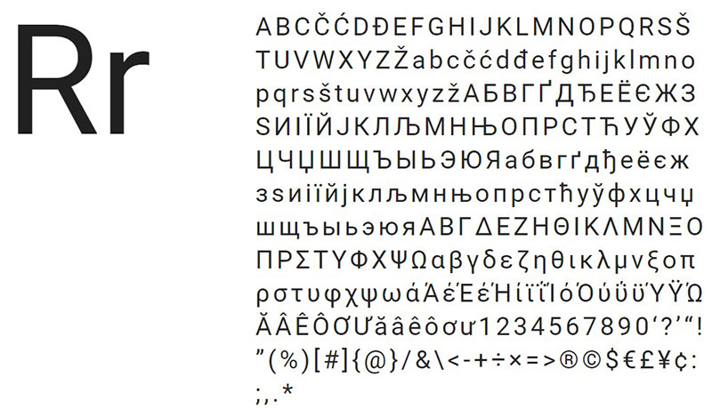

Roboto stands tall among easy-to-read fonts, shunning those overly ornate curves for clean lines and readability. Flaunt your font flair with 12 different styles, each tailored for digital clarity and user-friendly typography.
Georgia – For long texts
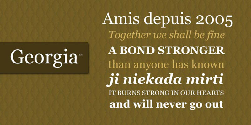

When lengthy reads beckon, Georgia steps in as the ultimate ally in legibility, weaving a tapestry of text in tight yet visually accessible spaces. With a professional aura, this font is a shoo-in for pristine professional and academic documents.
Open Sans – A Google’s famous

In the realm of Google’s typography treasures, Open Sans reigns supreme, celebrated for its simplest design that lets info shine, untouched by the shadow of flashy fonts—an SEO entity adopting simplicity and readability in web design.
Montserrat – Wide design

From the vibrant streets of Buenos Aires, Montserrat brings more breadth to the sans-serif game, its widened stance making a statement while keeping its angles meticulously aligned—a nod to urban chic typography.
Basic Font – For all screens
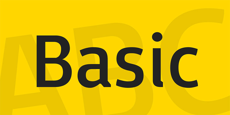
Redefining versatility, Basic Font effortlessly shifts between sizes on any screen type. With a subtle elegance, it adds a dash of flavor to the otherwise minimalistic approach, runnable across all typographical digital interfaces.
Fritz – Clean details
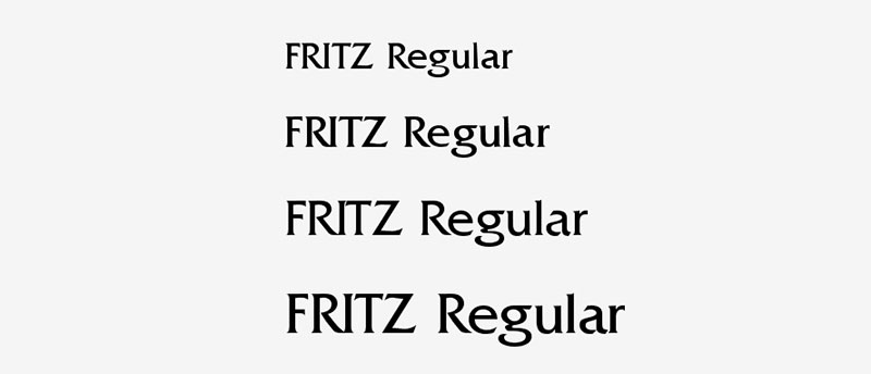

Fritz is the go-to for a clean, mechanical aesthetic, nixing the squares for a unified typographic flow. It’s a touch-bold but understated enough to keep the small text clear as day.
Bitter Ht – A nice read
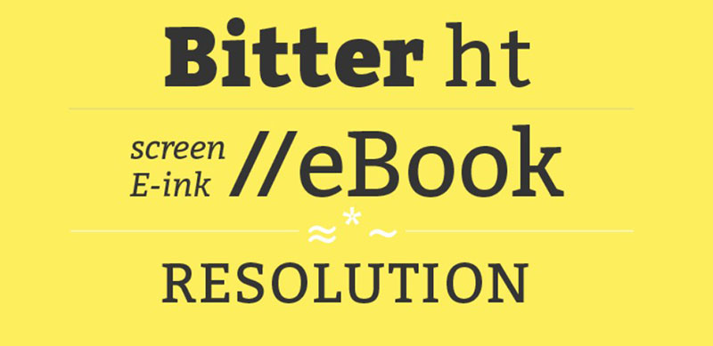
On the hunt for the best font for electronic reading? Bitter Ht was born for this, a design initially knitted for e-books and comfortable even on the most pixel-challenged screens.
Adamina – A refined design


Adamina speaks the language of contrast with its asymmetrical finesse, introducing intriguing variations and smooth reading transitions, making it a versatile partner in typographic expression.
Pluto Sans – Nice edges
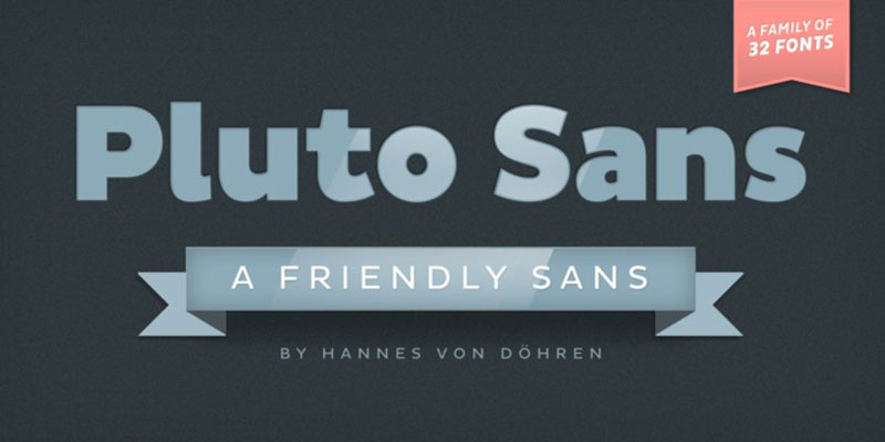
With Pluto Sans, it’s a tale of generous width while preserving immaculate drawing. Choosing from a whopping 32 styles is a luxury, but most find the base version more than satisfactory, thanks to its elongated elegance.
D-DIN Font – For design professionals
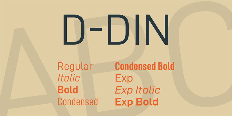
Embracing industrial roots and technical precision, D-DIN transcends its origins, delivering a legible workhorse for diverse design projects. Stripped of frills, it offers straight and consistent strokes for readability that endures regardless of where it’s penned.
Cinzel – Remembering the origins
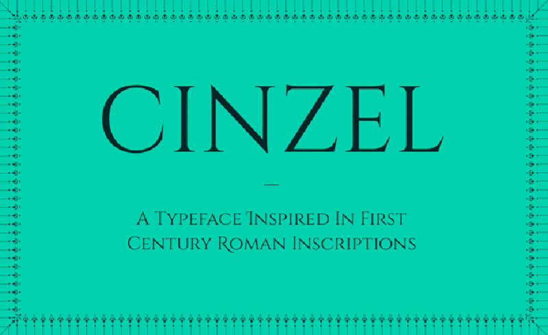

Cinzel revives the grandeur of first-century Roman inscriptions, balancing elegant squares and slender lines to carve its distinct impression in the realm of typographic history.
Lato – Something thicker

Lato, among Google’s treasure trove of legible typefaces, keeps it straightforward and professional—a perennial favorite, crowned with ten stylish options.
Helvetica – An old acquaintance
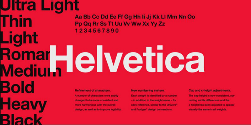
In the pantheon of readability, Helvetica is an easy pick, a champ in headlines and logos with its easy-on-the-eyes and elegant demeanor, bordering on the right edge of extravagance—the quintessence of accessible branding.
Artifika – The power of curves
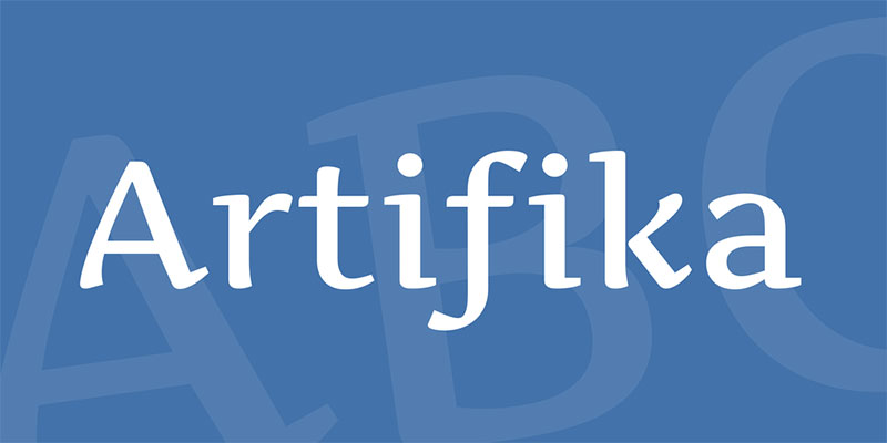
Who says elegance is cursive-only? Artifika squashes that notion, blending block-letter heft with subtle angles and curves. It replicates the ink-stroke spectrum with graceful variance in thickness, a testament to typographic versatility.
Gymkhana Font – Perfect proportions
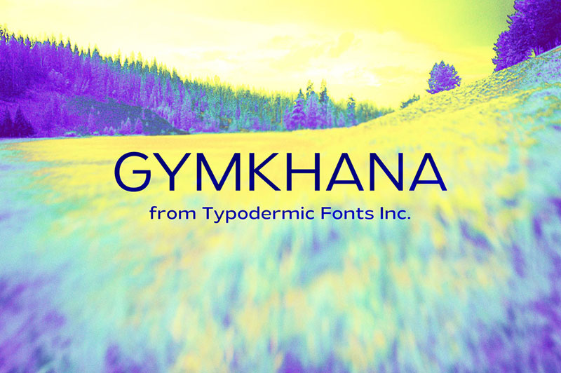

Gymkhana is all about harmonic proportions—whether stretched or compacted, it maintains its readable core, embodying font flexibility in every shape and form.
Margot – For every situation
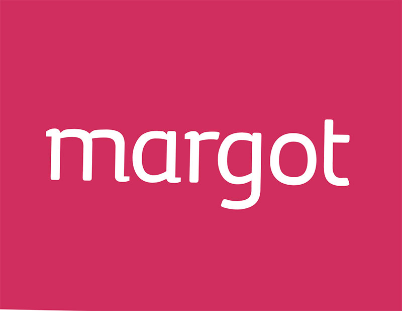

Though tailored for headline-dominating posters, Margot boasts a versatility that shines just as bright in the small print department, promising accessible legibility with a touch of grandiosity.
Verdana – A safe move

Verdana is your comfort font, almost a household name. Its simplicity and legibility are indisputable, but some argue it lacks a bold statement—a marketing shortfall, yet its visibility is unrivaled.
Cantata One – High Contrast

Elevating readability with high contrast, Cantata One dances between writing inspiration and typographical refinement, creating a finish that demands attention without screaming for it.
Playfair Display – Demonstrating the power of technology

Playfair Display couldn’t have existed in the bygone era—its feather-thin contrasts are a marvel of modern technology, engineered to perfection for today’s hi-res screens and crisp printouts.
Medio – A newspaper typography


Medio harks back to vintage newspapers where the headlines reigned supreme. It’s not cut out for small copy but commands attention in larger displays, echoing a time-honored print tradition.
Franklin Gothic – The important thing is visibility
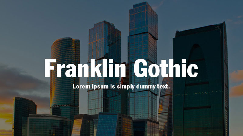

With its significant presence, Franklin Gothic embodies visibility. This gothic variant amplifies prominence. It may forgo elegance in favor of practicality, but its sizable personality suits various design needs.
Minion – Tribute to the Renaissance
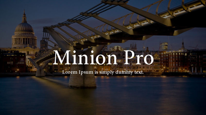
Minion transports back to the Renaissance’s aesthetic zenith, capturing its spirit with slanted profiles and slender strokes—a historical ode in typographical form.
Aleo – Subtle Details
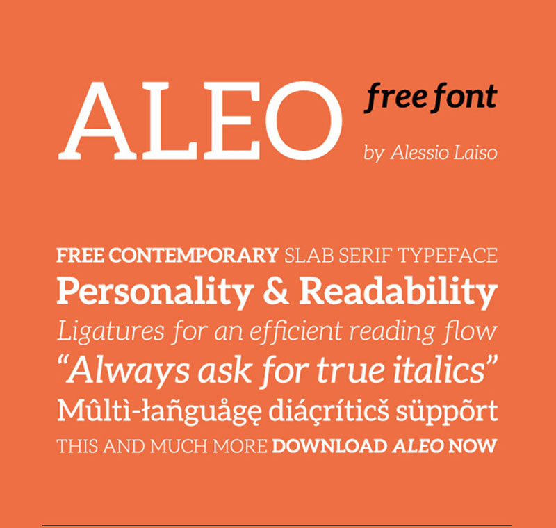

Aleo enchants more in the headline spotlight, its micro-curvatures radiating best in the square bracket terrain. It’s a font that asks for the stage to show off its understated beauty.
Gabriela – A fantasy book
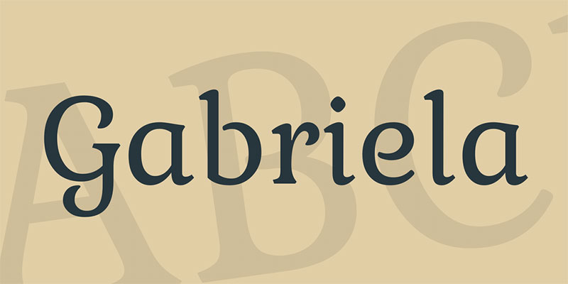
Gabriela forges readable artistry, blending readable structure with a fairytale flourish. Its curves embrace legibility, striking a balance that’s perfect for crafting enchanting texts or standout titles.
Source Sans Pro – A slight change

Source Sans Pro tweaks the familiar recipe of Google fonts, offering a dozen styles in its subtle shake-up—a font adaptation for contemporary tastes in the typography landscape.
FF Tisa – The wonder of the new millennium
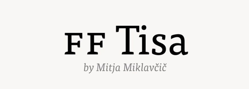

FF Tisa blooms in design circles, celebrated for its visually pleasing structure and prime legibility, delivering wide character spacing and consistent strokes, designed for the keen modern eye.
Droid Sans – For complex interfaces
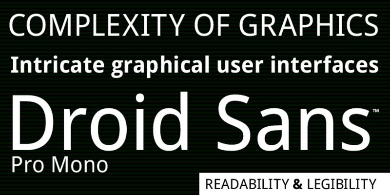
Tailored for the mobile world, Droid Sans masters vertical spaces, making it a font of choice for smartphones’ intricate user interfaces and interactive elements, always keeping readability in check.
Remember, beyond the aesthetic charm, it’s crucial to curate visibility on your platform—because most visitors will only skim your content. Pick a solid font, and you’re not just choosing a type. You’re building a bridge between your message and your audience.
FAQ on Easy To Read Fonts
What Defines an Easy to Read Font?
It’s all about the readability. Fonts should let words flow like water—effortless for the eyes. Think clean lines, open spaces, and distinct character shapes. Sans-serif types, like Arial, hit the mark for digital screens, while serif ones, like Times New Roman, often grace printed pages. The key? Recognizing legible typefaces as a staple in delivering clear messages.
How Do Fonts Affect Reading Speed?
Fonts are like the highway for reading—smooth ones get you there faster. Crisp, uncluttered typefaces let readers cruise through text without pit stops. Poor font choices are like bumpy roads; they slow you down. For zippy reading, simple fonts and an optimal line height make all the difference.
Are Some Fonts Better for Dyslexia?
Absolutely. Fonts can be a game-changer for dyslexic readers. Unique designs, like Dyslexie or Comic Sans, defy the norm—they offer asymmetrical letters that are dyslexia-friendly. These fonts lessen letter flipping and merging, easing the reading path. It’s about giving everyone a fair shot at understanding the text.
Does Font Size Matter for Readability?
Font size isn’t just a number—it’s the gateway to understanding. Too small, and you’re playing hide and seek with words. Too large, it’s a shout across an echo chamber. Aim for that sweet spot where the text is just enough to fill your cozy reading corner—readable font size for the win.
What’s the Deal with Serif and Sans-serif?
Here’s the scoop: serif fonts are the old souls of typography, rocking tiny feet that guide your eyes along a line. In books, they’re home. Now, sans-serif? They’re the modern, sleek ones, cutting clutter with their bare simplicity. Online? They rule. It’s a choice between tradition and clean modernity—role-suited actors in your typographic film.
Can Font Choice Enhance UX Design?
Imagine strolling through a park. That’s your UX design—the path should be self-explanatory, enjoyable. Fonts that are user-friendly make that stroll a piece of cake. They translate to less squinting, more appreciating. Good fonts smooth out the UX journey, guiding without needing a map.
What Font Works Best for Web Accessibility?
The MVPs for web accessibility are fonts that stand up loud and proud. Look for high-contrast fonts that pop against their backgrounds and avoid decorative fluff. Favoring simplicity is not only stylish; it’s a beacon for universal access— a nod to inclusive digital spaces where content speaks clearly to all.
What Role Does Color Contrast Play?
Imagine a painting—all one shade. Dull, right? Color contrast in fonts is the palette—varied hues help legibility take center stage. It’s not just black and white; it’s about finding the optimum contrast ratio for text to speak to eyes of all kinds.
Why is Text Spacing Important?
Crowded rooms versus open fields—text spacing dictates this in the land of words. Generous spacing stops letters from jostling for space, allowing for a Readable type setting that’s a breeze to navigate. Remember, it’s not just the letters, it’s the air around them that counts.
How Does Font Choice Impact Branding?
Fonts wield the power of first impressions. Pick a font, and you’ve donned your brand’s outfit. It sets the mood, carries the voice, and expresses the personality of your brand. The selection of simple fonts—or more expressive ones—can make your brand whisper, sing, or roar.
Conclusion
Alright, let’s wrap this up with a bow. We’ve talked a lot about easy to read fonts—the kind that invites your eyes to a friendly chat rather than a shouting match. From the zen-like simplicity of sans-serif to the classical dance of serif fonts, the gist is about finding that perfect ally for your text.
Remember, these font pals are not just about good looks; they’re your sidekicks in the grand quest for accessibility and UX nirvana. And when it comes to web design, picking a clear, friendly typeface means you’re not just making a visual choice, but an inclusive statement too.
So go ahead, cherry-pick some clean font styles from our adventure, cast them in your next digital story, and watch words play out effortlessly on-screen. Keep it legible, make it accessible, and let the simplicity do the talking. Your audience’s eyes will thank you, one easy-to-read line at a time.
If you enjoyed reading this article about fonts that are easy to read, you should read these as well: