

Imagine stepping into a scene where a simple emblem speaks volumes, where the iconic “Vans logo” emerges not just as a mark of style but a badge of culture.
This emblem, a name synonymous with skateboard flair and streetwear vogue, drives an unspoken camaraderie amongst the daring and the bold. Here, we unwrap the layers behind the familiar red and white signature that adorns sneakers and skate parks alike.
This unpacking is more than a mere curiosity — it’s essential. Understanding the symbol helps decode a global lexicon woven from skateboarding culture, a waffle sole, and a checkerboard pattern that marks both pavements and fashion runways.
The journey through this article illuminates the story behind the Vans logo, exploring how a single design encapsulates an enduring legacy and an identity etched in subcultural history.
By the time the last word is read, expect to grasp not only the threads that sew this iconic imagery into the fabric of action sports gear but also how it’s become part of the blueprint for the streetwear fashion movement.
Prepare for a dive into the heart of urban style—no half-pipes or kickflips necessary.
The Meaning Behind the Vans Logo

Weaving Stories
The logo isn’t just a bunch of lines and curves put together. It’s a story. It’s a feeling. It’s a culture. It’s skateboarding. It’s freedom. It’s youth.
Not Just a Checkerboard
The checkerboard pattern that is often associated with Vans is not just a pattern. It’s a statement. It symbolizes the rebellious spirit of the brand and its customers, who aren’t afraid to stand out in a crowd.
The History of the Vans Logo

A Logo is Born
When Vans started in the mid-60s, they didn’t even have a logo. They were just making shoes, and pretty good ones at that.
As the brand grew, so did its identity. And out of that identity, the Vans logo was born. The logo, like the shoes, was simple, clean, and functional.
The Evolution
Over the years, the Vans logo has evolved, but it has always stayed true to its roots. The square root-like symbol, also known as the ‘Jazz Stripe’, became an integral part of the brand’s identity.
It was a symbol of their commitment to quality, durability, and, most importantly, their skateboarding heritage.
The Colors of the Vans Logo
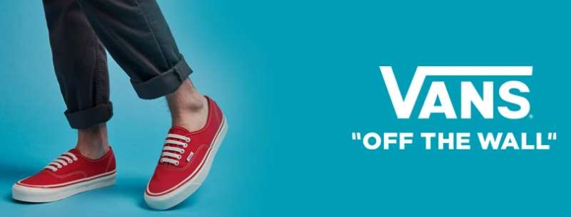
White and Red: More Than Just Colors
The logo is usually seen in white and red. But why these colors? Well, white symbolizes purity, while red symbolizes passion. Together, they represent the brand’s pure passion for skateboarding.
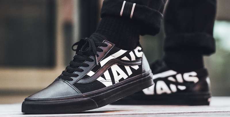
Black: The Color of Rebellion
Occasionally, you might see the Vans logo in black. This is no accident. Black is the color of rebellion, of standing against the norm. It embodies the brand’s rebellious spirit.
The Font Used in the Vans Logo

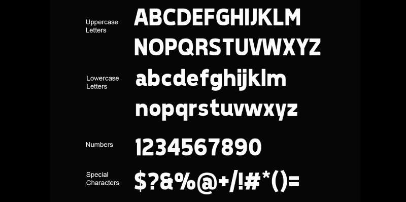
Bold and Simple
The font used in the Vans logo is bold and simple. It’s easy to read, yet hard to ignore. It’s a statement. It’s a declaration of intent. It’s Vans saying, “We’re here, and we’re not going anywhere.”
All Caps: A Symbol of Strength
The all-caps typography of the Vans logo symbolizes strength. It symbolizes the brand’s commitment to standing strong in the face of adversity.
The Impact of the Vans Logo

Beyond Fashion
The Vans logo is more than just a fashion statement. It’s a symbol of a movement. It’s a symbol of a lifestyle. It’s a symbol of freedom.
The Power of Recognition
The Vans logo is one of the most recognized logos in the world. It’s a testament to the power of good design and effective branding.
The Legacy of the Vans Logo

Standing the Test of Time
The Vans logo has stood the test of time. It has remained unchanged for decades, a testament to its timeless appeal.
A Logo for the Future
As we move into the future, the logo continues to inspire. It’s not just a logo. It’s a symbol of resilience, of creativity, of freedom. It’s a symbol that will continue to resonate with generations to come.
FAQ On The Vans Logo
What’s the history behind the Vans logo?
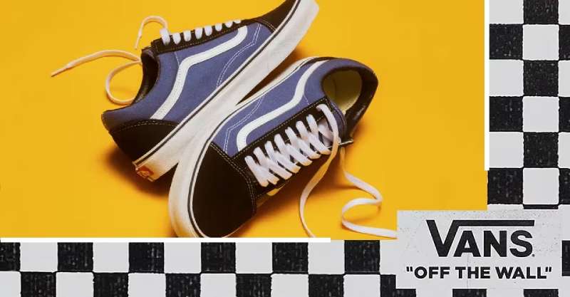
The Vans logo, with its distinctive ‘Off The Wall’ tagline, came to life in 1966. It’s the brainchild of the Vans founder, Paul Van Doren.
Initially, it emerged as a random doodle by him, but it swiftly embodied the burgeoning skate culture. It represents youth and rebellion against convention.
Why does the Vans logo say “Off The Wall”?
“Off The Wall” is steeped in skateboarding culture. The phrase captures the essence of skateboarders performing tricks where they literally go off the wall.
It’s this gravity-defying spirit that resonates with the Vans tribe, reinforcing the brand’s roots in the skateboarding world and its appeal among the youth.
Is the Vans logo trademarked?
Absolutely, as with most recognizable emblems of global brands. The Vans logo is trademarked to protect the brand’s identity and to stop any unsanctioned use.
It’s a legal shield for the company’s intellectual property, assuring the logo’s uniqueness stays snug within the hands of Vans, Inc.
Who designed the Vans logo?
While it is Paul Van Doren who is often credited with scribbling the first iteration of the logo, its design has evolved. The emblem as we know it today is an outcome of a collective process within the company, reflecting the brand’s skateboarding heritage and its lifestyle appeal.
Has the Vans logo changed over time?
It’s evolved, yes, but subtly. The core elements have stood the test of time: the distinctive typeface and the ‘Off The Wall’ slogan. These have preserved the logo’s original charm and link to skate culture, even as Vans expanded into a lifestyle and action sports brand.
What does the Vans logo symbolize?
The logo symbolizes rebellion, innovation, and creative self-expression.
It embodies the brand’s skateboarding origins and connection to extreme sports, interpretable as a sign of being ‘off the wall’ — metaphorically thinking outside the box and literally getting air on a skateboard.
Can I use the Vans logo on my products?
Not without permission — that would infringe on the trademark. Vans guards its logo rigorously because it’s pivotal to its brand identity in the athletic shoe industry and fashion collaborations.
You’d need a formal licensing agreement to collaborate and co-brand with the powerhouse that is Vans.
What products typically feature the Vans logo?
Primarily, you see the logo emblazoned on their iconic footwear ranging from Old Skool to Slip-ons, aligning with fashion trends.
But it stretches beyond sneakers, adorning apparel, skateboard gear, even co-branded merch from their various collaborations. It’s universal in the street fashion and casual wear segments.
What are the official colors of the Vans logo?
The logo is identified most with its classic red and white palette. But hey, it’s all about creativity, right?
So, you can spot an array of colors, some tailored per specific collaborations and limited editions, mirroring Vans’ vibrancy and adaptability in the sneakerhead community and youth culture.
Why is the Vans logo popular among youth?
Youths resonate with what the brand stands for — it’s not just footwear; it’s a fusion of comfort and a statement of identity.
With deep roots in urban style, skate parks, and streetwear fashion, the emblem represents a lifestyle, an attitude. It’s a seal of the effortlessly cool, the boldly defiant.
Conclusion
So there you have it. The journey through the Vans logo landscape winds down, but what sticks is more than the sum of its parts. More than the checkerboard and waffle soles, more than the Skate shoes and Streetwear fashion, it’s about the values stitched into that very emblem — rebellion, authenticity, creativity.
- Collective belonging, felt through every mention of the skateboard team and collaborations.
- Cultural legacy, echoed in every event like the Vans Warped Tour.
- Innovation, with Vans remaining at the forefront, from Slip-on sneakers to High-top Vans.
Understanding this emblem is embracing a chapter of urban style history, a synergy of Skateboarding culture and Youth fashion trends, leaving a distinct print not just on the ramps and streets but on hearts worldwide.
As we slide our feet into our favorite pair, remember, each step is a statement, a signature of the Off the Wall ethos that the Vans logo so boldly encapsulates.
If you liked this article about the Vans logo, you should check out this article about the Puma logo.
There are also similar articles discussing the Crocs logo, the Converse logo, the Reebok logo, and the New Balance logo.
And let’s not forget about articles on the Timberland logo, the Lacoste logo, the Skechers logo, and the Hunter logo.