

Imagine, just a simple brushstroke on fabric, yet it becomes an icon for generations. The Lacoste logo, a symbol that’s transcended mere fashion branding, whispers tales of prestige and timeless elegance.
How did a tiny crocodile manage to leap beyond its marshlands, to find a home stamped on the hearts of polo shirt connoisseurs and luxury enthusiasts alike?
Within this article, unravel the narrative woven into the threads of this fashion brand symbol. We’ll explore its brand recognition journey from the green tennis courts of France to high-street boutiques across the globe.
Delving into the design evolution, we’ll uncover how this crocodile emblem became synonymous with an empire built on both comfort and class.
Settle down, sartorial savants and brand builders! By the close, enlighten not just your wardrobe, but your brand wisdom, fathoming how powerful a logo can be—a lesson heralded by a creature of humble beginnings.
Welcome to a deep dive into an emblem that defines more than just a clothing brand logo—it’s a legacy stitched into the very fabric of the fashion industry.
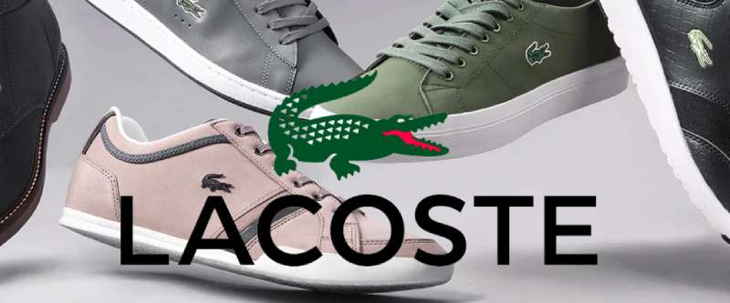
The Meaning Behind the Lacoste Logo
![]()

When you think about a little green reptile, you probably don’t think about fashion right off the bat. But, in the world of graphic design, this little guy is something of a superstar. This croc, the symbol of Lacoste, is a cornerstone of the brand, communicating its core values without uttering a single word.
Symbolism in the Lacoste Logo
This crocodile, elegantly embroidered on a polo shirt, is more than just a decorative element. It’s a symbol of tenacity, agility, and resilience – traits synonymous with both the creature and the brand.
Think about a crocodile in the wild. These beasts are survivors, enduring for millions of years, and just like them, Lacoste has been a consistent player in the fashion industry since its inception.
Connection with the Founder
The logo also bears a personal connection to the brand’s founder, Rene Lacoste, who was often referred to as ‘The Crocodile’ on the tennis court. This blend of personal history and symbolism gives the logo a unique touch of authenticity and originality.
The History of the Lacoste Logo
![]()

The story behind the Lacoste logo is as intriguing as the brand itself. It all started on a tennis court, believe it or not, and its evolution is steeped in a rich narrative of sports, fashion, and personal identity.
Origin in the Tennis Court
Rene Lacoste was a tennis legend in his time. His nickname, ‘The Crocodile’, came about because of a bet he made with his coach involving a suitcase made from crocodile skin.
The name stuck and became a part of his persona. When Rene started his clothing line, he incorporated this part of his identity into the brand.
Evolution Over the Years
Over the years, the logo has been tweaked subtly while keeping the core design intact. It’s a testament to how a strong, meaningful design can remain relevant and impactful through changing trends and times.
The Colors of the Lacoste Logo
![]()

The Lacoste logo features a color palette of green, red, black, and white.
The green hue symbolizes the brand’s iconic crocodile, the white corresponds to the creature’s spots and eyes, and the red signifies its mouth.
Additionally, the logo has a reversible version that showcases a white alligator set against a green backdrop.
The Font Used in the Lacoste Logo


Lacoste keeps it clean and classy when it comes to typography. The brand name is written in a custom sans-serif typeface which communicates simplicity, modernity, and sophistication.
Simplicity and Readability
The clean lines and even spacing make the brand name easily legible even from a distance. It’s a font that doesn’t compete with the logo; rather, it complements it.
Modern and Sophisticated
The typeface gives a nod to modern design trends while still maintaining an air of sophistication. It beautifully aligns with the brand’s image of creating modern yet classy fashion.
The Impact of the Lacoste Logo

The Lacoste logo has left a considerable mark on the fashion industry. Its simplicity, coupled with its meaningful and memorable design, makes it stand out amongst other fashion brands.
Consistency is Key
One thing that sets Lacoste apart is its consistency. Since its inception, the logo has remained largely unchanged.
This consistency has helped build a strong brand image that is instantly recognizable, further establishing Lacoste as a reliable and trustworthy name in the fashion industry.
Influence on Fashion Trends
The iconic crocodile logo has not only defined the brand’s identity but also influenced fashion trends. Its minimalistic and sporty style inspired a movement towards casual, comfortable, yet classy clothing.
The Lacoste Logo in Pop Culture
The Lacoste logo’s influence extends beyond the realm of fashion and into the broader sphere of pop culture. Its iconic status has been acknowledged in music, film, and art, asserting its place as a cultural icon.
Mentions in Music and Film
From hip-hop lyrics to movie wardrobes, the Lacoste logo often pops up, showing its widespread recognition and appeal. Its presence in these mediums testifies to its widespread popularity and relevance.
Collaborations with Artists

Lacoste has also collaborated with various artists over the years, who have put their own spin on the classic logo. These collaborations showcase the logo’s versatility and its ability to adapt to different styles while maintaining its core identity.
The Global Recognition of the Lacoste Logo
The Lacoste logo’s universal appeal and recognition are what truly set it apart. It’s a symbol that transcends language barriers and resonates with people globally, making it a truly international emblem.
Iconic Status Across Borders
The Lacoste logo is recognized and revered globally, thanks to its consistent branding efforts. Regardless of language or culture, the sight of the little green crocodile instantly brings Lacoste to mind, showing the power of a well-designed logo.
Unifying Factor
Despite cultural and geographical differences, the Lacoste logo serves as a unifying symbol. It’s a testament to the brand’s worldwide appeal and its ability to resonate with diverse audiences, further cementing its place in the annals of iconic logo designs.
FAQ On The Lacoste Logo
What’s the story behind the Lacoste logo?
Believe it or not, it’s all down to a bet over a suitcase made from crocodile skin. René Lacoste got tagged with the nickname “Crocodile” by fans because of his tenacity on the tennis court. That tenacious spirit comes through in the logo of this luxury fashion giant.
Why did Lacoste choose a crocodile as their logo?
It’s all about the persona. René Lacoste’s perseverance in his sport earned him the moniker “The Crocodile”. Embracing this, he had it embroidered on his blazer.
It speaks volumes about the brand identity, aligning perfectly with the fierce competitive nature and elegance of the brand.
Has the Lacoste logo changed over the years?
Like a fine wine, it’s gotten better with age! Some tweaks here and there, sure, but that iconic green crocodile has mostly stayed true to its original form—a testament to the enduring legacy and recognizable brand identity this symbol has carved out in the fashion world.
What does the Lacoste logo represent?
More than just a piece of embroidery, the Lacoste logo epitomizes a blend of sportswear functionality and everyday elegance.
It’s a fashion statement, a badge of premium quality, and to many, a symbol evoking the rebel spirit and innovation of its tennis legend founder, René Lacoste.
Where on the clothing is the Lacoste logo usually placed?
Picture this: a crisp, clean polo shirt, and right there, stitched onto the left chest area, the crocodile emblem perches proudly. It’s as iconic as a logo can get, consistently spotted across Lacoste’s line of polo shirts, knitwear, and even footwear.
How many versions of the Lacoste logo exist?
Interesting thing is, there’s a solid consistency to the Lacoste logo. But sure, there have been special editions and collaborations that have seen it reimagined. The heart of it—the green crocodile—remains the unaltered hero through decades.
What products is the Lacoste logo found on?
Oh, it’s everywhere Lacoste is. Polos, tees, sweaters, you name it. Leather goods, watches, perfumes, and shoes, too. If it’s Lacoste, that logo is making an appearance, a hallmark of brand authenticity and fashion-forward design in the luxury goods market.
Is the Lacoste logo always the same color?
Primarily, we’re talking a green crocodile with a little red tongue, but sure, there’s flexibility. Sometimes you’ll see it monochrome to match a particular design aesthetic. But green—it’s the classic, instantly picked out of a lineup.
Why is the Lacoste logo so popular?
It’s pretty simple, really. It stands for more than just a label. It’s about heritage, sophistication, and a lifestyle choice that spans generations. This crocodile emblem became an icon, easily recognizable and constantly associated with high-quality sportswear and luxury goods.
How to spot a fake Lacoste logo?
Details! A genuine logo has a very specific crocodile design, sharp and defined. The color’s a certain shade of green with a red mouth. Any blurriness, poor stitching, or off colors? Red flag. Always check for quality, because nothing beats the original.
Conclusion
Wrapping this up, the tale of the Lacoste logo is as rich as it gets. We’ve meandered through its birth on the tennis courts, gaining insight into how a reptilian nickname morphed into a global emblem of luxury and sportswear. A simple crocodile, steeped in tradition, has kept its jaws locked tight on the fashion world.
- Perseverance
- Innovation
- Sophistication
Found everywhere from the heart of France to the streets of Tokyo, this green croc isn’t just selling clothes; it’s promoting a legacy. It whispers of craftsmanship, nods at history, and, let’s be honest, it screams quality.
So next time you spot it—the green scales, the open jaw, perched on a crisp polo—know you’re looking at more than just a brand symbol. You’re witnessing a century of style and the embodiment of a vision.
That’s the story. The story of ambition, of a tennis icon, and how a piece of embroidery became the stuff of legends.
If you liked this article about the Lacoste logo, you should check out this article about the Puma logo.
There are also similar articles discussing the Vans logo, the Crocs logo, the Converse logo, and the Reebok logo.
And let’s not forget about articles on the New Balance logo, the Timberland logo, the Skechers logo, and the Hunter logo.