
Imagine stepping into a world where every hue whispers tranquility, where the mere sight of a color scheme can calm your nerves.
This is the soft-spoken allure of pastel color backgrounds. It’s not just about the gentle touch they bring to design; it’s the way they redefine simplicity and sophistication in the visual realm.
Dive into the essence of what makes these muted marvels stand out, whether you’re scrolling through digital art or sprucing up your home decor.
You’ll come away with a fresh perspective on how pastel color palettes can transform an environment, speak in a soothing tone, and convey emotion, all without saying a word.
By the end of this read, you’ll have your hands on a treasure trove of pastel color background examples, a grasp of the design principles that make them work, and the know-how to pick the perfect pastel for every one of your projects.
Breathe life into your creations with shades that exude calmness and bring a sophisticated edge to your design toolkit.
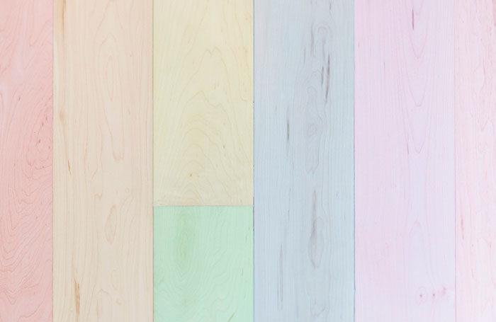
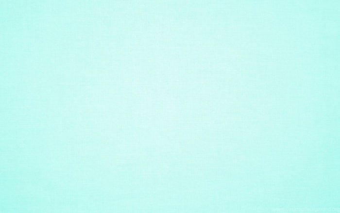
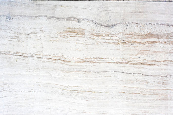
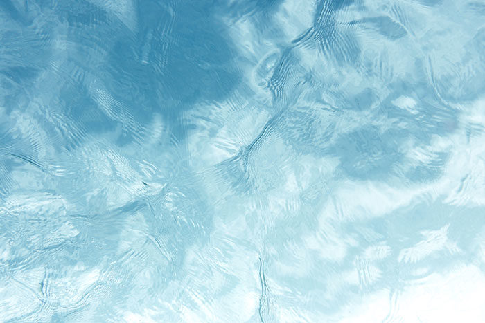
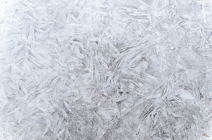
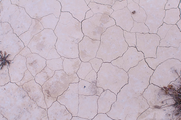
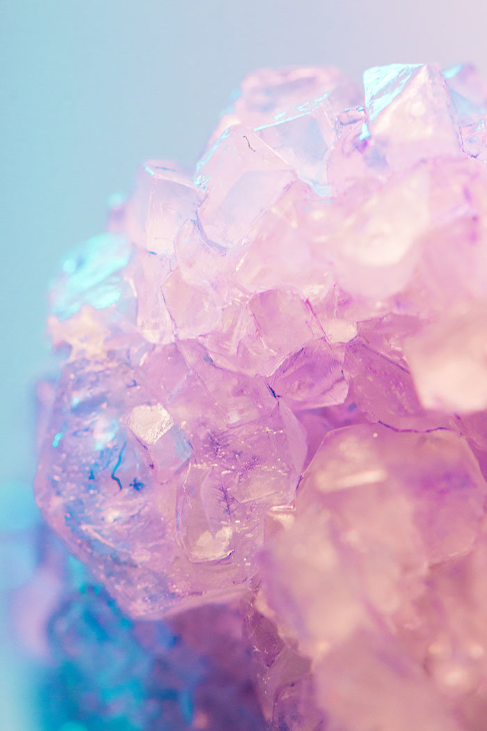
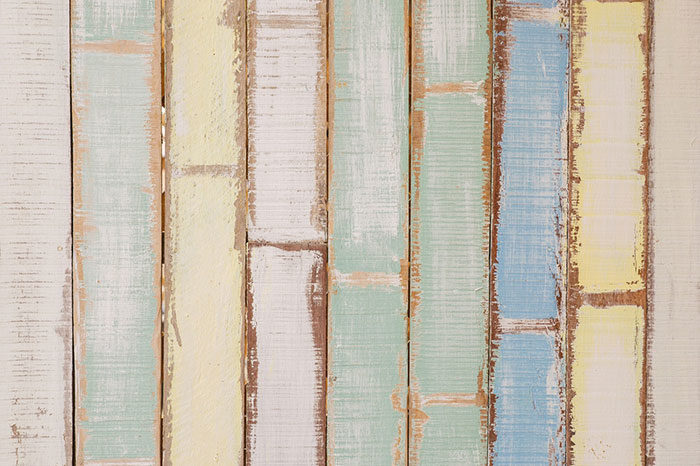
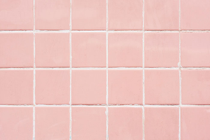
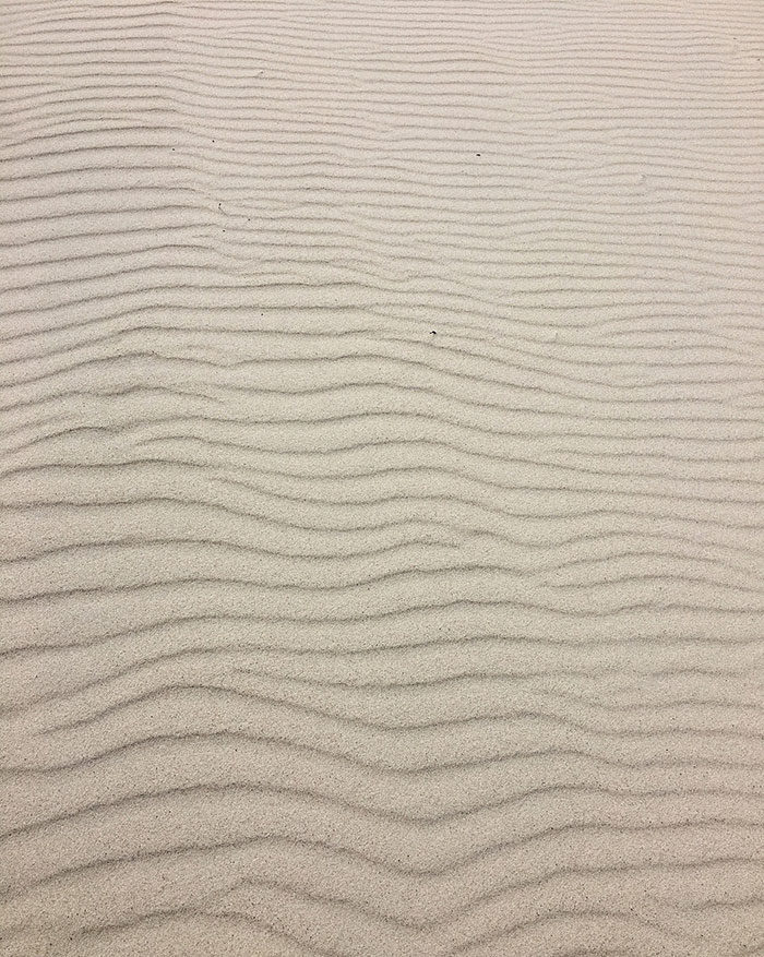
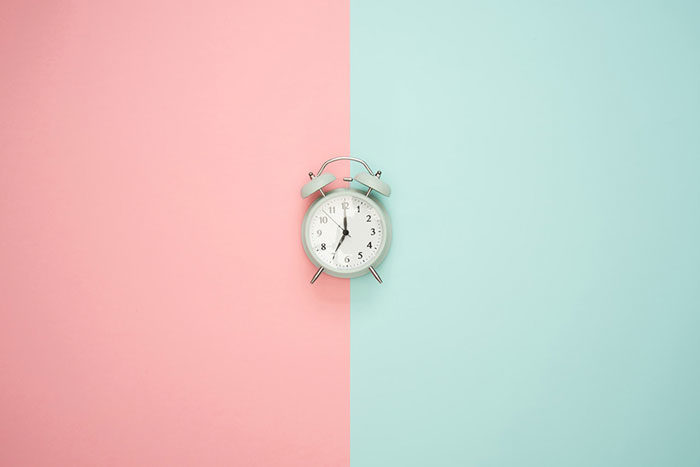
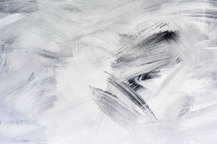
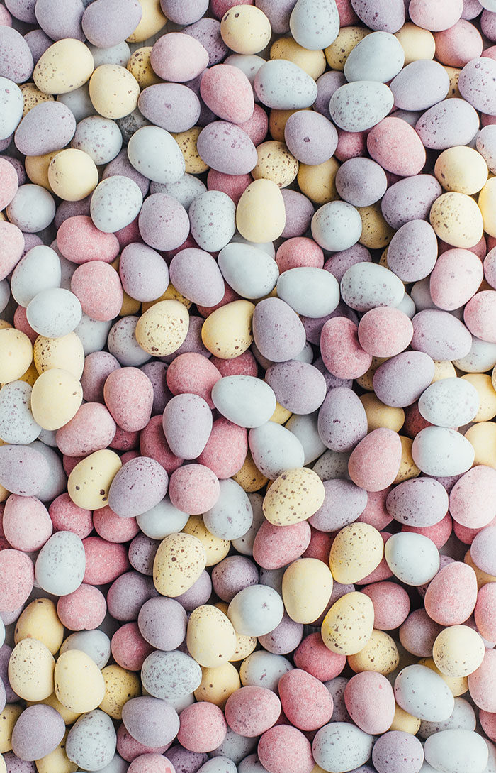
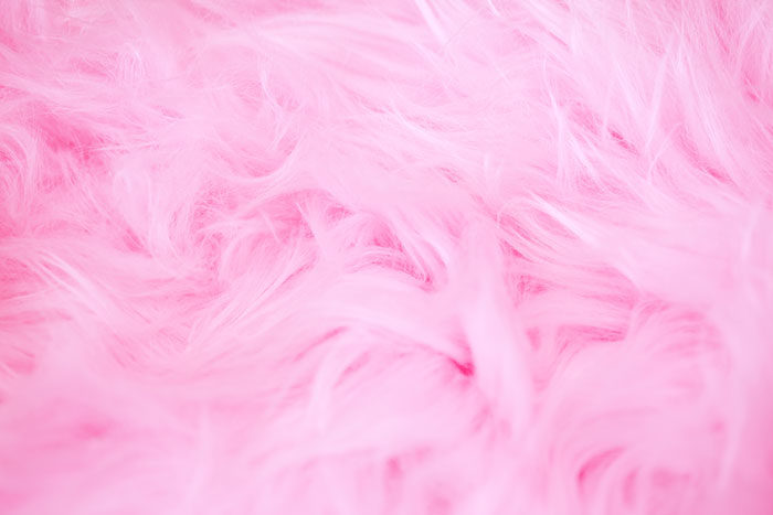
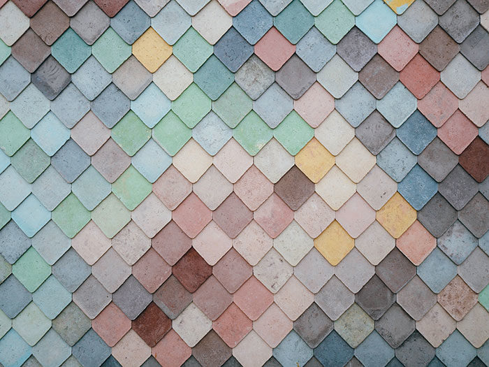
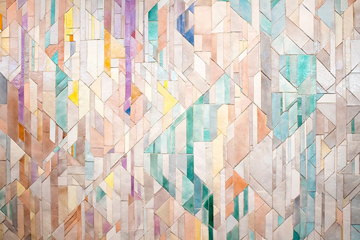
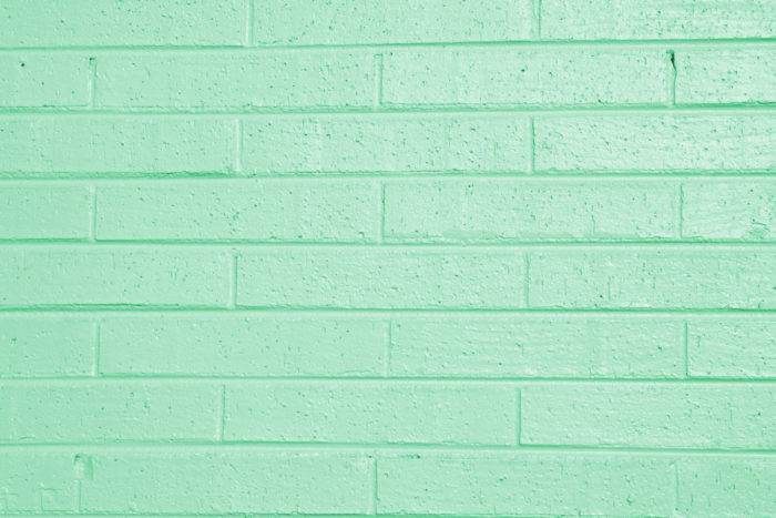
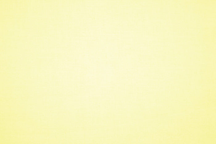
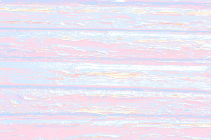
Pastel Color Background Images To Check Out


FAQ on pastel color backgrounds
What exactly is a pastel color background?
Pastels? Oh, they’re the chilled-out cousins in the color family. Think wallpapers that don’t shout but still make a statement. Soft, light hues, baby blues, and pinks—they’ve got a way of turning the volume down on a design, making everything feel a little more zen.
Where can I find pastel color background examples?
Alright, so you’re looking for inspo. Dive into platforms like Pinterest, or check out design sites like Behance. Artists and creators there, they’re always showcasing pastel palettes in action. Or just type ‘pastel aesthetic wallpaper’ into your search bar and watch the magic unfold.
How do I choose the right pastel color background for my project?
You’ve gotta feel the mood. Pastel backgrounds set the stage—a tranquil backdrop for presentations, or maybe an artsy splash for digital paper. Think about what emotions you’re aiming to evoke. Soothing lavender or a joyful yellow? Match the vibe with the pastel hue.
Can pastel color backgrounds work well for professional designs?
Absolutely! Think minimalist presentation decks, soft-colored graphics for annual reports, or a serene backdrop on a business website. Pastels can be super professional. They whisper where others scream, giving your design a modern edge that’s never in your face.
Are pastel color backgrounds a trend or timeless?
Pastels? Timeless, buddy. Sure, they have their moments in the trend spotlight, but they’ve been a staple in art and design forever. They morph with the times—retro, then modern, but always keeping that dreamy, nostalgic charm.
What tips can you give on pairing fonts with pastel color backgrounds?
The key’s contrast, but the gentle kind. A sharp black font against pastel? That’s a classic. Or something soft like a muted gray—complements without overpowering. Just make sure your text pops enough to be legible. Play around with weight and size too.
How do I create a pastel color background in Adobe Photoshop?
Oh, Photoshop can whip up pastels in no time. Start with a blank canvas, pick a light hue, mix in some white—maybe play with the opacity. Use gradients for a multi-tone effect or watercolor brushes for that textured look. Pastels in Photoshop are a designer’s playground.
What’s the best way to use pastel colors in web design?
Pastels in web design? They’re like a breath of fresh air. Used right, they make everything look crisp and clean. A soft background with clear navigation icons, light-colored buttons—users love it. Trust me, it turns browsing into a visual vacation.
Can pastel color backgrounds help in branding?
For sure. Branding with pastel backgrounds? That’s building identity with a touch of elegance. It’s subtle but speaks volumes about the brand’s personality—a gentle approach, an eye for aesthetics. Can make your brand feel approachable and down-to-earth.
What are the psychological effects of using pastel color backgrounds?
Pastels have power. They can calm a racing mind or warm a cold day—color psychology 101. Different shades carry different vibes; light pinks for warmth and nurture, cool blues for calm and focus. They influence feelings, softly shaping the environment’s mood without a sledgehammer.
Conclusion
So there we have it, a whole spectrum of pastel color background examples has been paraded before your eyes. It’s like we’ve walked through a gallery where the walls hum with muted rainbows, each canvas a soft whisper of color meant to inspire or soothe or just plain make you happy.
Let’s do a quick recap:
- Those pastel-shaded textures? They’re your go-to when you want design that doesn’t scream for attention.
- Stumbled upon a soft color palette that felt like a spring morning? Yeah, that’s the charm of pastel.
- Muted colors design thinking about those creams and pale greens for a minimalist background? Nailed it.
With a few pastel hues, the right shades can touch the essence of a brand, the heart of a personal project. They speak without noise, proving that in a world full of bold and bright, sometimes the softest touch leaves the deepest impression.
If you enjoyed reading this article about pastel background textures, you should read these as well:
- Pastel colors: The basics, usage, and website color schemes
- Pink background images to use in your design projects
- Fall background images that you can use in your designs
- Clouds background images to use in your design
- Wood background textures that you can add in your designs
- Blue background textures and images
- Red background images and textures