
Pink is a highly evocative color. Using a pink background for your website or even your desktop computer or phone can stir all kinds of emotions. Pink isn’t just a one-dimensional color.
The pink color can mean many different things. Pink is commonly associated most closely with caring, compassion, and love. The color pink is often used to convey unconditional love and understanding.
It seems a lot of use when people want to communicate something about giving and receiving care. Pink is also used to convey romance, intimacy, femininity, love, care, and consideration.
It has a sense of insight and intuition that also displays tenderness and kindness, thanks to its sensitive and empathetic feel. The color meaning of pink in color psychology is hope. This color inspires positive feelings and comfort.
It makes people more optimistic, helping them to think that everything will be okay in the end. After all, people do say “everything is rosy” to convey that things are going well (sometimes sarcastically) and rose pink is a shade of pink.
Because pink comes from a mix of red and white, it has a little bit of the traits of those colors. There’s a bit of red’s list for action, passions, and power in a pink background, as well as white’s opportunity, success, insight, purity, and openness.
Pink gives you a chance to make use of the sheer potency of the color red while keeping it from being overwhelming. Pink is a more balanced color.
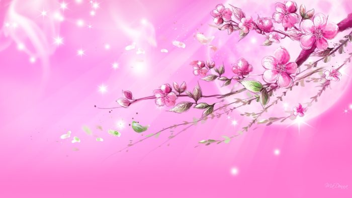
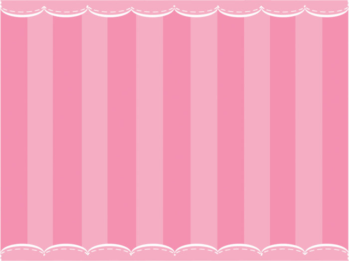
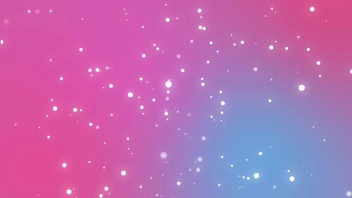
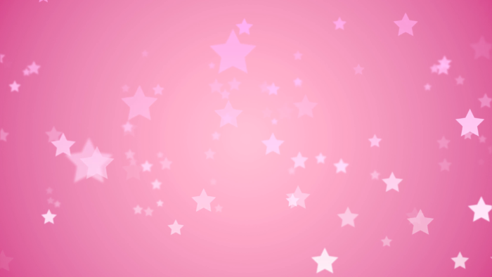
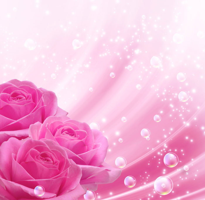
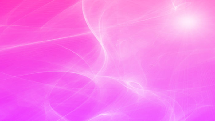
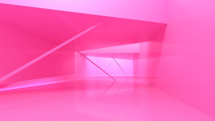
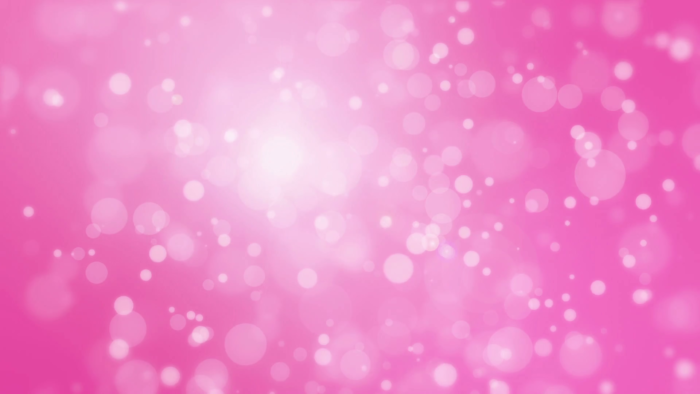
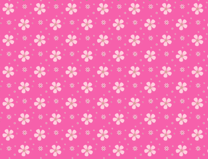
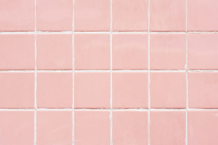
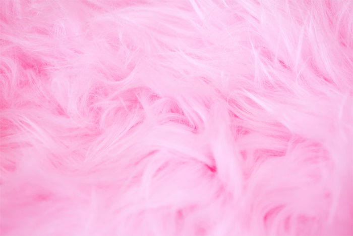
Pink background images to check out


Exploring the Meaning of Pink
Pink is generally just a very calming color. It helps tone emotions down an helps to relieve any sense of anger, aggression, or neglect someone may be feeling. Studies show that pink has a physiologically calming effect and can even cause actual physical weakness.
Pink has been used to treat violent and aggressive prisoners by putting them in rooms with pink walls over a period of time. However, overexposure may result in a kind of immunity to the color pink, mitigating these effects.
Pink can be useful for helping people get in touch with their thoughtful and caring sides. This can make it useful for situations when you want to get people to think about giving or receiving care for others.
A pink background is a particularly good choice if your target market is primarily composed of women. The color pink is often associated with youthful femininity, making people think of innocence and bubblegum.
Use Pink To Take Viewers Back to Their Childhood
The color pink appeals to everyone’s inner child. It stands for uncomplicated emotions, naivete, and inexperience. It is often associated with childhood and especially motherhood.
Using a pink background can take people back to a time they remember very fondly, making it great for a wide range of products, from candy to toys to vacation websites.
Use Pink to Make a Statement
Pink has its own sort of vibrant feel, especially hot pink. It has a particular association with retro looks, whether they’re ‘80s neon or ‘70s psychedelic. Powerful hot pink colors shades can be used to grab people’s attention immediately.
Use Pink as a Neutral Color
A toned down pink works well as a neutral color. It has an earthy look, but still retains pink’s sense of caring and warmth. A light pink background is a nice subtle way to take advantage of the color pink’s unique traits without being too overwhelming feminine.
The Psychology of the Color Pink
Pink isn’t just light red. Pink stands for sincerity, romance, love, and sophistication. It lacks all of red’s angry and violent connotations, instead of being quite soothing and gentle.
Use pink for feminine sites that are geared towards (or about) women and young girls.
Avoid using gaudy hot pink and light pink when they seem too sweet or sentimental for a more professional website.
What Colors Go With Pink?
Green
To get an idea of why this color combination works so well, consider the color balance fo a pink rose. It artfully displays pink and green together in one flower. Even with this example of natural coexistence, it’s not always ideal.
A dark forest green may not work well with a very pale pink. However, a light pink and a pale green tend to look wonderful together. Dark shades and light shades have a tendency to look a bit off, so be careful.
Pink
Different shades of pink can work together very well for an ultra-feminine look. Try using a rose pink with a pale pink, for example.
Pinks that are just a few shades away from each other usually look best when paired together. The result is much more striking than you might think and can be very soothing.
Orange or Purple
Both orange and purple are on either side of pink on the color wheel. This can result in a vibrant color scheme. Purple and pink together communicate a child-like sweetness, ideal for feminine websites or even websites for candy stores.
Pink and orange are lively and almost psychedelic. Be sure to choose a pink that stands out if you pair it with orange, otherwise, the two colors may blend together just enough to be hard to tell apart at a casual glance.
Blue or Yellow
Pink and blue combine into a lot of really striking color schemes, including navy blue and fuschia. Pink and yellow may seem too “tame” to go together, but in fact, will convey a sunny and tropical feel. Use shades of pink, blue, and yellow together for a dazzling look.
What’s interesting is that this is essentially a way of using all three primary colors (blue, yellow, and red) together without giving anyone a headache, since pink is for the intents and purposes of the color wheel just light red.
Black, White, or Brown
These three neutral will go with any color. Black and pink are sleek, sophisticated, and surprisingly adult together. White and pink is a classic innocent and feminine color scheme that is still very striking.
Pink and brown are less intuitive, but they can work very well together, particularly if you are using a chocolate brown or a cinnamon brown with a number of pink shades.
FAQ about pink backgrounds for designers to use
Where can I find some amazing pink backgrounds for my designs?
You’re in luck! There are tons of websites that offer a plethora of pink backgrounds for your creative projects. Some of my favorites include Unsplash, Pexels, and Shutterstock. These platforms provide high-quality images and backgrounds, many of which are free to use. Just make sure to check the licensing and attribution requirements before you download any image.
Are there any specific shades of pink that are trendy right now?
As a matter of fact, yes! There are a few shades of pink that are quite popular these days. Some of the hot trends include millennial pink, which is a soft, muted shade, and living coral, which is a vibrant, energetic hue. Of course, trends are always changing, so it’s essential to stay up-to-date with the latest color forecasts from Pantone and other industry sources.
How can I create my own custom pink background?
Ah, creating your own custom background is a fantastic idea! You can use graphic design tools like Adobe Photoshop, Canva, or Affinity Designer to make unique, personalized pink backgrounds. These platforms offer different shapes, patterns, and textures that you can combine to create your own masterpiece. Just experiment with different shades and elements to get the perfect background for your design.
What are some design tips for using pink backgrounds effectively?
To make the most out of your pink background, consider the following tips:
- Contrast: Pair your pink background with complementary colors, such as green or blue, for maximum impact.
- Balance: Use different shades of pink or combine them with other colors to create harmony in your design.
- Hierarchy: Pink can be used to highlight important elements in your design, such as headings or call-to-actions.
Remember, less is often more, so don’t be afraid to let your pink background speak for itself!
Can I use pink backgrounds for professional projects?
Absolutely! Pink backgrounds can be used effectively in professional settings, as long as you choose the right shade and design elements. For example, a subtle pastel pink can convey a sense of warmth and sophistication, while a bold, hot pink might be more suitable for creative or unconventional industries. Just make sure your background complements your brand identity and target audience’s preferences.
What emotions do pink backgrounds evoke?
Pink is often associated with feelings of love, warmth, and nurturing. Different shades of pink can evoke various emotions, ranging from playful and fun (think bubblegum pink) to calming and serene (like blush or rose). When using pink backgrounds, consider the emotions you want to convey and choose the appropriate shade to match your desired tone.
Are there any cultural considerations when using pink backgrounds?
Yes, cultural factors should be taken into account when using pink backgrounds. While pink is often seen as a feminine color in Western cultures, it may not carry the same connotations in other parts of the world. Do some research to understand your target audience’s cultural preferences and make sure your design choices are appropriate and inclusive.
What are some industries where pink backgrounds are popular?
Pink backgrounds are popular in various industries, including fashion, beauty, and interior design. You might also see pink backgrounds in marketing materials for events like weddings, baby showers, or Valentine’s Day promotions. However, don’t be afraid to break the mold and use pink in unconventional ways—it could help your design stand out from the crowd!
How do I make sure my pink background doesn’t overpower my design?
To avoid overwhelming your design with pink, follow these simple tips:
- Balance: Use a mix of colors, including neutrals like white, gray, or black, to create a harmonious design.
- Proportion: Reserve pink for specific elements or areas in your design, such as accents or highlights, rather than making it the dominant color.
- Hierarchy: Ensure that your text and other key design components remain easily legible and don’t get lost against the pink background.
By carefully considering these factors, you can create a visually appealing design that doesn’t let the pink background overpower the overall aesthetic.
What file formats should I consider when downloading pink backgrounds?
When downloading pink backgrounds, you’ll typically find them available in various file formats, such as JPEG, PNG, and SVG. JPEG is a common format for raster images, while PNG offers the advantage of a transparent background for easy layering. SVG is a vector format that allows for easy resizing without losing quality. The choice of format depends on your specific design needs, but it’s a good idea to have a background in multiple formats to ensure compatibility with different design tools and platforms.
Ending thoughts on using pink background images
A pink background can be just what your website needs to communicate what your organization does. It is a caring yet powerful color that soothes but is far from bland. If you are trying to think about your website’s color scheme and keep running into mental blocks, give the color pink a think.
You can even edit the photo background to make it pink. This way, you can try out different shades of pink and choose the one that goes with the branding of your blog, website, or social media page.
If you enjoyed reading this article about Pink background images, you should read these as well:
- Fall background images that you can use in your designs
- Clouds background images to use in your design
- Wood background textures that you can add in your designs
- Blue background textures and images
- Red background images and textures
- Purple background images and textures
- Free wooden background images and textures
- Neat stars background images