

Picture the roar of the crowd, a sea of black and gold, and centrally placed, the emblematic Fleur-de-lis shining proudly – the emblem of passion, the New Orleans Saints logo.
Anchored in the heart of Louisiana, this symbol transcends mere design; it encapsulates spirit, history, and sportsmanship in one bold flourish.
Trekking beyond its aesthetic charm, we dive into the vortex of football iconography where this logo stands as both beacon and brand.
The chronicles of this emblem weave through crescent city football culture, NFL team emblems, and the thunderous Superdome – each a narrative thread in the Saints’ fabric.
By article’s end, unveiled will be the logo’s lineage, its symbiotic tie to New Orleans culture, and its evolution alongside NFL branding strategy.
With a lens focused on sports team branding and the pulsing heart of merchandise, prepare for a journey into the core of what makes the Fleurs truly iconic.
En route, we will navigate through design elements, color palettes tied to local identity, and the strategic orchestration of fan engagement – facets essential for aficionados and aesthetes alike.
The Meaning Behind the New Orleans Saints Logo
![]()

The fleur-de-lis, a symbol that’s both elegant and resilient, just like the city it represents. Dive into what this iconic emblem stands for!
Spirituality and Heritage
The fleur-de-lis has its roots deep in medieval European history. Primarily associated with the French monarchy, it’s a symbol of perfection, light, and life. Similarly, “Saints” in the team name implies a spiritual dimension.
The fusion of this spiritual element with a historic symbol speaks volumes about the team’s identity and connection with the city’s roots.
Resilience and Determination
Post-Katrina, the emblem also stands as a badge of resilience, representing a city that bounces back no matter the challenges thrown its way. When you see that fleur-de-lis, remember: it’s not just about football, it’s about the spirit of New Orleans.
The History of the New Orleans Saints Logo
![]()

Let’s time-travel a bit and delve into the fascinating timeline of this iconic logo.
Humble Beginnings
Back in 1967, the New Orleans Saints burst onto the NFL scene. Their logo? The fleur-de-lis, a symbol already synonymous with New Orleans. It was an immediate hit, cementing the bond between the city and its new football team.
Evolution and Tweaks
Though the core design remained, subtle changes in shade and styling have been introduced over the years. Each iteration aiming to reflect the contemporary design language while staying true to the original emblem.
The Colors of the New Orleans Saints Logo
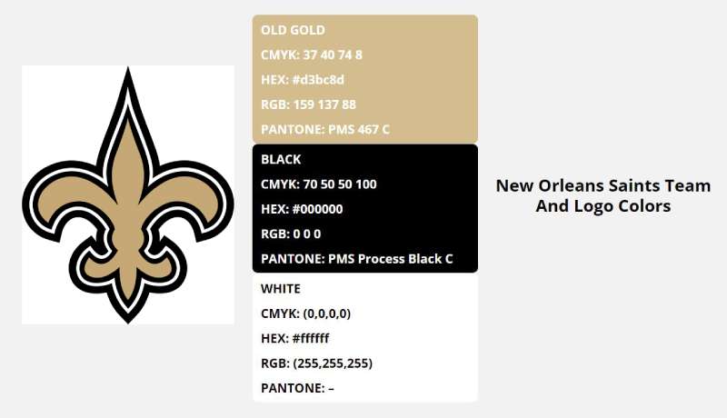

Gold and black – not just colors, but emotions, vibes, moods.
Gold
Represents excellence, grandeur, and the pursuit of greatness. It’s no surprise that this royal hue is central to the Saints’ identity.
Black
Black speaks authority, power, and mystery. When you see those black jerseys on the field, you’re looking at a team that means business.
The Font Used in the New Orleans Saints Logo
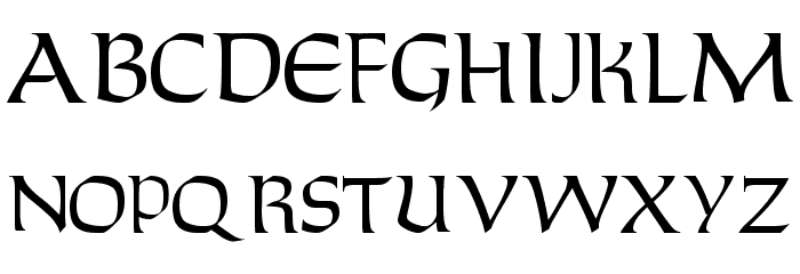

Ever noticed that sleek yet impactful lettering on the logo? Let’s decode that.
Stylish and Bold
The font resonates with strength and agility. Modern and dynamic, it beautifully complements the historic fleur-de-lis, creating a perfect balance between the old and the new.
Consistency
While the logo witnessed tweaks, the font has remained consistent, symbolizing the unwavering spirit of the team and its supporters.
Iconic Moments with the Logo
Alright, sports buffs! We gotta reminisce some goosebump-inducing memories, right?
Super Bowl XLIV
Who can forget 2010? The Saints, donning their emblem, clinched their first Super Bowl title. That fleur-de-lis wasn’t just a logo that day; it was a beacon of hope and victory.
The Dome’s Roar
Be it a routine game or a high-octane playoff match, the logo resonates with the roar of the Mercedes-Benz Superdome, painting memories, one game at a time.
The Influence Beyond Football
The logo isn’t limited to the football field. Its reach is far and wide.
City’s Cultural Fabric
From murals to Mardi Gras, the logo has intertwined itself into New Orleans’ cultural fabric, becoming more than just a sports symbol.
Merchandise and Beyond
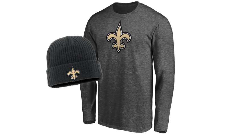

Caps, tees, mugs, tattoos – the fleur-de-lis is everywhere. It’s transcended beyond a mere logo to become a lifestyle for many in and beyond New Orleans.
FAQ On The Orleans Saints Logo
What does the New Orleans Saints logo represent?
The logo, a distinctive Fleur-de-lis, is a revered symbol tied intricately to the rich tapestry of New Orleans culture. It embodies resilience, heritage, and a deep bond with the community.
Standing as more than an NFL team emblem, it signifies the unyielding spirit of both the city and its beloved Saints.
How did the New Orleans Saints choose their logo?
Amidst the birth of the franchise, the Fleur-de-lis was chosen for its strong historical significance to New Orleans. It’s a French symbol resonating with the city’s past.
Selected for its representation of unity and tradition, the logo has become synonymous with the team and the region’s identity.
Can the New Orleans Saints logo be used commercially?
Usage of the Saints logo is tightly regulated, especially for commerce. NFL logo guidelines are strict; permission and licensing are critical for commercial use.
Merchandise must be officially sanctioned, protecting the sports team branding and ensuring quality and legitimacy for passionate football fans.
Has the New Orleans Saints logo changed over time?
Indeed, since its inception, the logo has undergone subtle refinements but the core design—the Fleur-de-lis—remains steadfast.
Color adjustments and graphical enhancements reflect evolving design trends, keeping the team’s identity fresh yet familiar within the ever-dynamic NFL branding strategy.
Are there any restrictions on using the New Orleans Saints logo for personal purposes?
While personal, non-commercial use, like fan art, is generally more lenient, it’s wise to respect copyright laws. Replicating the logo for personal gain or misusing its iconic status, still falls under legal scrutiny.
What is the significance of the logo’s colors?
The black and gold palette in the logo is not arbitrary. Gold epitomizes the triumphs and achievements, while black reflects the strength and determination. These colors have become integral to the Saints fan gear, evoking the very essence of the team’s fighting spirit.
How often do the New Orleans Saints update their logo?
Updates are infrequent; maintaining a consistent image is crucial for brand identity in sports. Minor tweaks may occur to stay contemporary but any significant changes would merit a grand unveiling to ensure a smooth transition in fans’ hearts and the merchandising ecosystem.
Is the New Orleans Saints logo trademarked?
Absolutely, the logo is a legally protected trademark. This safeguards team interests against unauthorized usage and ensures that any sports logo licensing maintains the integrity and value of the New Orleans Saints and NFL identity.
How does the New Orleans Saints logo impact team merchandise sales?
The logo is a juggernaut in driving merchandise sales. As a symbol fans rally behind, it’s plastered on everything from jerseys to keychains. Its lure is undeniable, propelling sales and fortifying the team’s place in both the sports and local business sectors.
What are common mistakes people make regarding the New Orleans Saints logo?
A common blunder is the unauthorized replication or alteration of the logo. Misuse can lead to infringement issues.
Another mishap is mistaking older logo versions for current branding, leading to outdated representations of the team’s image, which can skew the perception of the logo’s history and evolution.
Conclusion
As we draw the final stokes on our exploration of the New Orleans Saints logo, it’s vital to crystallize its essence: a beacon within the NFL’s panorama, an emblem woven through the cultural fabric of New Orleans, and an insignia of more than just a football team—a community. With each discussion of its hues, the Fleur-de-lis, and the pulse of merchandising, a shared understanding emerges.
Here’s what etches in memory:
- Fleur-de-lis: More than a design; it’s an embodiment of legacy.
- Black and Gold: A duo that narrates tales of resilience and triumph.
- Brand Identity: Unwavering amid the tides of time, it anchors the Saints firmly in the heartlands of Louisiana and the broader NFL narrative.
Momentum forged from history, fandom, and the artistry of sports branding, the logo stands indisputable in its power to command presence and allegiance. The future? Unwritten still, yet one can be certain; the emblem’s journey mirrors that of its city—forever marching forward, distinctly unstoppable, eternally Saints.
If you liked this article about the New Orleans Saints logo, you should check out this article about the Pittsburgh Steelers logo.
There are also similar articles discussing the Los Angeles Chargers logo, the Minnesota Vikings logo, the San Francisco 49ers logo, and the Seattle Seahawks logo.
And let’s not forget about articles on the Chicago Bears logo, the Houston Texans logo, the New York Jets logo, and the Indianapolis Colts logo.