

Embarking on a visual odyssey, we unveil the saga behind the emblem that rallies a legion of warriors and loyalists alike—the Minnesota Vikings logo.
A tapestry of royal purple and gold, this Norseman effigy is not just a crest; it’s the pulsating heart of a cultural phenomenon that transcends the gridiron.
It’s the alchemy of history, heritage, and pride that molds a logo’s essence. My journey through design unveils that enigma. Here, I pull back the veil on an icon, intricate in its simplicity, robust in its representation.
Ensconced in the NFL’s valiant pantheon, we start where passion meets artistry.
With an artisan’s precision, this article parses threads of gridiron Norse imagery and brand evolution. You’ll pierce the helm of the Twin Cities football team symbol to discover what lies beneath.
As we traverse the peaks and valleys of sports branding and fan engagement, expect to emerge armed with insight into the almighty role of sports insignias—where every stitch and hue narrates a tale.
The Meaning Behind the Minnesota Vikings Logo
![]()

Hey there! So, you wanna dive deep into the Minnesota Vikings logo, huh? Let’s get into it.
The Mascot
First and foremost, the logo’s centerpiece, a stoic Norseman. Vikings! Yeah, those sea-faring Scandinavians from way, way back. It’s not just a cool-looking dude with a horned helmet; it’s a symbol of strength, endurance, and exploration.
Represents the spirit of the team and their fierce determination on the field. Cool, right?
The Helm
Horns aside, the helmet is pretty slick. Helmets were major protection for Vikings against, well, everything. Just like our team on the field, always prepared, and ready for battle. The emblem captures that readiness and resilience.
The History of the Minnesota Vikings Logo

Alright, let’s time-travel a bit.
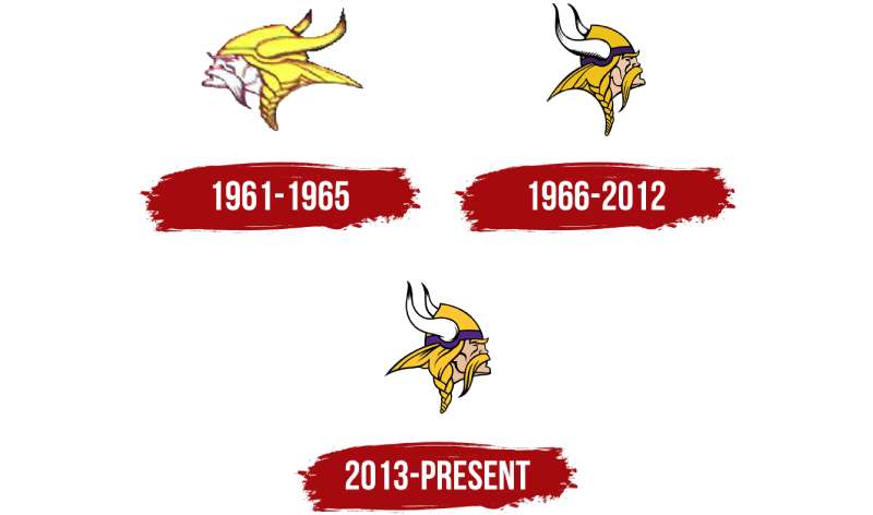
The Birth of the Norseman
When the team was birthed in 1961, so was the logo. Not a lot of tweaks since then, which shows how iconic and timeless the design has been. Through the decades, while jerseys might’ve changed and players have come and gone, the Norseman? He’s been consistent.
Evolution, but Not Really
There were minor tweaks here and there. Some line adjustments in 2013 to give it a modern touch, but the essence? Still the same. Why change what’s already epic?
The Colors of the Minnesota Vikings Logo

Color is everything in design. Trust me.
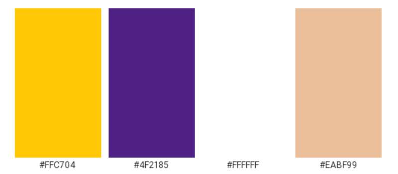
Purple and Gold
It’s more than just looking snazzy. The deep purple represents royalty, richness, and ambition. Then there’s the gold/yellow, lighting up the logo with optimism, energy, and happiness. Together? They’re magic, showcasing the team’s noble spirit.
White and Black Accents
They may be subtle, but they’re vital. White speaks of purity and innocence, while the black gives depth and perspective.
The Font Used in the Minnesota Vikings Logo

Fonts, my friends, are the unsung heroes.
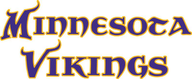
Bold and Sturdy
Look at that typography. It’s not just about being readable. That boldness? It screams confidence.
The unique curvature? A nod to their Norse heritage. It complements the logo, balancing between history and modernity.
Pop Culture and the Minnesota Vikings Logo
Movies and TV
Ever noticed how often this logo pops up? From movies to TV shows, when they need a representation of heart, grit, and undying spirit, who do they call? Yep. Our Norseman.
Merch and Madness
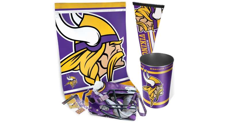

Merchandise! From hats to hoodies, the Minnesota Vikings logo has been flaunted by fans and fashionistas alike. It’s become more than just a team logo; it’s a style statement.
The Art of Designing a Legendary Logo
Simplicity is Key
The Vikings logo teaches us that sometimes, simplicity triumphs. No need for a thousand elements. Just a strong symbol, and boom! Instant recognition.
Consistency Matters
Consistency in branding is everything. Changes over the years? Minimal. And look where it’s got them. Always recognizable, always on point.
FAQ On The Minnesota Vikings Logo
What is the significance of the Minnesota Vikings logo?
The Norseman depicted in the Minnesota Vikings logo serves not just as an emblem but as a nod to Minnesota’s rich Scandinavian heritage.
Its distinctive appearance symbolizes the courage and exploratory spirit echoed by the state’s ancestors, anchoring the team’s identity within a historical context worthy of epic sagas.
Has the Vikings logo evolved over time?
Indeed, akin to many NFL logo designs, the Minnesota Vikings’ logo has undergone subtle yet impactful transformations since its inception.
Each iteration reflects the convergence of tradition with contemporary aesthetics, ensuring the logo resonates with each generation while maintaining its core symbolic strength.
What do the colors in the logo represent?
Imbued within the Vikings logo are colors of royalty and battle: purple and gold. Purple signifies valor and nobility, reminiscent of regal cloaks, while gold echoes the treasures sought by Viking explorers.
Together, they encapsulate prominence and achievement, essential elements of the franchise’s brand identity.
Is the Vikings logo a trademark?
As with significant sports brands, the Minnesota Vikings logo is a registered trademark, zealously guarded to maintain exclusive rights.
This ensures that the emblem remains an unaltered beacon of the team’s legacy, protected from unauthorized replication or use that could dilute its iconic stature.
How does the Vikings logo compare to other NFL team logos?
The Vikings logo stands as a paragon of distinctiveness, with the fierce Norseman’s profile instantly recognizable.
Unlike some logos that rely on lettering or animals, the Minnesota Vikings’ figurehead exudes a unique persona that encapsulates the team’s spirit and the region’s historical references.
Can fans use the Vikings logo on personal items?
Die-hard enthusiasts can indeed showcase the Vikings horn logo on personal items, but within the confines of fair use.
As long as it’s not for commercial gain, sporting the logo on fan apparel, tailgate gear, or social media avatars embodies the passion of the Twin Cities football team‘s following.
What was the inspiration behind the Vikings logo design?
The stirrings of the Viking age gave life to the logo, drawing on bold Norse imagery. The iconic silhouette hearkens back to seafaring conquerors, while emulating the modern sports branding success formula—a distinctive, readily identifiable, and emotionally charging symbol that fans can rally behind.
How often do the Vikings update their logo?
Alterations to such a storied emblem come sparingly. While minor tweaks have refined its features, ensuring crispness across new-age digital platforms, the core elements and lineage of the Minnesota sports team logo have perennially stood firm—a testament to enduring brand values.
How does the Vikings logo impact team merchandise sales?
The might of the Vikings logo in merchandising is colossal, serving as a rallying emblem that adorns a vast array of products.
From jerseys to helmets and accessories, the Minnesota Vikings brand images have proven to be a potent force in driving sports merchandise sales, both locally and nationally.
What materials are used to create the logo on team helmets and gear?
Crafted to withstand the rigors of combat on the gridiron, the logo on team helmets employs durable, high-quality decals.
Similarly, the emblems that grace Vikings gear, whether embroidered or screen-printed, adhere to high standards ensuring longevity and vibrancy, befitting champions of the National Football League.
Conclusion
In the vast expanse where design and affinity collide, the Minnesota Vikings logo stands as a monolith. Its contours and hues have now become as familiar as the very sport it represents. Exploring its saga reveals the sinew and soul of a brand that’s more than just a franchise; it’s a beacon for the Twin Cities and beyond.
Draped in regal purple and gold, the emblem encapsulates the convergence of history, culture, and modernity. Its evolution, measured and reverent, reflects a commitment to maintaining a legacy that stretches beyond the limits of the field.
- Norwegian valor
- Spielman’s legacy
- A Nordic symphony in design
As the last echo of the Skol Vikings chant fades, what lingers is a deeper appreciation of the meticulous craftsmanship that makes the Viking emblem an undying symbol of pride. Here is where tradition meets ambition, and every rendition of this iconic logo whispers the intrepid spirit of Minnesota.
If you liked this article about the Minnesota Vikings logo, you should check out this article about the Pittsburgh Steelers logo.
There are also similar articles discussing the Los Angeles Chargers logo, the San Francisco 49ers logo, the Seattle Seahawks logo, and the Chicago Bears logo.
And let’s not forget about articles on the New Orleans Saints logo, the Houston Texans logo, the New York Jets logo, and the Indianapolis Colts logo.