

Imagine a simple curve and two dots triggering an instant craving for a juicy, succulent burger.
You’ve just thought of the McDonald’s logo, right? A universally recognized icon, splashed across cities worldwide, whispering ‘familiarity’ wherever you land. Ah, but that’s just the tip of the iceberg.
Let’s zoom in. The design, those colors, the implicit promises it carries. As a connoisseur of creativity, here’s where I weave you through the tapestry of this logo’s tale.
An emblem not just of speedy service but of an experience that’s echoed across globes and generations.
By the final dot of this article, you’ll have uncovered the essence behind the golden arches. We’re diving deep into the psychology of color, teasing out the finesse of visual identity, and maybe, just maybe, cracking the code of why this logo feels like coming home.
So, buckle up, as we’re about to embark on a design odyssey, unpacking a logo’s journey from mere graphic design to becoming a cornerstone of the fast food industry. No fluff—just the meaty good stuff.
The Meaning Behind the McDonald’s Logo

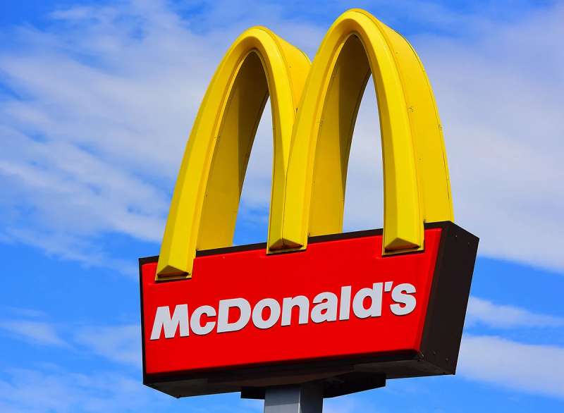
The Golden Arches
Alright, so let’s talk about the McDonald’s logo. You know, the one with the Golden Arches? Well, there’s more to it than just a cool design.
It represents something much deeper. You see, the arches are meant to symbolize a feeling of warmth, comfort, and familiarity.
Now, I bet you’re wondering how a couple of arches can evoke such feelings, right? Well, they’re actually inspired by the architecture of the original McDonald’s restaurants.
Back in the day, they had these massive arches on either side of the building. So, when people saw the logo, they would instantly recognize the brand and remember the good times they had at the restaurant.
Connection to Home
But wait, there’s more! The McDonald’s logo also aims to create a connection with the idea of “home.”
You see, the color yellow is often associated with happiness and warmth, and the arches themselves resemble the letter “M,” which could stand for “McDonald’s,” or even “Mom” or “Mother.” After all, what’s more comforting than a mother’s love and a home-cooked meal?
The History of the McDonald’s Logo

The Beginning
Now, let’s dive into the history of the logo, ’cause it’s quite a journey. The story begins in the 1950s when the McDonald brothers opened their first restaurant.
They used a simple, but effective logo featuring the words “McDonald’s Famous Hamburgers” in red on a white background.
The Evolution
As the brand grew, so did the need for a more recognizable logo. In 1961, Ray Kroc, the man who took McDonald’s to new heights, decided to change things up. He enlisted the help of designer Jim Schindler, who incorporated the now-iconic Golden Arches into the design.
Modernization
Fast forward to today, and you’ve got the sleek, minimalist logo we all know and love. The arches have been simplified, and the background has been removed, leaving just the unmistakable symbol of the brand.
The Colors of the McDonald’s Logo

Yellow and Red
When it comes to colors, the McDonald’s logo is all about red and yellow. These two colors were specifically chosen for a reason.
The red represents energy and excitement, while the yellow is all about warmth and happiness. Together, they create a perfect balance that makes you feel good every time you see the logo.
The Psychology of Colors
Believe it or not, there’s a whole science behind the way colors make us feel. Color psychology is a fascinating field that explores how different hues can evoke certain emotions and reactions.
So next time you’re munching on some fries, remember that the McDonald’s logo was designed to make you feel right at home.
The Font Used in the McDonald’s Logo

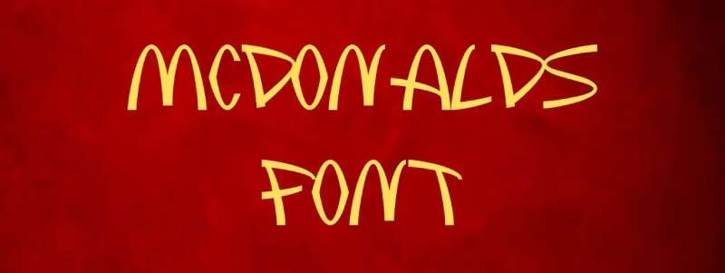
Simple and Bold
When it comes to the font used in the McDonald’s logo, simplicity is key. The bold, uppercase lettering is easy to read and instantly recognizable. The font, Helvetica, is a popular choice for many brands because of its clean, modern look.
Timelessness
Helvetica has been around since the 1950s, and it’s still going strong today. Its timeless appeal makes it the perfect choice for a brand like McDonald’s, which has been around for decades and continues to evolve.
The Impact of the McDonald’s Logo on Pop Culture
Recognizability
You can’t talk about the McDonald’s logo without mentioning its impact on pop culture. The Golden Arches are one of the most recognizable logos in the world, and they’ve become synonymous with fast food and American culture. Whether it’s in movies, TV shows, or music videos, the McDonald’s logo has a way of popping up everywhere.
Symbol of Globalization
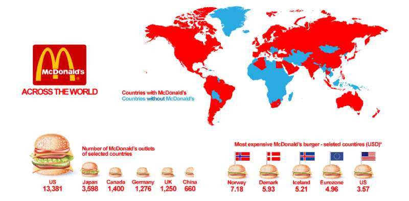

Moreover, the logo serves as a symbol of globalization. Wherever you go in the world, you’re likely to come across those familiar Golden Arches. They represent not just a place to get a quick meal, but the spread of Western culture and the global influence of American brands.
The Adaptability of the McDonald’s Logo
Flexible Design
Lastly, we should chat about how flexible the McDonald’s logo is. It’s been tweaked and altered over the years to fit various platforms and mediums. Whether it’s on a towering sign, a tiny mobile app icon, or a social media profile, the logo always stands out.
Cultural Adaptations
The McDonald’s logo also adapts to different cultural contexts. For instance, in some countries, the logo incorporates local scripts or changes color to better fit with the aesthetic preferences of the market.
This adaptability has helped McDonald’s maintain its global appeal and connect with customers all around the world.
There you have it, the story of the McDonald’s logo. From its humble beginnings to its modern incarnation, it’s a shining example of design done right. It’s simple, bold, and full of meaning – a testament to the power of great branding.
FAQ On The Mcdonald’s Logo
What’s the story behind the Golden Arches?
The arches started as part of the architecture, but in ’62 designer Jim Schindler morphed them into the M we all know. It’s not just clever design; it’s a branding masterstroke that screams McDonald’s faster than you can say “Big Mac.”
How has the McDonald’s logo evolved over time?
Short version: it’s simpler, more iconic now. From a detailed chef character to just the arches and name, it’s been trimmed down over the decades, going for that clean, unforgettable look. Peak minimalism, if you will.
What does the red and yellow color scheme mean?
Color psychology in play here; red grabs attention, stirs excitement, while yellow brings happiness, stimulates appetite. It’s a combo that has your brain thinking yum before you step foot in the door.
Is there a meaning behind the design of the McDonald’s logo?
Designer Ray Kroc wanted an advertising beacon – and it worked. The ‘M’ of the Golden Arches is a standout symbol of a quick, tasty meal. That’s honest visual communication for you, right?
Why is the McDonald’s logo so memorable?
Because it’s everywhere and consistent! Add to that the visual identity game – stark colors, bold design – and you’ve got a brand image that’s nearly impossible to forget. It’s like your brain’s in a cozy relationship with those arches.
How does the logo contribute to McDonald’s brand identity?
It’s the cornerstone, really. This logo encompasses reliability, efficiency, and that feel-good vibe. One glance and you know what you’re getting – from New York to Tokyo, the experience doesn’t change. That’s some powerful visual articulation, huh?
Has the McDonald’s logo won any design awards?
It hasn’t snagged a specific trophy, but let’s be real – it’s an all-star in the logo hall of fame. It’s got that je ne sais quoi that every designer hopes to capture.
What role does Ronald McDonald play in relation to the logo?
This clown was a hit for the younger crowd and turned up alongside the logo for years. Gave the brand a friendly face, you could say – integrating marketing and mascot seamlessly. Nowadays, you see more of the arches flying solo, though.
Can the McDonald’s logo be considered an example of successful corporate branding?
Absolutely, it’s textbook success! It’s the visual shorthand for chain restaurants, and a case study for budding marketers. The definition of nailing that corporate identity, branding doesn’t get much more on-point than this.
How does the McDonald’s logo affect customer perception of the brand?
It’s got some sort of magnetic pull. Shows consistency, efficiency, and that comforting feeling of familiarity. Customer perception is all about those happy feels. And the logo? It’s practically an ambassador of happiness.
Conclusion
Well, that’s a wrap. Picture this: the McDonald’s logo, splashed across the globe, a beacon of fast-food familiarity. We’ve chewed on the juicy details of the Golden Arches, from color psychology to visual identity gymnastics. It’s clear, isn’t it—how those arches do more than just signal tasty burgers and fries?
- They spark nostalgia.
- They promise a consistent feast.
- They’re the emblem of the quick-service delight.
And, ladies and gents, it’s no accident. This design saga, this close-knit weave of marketing savvy and graphic simplicity is precisely why those arches are etched into our collective craniums.
So, next time that radiant M catches your eye, appreciate the masterpiece. It’s not just a logo; it’s a cultural shorthand, a bite of design excellence that goes well beyond its fast food foundation. Here’s to the unsung hero of the burger world – golden, glorious, and oh so grand.
If you liked this article about the McDonald’s logo, you should check out this article about the Subway logo.
There are also similar articles discussing the Pizza Hut logo, the Arby’s logo, the Little Caesars logo, and the Dairy Queen logo.
And let’s not forget about articles on the Panda Express logo, the Shake Shack logo, the Domino’s Pizza logo, and the Chick-fil-A logo.