


Ever stared at a pizza box and felt an instant wave of hunger? The Dominos Pizza logo packs that punch, triggering a carousel of cheesy, saucy pizza slices in your mind.
Think about it; a mere glance at the iconic red and blue domino icon sends a message of hot meals delivered quick. Here’s the kicker – it’s not mere happenstance; it’s top-tier branding, pure and simple.
By journey’s end, you’ll unravel the mastery behind this emblem that stands as a beacon for pizza aficionados. Dive deep into the evolution of a visual identity that transcends mere graphic design.
We’re cracking open the design playbook! From the three dots symbolizing the first three stores to modern tweaks signaling tech-savvy order methods.
Ready for the juicy bits? We’ll dissect the brand recognition strategy, tug at the threads of the famed Domino effect imagery, and even spill secrets behind their “30 minutes or less” delivery lore.
Buckle up, the magic behind the Domino’s Pizza logo is more than a feast for your eyes; it’s a branding blueprint that’s the talk of pizza box design town.
The Meaning Behind the Domino’s Pizza Logo
![]()

Every logo has a tale to tell, a hidden message to deliver. The Domino’s Pizza logo is no different. So, what’s the story here?
The Power of Three
The iconic Domino’s Pizza logo sports three dots. These dots aren’t just for show, folks. In fact, they signify the first three stores that the company opened. Isn’t it amazing how the very foundation of the brand is illustrated right there in the logo?
A Visual Manifestation of the Brand’s Name
The logo also does a fantastic job at visually representing the company’s name. It’s a domino tile, folks! The two squares represent the two halves of a domino, and the dots bring in the essence of the game. Now, isn’t that clever?
The History of the Domino’s Pizza Logo
![]()

With time, a brand evolves, and so does its logo. Domino’s Pizza is no different. So how did the logo change over the years? Let’s dive into the past.
The Initial Days
The first logo of Domino’s Pizza was as simple as it could get. A single black domino tile. It was plain but set the tone for the brand’s identity.
The Era of Transformation
In the 1960s, the logo got a revamp. The single black tile was now blue and red, and sported the brand’s name. The three dots made their debut, symbolizing the first three stores.
The Modern Touch
Fast forward to 2012, and the logo got another makeover. The words “Pizza” was dropped, signaling the brand’s expansion into varied food items. The domino and the dots stayed, keeping the nostalgia alive.
The Colors of the Domino’s Pizza Logo
![]()
Colors speak louder than words. The colors of the Domino’s Pizza logo are no exception. So, what do the colors say?
The Vibrancy of Red
Red in the logo represents the vibrancy, energy, and passion that the brand embodies. It also signifies the mouth-watering pizzas that Domino’s is famous for!
The Dependability of Blue
The blue color stands for the dependability and trustworthiness of the brand. It reassures the customers that they are in for a delightful and reliable experience.
The Font Used in the Domino’s Pizza Logo


The font used in a logo is the voice of the brand. The font of the Domino’s Pizza logo is unique and communicates the brand’s values. So, what does the font say?
The Boldness of the Typeface
The bold and capitalized typeface in the logo signifies the brand’s strength, reliability, and commitment to delivering high-quality products.
The Simplicity of the Style
The simple and clean typeface also communicates the brand’s straightforwardness and dedication to customer satisfaction.
The Domino’s Pizza Logo Around the World
Brands need to appeal to audiences across the globe, and logos play a key role in this. So, how does the Domino’s Pizza logo fare worldwide?
Universally Recognizable
The beauty of the Domino’s Pizza logo lies in its universal appeal. Be it in New York or Tokyo, the logo is instantly recognizable, making the brand a global favorite.
Adaptable Yet Consistent
The logo also beautifully adapts to different cultures while maintaining its core essence. Whether it’s the color scheme or the domino tile, the logo retains its identity, irrespective of the region.
The Domino’s Pizza Logo in Pop Culture
Logos are not just a part of a brand’s identity; they often become a part of the popular culture. So, how has the Domino’s Pizza logo left its mark on pop culture?
Logo Merchandise
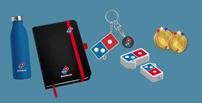

Domino’s Pizza logo merchandise is a hit among the fans. Be it T-shirts, caps, or even pizza-shaped keychains sporting the logo, they have made their way into the wardrobes and hearts of many!
Media Presence
The logo has also been spotted in various forms of media. Whether it’s a quick glimpse in a blockbuster movie, a TV show, or even in video games, the Domino’s logo has made its presence felt.
The Evolution of Domino’s Pizza Logo in the Digital Era
In the digital era, logos need to be adaptable to various platforms. So, how has the Domino’s Pizza logo evolved in this era?
A Responsive Logo
The Domino’s Pizza logo has been tweaked to be more responsive for digital platforms. Be it a tiny app icon or a large banner on the website, the logo retains its charm and recognizability.
The Advent of Animations
With the rise of digital media, the logo also got an animated version. The flipping domino tile animation on app loading screens or online advertisements adds a fun twist to the logo.
In essence, the Domino’s Pizza logo stands as a testament to the brand’s journey, values, and adaptability.
From the first black domino tile to the globally recognized red and blue domino tile, it has come a long way, making it more than just a symbol; it’s a story, an experience, a memory!
FAQ On The Domino’s Pizza Logo
What’s the story behind the Domino’s Pizza logo?
The Domino’s logo started as a simple, literal nod to the name. Picture it – one domino, straight-up classic, with three dots signifying the original three stores.
They had plans to add dots for new locations, but let’s just say that idea got shelved when the franchise exploded faster than dough in a hot oven.
Has the Domino’s logo always been the same?
Heck no, it’s had a makeover or two. The redesign journey reflects a move from a small pizza joint to a global powerhouse.
The logo ditched its hardcore pizza imagery to embrace a sleeker look that shouts ‘tech-savvy’, ‘modern’, and ‘convenient delivery’, aligning with their brand evolution.
What do the colors in the Domino’s logo represent?
That red and blue? More than just a pretty face. Red’s all about energy and passion, which speaks volumes about their love for slinging pizzas. And the blue? It stands for trust, which they’ve been building slice by slice since the ’60s. Color psychology in action.
Why did Domino’s remove the pizza from their logo?
Funny enough, it wasn’t just a whim. Pulling a major Houdini on “Pizza” from the logo was strategic. It signaled Domino’s expanding into more varied menu items – I’m talking pasta, sandwiches, you name it.
Plus, it polished their brand image, showing they’re not just a one-trick pony.
What is the significance of the domino in the Domino’s logo?
The domino serves up a double whammy – an unmistakable brand symbol and a clever hat tip to the name itself. It’s all about instant recognition. You see that domino; you’re thinking pizza. Plus, it’s a subtle shout-out to the game, evoking ideas of fun and togetherness.
How does Domino’s logo tie into its marketing strategy?
Their logo? It’s like the silent ninja of their marketing arsenal. It’s out there, on boxes, ads, and apps, reinforcing that brand recognition game hard.
The logo’s simplicity and boldness are by design, making it super adaptable across various marketing collaterals, sticking in your brain like that last slice of pepperoni pizza.
Does the Domino’s logo look different in other countries?
While the core vibe of the logo stays put, little tweaks do happen. Different markets might see slight variations to resonate with local tastes.
But the big players – that iconic domino, the trademark red and blue – they’re kickin’ it global style, giving pizza lovers everywhere that warm, fuzzy, “getting-my-fix” feeling.
How often has the Domino’s logo been updated?
Not as often as you might think; there’ve been just a few key refreshes. Each vector logo update was more like evolution than revolution – keeping pace with the times and tech without losing their saucy soul.
They’re not playing dress-up; they’re dressing for success, sticking to that corporate identity that’s golden.
What does the Domino’s logo mean for brand loyalty?
Everything! It’s about that connection. You see the logo, you’re back in your living room, game night, hot pizza on tap. It’s a trademark that bridges brand image and emotional ties.
By keeping it consistent and recognizable, they’re not just dishing out pizza – they’re delivering reliability, one box at a time.
How is the Domino’s logo perceived in the fast-food industry?
In the fast-food league, Domino’s logo holds its weight like a champ. It packs a punch with a simple, but distinct, design that cuts through the clutter.
It’s the badge of a player who knows the game inside out – from local SEO to global campaigns, this logo’s serving up industry respect with a side of envy.
Conclusion
So there you have it, the full slice – the lowdown on why the Domino’s Pizza logo isn’t just a playful icon; it’s a juggernaut of brand storytelling. You’ve seen how it fits snug as a pepperoni on a pizza into their advertising campaigns, representing more than just a fast-food joint but a symbol of quick bites and good times.
And, here’s the kicker – it’s not just a static symbol. This logo has legs, evolving alongside a growing menu diversity, morphing from pizza place to food delivery powerhouse. It’s everything a logo should aspire to be – instantly recognizable, a promise of quality, rolled into one graphically pleasing package.
In the end, remember the power packed in that tight cluster of dots and colors. It’s about more than enticing you into a cheese-laden journey; it’s a visual handshake, a growth chart, an emblem etched into the pizza-loving soul of society. Next time you spot that logo, tip your hat to the design and marketing mastery at play.
If you liked this article about the Domino’s Pizza logo, you should check out this article about the Subway logo.
There are also similar articles discussing the Pizza Hut logo, the Arby’s logo, the Little Caesars logo, and the Dairy Queen logo.
And let’s not forget about articles on the Panda Express logo, the McDonald’s logo, the Shake Shack logo, and the Chick-fil-A logo.