


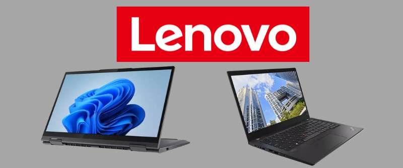
Imagine unfurling the fabric of a brand, and at the forefront, there it is: the Lenovo logo. More than just a symbol, it acts as a beacon to technology aficionados and a testament to design finesse.
Every curve, color, and font nestled in that emblem has a backstory – one of innovation, market shifts, and an unwavering commitment to user perception.
Through this read, you’ll delve into the Lenovo brand identity, decipher the visual language of its emblem, and grasp the ethos it conveys. Hooked on uncovering the brand evolution? Well, you’re in for a graphic tale.
You’ll emerge with insights into how strategic design choices in logos foster brand recognition and align with corporate identity, all wrapped in a Lenovo context.
Be it the ThinkPad’s stark angles or Yoga’s fluidity, each product line whispers its own narrative.
From the logo’s conception to its latest iteration, get ready for a deep dive into Lenovo’s visual odyssey. This exploration isn’t just about looks; it’s branding with brains.
The Meaning Behind the Lenovo Logo
![]()

Glad you asked about Lenovo! It’s a logo with a fascinating tale to tell.
How’d They Get the Name?
You’d think it’s some complex story, right? Nah, just the opposite. Lenovo came from “Le-” (from “Legend”, their former name), and “-novo” from Latin “novus,” meaning new. Easy peasy!
Breaking Down the Symbol
The logo, a piece of art in itself, is a bit more interesting. At first glance, you might just see an enclosed circle with “Lenovo” inside, but the logo’s actually doing some really hard work.
The circle’s not just for show. It’s like a protective aura, symbolizing the company’s promise of reliability and quality. And it’s got an open top – think of it as an invitation. An invitation to enter, to explore, to innovate. Quite clever, isn’t it?
Just a Name? Think Again!
And what’s in a name? Well, for Lenovo, a lot. The stylized typography – oh, that’s pure genius. Each letter, each stroke tells a story of innovation, dynamism, and a customer-centric approach.
The History of the Lenovo Logo
![]()

Time for a little journey back in time. How did Lenovo’s logo come to be? Well, sit tight, because it’s a wild ride!
The Legend Era
Back in the 80s, Lenovo was known as “Legend”. Their logo was as straightforward as it gets. They had a simple rectangle with “LEGEND” inside in a bold, no-nonsense typeface. Not much to look at, but hey, it was a start!
Enter the Lenovo Brand
Fast forward to 2003, Lenovo adopted its new name and logo. The name was now inside an enclosing circle, a bold step towards their global presence. But, it wasn’t quite the logo we know today.
The Modern Lenovo
Then came 2015. Lenovo went all out, saying “let’s shake things up a bit.” The logo got a total makeover. The letters became friendlier, the circle more dynamic, and there was a touch of red. That’s the Lenovo we recognize today, folks!
The Colors of the Lenovo Logo

We’ve got to talk colors. After all, color is to a logo what seasoning is to food. It brings out the essence!
The Passionate Red
Lenovo’s red? That’s the heart of their brand. It’s a symbol of passion, action, and excitement. A declaration that Lenovo’s not just about tech, but about energizing people’s lives.
The Pure White
Accompanying this is the white, an epitome of clarity and simplicity. It exudes a sense of purity, innovation, and serenity. When paired with the intense red, it creates a harmonious contrast, striking the perfect balance. A masterful combination indeed!
The Font Used in the Lenovo Logo
Now let’s peek at the typography. The Lenovo logo uses a custom typeface, a playful and friendly version of their previous self.
Why Go Custom?
By designing their own typeface, Lenovo gets to express its unique identity. It’s a balance between simplicity and personality – an embodiment of their brand spirit.
The Playfulness
One cool thing? The rounded edges. They make the logo approachable, inviting. It’s like Lenovo’s saying “Hey, we’re not just a tech company. We’re your friend in the tech world.”
The Impact of the Lenovo Logo

Did you ever stop to think about how a logo can impact you? If not, let’s dive in.
Recognition and Trust
First off, recognition. When you see that bright red circle, you instantly know it’s Lenovo.They’ve created a distinctive visual identity that sticks in your mind. And recognition breeds trust. You feel more at ease buying a Lenovo product because you know who they are.
Emotional Connection
Then, there’s the emotional connection. Lenovo’s logo isn’t just a name inside a circle.
It’s a symbol of innovation, reliability, and approachability. This forms a connection with you, making you feel valued as a customer.
The Evolution of the Lenovo Logo
Evolution’s part of life, and logos aren’t immune. Let’s look at how Lenovo’s logo evolved over time.
From Tradition to Innovation
From a simple rectangle with “Legend” to the dynamic, engaging logo we know today, Lenovo’s logo has evolved to embody its commitment to innovation and user experience.
Embracing Globalization
The evolution also reflects Lenovo’s transition from a local Chinese company to a global tech giant. The modern logo speaks a universal language, resonating with audiences worldwide.
The Future of the Lenovo Logo
No one knows for sure what the future holds, but we can always speculate, right?
Consistency with Room for Change
Based on Lenovo’s past, one thing’s clear. While they might tweak their logo to stay fresh and relevant, they’ll maintain the core elements that define their brand – the circle, the red, and the unique typography.
Digital Optimization
As the world becomes increasingly digital, we can expect the Lenovo logo to adapt accordingly. This could mean a logo that’s more optimized for digital use – think responsive design and animation.
There you go, a complete breakdown of the Lenovo logo. Remember, a logo’s not just about looking pretty. It’s a storyteller, a symbol of a brand’s promise to you. And Lenovo’s logo does that job beautifully!
FAQ On The Lenovo Logo
What does the Lenovo logo represent?
The design of the Lenovo logo embodies modern sophistication. It’s not just a tech emblem; it roots in the principle that less is more—striking with its simplicity.
It represents Lenovo’s commitment to innovation, harnessing a corporate brand identity that’s both accessible and assertive.
How has the Lenovo logo evolved over time?
So, about the evolution: it’s a history of calculated refinement. Starting bold, the logo has transitioned to a more fluid and dynamic aesthetic.
Past iterations shouted; the current whispers sophistication. It has moved from company insignia to a nuanced storyteller of the Lenovo journey.
What colors are used in the Lenovo logo?
This isn’t just red; it’s a statement. The logo uses a specific shade of red that stands for energy and passion. It’s a deliberate choice that underlines Lenovo’s forward-thinking nature while ensuring brand recognition is at its peak.
Who designed the Lenovo logo?
Truth? The minds behind the curtain aren’t household names. But they’re sharp, skilled crafters of visual identity systems who’ve given Lenovo its visual branding muscle. It was a collaboration, a spark of genius that married form and function to create an enduring logo.
Is the Lenovo logo different in various countries?
Nah, consistency’s key here. Lenovo’s rocking the same brand image worldwide. Because let’s face it, a uniform visual identity is like a global handshake. Irrespective of where you spot it—Beijing or Boston—it’s the unmistakable face of Lenovo.
What is the significance of the font used in the Lenovo logo?
Alright, the font. It’s bespoke, a tailored choice that’s all about readability and character. Lenovo steers clear of fancy – going for bold, clean lines that whisper professional and reliable, tempting the tech-savvy folks with subtlety.
Can the Lenovo logo be used freely for personal projects?
Absolutely not without permission. It might be a corporate branding star, but Lenovo’s trademark icon is protected. Using it for your blog or app? You’ll need to have a little chat with Lenovo’s legal eagles first.
Is there any hidden meaning in the Lenovo logo?
Hidden? More like infused! Every aspect of the emblem carries brand assets and a strategic narrative. Yet there’s no secret Morse code here; it’s talented design work doing the heavy lifting, resonating the company’s brand ethos loud and clear.
How does the Lenovo logo impact the company’s marketing strategy?
Think of it as the queen on the chessboard – powerful and pivotal. The Lenovo logo is front and center across marketing collateral, a beacon that aligns with the brand positioning and amplifies the company’s voice in a crowded tech marketplace.
What are the branding guidelines for using the Lenovo logo?
Straight up, they’ve got a rulebook for it. The guidelines are the do’s and don’ts, offering up clarity on using their prized visual branding correctly. Get it wrong? It’s like wearing socks with sandals – a definite no-go if you’re aiming for sharp.
Conclusion
So, we’ve journeyed far and wide across the pixels and palettes, mapping out every curve of the Lenovo logo. What a ride, huh?
- We started by sizing up that emblem, seeing it as more than a splash of red and a quirky font—it’s a corporate insignia with a punch.
- Wove through the timeline, watching the logo evolve, mature, get with the times—so slick, so composed now.
- Delved into the strict color commands, that staunch red speaking volumes, without a single word.
Wrapping up, the logo—this icon—is a silent envoy of the Lenovo ethos, steadfast at the intersection of consumer electronics and corporate identity. This isn’t merely design we’re talking about; it’s the visual articulation of a brand promise.
One leaves this space, eyes a tad wider—the logo’s not just seen now; it’s understood. It’s the visual identity captured in a symbol, the unwavering lighthouse guiding Lenovo’s innovative spirit through the digital seas.
If you liked this article about the Lenovo logo, you should check out this article about the Dropbox logo.
There are also similar articles discussing the Alphabet logo, the Panasonic logo, the Huawei logo, and the Qualcomm logo.
And let’s not forget about articles on the Fujitsu logo, the Baidu logo, the Tencent logo, and the Booking logo.