


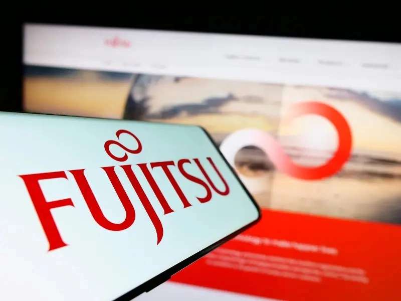
Imagine this: a symbol, stark against a sea of competition, not just a logo, but a beacon of innovation. You’ve seen it, the Fujitsu logo, that distinctive red triangle sparking recognition worldwide.
Here’s the twist—this isn’t just any emblem; it’s the storyteller of a Japanese multinational giant, narrating a tale of corporate identity through stark geometrics and color.
Now, as we unwrap the secrets behind this visual branding, you’ll discover how a logo mirrors an organization’s brand image.
It’s more than meets the eye, transcending graphics to an embodiment of market presence and brand equity.
This article peels back layers of the Fujitsu corporate branding, diving deep into the fabric of information communication technology. Expect to find the heartbeat of business solutions and the meticulous craft of graphic design.
Ready to explore how a single symbol can signify a sprawling tech empire? Then, brace for this tapestry of lines, shapes, and color that brands a legacy.
The Meaning Behind the Fujitsu Logo
![]()

Fujitsu’s logo is more than just a name. It’s an art piece, filled with meaning, aspiration, and a reflection of the brand’s core beliefs.
The Emphasis on Innovation
Imagine you’re looking at the Fujitsu logo for the first time. You might notice its simplicity, yet there’s a degree of boldness that’s hard to ignore. Why? It’s in the design, my friends.
The way those letters are crafted, they’re meant to communicate the idea of innovation and future thinking.
The all-caps approach gives off an air of strength and reliability. Fujitsu wants you to know they’re there for the long haul, always pushing for the new, the better, the unexpected.
The Infinity Symbol
Then there’s that infinity symbol. The infinite loop, beautifully nestling right there in the ‘j’ and ‘i’ of Fujitsu. So, what’s the story?
Well, the infinity symbol in their logo showcases their commitment to continuous growth and progress. It’s like a promise to keep on going, to keep on improving, and to provide infinite solutions. In essence, Fujitsu is in the game for infinity.
The History of the Fujitsu Logo
![]()

This logo that we’ve grown to recognize today has its roots buried deep in history. A tale of evolution and adaptation that mirrors the company’s journey.
The Early Beginnings
Fujitsu has not always been the tech giant we know today. It all started in Japan, circa 1935.
The initial logo was more of a seal, featuring kanji characters. It was a reflection of their Japanese origins, looking more like an artistic emblem than a tech company logo. But as times changed, so did Fujitsu.
From Simplicity to Sophistication
As Fujitsu ventured into the tech world and started to expand globally, the logo evolved. The switch from the traditional kanji to the Latin alphabet marked a significant milestone in the company’s history. It was a move towards modernity, a nod to the western world, and an indicator of their global aspirations.
Over the years, the logo has seen minor tweaks and updates, but the core essence remains intact. Today, the Fujitsu logo stands as a symbol of the brand’s journey from a small telecommunications company to a global tech leader.
The Colors of the Fujitsu Logo
The choice of color in a logo can say a lot about a brand. Let’s explore what the colors of the Fujitsu logo reveal.
The Power of Red
Dominating the logo is the vibrant hue of red. Red, in branding, is often used to signify passion, energy, and urgency. For Fujitsu, the red embodies their passion for technology, their energetic drive for innovation, and the urgency to provide effective tech solutions.
The Font Used in the Fujitsu Logo

Typography can convey a brand’s personality just as effectively as color or symbol. Let’s dive into the font of the Fujitsu logo.
A Custom-Built Typeface
It’s fascinating to know that Fujitsu uses a custom, proprietary typeface in their logo. This isn’t some run-of-the-mill font you’d find on a word processor. It’s carefully crafted, unique to Fujitsu, adding an extra layer of exclusivity.
The Language of Geometry
The typeface in the Fujitsu logo employs clean, geometric shapes, communicating a sense of precision and perfection. The characters have this unique blend of roundness and sharpness, highlighting Fujitsu’s balance between soft skills (like customer care) and hard technical skills.
The Boldness of Caps
In typography, using capital letters can suggest authority, reliability, and stability. Fujitsu’s all-caps approach in their logo plays into these sentiments, underlining their status as a dependable technology leader.
Visual Impact of the Fujitsu Logo
Beyond meaning, history, color, and typography, let’s consider the overall visual impact of the Fujitsu logo.
Making a Statement
The Fujitsu logo stands out. The bold red against the pure white letters, the uncomplicated yet strong typeface, and that infinity symbol weaved into the name – all these elements work together to create a logo that’s immediately identifiable.
A logo is, after all, a visual representation of a brand. And Fujitsu’s logo, in its powerful simplicity, manages to make a strong statement about who they are and what they represent.
Versatility across Platforms

A crucial aspect of a good logo is its versatility. And this is where the Fujitsu logo shines.
The logo remains visually coherent, whether it’s on a big billboard, the cover of a laptop, or an app icon on your smartphone. This adaptability across platforms demonstrates the thoughtful design behind the Fujitsu logo.
The Legacy of the Fujitsu Logo
Lastly, it’s worth noting the legacy that the Fujitsu logo carries with it.
An Emblem of Trust
With decades of history behind it, the Fujitsu logo is more than just a design; it’s an emblem of trust. Customers and businesses alike recognize it as a symbol of quality and reliability in the tech industry.
A Constant Reminder
The Fujitsu logo also serves as a constant reminder of the company’s commitment to innovation, as well as their aspiration for infinite growth and progress.
In the end, the Fujitsu logo, in its entirety, is a testament to the company’s journey, their values, and their aspirations. It’s a subtle yet powerful embodiment of what Fujitsu stands for in the vast tech landscape.
FAQ On The Fujitsu Logo
Who Designed the Fujitsu Logo?
Believe it or not, the herald of this tech emblem, its precise origins, can get a bit hazy. It’s a product of numerous creative minds over time, adapting Fujitsu’s corporate identity to match the company’s evolving brand image.
No single designer is universally credited; it’s a collaborative triumph.
What Does the Red Triangle Stand For?
That red triangle? It’s not just flashy—it’s purpose-driven. Fujitsu’s red speaks to energy and passion, while the triangle embodies stability and strength in business solutions. Together, a combo that’s got as much punch as the technology brands it represents.
When Was the Fujitsu Logo Created?
Turn back the clock—it emerged in the swinging ’60s. 1967, to get precise, concurrent with Fujitsu’s international market expansion. A tangible declaration of the company’s ICT Services and assertive global vision.
Has the Fujitsu Logo Changed Over Time?
Evolution is key in the tech industry. The Fujitsu logo morphed subtly through the decades, refining its essence while holding on to its core—consistency amidst change, never straying far from its original visual elements.
What’s the Significance of the Logo’s Color Scheme?
It’s stark. It’s bold. Red for the energy of innovation, underscored with a dash of white, symbolizing integrity and precision—qualities prized in the realm of ICT services and beyond.
Are There Any Hidden Meanings in the Logo?
No Easter eggs here, just bold directness. It’s all about representation—Fujitsu Limited in its purest form. Any deeper meaning is tied not to secrets, but to what the brand stands for in the collective tech consciousness.
Is the Fujitsu Logo Trademarked?
Absolutely, it’s a legal eagle. That iconic mark is protected under trademark laws far and wide, preventing any unsanctioned mimicry and safeguarding Fujitsu’s brand recognition across the board.
How does the Fujitsu Logo Reflect the Company’s Mission?
It’s the visual chant of business consulting excellence and relentless innovation. That red triangle isn’t just flashy—it’s the visual identity that aligns seamlessly with Fujitsu’s mission to harness tech for good.
Where Is the Fujitsu Logo Usually Displayed?
Wherever you spy a spark of their market presence—from marketing collateral to the sleekest computer hardware, digital platforms to print, this logo commands attention, symbolizing a global warming of brand equity and visual branding.
How Is the Fujitsu Logo Perceived Globally?
Stellar. It’s the face of reliability and cutting-edge tech across continents.
Over the globe, this emblem is a universal nod to tech savviness—a beacon of business solutions and product lines that cements Fujitsu Limited as a top-notch information technology equipment and services provider.
Conclusion
We’ve journeyed through the nuances of color, shape, and symbolism that culminate in the Fujitsu logo, unearthing layers that transcend mere design. This emblem, crafted amid a fusion of culture and corporate identity, continues to stand as a testament to brand equity as robust as the technology products it represents.
- Crafted with purpose and precision
- Steeped in the rich legacy of Fujitsu Limited
- Echoing innovation and business solutions
And so, as we wrap up, consider how this symbol—subtle yet evocative—does more than identify a company. It encapsulates a philosophy, a bridge connecting Japanese heritage and cutting-edge technology. It’s a beacon, a rallying cry for quality, information communication technology, and a boundless future.
The next time that red triangle catches the eye, it’s not just spotting a tech emblem; it’s an appreciation, understanding that behind it lies a narrative of enduring brand image and relentless pursuit of excellence. The Fujitsu logo—iconic, evocative, timeless.
If you liked this article about the Fujitsu logo, you should check out this article about the Lenovo logo.
There are also similar articles discussing the Dropbox logo, the Alphabet logo, the Panasonic logo, and the Huawei logo.
And let’s not forget about articles on the Qualcomm logo, the Baidu logo, the Tencent logo, and the Booking logo.