The Taco Bell Logo History, Colors, Font, and Meaning
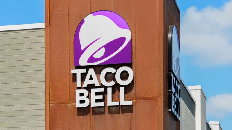
Imagine you’re cruising down the highway, and there it is. The unmistakable bell that promises a fiesta of flavors. The Taco Bell logo. It’s more than just a signpost for tacos; it’s a beacon of brand identity, a symbol woven into the fabric of fast food culture.
Sure, it’s a graphic, a splash of purple and white, but have you ever stopped to ponder the story it’s telling?
We live in a visual world, where logos and branding are the silent ambassadors of our brands.
Taco Bell’s emblem is no exception. It’s a tale of innovation, marketing campaigns, and the evolution of fast food branding.
Dive into this exploration, and you’ll unearth the insights behind successful corporate symbols.
You’ll discover not just the how, but the why, of a logo refresh that keeps fans engaged and the competition on its toes.
From graphic design intricacies to psychological impact, this is your gateway to understanding why that bell doesn’t just ring, it resonates.
The Meaning Behind the Taco Bell Logo
Symbolic Significance
In the world of logos, the Taco Bell symbol is a classic. You might think it’s just a bell, but there’s a whole lot more to it.
The bell, you see, is a representation of the restaurant’s name, which was inspired by the founder, Glen Bell. That bell is an emblem of the unique, flavorful, and quickly served food that the establishment is known for.
Aesthetic Appeal
The logo’s design is more than just a fancy bell. It’s got that sleek, modern vibe that makes it pop on billboards, screens, and storefronts alike. The bell is simple, but it’s also visually striking.
It draws the eye and makes a statement. It’s a testament to the power of minimalist design, really.
The History of the Taco Bell Logo
Humble Beginnings
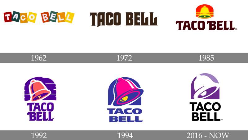
Back in the day, the Taco Bell logo was a lot different. It started off as a quaint, rather rustic sign that was full of charm.
It had the words “Taco Bell” printed in a funky font with a sombrero hovering above it. It gave off a festive, Mexican vibe that was a nod to the cuisine they served.
Evolution and Modernization
Over time, the logo evolved. The sombrero was replaced with a bell in the ’80s. The bell symbol became prominent and the font was streamlined, giving it a more modern appeal.
Then in 2016, it underwent another transformation. The bell was stylized and the color palette was switched up, giving us the purple logo we know today.
The Colors of the Taco Bell Logo
The Power of Purple
The logo today is dominated by a bright, vibrant purple. This color is all about uniqueness, creativity, and extravagance. It’s bold, it’s different, and it’s eye-catching. It speaks to the brand’s personality and it definitely sets Taco Bell apart from the crowd.
The Font Used in the Taco Bell Logo
A Sleek Typeface
When it comes to the font, the Taco Bell logo keeps it clean and simple. It’s a sans-serif typeface that’s all about clarity and legibility. It’s straightforward and no-nonsense, just like the brand.
Balancing Tradition and Modernity
The font balances the traditional with the modern. It’s got a timeless feel to it, but it’s also fresh and contemporary. It complements the bell symbol and ties the whole logo together.
Subliminal Messages in the Taco Bell Logo
Hidden in Plain Sight
Now, here’s a fun fact. If you look closely at the bell in the logo, you’ll notice that it kind of, sort of, looks like a snake’s tongue. Is this intentional? Who knows. But it’s a nifty little detail that adds a layer of intrigue to the logo.
Intention or Coincidence?
Whether this was a deliberate design choice or just a happy accident, it’s one of those things that once you see it, you can’t unsee it. It’s a testament to the complexity of logo design, and how even the simplest of logos can have hidden depths.
Impact of the Taco Bell Logo on Branding
Instant Recognition
One of the key functions of a logo is to make a brand instantly recognizable. And the logo does just that. Its distinct bell symbol and bright color palette make it immediately identifiable, whether it’s on a restaurant sign, a takeout bag, or a TV ad.
A Memorable Impression
The logo leaves a lasting impression on viewers. It’s bold, it’s unique, and it’s hard to forget. This makes it an essential part of Taco Bell’s branding strategy. It’s the visual representation of the brand, and it plays a crucial role in shaping public perception of the company.
Taco Bell Logo’s Influence on Pop Culture
Ubiquitous Presence
It’s not just in the realm of fast food that the Taco Bell logo has made its mark. Its influence extends into pop culture as well.
It’s featured in movies, TV shows, and music videos. It’s printed on merchandise like t-shirts, hats, and phone cases. It’s a symbol that’s become a part of our everyday visual landscape.

Iconic Status
The logo’s design, coupled with the brand’s widespread popularity, has elevated it to iconic status. It’s more than just a brand symbol; it’s a cultural icon that’s synonymous with fast food and American consumer culture.
In the grand scheme of things, the Taco Bell logo is a brilliant piece of design work. It’s simple yet memorable, modern yet timeless. It communicates the essence of the brand and resonates with its target audience. It’s a testament to the power of good design and effective branding.
FAQ On The Taco Bell Logo
What’s the story behind the Taco Bell logo?
Taco Bell’s emblem, this iconic symbol, it packs a history of the brand’s journey. From its 1962 beginnings, it’s morphed several times, reflecting Taco Bell’s growth and the ever-evolving fast-food scene. It’s the tale of fast food branding meeting modern aesthetics.
Why did Taco Bell change its logo?
Change, it’s inevitable, right? Taco Bell shifted their logo to stay current, resonate with the times. It’s all about that fresh appeal, staying top-of-mind in a competitive market. Think of it as a logo refresh, keying into the pulse of what customers dig today.
What does the Taco Bell logo represent?
We’re talking more than tacos here. The logo? It stands for Mexican-inspired zest, a promise of quick, tasty meals. Bold, with that purple flair, it’s the face of the brand’s vibrant, lively experience they’re dishing out. That bell, it’s a rallying cry for flavor fiends.
Who designed the original Taco Bell logo?
A fellow named Mark James—credit where it’s due—is behind that first iconic design. His creation laid the foundation for a visual identity that’s pretty much fast-food royalty. Thanks to him, that bell has been ringing loud and clear in the hearts of Taco Bell aficionados.
Has the Taco Bell logo always featured a bell?
Bingo, you’ve hit the nail on the head. That bell’s been a mainstay, a constant in Taco Bell’s identity. From day one, it’s been about that recognizable chime, a symbol that conjures up images of tasty, Mexican-inspired bites and a quick, friendly service.
What are the colors of the Taco Bell logo and their meaning?
Time to talk color psychology. Taco Bell rocks that purple to stand out, symbolizing creativity and uniqueness. It’s flanked by touches of white for simplicity, cleanliness. A visual harmony that’s as much about standing out as it is about laying down a vibe of innovation.
How has the logo affected Taco Bell’s brand identity?
Listen, brand identity? That’s the game. And the Taco Bell logo? It’s scored big time. It’s the flagbearer, the embodiment of the brand’s spirit.
It’s locked in the uniqueness of Taco Bell’s brand recognition, showing off the chain’s flair across billboards, ads, and of course, those ever-busy storefronts.
Can you describe the evolution of the Taco Bell logo?
Evolution, well, it’s a journey from classic to contemporary. Starting with that sombrero-inspired number, cruising through various redesigns, each splash of change tweaked to the tastes of the time.
It’s a logo redesign case study in keeping a brand’s face fresh without losing the soul.
Are there any hidden messages in the Taco Bell logo?
Hidden messages, secret handshakes—nah, that’s not Taco Bell’s style. What you see is what you get. But, if you’re peeling back the layers, you could say the bell symbolizes a call to gather, an invitation to feast. A visual shoutout to quick service restaurant lovers.
How does the Taco Bell logo compare to other fast-food logos?
A bit like comparing apples and oranges—or tacos and burgers. Each fast-food logo has its shtick.
Taco Bell’s? That’s striking uniqueness, a visual trademark that pops in a sea of reds and yellows typical of the fast-food arena. It’s different, daring, and delivers its distinctive brand story.
Conclusion
So there you have it. The journey’s end on our deep dive into the world of the Taco Bell logo. A saga of imagery, steeped in the spices of creativity and the zest of the unexpected. This isn’t just a tale told through hues of purple and white. It’s a narrative, woven through the fabric of brand identity and visual storytelling.
It’s clear. The bell doesn’t just toll for the bold flavors on the menu. It chimes for innovation, for the evolution of a visual trademark that’s as dynamic as the fast food industry itself. A symbol that’s danced through the decades, adapting and resonating, all the while keeping that iconic bell at its core.
Thanks for riding shotgun on this little adventure behind one of the most recognizable signs in the quick service restaurant world. You’ve seen it morph, adapt, grow. Just remember, every time you spot that logo, there’s a whole lot more behind it than just the ringing of a bell.
If you enjoyed reading this article about the Taco Bell logo, you should read these as well:
- Taco Tuesday Flyers That Will Make Your Mouth Water
- Creative Cinco de Mayo Flyers That Will Take Your Party to the Next Level
- Food Truck Flyers That Will Make Your Mouth Water
- Seamlessly Blended: Gorgeous Gradient Color Palettes - 30 April 2024
- Examples of Great Gym Websites to Inspire You - 30 April 2024
- The Activision Blizzard Logo History, Colors, Font, And Meaning - 29 April 2024


