

The Superman Logo History, Colors, Font, and Meaning
It’s nothing short of an emblem of audacity, etched into the fabric of pop culture—the Superman logo. This iconic insignia has zigzagged its way from comic book pages to the robust fortress of global recognition.
Think about it. That singular heroic badge evokes a universe, a bevy of tales spun around Metropolis’s gallant protector.
Peel back the cape, and what’s there? More than just an S-shield; it’s a visual dialogue spanning decades, echoing from Action Comics to modern silver screen epics.
Delve into the saga behind the Superman emblem—its storied inception, design evolution, and the cultural waves it spurred.
Within the turn of a page, this article unfurls insights. Insights that map out how a Kryptonian symbol grows to be a graphic monolith that towers over the landscape of superhero branding.
From a web designer’s lens, see how this logo’s journey weaves through history, Justice League lore, and the legal spirals of trademarks.
By article’s end, you’ll grasp the profound imprint of the Man of Steel’s badge, transcending its comic book iconography into a universal lexicon of superhero insignia.
The Meaning Behind the Superman Logo
A Symbol of Hope
Superman’s logo. You know it, I know it. A bold diamond shape with that familiar “S” inside. But it’s more than just an “S”. In the universe of Superman, it’s a Kryptonian symbol of hope.
Origin and Adoption
When we see the Superman logo, we instantly think of the Man of Steel. But why is that? It’s because this symbol, through its various appearances and uses, has become deeply connected to the character’s identity.
Superman, or Kal-El, originally donned the symbol as a link to his Kryptonian heritage, a remnant of the world he lost. Over time, it has transformed into a universal symbol of hope and justice, as much a part of Superman as the man himself.
The History of the Superman Logo
The Golden Age
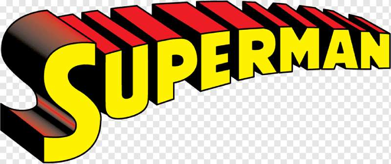
The tale of the Superman logo begins in the Golden Age of Comics. Back then, it was a simple black-and-white shield with an “S” that looked more like a serpent than anything else. It was bold and striking, a perfect match for the era.
Evolution Over Time
As the years went by, the logo started evolving. The edges became sharper, the “S” more defined. Slowly but surely, it began to take on the iconic look we know today.
The Iconic Diamond
Finally, we arrived at the diamond-shaped design that has become synonymous with Superman. This was the first time the “S” was contained within a shape that resembled a diamond. This change added a sense of strength and solidity to the logo, reflecting Superman’s unyielding will.
The Colors of the Superman Logo

Royal Blue: The Color of Stability
Blue is the primary color of the Superman logo. It is a color associated with depth, stability, and wisdom. It perfectly embodies Superman’s character – steadfast, reliable, and wise beyond his years.
Vibrant Red: The Color of Energy
Next, we have the vibrant red of the “S”. Red is a very emotionally intense color. It symbolizes energy, strength, power, and determination, all of which are defining traits of our hero.
The Font Used in the Superman Logo
The font used in the Superman logo is as unique as the logo itself. It’s not a font you can find in any word-processing program. The “S” in the logo was custom-designed, an emblem that stands out just as much as the Man of Steel himself.
The Impact of the Logo
Pop Culture Icon
From comic books to TV shows to movies, the logo has permeated every corner of popular culture. It is instantly recognizable, a symbol that has transcended the realm of comics to become a universal icon.
Merchandising Powerhouse
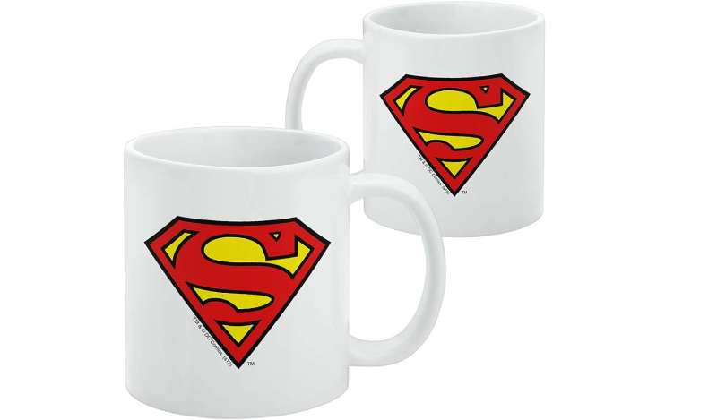
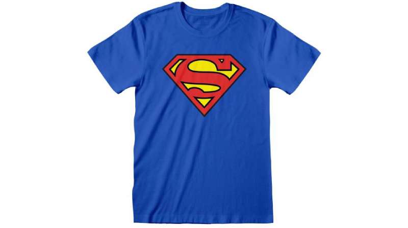
The Superman logo is a merchandising goldmine. From t-shirts to coffee mugs to posters, it’s everywhere. And its appeal is undeniable. Who wouldn’t want to wear a symbol of hope and justice?
The Versatility of the Superman Logo
The Logo’s Adaptability
The logo has shown remarkable adaptability. It’s been reimagined, redesigned, and reinterpreted countless times.
Yet, each iteration has retained the core elements that make it identifiable – the diamond shape, the bold “S”, and the vibrant colors. This adaptability reflects the timeless nature of Superman as a character.
Logo Variations
Across different media, the Superman logo has seen numerous variations. In the ‘Superman: Red Son’ graphic novel, the logo takes on a more Soviet-inspired look.
In the television series ‘Smallville’, the logo is more rustic and homemade, reflecting Clark Kent’s farm upbringing. These variations show how the logo can be tailored to different narratives and aesthetics while still remaining recognizable.
The Influence of the Superman Logo
Impact on Other Superhero Logos
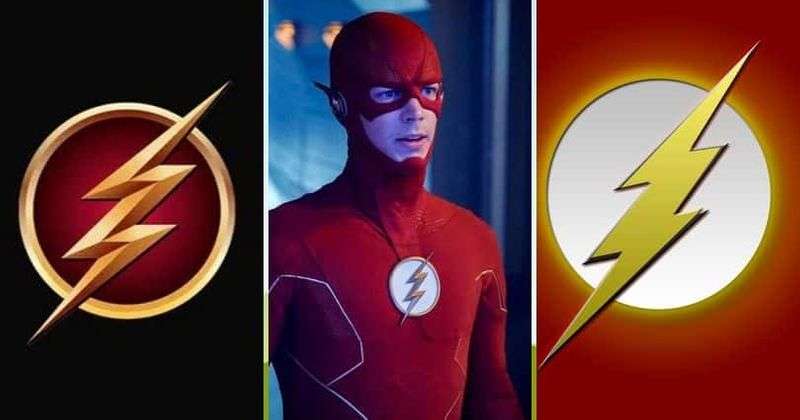
The Superman logo has had a significant influence on the design of other superhero logos. Its simple yet bold design has set the standard for other comic book characters. Whether it’s the bat symbol for Batman or the lightning bolt for The Flash, the logo’s influence is clearly visible.
Beyond the Comic Book World
The logo’s influence extends beyond the comic book world. It has found its way into fashion, music, and even politics. The design is often used in a variety of contexts, from expressing fandom to making a statement. The Superman logo has transcended its origins to become a part of our everyday visual language.
FAQ On The Superman Logo
What is the symbolic meaning behind the Superman logo?
It’s an “S”, right? You’d think so, but it’s Kryptonian for ‘hope’, symbolizing much more than a guy who can fly. It’s the essence of a hero. Grit, resilience – Superman signifies these traits, setting the bar for not just DC Comics characters but ideals humans strive for.
Has the Superman logo always looked the same?
Not even close. Designs evolve, and so did this emblem. It started simple, got complex, then circled back.
From the Golden Age of Comics to the Zack Snyder era, the insignia morphed with the times, mirroring the visual storytelling evolution of Superman’s graphic narrative.
Why is the Superman logo so iconic?
Staying power, my friend. It’s not just a superhero emblem – it’s a cultural benchmark. Instant recognition is key.
Whether stitched on Superman costumes or splashed across licensing superhero logos, it’s got legacy. A legacy wrapped in Justice League ethos and a beacon within the superhero branding landscape.
Can anyone use the Superman logo?
Whoa, hold on – that’s where trademark law swoops in. Warner Bros. keeps a tight grip on it. It’s not just a Man of Steel cape detail, it’s a legal powerhouse. For personal use, maybe you’ll fly under the radar. Try selling, though, and you might face legal Kryptonite.
What changes have been made to the Superman logo over the years?
It’s done some shape-shifting – angles sharpened, colors flipped. Even beneath the capes of Henry Cavill, transformations unfolded. Silhouettes slimmed, hues deepened.
But the “S” – that superhero insignia’s heart – held fast, securing its spot in the Superman franchise through each stylish tweak.
Where did the Superman logo first appear?
Alright, so we’re throwing back to the Golden Age of Comics, right at the launchpad. Picture it: Action Comics #1, 1938. That’s the cradle of this cultural gem. A seismic event in both comic book symbolism and the birth of superhero emblems.
What does the color of the Superman logo represent?
Crimson and gold, colors of vitality and honor. They echo Superman’s cape (product category) and the sun’s vigor that fuels his Kryptonian cells. More than aesthetic, it’s thematic. Conjures that undying spirit of the Kryptonian symbol.
How has the Superman logo been used in marketing?
Savvy marketers? They know. Slap that logo on something, and it’s not just a product anymore – it’s an idea for sale.
The Superman shield conveys courage, assuring consumers they’re buying a slice of heroism with those Superman merchandise and pop culture icons.
What challenges have surrounded the Superman logo concerning legal issues?
It’s a high-stakes battlefield. The legal rights to Superman logo? Dispute central. DC Comics and the original creators’ heirs locked horns in a saga as gripping as the storylines the logo fronts. The quest for control is a complex tale woven through the judicial system.
How has the Superman logo influenced other superhero designs?
Influence? More like set the benchmark. It’s the tide that lifted all boats in the comic book iconography harbor.
The simple, clean design of Superman’s badge paved the way for others – think Batman’s emblem or Wonder Woman’s crest. They all share DNA, with the Superman shield leading the charge.
Conclusion
So, we’ve zipped across the skyline, tracing the bold contours of the Superman logo. It’s the sentinel that has stood watch over Metropolis and beyond, a beacon firing up imagination in the hearts of comic aficionados and the everyday dreamer alike.
We’ve charted its evolution—from a shield in Action Comics to a modern emblem emblazoned across multimedia franchises. It’s been a journey echoing the hero’s own: steadfast, yet adaptable to the changing landscape of culture and superhero branding.
- The “S” stands resilient, a testament to design that transcends its medium.
- The colors—a vibrant echo of valor.
- The legality—a tangled web of trademark law, grappling with poignant legacies versus rigid corporate claims.
From the Justice League‘s hallowed halls to the silent nod of acknowledgment between fans sporting the iconic merchandise, understand this: The Superman logo is more than mere graphic—it’s a symbol etched into eternity, as immortal as the hero it represents.
If you liked this article about the Superman logo, you should check out this article about the Batman logo.
There are also similar articles discussing the Punisher logo, the Wonder Woman logo, the Spider-Man logo, and the Iron Man logo.
And let’s not forget about articles on the Black Panther logo, the Deadpool logo, the Flash logo, and the Green Lantern logo.
Bogdan Sandu, a seasoned designer with 15 years of diverse experience, has been designing websites since 2008.
Renowned for his expertise in logo design and visual branding, Bogdan has developed a multitude of logos for various clients.
His skills extend to creating posters, vector illustrations, business cards, and brochures. Additionally, Bogdan's UI kits were featured on marketplaces like Visual Hierarchy and UI8.
Latest posts by Bogdan Sandu (see all)
- Seamlessly Blended: Gorgeous Gradient Color Palettes - 30 April 2024
- Examples of Great Gym Websites to Inspire You - 30 April 2024
- The Activision Blizzard Logo History, Colors, Font, And Meaning - 29 April 2024