The Seattle Seahawks Logo History, Colors, Font, and Meaning
Envision a symbol, a totem that captures the spirit of an entire region, a conduit for camaraderie and pride—a tapestry woven with navy, green, and grey.
This is the realm of the Seattle Seahawks logo, more than a mere emblem—it’s the heartbeat of a fanbase known as the 12th Man.
Within these lines lies an exploration into the significance, the evolution of what makes this logo a sentinel of the National Football League’s identity.
From the contours that shape the formidable Seahawks totem to the NFL logo design trends it follows, the insignia stands as a timestamp of sports brand identity, narrating a tale far beyond the stitches on jerseys.
This discourse aims to unravel the threads of the Seahawks emblem’s history and its merchandise phenomenon.
By the culmination of our journey, you’ll comprehend the mastery behind the sports team iconography that galvanizes a city, a team, and its emblematic significance.
On this canvas, we’ll paint a broader picture, showcasing how the emblem encapsulates Seattle’s professional sports ethos.
The Meaning Behind the Seattle Seahawks Logo
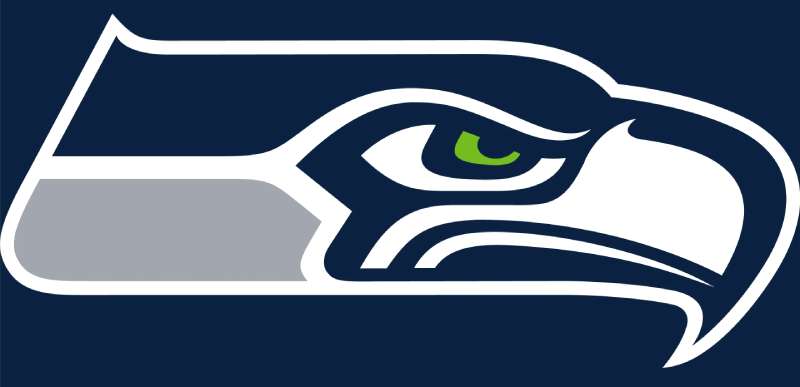
The Seattle Seahawks logo is more than just a fancy design on a helmet. It’s a powerful symbol, a representation of the team’s spirit and the rich culture of the region it represents. Dive in with me to understand the deeper connections.
The Totem Connection
Did you know the Seattle Seahawks logo is inspired by Native American totem pole art? The Pacific Northwest, including Seattle, is home to many indigenous tribes, and their totemic art has a big influence in the region.
The logo, in many ways, mirrors the striking and bold patterns seen in these carvings, echoing a connection to the land’s history and its people.
A Symbol of Strength
The Seahawk, or Osprey, is a bird of prey. It’s fierce, swift, and known for its incredible vision. Much like the football team, this raptor is always aiming for precision and victory.
So, the logo encapsulates this spirit – it’s not just about the bird, but what the bird represents: prowess, agility, and dominance.
The History of the Seattle Seahawks Logo
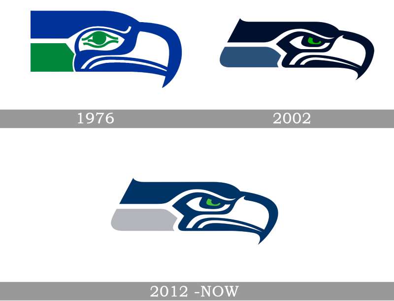
Stepping back in time, the evolution of the Seattle Seahawks logo is a tale of design, culture, and a reflection of changing times.
Early Beginnings
Back when the team was born in the mid-1970s, the original logo was an artful blend of indigenous art influences and modern design techniques. It was simpler, yet still retained the essence of the Seahawk.
Evolutions and Tweaks
Over the decades, like every evolving entity, the logo too underwent transformations. The sharper curves, the bolder colors, and the more streamlined design we see today are the result of these tweaks.
Each alteration wasn’t just about aesthetics but aligning with the team’s evolving identity.
The Colors of the Seattle Seahawks Logo
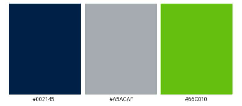
Colors. They’re not just there to look pretty. They tell a story, evoke emotion, and create an identity.
Navy Blue
Navy blue is dominant, strong, and represents the depth and richness of the sea. Given Seattle’s maritime heritage, it’s a nod to the waters that surround the city.
Action Green
Action Green, on the other hand, is vibrant and energetic. It symbolizes zeal, passion, and the verdant landscapes of the Pacific Northwest.
Wolf Grey
Lastly, Wolf Grey is a neutral, providing balance. It’s sleek, modern, and undeniably stylish.
The Font Used in the Seattle Seahawks Logo

Let’s talk typography. Fonts speak volumes, and the one in the Seahawks logo is no exception.
Modern and Athletic
The typography in the Seahawks logo exudes a contemporary vibe. It’s bold, angular, and utterly athletic. This font choice complements the logo’s visuals, creating a cohesive and forward-thinking brand identity.
The Impact on Fans and Culture

You see it everywhere – on jerseys, bumper stickers, and even tattoos. The Seattle Seahawks logo has a massive influence on its fans and the city’s culture.
Fan Loyalty
For the die-hard fan, the logo is a badge of honor, a symbol of unwavering loyalty and support for their beloved team. It’s a mark of identity, showing the world who they stand behind.
Merging Sports and Art
For the artistically inclined, the logo represents a blend of traditional and modern art forms. Its rich heritage provides an opportunity for local artists to merge their love for sports and design in unique ways.
A Global Recognition
In today’s globalized world, logos travel beyond borders. And the Seattle Seahawks logo is a testament to this.
International Seahawk Supporters
From London to Tokyo, you’ll find pockets of Seahawk supporters. The logo, instantly recognizable, has played a role in garnering this global fanbase.
A Mark of Excellence
Beyond being just a team insignia, the logo stands for excellence in the world of American football. It’s not just fans who recognize it, but sports enthusiasts around the world, associating it with prowess and unmatched skill on the field.
FAQ On The Seattle Seahawks Logo
What inspired the Seattle Seahawks logo?
The emblem is a tribute to the Pacific Northwest’s heritage—a nod to the region’s Native American art.
Specifically, it takes cues from the Kwakwaka’wakw tribe’s transformation masks, embodying the power and grace of the Seahawk, a mythical bird representative of the fiercely competitive team spirit.
How has the Seattle Seahawks logo evolved over the years?
From its inception in 1976, the logo has undergone subtle yet impactful refinements. The hawk’s geometry became sharper, the color palette intensified, and the eye’s piercing gaze now mirrors the team’s undaunted spirit.
Each tweak mirrored the evolution of the team’s NFL identity and branding strategy.
Why are the colors navy, green, and grey chosen for the Seahawks logo?
These hues encapsulate the ambient essence of the Seattle landscape. Navy mirrors the vast Pacific, green for the dense evergreen forests, and grey, the overcast skies above.
Together, they forge an identity synonymous with the Seahawks and their connection to the Seattle professional sports scene.
What does the Seahawks logo symbolize to the fans?
To the diehards populating CenturyLink Field, or Lumen as it’s now known, the logo is a badge of honor, a summon to rally. It embodies resilience, unity, and the collective pride of the Seahawk nation, epitomizing the 12th Man’s unwavering support.
Is there any controversy surrounding the Seahawks logo?
While issues of cultural appropriation were discussed early on, the organization made concerted efforts to respect the Native art that inspired their logos.
They’ve engaged with indigenous communities to cultivate understanding and mutual respect, which in turn, has reinforced the emblem’s sports team iconography.
How do the Seahawks logo and branding impact merchandise sales?
Iconic and instantly recognizable, the logo propels merchandise sales through the roof. Be it jerseys, caps, or bumper stickers; the emblem fuels the fervor for all things Seattle Seahawks merchandise—a testament to its entrenched place in NFL merchandise marketability.
Can fans use the Seattle Seahawks logo for personal use?
Yes, but with limitations. While for personal, non-commercial expressions of fandom it’s generally fine, any hint of profit-making ventures without permission veers into copyright infringement territory.
The sports logo copyright law is unwavering, designed to protect the legitimacy of the NFL franchise logos.
What role did fans have in developing the Seahawks logo?
While the fans didn’t directly design the original logo, their embrace impacted its ascension to iconic status. Their adoption made it a staple, beyond sports brand identity, forming a tacit yet inextricable link between the emblem and the roar of the crowd.
How is the Seahawks logo incorporated in team uniforms?
Strategically and with vigor. The logo clinches sleeves, commands helmets, and creates focal points across jerseys and pants—integral in the sports logo history for its consistent visibility.
It is the uniform’s cornerstone, central to players’ portrayal and team emblem significance.
What is the significance of the Seahawks logo facing right?
In Western cultures, rightward action symbolizes forward movement and progress—apt for a team always pushing the limits.
Aligning with this ideology, the hawk’s rightward gaze sets the sight on future victories, an emblem of the team’s relentless drive within the NFC West division.
Conclusion
In the fabric of NFL insignia, the Seattle Seahawks logo stands fiercely unique, mirroring the spirit of its city and fans. It’s not merely aesthetic—it’s the emblem of community identity, the branding soul of a franchise interwoven with tales of triumph and the collective pulse of the 12th Man.
From the field to the fervor of fandom, the logo transcends the bounds of sports iconography, merging team lore with the cultural tapestry of the Pacific Northwest. This has been an expedition through the evolution of a symbol that embodies the tenacity and heart of Seattle, a mark as dynamic as the team it represents.
As the NFL franchise logos landscape continues to shift, this beacon of the Seahawks will undoubtedly endure. It is a guiding totem that continues to soar high, riding the winds of change with the grace and resilience synonymous with its Seattle professional sports lineage.
If you liked this article about the Seattle Seahawks logo, you should check out this article about the Pittsburgh Steelers logo.
There are also similar articles discussing the Los Angeles Chargers logo, the Minnesota Vikings logo, the San Francisco 49ers logo, and the Chicago Bears logo.
And let’s not forget about articles on the New Orleans Saints logo, the Houston Texans logo, the New York Jets logo, and the Indianapolis Colts logo.


