The Montreal Canadiens Logo History, Colors, Font, And Meaning
There’s magic woven into the fabric of sports—a language of allegiance spoken through iconic symbols. Gripping the imagination, the Montreal Canadiens logo stands as a heraldic beacon in the world of ice hockey.
Its vivid hues and storied emblem encapsulate a legacy remembered not simply by Montreal but the entire NHL.
This emblem transcends mere branding; it’s a timeless motif that evokes a sense of heritage, a narrative of victories etched in the annals of the Stanley Cup Championships.
In this article, we shall unravel the threads of history and artistry interlaced within the Canadiens symbol.
A visual saga awaits—from the early days of the Habs emblem to its current rendition, it is a masterclass in sports team branding.
By the final period of our exploration, you’ll come to appreciate the finesse required to forge not just a logo, but an enduring icon that captures the essence of the Bleu Blanc Rouge.
Prepare to delve into the design intricacies that chart the course of a classic emblem’s journey in the high stakes arena of professional sports imagery.
The Meaning Behind the Montreal Canadiens Logo
Symbolism Speaks Volumes
Let’s kick things off with the symbolism. The Montreal Canadiens logo isn’t just an image; it’s a tapestry of meaning.
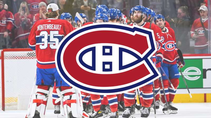
Ever noticed the “H” in the center? That’s not for “Hockey” as most might assume. It stands for “Habitants,” a nod to the hardworking French settlers of Quebec.
Culture and Legacy
The logo is more than a brand; it’s a tribute to Montreal’s culture and hockey legacy. It embodies passion, dedication, and a deep-rooted sense of belonging that resonates with both players and fans alike.
The History of the Montreal Canadiens Logo
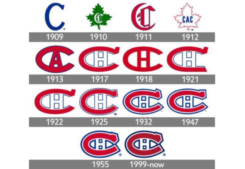
Humble Beginnings
Like a fine wine, the Montreal Canadiens logo has evolved over time. It first made its appearance back in the early 1900s, simple and unassuming.
Iterations and Adaptations
Over the decades, it has seen tweaks and changes, each modification capturing a new era’s essence while respecting the past. It’s been a beautiful dance between tradition and innovation.
The Colors of the Montreal Canadiens Logo
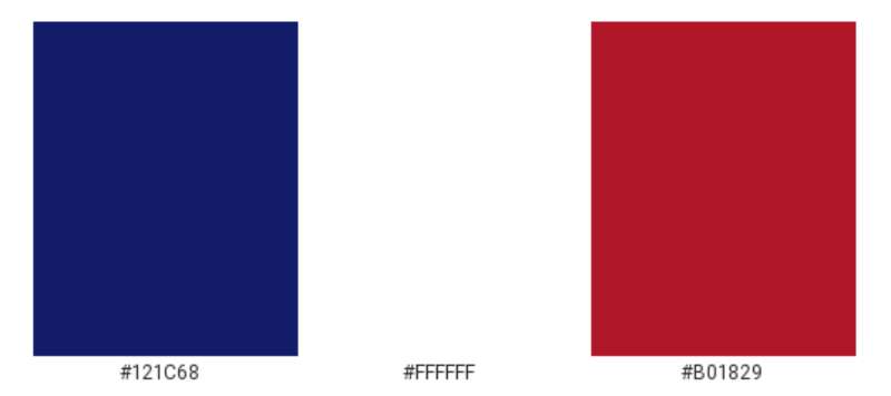
Red, Blue, and White
The primary colors of the Canadiens logo are red, blue, and white. But these aren’t just any colors. The red symbolizes passion and determination, the blue exudes confidence and trust, and the white? It stands for purity and integrity.
Significance in Hockey
In the realm of ice hockey, where the play is intense and stakes are high, these colors together represent a team that’s both fierce in spirit and noble in sportsmanship.
The Font Used in the Montreal Canadiens Logo
Classic Yet Contemporary
The font used in the Montreal Canadiens logo is a perfect blend of classic and contemporary. Its boldness conveys strength, while its subtle curves resonate with grace and elegance.
Typography Matters
In the world of graphic design, typography can make or break a brand’s image. And the Canadiens? They’ve nailed it, balancing readability with style.
The Emotional Impact of the Logo
Stirring the Heart
Every time fans see that emblem, there’s an undeniable rush of emotion. Joy, nostalgia, pride, hope – it’s a rollercoaster, all packed into one emblematic symbol.
A Unifying Force
Beyond aesthetics, the logo serves as a unifying force, bringing together fans from different walks of life under one banner of undying support.
Evolution in Pop Culture
From Jerseys to Jingles
The Montreal Canadiens logo isn’t confined to the rink. It’s made appearances in movies, music videos, and even fashion runways. It’s transcended beyond hockey, embedding itself into popular culture.
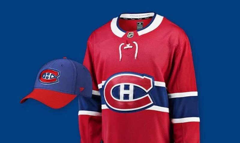
Merchandise Magic
From caps, tees, and mugs to even phone covers, the emblem’s influence is vast. Its design appeal, combined with the team’s legacy, makes it a hot favorite for merchandise, proving that good design paired with rich history is a formula for success.
FAQ On The Montreal Canadiens Logo
What’s the significance of the “H” in the Montreal Canadiens logo?
The “H” stands for hockey, not “Habs” as often misconstrued. Locked within the logo’s “C”, it highlights the club’s pride in being a founding team in the realm of professional ice hockey, a nod to Montreal’s pivotal role in the sport’s history.
How has the Canadiens logo evolved over time?
The emblem has undergone subtle tweaks rather than radical changes. It’s evolved to boast crisper lines and bolder colors, reflecting advancements in design and textile technology.
The timeless character of the Bleu Blanc Rouge remains the heart of the team’s visual identity.
What do the colors in the Canadiens logo represent?
Rooted in historical significance, the red symbolizes strength and passion, blue denotes depth and stability, and white reflects purity and peace.
Together, these colors encapsulate the essence of the Montreal Canadiens, painting a narrative rich in patriotism and spirited competitiveness.
Is the Montreal Canadiens logo one of the oldest in the NHL?
Indeed, it stands as one of the oldest, with its genesis tracing back to 1917. Heritage interwoven with modernity, the logo’s staying power is a testament to its iconic status within the National Hockey League.
Are there any hidden meanings behind the Canadiens logo?
Subtly hidden, the “C” and “H” embody Montreal’s dedication to hockey, while the overall design is an homage to the team’s host city and French-Canadian culture—a beacon of tradition in a fast-evolving sport.
Has the Montreal Canadiens logo ever had a major redesign?
Major overhauls? No. The logo has been safeguarded from radical redesigns, ensuring its heritage is preserved while allowing minor refinements to align with contemporary aesthetics. It’s a stanchion of stability in a league of ever-changing team symbols.
Why is the Canadiens logo often referred to as the “Habs emblem”?
“Les Habitants,” a term historically associated with French settlers in New France, gave rise to the nickname “Habs”. This colloquialism became an informal moniker for both team and emblem, further knitting the Canadiens’ identity into the cultural tapestry.
Can the Montreal Canadiens change their logo in the future?
Change is an inevitable tide. Yet, given its entrenched status—a beacon of the franchise’s storied legacy—any transformation would tread softly, mindful of the passionate fan base and the historical reverence the emblem commands.
How does the Canadiens logo compare to other NHL team logos?
It’s not about comparison; it’s about the emblem occupying a niche of reverence. Standing shoulder-to-shoulder with other historic logos, it speaks the visual language of ice hockey symbols with unparalleled authenticity and an air of sports team branding elegance.
Why is the Montreal Canadiens logo so popular among fans?
Beyond the rink’s poetry in motion, the logo symbolizes identity, community, and a rich tapestry of triumphs and challenges.
It carries an air of familiarity, a keep of memories for fans—an emblem that radiates a team’s enduring spirit and storied chapters of the Stanley Cup Championships.
Conclusion
Embarking on this journey—a dissection of the visual lexicon—the Montreal Canadiens logo emerges not simply as a design but as a chronicle. Stitched through the fabric of hockey history, it resonates with the echoes of skates carving the ice, each pass encapsulating that same tenacious spirit spanning generations.
In our exploration, it’s this emblem, steadfast in a sea of change, that radiates the hallmarks of a celebrated legacy. Bleu Blanc Rouge—more than hues; they paint a palette of pride, heritage, and belonging. Today’s rendition, while polished with the sophistication afforded by modern graphic sensibilities, still bows to the sacredness of its origins.
And so, with every Canadiens crest dotting paraphernalia, fluttering in fans’ hands, or emblazoned on the players’ chests, it stands—a sentinel of solidarity, a silent guardian of glories past and the intrepid promise of triumphs yet to be seized. The logo, etched in the collective, remains an indelible imprint of the storied Habs emblem.
If you liked this article about the Montreal Canadiens logo, you should check out this article about the Detroit Red Wings logo.
There are also similar articles discussing the Edmonton Oilers logo, the Florida Panthers logo, the Los Angeles Kings logo, and the Minnesota Wild logo.
And let’s not forget about articles on the Nashville Predators logo, the New Jersey Devils logo, the New York Islanders logo, and the New York Rangers logo.
Bogdan Sandu, a seasoned designer with 15 years of diverse experience, has been designing websites since 2008.
Renowned for his expertise in logo design and visual branding, Bogdan has developed a multitude of logos for various clients.
His skills extend to creating posters, vector illustrations, business cards, and brochures. Additionally, Bogdan's UI kits were featured on marketplaces like Visual Hierarchy and UI8.
Latest posts by Bogdan Sandu (see all)