
The Memphis Grizzlies Logo History, Colors, Font, and Meaning
Imagine the fierce roar of a grizzly resonating through the vibrant streets of Memphis. This isn’t just a wild fantasy—it’s the essence captured in the Memphis Grizzlies logo, a symbol that transcends sports to embody a city’s spirit and a team’s tenacity.
Within each curve and color lies a story, a visual saga of basketball passion intertwining with design finesse.
As we delve into this emblematic beacon, you’ll grasp how a logo transcends mere branding—it anchors an NBA team to its roots while propelling it into the hearts of fans.
You’re about to unravel the threads of creativity and strategy spun into the Grizzlies emblem, explore the depths of sports team branding, and decipher the symbol that clothes Grizzlies fan apparel with pride.
By the final stroke of this analysis, anticipate more than just insights—you’ll hold the key to the subliminal power of team iconic NBA logos and their role in echoing the roars of success throughout FedExForum and beyond.
Embark on this journey, and witness the quirks of design meeting the bounce of basketball in a spectacle of Memphis basketball symbol lore.
The Meaning Behind the Memphis Grizzlies Logo
Deep Dive into Symbolism
Alright, let’s start off with the name, Grizzlies. When you think grizzly bear, you’re thinking strength, ferocity, and resilience, right? Now let’s connect the dots.
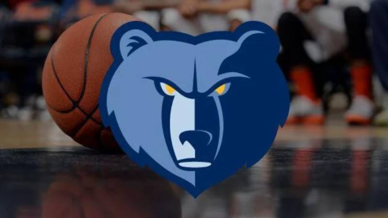
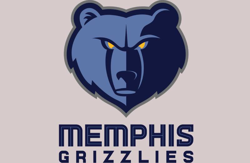
The Memphis Grizzlies logo portrays the qualities that the basketball team wants to embody on the court. It’s not just about the bear; it’s about the spirit of the game.
Reflection of the Region
Memphis, man! It’s a place of rich history, deep culture, and some banging tunes. The Grizzlies, in their logo, are also reflecting the city’s tenacity and spirit.
There’s a deep sense of community pride embedded in that emblem. When you sport that logo, you’re not just repping a team but an entire city and its ethos.
The History of the Memphis Grizzlies Logo
Origins and Evolutions
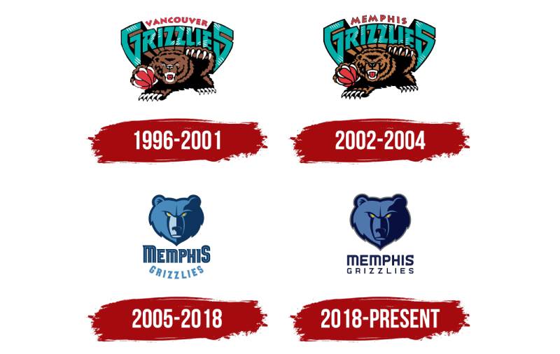
Okay, story time! Originally, the Grizzlies weren’t even from Memphis; they started out as the Vancouver Grizzlies. Whoa, right? Their earlier logo was pretty cool, with a fierce bear and teal tones.
Fast forward to their move to Memphis and bam! The logo transformed, becoming more streamlined, focused, and rooted in the Memphis vibe.
The Modern Makeover
As with everything in design, things get a lil’ facelift now and then. The logo underwent subtle changes over the years, always keeping the grizzly bear at its heart but playing around with colors and shapes.
It’s like watching your favorite series evolve season after season – exciting, unpredictable, and always keeping you on your toes.
The Colors of the Memphis Grizzlies Logo
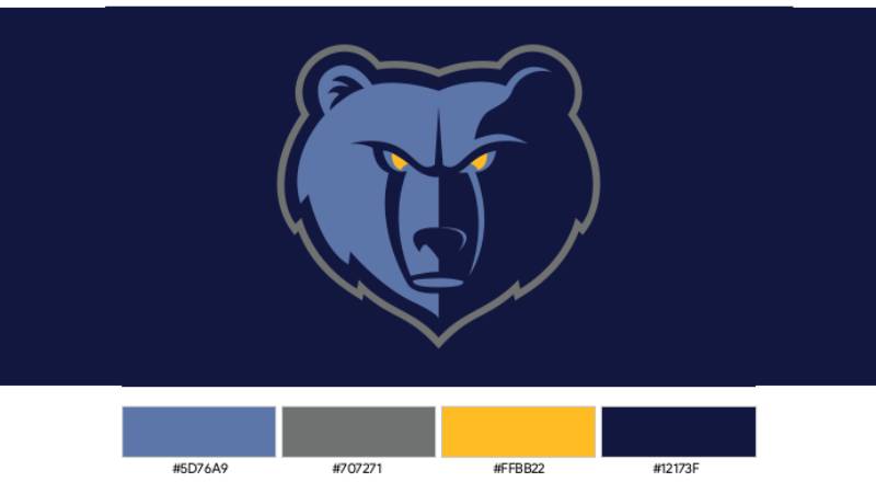
Navy, Smoke, and All Things Blue
The Memphis Grizzlies have always flirted with the shades of blue. The current palette, with its navy and smoke blue, screams sophistication. It’s not just pretty; it’s strategic. Navy represents strength and determination while smoke blue adds a modern touch.
The Link with the City
Colors are more than just… colors. They tell a story. Memphis is a city by the river, and the blues in the logo subtly nod to the waters of the Mississippi. Every time the players hit the court, they bring a bit of the river’s flow and rhythm with them.
The Font Used in the Memphis Grizzlies Logo
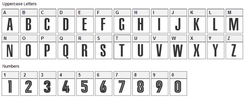
Bold Choices
The font! It’s the unsung hero of any logo. In the case of the Grizzlies, it’s bold, assertive, and forward-leaning, kinda like a fast break in basketball. It complements the fierceness of the bear, creating a harmonious balance.
Stylistic Evolution
Over the years, while the bear remained a steadfast symbol, the typography witnessed some tweaks. The modern font choice reflects a contemporary vibe, ensuring the logo remains relatable to newer generations while keeping its core ethos intact.
Behind the Scenes: Crafting the Logo
The Design Process
Ah, the creative journey! Designing the Grizzlies logo wasn’t a one-shot thing. It involved a lot of brainstorming, sketching, and revisions.
Think about taking the essence of a team, a city, and a sport, then blending them into one iconic image. It’s magic mixed with a lot of caffeine and late nights.
The Emotions It Evokes
A great logo does more than just look good. It feels right. The Grizzlies logo, with its fierce bear and dynamic typography, evokes feelings of anticipation, excitement, and pride.
When fans see that logo, their hearts beat a lil’ faster, and the atmosphere gets electric. That’s the power of great design.
Future Prospects: What’s Next?
The Digital Age Touch
We’re in an age of screens, apps, and holograms. How does the Memphis Grizzlies logo fit into this? Well, it’s ripe for digital transformations.
Think augmented reality, where the bear leaps off the jersey or interactive merchandise. The future’s bright, and the logo’s set to shine even brighter.
Sustainability and Merchandise
With the world moving towards sustainable choices, it’s essential that the merchandise bearing the logo does too. Imagine eco-friendly jerseys, upcycled fan gear, and even digital collectibles.
The Memphis Grizzlies logo will not just be a symbol of the team but also of positive change in the sports world.
FAQ On The Memphis Grizzlies Logo
What’s the history behind the Memphis Grizzlies logo?
The journey of the Grizzlies emblem kicked off when the team migrated from Vancouver to Memphis. It’s a story of transformation, keeping the fierce grizzly bear and refining its look to meld with Memphis’s rich cultural tapestry.
The iconic NBA logo reflects the team’s evolution, embodying grit and resilience.
How has the Memphis Grizzlies logo evolved over time?
It’s a dance of design, really. The Grizzlies emblem has evolved, embracing sleeker lines and bolder colors while honoring its original spirit.
The most recent iteration showcases a modernized bear aligned with contemporary graphic design in sports, yet it continues to roar with the team’s original bold vibe.
What do the colors in the Memphis Grizzlies logo represent?
Pardon the pun, but it’s not just black and bear. The NBA team logos bear deep meanings; the navy blue conveys power, the smoke blue speaks to the city’s musical history, and the gold represents the fight for victory.
Every hue narrates the tenacity and heritage of the Memphian squad.
Is there symbolism in the design of the Memphis Grizzlies logo?
Absolutely. More than a mark, it’s a sigil of agility and strength. The grizzly bear’s stance signals readiness to pounce, much like players on a court.
The star-studded eyes? They represent the hope and aspirations of the Memphis sports branding, eyeing success amidst the competitive thunder of the NBA.
Who designed the current Memphis Grizzlies logo?
Truthfully, the designer credits get murky in sports marketing and branding jazz. But what matters is that the current logo was a collective triumph.
It stands as a testament to collaboration between creative minds keen on capturing the essence of Memphis and dunking it right onto the NBA merchandise design circuit.
Can fans use the Memphis Grizzlies logo for personal use?
Fans often wish to wave the emblem like a flag of pride, don’t they? However, the Memphis Grizzlies merchandise and imagery are legally protected.
Personal, non-commercial usage is generally fine, but reproducing the logo for sale or wide distribution without permission plays foul with copyright laws.
What have been the major influences on the Memphis Grizzlies logo design?
Seems like we’re digging into a design detective story! Major influences on the Grizzlies emblem involve interpreting the spirit of Memphis and the embodiment of the grizzly.
These influences meld with trends in the sports logo evolution, ensuring the emblem stays fresh and fierce in fans’ hearts.
How does the Memphis Grizzlies logo compare to other NBA team logos?
The NBA logo design realm is a mosaic of stories and styles. Memphis’s version brings a unique mix of Memphis’s soul shaken with the hardy nature of a grizzly, resulting in a sports team branding cocktail that’s both visually compelling and emotionally resonating, setting it apart in the league’s branding playbook.
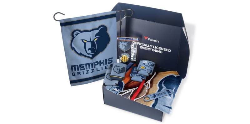
How can I get Memphis Grizzlies logo merchandise?
If the craving for some logo gear is real, you’re in luck. Official Grizzlies fan apparel can be snagged at the team store, online NBA shop, or authorized retailers.
Splashing the Memphis Grizzlies colors on your gear is a click or a step away, ensuring you rock that grizzly pride in style.
Why was the grizzly bear chosen as the symbol for Memphis, given there are no grizzlies in Tennessee?
Irony has its way in logos, doesn’t it? Originally born as the Vancouver Grizzlies, the mascot journeyed southward with the team.
Despite the lack of local grizzlies, the bear remained, latching onto the tough and fearless attributes that mesh well with the Memphis NBA franchise logo and the sports ethos of the city.
Conclusion
Venturing through the visual tapestry of the Memphis Grizzlies logo, we’ve unraveled the enigma of colors and contours that echo the team’s spirit. Bold and unapologetic, the symbol stands not merely as a beacon of Memphis’s prowess on the hardwood but as the heart of the city’s sporting culture, each thread in the emblem’s intricate design a testament to the city and its passionate fandom.
- We’ve recognized the robust history that paved the path for the logo’s creation, a narrative woven from the very essence of Memphis itself.
- We’ve dissected the colors, those vibrant heralds of Memphis’s vibrancy and the team’s tenacity.
- We’ve appreciated the cunning artistry behind sports branding, seeing firsthand how a logo can rouse the roar of fans in FedExForum and beyond.
As the emblem charges forward in the ever-evolving dance of NBA team logos, one thing remains unmistakable: the Memphis Grizzlies logo is much more than an icon; it’s the visual roar of a city, a team, and its zealous supporters.
If you liked this article about the Memphis Grizzlies logo, you should check out this article about the Chicago Bulls logo.
There are also similar articles discussing the Golden State Warriors logo, the Miami Heat logo, the Houston Rockets logo, and the Detroit Pistons logo.
And let’s not forget about articles on the Milwaukee Bucks logo, the Cleveland Cavaliers logo, the Utah Jazz logo, and the Toronto Raptors logo.
Bogdan Sandu, a seasoned designer with 15 years of diverse experience, has been designing websites since 2008.
Renowned for his expertise in logo design and visual branding, Bogdan has developed a multitude of logos for various clients.
His skills extend to creating posters, vector illustrations, business cards, and brochures. Additionally, Bogdan's UI kits were featured on marketplaces like Visual Hierarchy and UI8.
Latest posts by Bogdan Sandu (see all)
- Glow of Dusk: Sunset Color Palettes for Warm Designs - 1 May 2024
- Inspiration For Furniture Website Design: 14 Sites - 1 May 2024
- The Columbia University Logo History, Colors, Font, And Meaning - 30 April 2024