
The KTM Logo History, Colors, Font, and Meaning
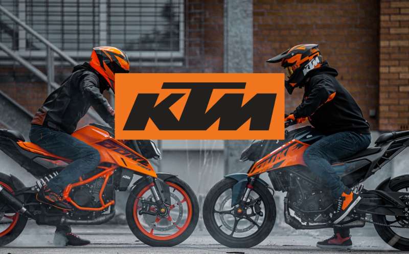
Racing enthusiasm roars just as loudly as the engines on the track, but it’s the silent symphony of design that truly captures the spirit of speed. Behold the KTM logo, a visual testament to heritage and high-octane performance.
This mark, embodied in a distinct orange and black color scheme, is far more than mere branding; it’s the emblem of a motorsport legacy.
In this dive into the essence of graphic identity, you will unearth the stories inked beneath the surface of KTM’s iconic badge.
From the rugged dirt tracks illuminated by the glare of KTM motocross graphics to the urban sprawl conquered by the precision of Duke and RC series street bikes, the design nuances of the emblem speak volumes.
Treading the balance between an aesthetic allure and symbolic prowess, the motorcycle insignia serves as a beacon, rallying the adventurous at heart.
By article’s end, the evolution of the KTM crest will be demystified, leaving you with an enriched understanding of its role in shaping a globally revered powersports manufacturer’s image.
Prepare to throttle through the lanes of design, history, and marketing strategy—where every turn is a revelation.
The Meaning Behind the KTM Logo
Soul, Baby!
Okay, let’s get this straight, logos are like the tattoos of a brand. They tell you a story, give you vibes, and create an aura.
The KTM logo? Man, it’s more than just orange and black swirls. Think of it as an emblem, an emblem that speaks ruggedness, speed, and innovation. Have you ever seen a KTM bike zipping past you? That logo encapsulates the essence, the sheer power of that machine.
Three Letters to Rule Them All
KTM stands for “Kronreif, Trunkenpolz, Mattighofen”. A mouthful, right? But these three words are the cornerstone of KTM’s legacy. The logo encompasses the initials, crafting them into a symbol that stands for Austrian engineering brilliance.
The Design Lingo
Okay, to all of us non-designer folks, the KTM logo may look simple. But, listen, every curve and line in that design is meticulously planned.
The lines are crisp, like a well-tailored suit; they give the whole thing a modern, edgy look. This ain’t your grandma’s vintage logo; it’s a looker designed for the adrenaline junkies!
The History of the KTM Logo
The Humble Beginnings
Listen up, because this is where the action starts. The brand started in 1934. Yeah, that far back! They started off making metal stuff, not bikes. But as the years rolled on, KTM decided they were destined for faster, dirtier things. And oh boy, did they embrace it!
The Evolution, Baby
Now let’s talk about the logo journey. It’s been through changes, man. The first KTM logos were as basic as you can imagine.
As the brand evolved, so did its logo. It started getting sharper, edgier, and yes, ORANGER. The essence remained the same, but the aesthetics? They went from zero to hundred, real quick!
The Modern Shebang
Today, the KTM logo screams modernity, but it’s got that old-school charm. It tells you it’s ready to take on the world but respects where it came from. That’s how you keep it real while moving with the times!
The Colors of the KTM Logo
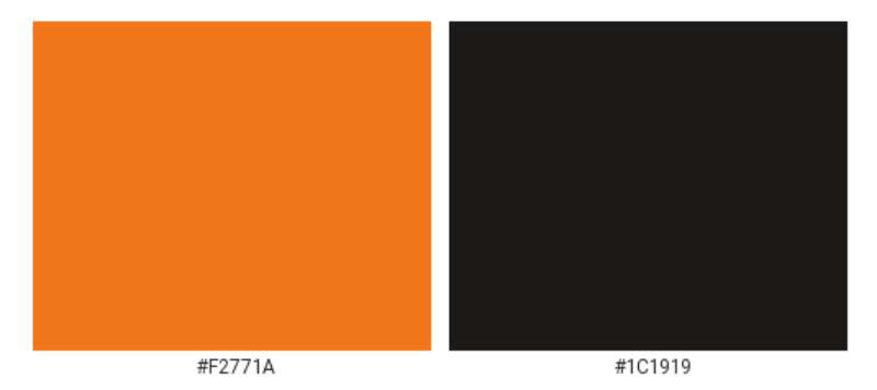
It’s All About That Orange
No messing around here, orange is the soul of the KTM logo. It’s energetic, it’s vibrant, and it shouts “Look at me!” It’s basically the visual equivalent of a revving KTM bike. Makes you feel alive, doesn’t it?
The Black Factor
Don’t forget the black. It’s like the sidekick that makes the hero look good. Adds contrast, brings in some gravity, and balances out the electric orange. Together, they’re the dynamic duo of the visual world.
The Font Used in the KTM Logo
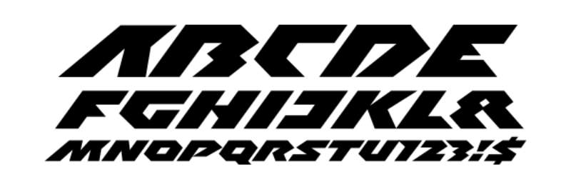
It’s All in the Typeface
Alright, typeface may seem boring, but it’s the unsung hero. The KTM logo uses a custom, proprietary font. It’s bold but not in-your-face. Clean lines, no-nonsense – perfectly aligns with what KTM stands for.
The Message in the Text
See, fonts have personality too. This one? It’s like that serious guy at the party who doesn’t talk much but when he does, you listen. The font conveys authority, strength, and oh boy, it has got charisma.
The Anatomy of the Logo
Symmetry and Proportions
Ever thought about why the KTM logo looks so balanced? That’s because the designers have carefully played with proportions and symmetry. Every element complements the other, creating a harmonious look that grabs attention without screaming for it.
The Subtle Details
Look closely, and you’ll notice tiny elements that make a big difference. There’s meticulous attention to detail, from the spacing between the letters to the angles of the lines. Tiny stuff, but oh-so-important!
The KTM Logo and Brand Identity
An Extension of Brand Personality
The KTM logo isn’t just a separate entity; it’s a crucial part of KTM’s brand identity. When you see that logo, you should instantly think of speed, adventure, and a machine that’s built to perform. It’s like the brand’s fingerprint, unique and telling.
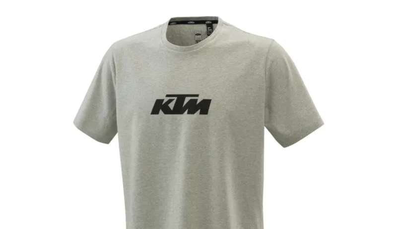
Across Various Platforms
From merchandise to billboards to social media, the KTM logo maintains its vibe everywhere. It’s versatile yet consistent, making sure the brand message is loud and clear, irrespective of where you see it.
FAQ On The KTM Logo
What does the KTM logo represent?
The KTM logo, emblazoned in its signature orange and black color scheme, stands as a beacon of performance, speed, and precision engineering.
Sealed within its lines are the company’s Austrian roots and the pledge of “Ready to race,” echoing its commitment to motorsports excellence.
Where did the KTM logo originate?
Hailing from Mattighofen, Austria, the KTM logo took its first breath side-by-side with the company itself. It’s been a journey through time, transforming and adapting but always clinging to its original ethos of boldness and innovation, much like the motorcycles it adorns.
Has the KTM logo changed over time?
Certainly, the KTM logo has evolved. It’s refined its contours and shades to stay abreast with the times while retaining the essence that distinguishes KTM motorcycles. Each iteration respects the history but embraces progression—an homage to its living legacy.
What do the colors of the KTM logo mean?
Key to its identity, the vibrant orange exudes energy, passion, and adventure, while the black grounds it in strength and sophistication. Together, they mirror the vivid experience of riding a KTM sports bike, from city streets to off-road trails.
Can the KTM logo be used freely?
Usage is strictly tied to copyright laws. Permission is paramount when it comes to reproducing the KTM emblem for any public or commercial purposes, safeguarding the brand’s iconic status and preventing unauthorized applications that could dilute KTM’s brand equity.
Why is the KTM logo prominent in motocross?
KTM’s deep roots in motocross and rally racing have made its logo akin to a trophy. From the tough terrains to the first-place podium finishes, the logo encapsulates a world-class racing heritage, becoming a flag bearer within the community.
How has the KTM logo impacted the brand’s marketing?
The KTM badge is a cornerstone of its marketing, acting as much a symbol of identity as a stamp of quality. It has propelled the brand into a global spotlight, aligning the logo with a lifestyle of adrenaline-fueled excitement.
What products feature the KTM logo?
From the KTM Duke series to elements of gear and clothing, the logo is displayed as a mark of superior craftsmanship. It adorns every product that leaves the house of KTM, including the power-packed KTM X-Bow sports car.
How does the KTM logo compare to competitors’ logos?
In the realm of two-wheelers, few logos command the instant recognition that KTM’s does. It’s not just a mark; it’s a statement. Bold and aggressive, it sits in stark contrast to competitors, often lauded for its uncompromising representation of a brand that lives to race.
What cultural significance does the KTM logo hold?
The KTM logo transcends mere corporate identity, weaving into the fabric of bike culture and motorsport community. It signifies a tribe, a shared ethos among riders, and fans who bleed orange, united under the fluttering flag of KTM’s distinct insignia.
Conclusion
In once-blank canvas of imagination, the KTM logo now breathes life into every crevice of motocycle culture. Through its evolution—from the shores of Mattighofen to the podiums of Dakar—it has become much more than an emblem; it’s the pulse of a legacy, a siren for the thrill-seekers.
Within its bold contours and vivid shades, you’ve witnessed the amalgam of Austrian precision and the call of the wild—orange and black, a heraldry as magnetic on the sophisticated streets as it is on the rugged dirt tracks. Adventure touring motorbikes flash this insignia, making the heart skip a beat, a symbol that echoes ‘Ready to race.’
This exploration has unpeeled layers of the KTM badge, uncovering richness beyond the surface. From motocross graphics to the legendary Duke series, the emblem stands not just for a brand but for a community fiercely united under the warmth of KTM’s sun.
- KTM logo: A crest of excellence
- Heritage: Respected
- Future: Illuminated
As designers, we are architects of perception. And as the final pixel falls into place, remember that every stroke paints a chapter of an ever-unfolding story.
If you liked this article about the KTM logo, you should check out this article about the Suzuki logo.
There are also similar articles discussing the Yamaha logo, the Kawasaki logo, the Indian Motorcycle logo, and the Husqvarna logo.
And let’s not forget about articles on the Ducati logo, the Triumph logo, the KYMCO logo, and the Aprilia logo.
Bogdan Sandu, a seasoned designer with 15 years of diverse experience, has been designing websites since 2008.
Renowned for his expertise in logo design and visual branding, Bogdan has developed a multitude of logos for various clients.
His skills extend to creating posters, vector illustrations, business cards, and brochures. Additionally, Bogdan's UI kits were featured on marketplaces like Visual Hierarchy and UI8.
Latest posts by Bogdan Sandu (see all)
- Seamlessly Blended: Gorgeous Gradient Color Palettes - 30 April 2024
- Examples of Great Gym Websites to Inspire You - 30 April 2024
- The Activision Blizzard Logo History, Colors, Font, And Meaning - 29 April 2024