The Kansas City Royals Logo History, Colors, Font, and Meaning
Imagine a symbol capturing the essence of a city’s spirit, a team’s legacy, and the unbridled passion of sports fans. The Kansas City Royals logo, a distinctive mark in Major League Baseball, wears its royal blue with a pride that echoes through Kauffman Stadium.
This emblem isn’t merely a design; it conveys a rich tapestry of triumphs, trials, and timeless tradition.
In the unfolding pages, delve into the significance of design aesthetics in sports branding, unravel the history behind the Royals’ emblematic crown, and explore the impact of trademarks in an industry driven by fierce loyalty and heritage.
Understanding the nuanced philosophy of athletic insignia draws a line directly to the core of a franchise’s identity.
By article’s end, the reader will grasp not just the logo’s visual allure but its strategic place in the narrative of professional baseball. Prepare to decode graphic elements that, although silent, resonate louder than a stadium full of zealous voices, cheering for the home team.
The Meaning Behind the Kansas City Royals Logo
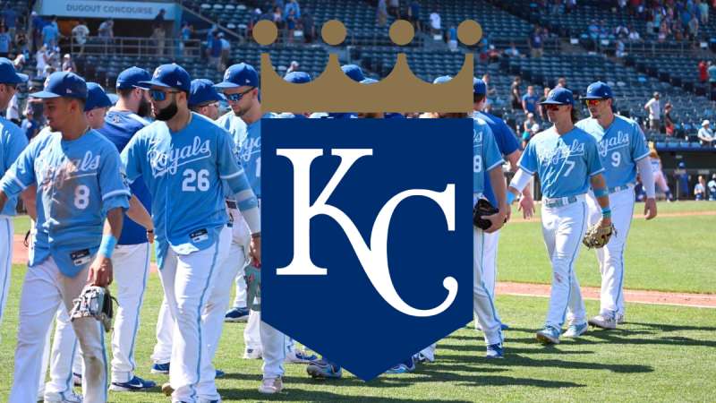
![]()
Oh, the beauty of a brand logo. It’s not just about the visuals, mate. Logos speak.
They have stories, emotions, and, believe it or not, history. The Kansas City Royals logo isn’t an exception. Buckle up, as we’re diving into some deep symbolic waters!
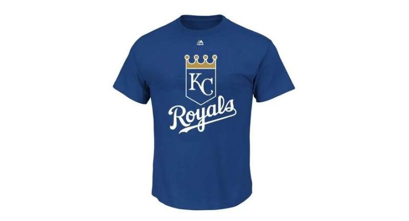
A Symbol of Royalty
Every logo tells a story. For the Kansas City Royals, the essence of royalty is evident. The crown isn’t just there because it looks snazzy! It represents the majesty and the regal stature. It’s an ode to the “City of Kings”. You know, royal vibes.
The Baseball Connection
Then there’s the baseball. Oh yes, the baseball. As much as the Royals honor their city’s name, they also celebrate the sport they love and play. The ball in the emblem is there, loud and proud, saying, “We play with passion and we represent Kansas City.”
The History of the Kansas City Royals Logo
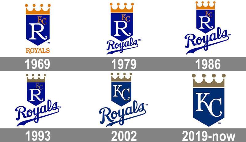
Man, oh man! Jump into the time machine because it’s storytime. The Kansas City Royals logo has evolved. It wasn’t always what it looks like now.
Beginnings and Inspiration
Our journey begins in 1968. Kansas City was bestowed a new baseball franchise, and with it, the need for a standout emblem.
The name “Royals” wasn’t randomly picked from a hat. It was influenced by the American Royal, a livestock show, rodeo, and championship barbeque competition. See the connection? Livestock show = Royalty. Mind-blown, right?
Evolution and Changes
Like every fashion trend, logos have their highs and lows. Over the decades, the Royals logo saw tweaks here and there. The crown became sharper, the colors got a facelift, but the essence? That never changed.
The Colors of the Kansas City Royals Logo
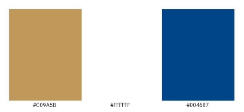
Colors, dude, they’re powerful. They convey emotions, sentiments, and set the mood.
Blue: The Dominant Shade
There’s a lot of blue in the logo. Blue is calm, trustworthy, and oozes dependability. It’s like your loyal buddy who’s always got your back.
Gold: The Royal Touch
Then there’s gold. Gold stands for grandeur, glitz, and glory. It’s like a pat on the back for the Royals, a reminder of their majestic roots.
The Font Used in the Kansas City Royals Logo
Typography. It’s the unsung hero of any design.
Simple Yet Significant
The Royals went with a font that’s straightforward yet dripping with significance. It’s not just any random font; it’s custom-tailored. The letters, bold and upright, exude confidence.
Making a Statement
In the world of design, the choice of typeface can make or break the deal. The Royals’ typeface is a statement in itself, complementing the overall aesthetic of the logo.
Cultural Impact and Recognition
The Kansas City Royals logo isn’t just a design. It’s an icon that’s recognized not only in baseball circles but beyond.
A Cultural Staple
For the folks in Kansas City, the Royals logo isn’t just a symbol of their baseball team. It’s a part of their culture, their identity. It’s on merchandise, murals, and even some funky tattoos.
Global Recognition
Thanks to the team’s successes and media coverage, the emblem has gone global. Even if you’re miles away from Kansas City, spotting that crown and baseball combo instantly rings a bell.
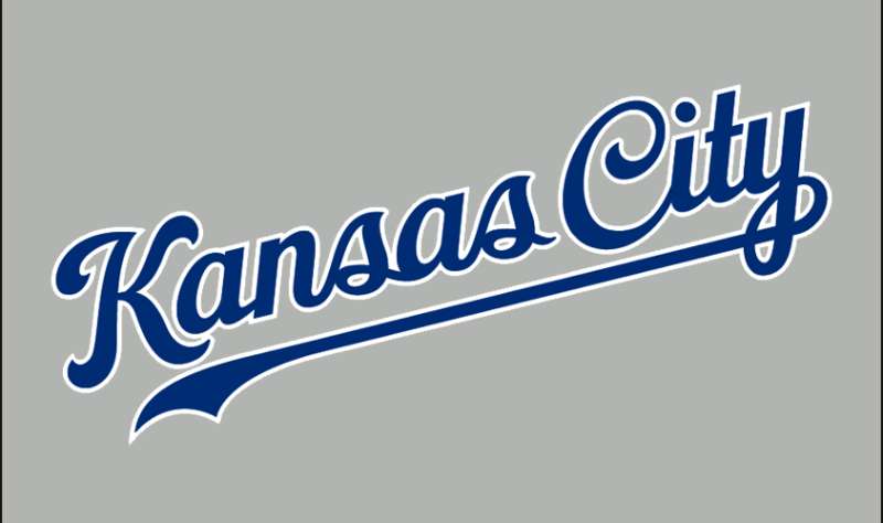
Logo Adaptations and Variations
Hey, variety is the spice of life!
The Alternate Logos
Throughout its history, the Royals have had several alternate logos. These variations, though not as prominent as the primary, have their own charm.
Seasonal and Special Editions
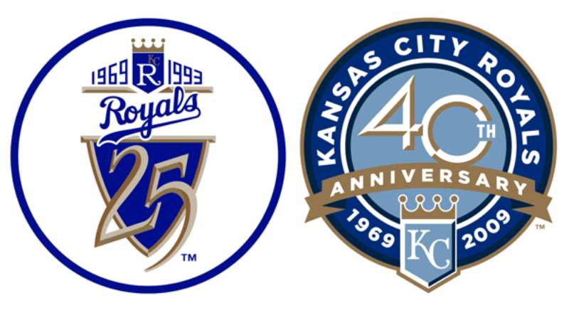
Special occasions? The Royals got you. They’ve rolled out some super cool editions for anniversaries, championships, and more. Each unique, each holding a memory.
FAQ On The Kansas City Royals Logo
Who designed the Kansas City Royals logo?
The Royals logo, a symbol of Kansas City’s passion for baseball, wasn’t just the brainchild of one person but rather the result of a collaborative effort.
Different versions have evolved, but each iteration was meticulously crafted by graphic designers intent on capturing the team’s spirit.
What do the colors in the Royals logo represent?
Royal Blue and gold stand at the logo’s core. The colors symbolize excellence and regality. The blue resonates with steadfast loyalty, while the gold accents signify a commitment to high standards and the pursuit of victory — traits integral to the Royals’ identity.
Has the Kansas City Royals logo changed over time?
Indeed, the logo has undergone transformations, reflecting evolving times and the franchise logos‘ need to stay fresh. Adjustments have been made to color shades and graphical elements, ensuring the logo continues to connect with new generations of fans.
What year was the current Royals logo introduced?
The current iteration of the logo made its debut in the year 2002. This refresh introduced a more modern edge to the team’s branding, resonating with the vibe of early 21st-century graphic design yet maintaining the iconic elements beloved by fans.
Is there a meaning behind the crown in the Royals logo?
The crown is more than an eye-catching feature; it’s a nod to the city’s namesake—the “Royals” and a representation of the team’s quest for excellence. Symbolizing sovereignty within the sport, the crown also alludes to Kansas City’s own ‘Monarchs’ from the Negro Leagues.
Can fans use the Kansas City Royals logo for personal use?
While fans are encouraged to show their support, the logo is a trademarked symbol and its use is regulated. Unauthorized reproduction or sale of merchandise featuring the logo is prohibited.
Where can I buy official Kansas City Royals logo gear?
Official Royals logo gear is widely available. From the MLB shop to local sports memorabilia outlets in Kansas City, as well as various online platforms, the options cater to every fan’s desire to don the team’s emblem.
What’s the significance of the “KC” in the Royals logo?
“KC” isn’t just an abbreviation; it’s the heart of the city’s identity. Symbolizing the unwavering bond between the team and its home plate, those two letters on a cap or jersey are instant identifiers of Royals pride.
How does the Royals logo compare to other MLB team logos?
In the world of MLB team logos, the Royals’ logo stands out for its elegant simplicity and strong color contrast. It’s both modern and timeless, capturing the team’s essence without unnecessary complexity—a balance that’s both admired and challenging to achieve.
Are there any special editions of the Kansas City Royals logo for events?
Celebratory events, like a World Series win, often spur the release of special edition logos. These collectible graphics fuse the traditional symbol with elements commemorating the occasion, making them a treasured piece of Royals history.
Conclusion
In essence, the fluid lines and bold colors of the Kansas City Royals logo weave a narrative that transcends baseball. The emblem, crowned with history, stands testament to a community bound by threads of blue and gold—a tapestry of athletic pride unfurling in the heart of Missouri.
This deep dive into the logo’s anatomy has revealed more than a mere visual identity; it has showcased a branding masterpiece reflective of a team’s storied legacy under the bright lights of Major League Baseball. It captures a saga rich with strikes and home runs, narrated by a city’s love for America’s favorite pastime.
As the final chapter of this exploration concludes, one thing remains crystal clear: the logo is not just a representation—it’s a declaration. A symbol turned beacon that continues to inspire both players and fans, ensuring the script of the Royals’ spirit is indelibly written across the sport’s grand stage.
If you liked this article about the Kansas City Royals logo, you should check out this article about the Arizona Diamondbacks logo.
There are also similar articles discussing the Colorado Rockies logo, the Houston Astros logo, the Miami Marlins logo, and the Chicago White Sox logo.
And let’s not forget about articles on the New York Yankees logo, the Philadelphia Phillies logo, the Toronto Blue Jays logo, and the Los Angeles Dodgers logo.
Bogdan Sandu, a seasoned designer with 15 years of diverse experience, has been designing websites since 2008.
Renowned for his expertise in logo design and visual branding, Bogdan has developed a multitude of logos for various clients.
His skills extend to creating posters, vector illustrations, business cards, and brochures. Additionally, Bogdan's UI kits were featured on marketplaces like Visual Hierarchy and UI8.
Latest posts by Bogdan Sandu (see all)