The Denver Nuggets Logo History, Colors, Font, and Meaning
Imagine the pulse of exhilaration that surges through the stands of the Pepsi Center when the bold navy and golden hues of the Denver Nuggets logo light up the arena.
This iconic emblem embodies not just a team but a relentless spirit woven into the fabric of Colorado’s basketball tapestry.
Diving into the depths of this singular graphic identity reveals a saga of design, sports culture, and loyalty. This article unfurls the rich tapestry behind the emblem, from its conception to the present day—showcasing how every curved line and color shade encapsulates a storied legacy.
By the conclusion, readers will have unraveled the emblem’s evolution, its indispensable role in branding strategy, and its emotional resonance with fans.
Unearth the significance of the Denver Nuggets’ logo—a symbol standing at the crossroads of athletic excellence and artistic genius.
Prepared to embark on a journey through time, trends, and textures of the Denver Nuggets insignia, we will traverse NBA team logos, sports branding, and dive into the essence of sports marketing—all elements integral to the graphic identity of an NBA Western Conference powerhouse.
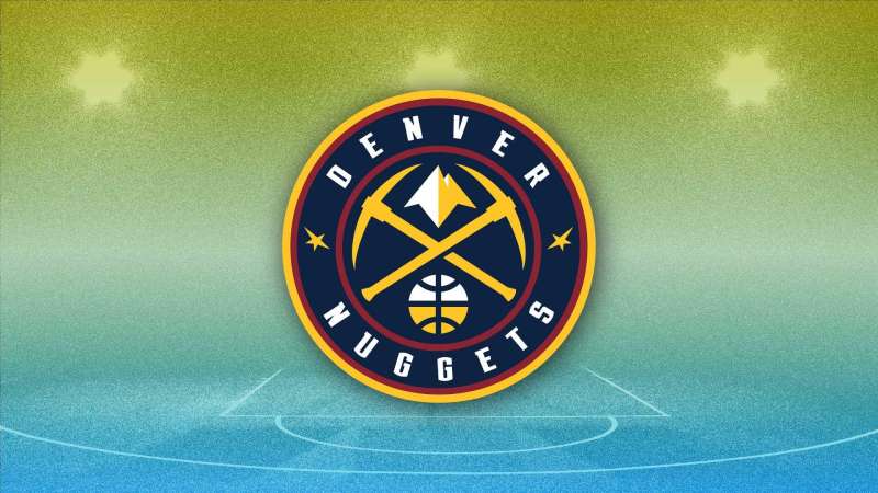
The Meaning Behind the Denver Nuggets Logo
![]()
Ah, the Denver Nuggets logo. When you look at it, it might just seem like a design, but there’s more than meets the eye.
Digging Deep
So, you’ve seen the logo, right? You’ve got mountains, a ball, and that sleek pickaxe. The mountains? They represent Denver’s location at the foothills of the Rocky Mountains, a nod to the city’s geographic pride.
The ball, obviously, represents basketball, the game we all adore. But the pickaxe, that’s the cool bit. It signifies Denver’s gold rush history, the same history that gives the team its name. Nuggets, as in gold nuggets.
More Than Just Graphics
When a team chooses symbols for its emblem, it’s not just about looking good on a jersey. It’s about identity. The Nuggets logo captures the essence of Denver, both its rich history and its modern love for basketball.
The History of the Denver Nuggets Logo
![]()
Logo history is always fascinating. It’s like watching your favorite movie character evolve. And boy, the Denver Nuggets logo has a tale to tell.
A Journey Back in Time
Back in the 70s, the Nuggets had a totally different look. Picture a miner with a big ol’ basketball.
Fast forward a bit, and they introduced those crisp mountains into the mix. The team played around with various designs over the years, tweaking, adjusting, until landing on the gem we see today.
From Simplicity to Sleekness
With each iteration, the Nuggets seemed to refine their vision. They moved from a simpler, more cartoonish look to something sleeker, more modern, and yet full of meaning.
The Colors of the Denver Nuggets Logo
Blue Like the Sky
The dominating navy in the Nuggets logo? It’s all about the expansive Colorado sky and those deep twilight moments. It symbolizes depth, trust, and loyalty.
Gold for the Win
The gold? Yep, you guessed it. A throwback to those gold nugget days. But also, gold in sports often signifies victory, superiority, and grandeur.
The Font Used in the Denver Nuggets Logo
Fonts are like the unsung heroes of designs. The font in the Nuggets logo is bold, commanding attention.
A Modern Touch
The typeface feels modern, doesn’t it? It’s straight with sharp edges, representing precision and forward motion. It complements the overall design, making the name of the team stand strong amidst the bold symbols.
The Symbolism of the Pickaxe
This deserves its own spotlight. The pickaxe in the logo, crossing over the basketball, is not just a nod to history.
A Tool of Tenacity
In the gold rush era, the pickaxe was a tool of persistence. It represents the tenacity, the grit, the hard work that defines not just a gold digger, but also an athlete striving for greatness.
The Evolution of Branding in Sports
When we look at logos like that of the Nuggets, it’s a reminder of the evolving world of branding in sports.
Beyond Just a Game
Today, a team’s emblem is not just a symbol of a game, but an entire brand. It influences merchandise, digital media, and even how fans connect emotionally to their teams.
The Denver Nuggets logo is a fantastic example of blending history, meaning, and modern design into one cohesive brand image.
FAQ On The Denver Nuggets Logo
What inspired the design of the Denver Nuggets logo?
The mountainous backdrop and mining history of Colorado were key influencers. With a pickaxe and a mountain range silhouette, the logo encapsulates Denver’s gold rush legacy and its lofty aspirations, akin to the towering peaks of the Rockies.
Has the Denver Nuggets logo changed over the years?
Indeed, it has evolved with time, reflecting the team’s growth and changes in aesthetic trends. Starting with a prospector, moving through various rebranding phases, the current logo now boasts a sleek, modern design that pays homage to the team’s heritage and the city’s energy.
What do the colors of the Denver Nuggets logo represent?
Blue represents the sky, red signifies the western landscape, gold echoes the mining past, and white symbolizes the snow-capped Rockies. Each shade is chosen to evoke Colorado’s natural beauty and the Nuggets’ vibrant spirit.
How often does the Denver Nuggets logo get updated?
Updates aren’t on a set schedule—changes occur at strategic intervals to refresh the brand. The team’s visual identity has been modified several times, with the last major update moving towards a more minimalist and bold representation to capture the ethos of modern Denver.
What was the public’s reaction to the last logo change?
It was a concoction of nostalgia and excitement. While some fans yearned for tradition, others applauded the fresh take. Over time, the new logo has gained acceptance as a symbol reflecting both the Denver Nuggets’ rich history and progressive future.
Are there alternate versions of the Denver Nuggets logo?
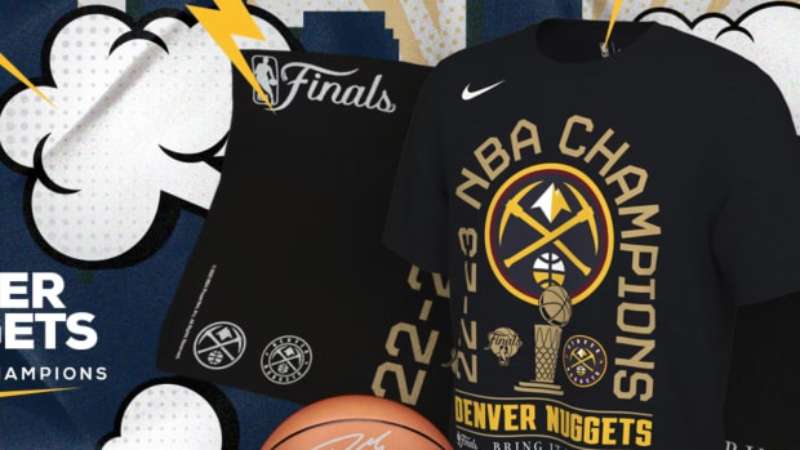
Absolutely, special editions like the skyline logo or the retro rainbow design surface occasionally. These alternate logos cater to diverse preferences, often appearing on merchandise and becoming fan favorites that celebrate the Denver Nuggets’ unique basketball journey.
Can you describe the design elements of the Denver Nuggets logo?
The current logo is a masterclass in simplicity and relevance. A basketball encapsulates the city’s skyline against a mountain silhouette, bound by a circular frame. Two crossed pickaxes further allude to Denver’s mining roots, reinforcing the team’s ties to local history.
How does the Denver Nuggets logo compare to other NBA team logos?
The Denver Nuggets logo stands out with its geographic and historic references, which is less common among other NBA logos.
It has a distinct identity that uniquely binds the team to its home state, distinguishing it from the generic or mascot-centric logos of many other franchises.
What legal protections does the Denver Nuggets logo have?
As a registered trademark owned by Kroenke Sports & Entertainment, the Denver Nuggets logo is legally protected against unauthorized use. This ensures that the emblem remains a unique identifier of the franchise and its official merchandise.
How can I legally use the Denver Nuggets logo?
Wishing to incorporate the Nuggets’ emblem into a project or product? Secure written permission from Kroenke Sports & Entertainment. They’re the gatekeepers, ensuring that the team’s logo is used in ways that uphold the brand’s integrity and legal standing.
Conclusion
Navigating through the storied panorama of the Denver Nuggets logo, one becomes a witness to a confluence of art, history, and basketball passion. I’ve led you down the memory lanes paved with the team’s colors, guiding you to appreciate how each iteration reflects a chapter in Denver’s tale, as much as any victory on the hardwood.
- The emblem is not just a trademark; it’s the pulse of the Pepsi Center, the roar of the fans, and the spirit of the players condensed into a visual anthem.
- The pickaxes, the mountain silhouette, they’re more than design elements; they embody the relentless drive that defines both the city and its team.
In the dance of pixels and palette, remember that branding and sports marketing merge here to paint a story—inspiring loyalty, inviting nostalgia, dictating merchandise trends—all through the poetry of design. Carry forward an enriched understanding of an identity that stretches well beyond the court—a logo that’s etched in the heart of Denver, and the game.
If you liked this article about the Denver Nuggets logo, you should check out this article about the Sacramento Kings logo.
There are also similar articles discussing the Dallas Mavericks logo, the Washington Wizards logo, the Atlanta Hawks logo, and the Brooklyn Nets logo.
And let’s not forget about articles on the New York Knicks logo, the Orlando Magic logo, the Los Angeles Lakers logo, and the Minnesota Timberwolves logo.
Bogdan Sandu, a seasoned designer with 15 years of diverse experience, has been designing websites since 2008.
Renowned for his expertise in logo design and visual branding, Bogdan has developed a multitude of logos for various clients.
His skills extend to creating posters, vector illustrations, business cards, and brochures. Additionally, Bogdan's UI kits were featured on marketplaces like Visual Hierarchy and UI8.
Latest posts by Bogdan Sandu (see all)