

Creating infographics and creating them properly is not an easy task, it’s actually a challenge and requires a designer to get documented first, practice, and only afterward to actually design one for a client.
Infographics are good examples of visual communication and are quite popular these days due to the fact that everything that is visual is almost automatically well-received by the public. This has made data visualization a thing that “must be done” by every designer, and that is almost always a bad thing.
Creating good data visualization is not the same as designing a brochure, flyer, or poster. The problem is that many ignore this aspect and keep doing it by their own rules, which can only be a stupid thing to do since it results in misleading data visualization.
The purpose of infographics is to visualize data, to communicate information clearly and efficiently. As you will see in the following examples, the designers who made these masterpieces haven’t been able to communicate information clearly and efficiently at all, instead they complicated things or managed to add incorrect data which can only confuse the viewers.
Of course, there are also good infographic examples, if you want to check them out.
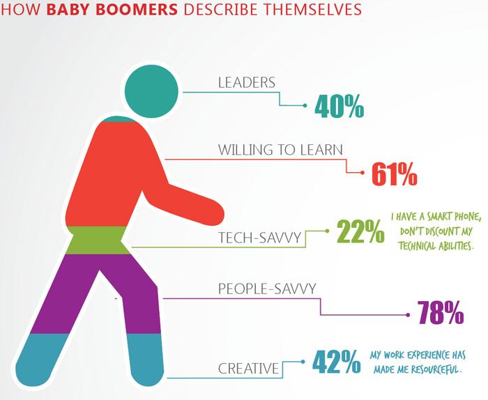
He’s 243% baby boomer

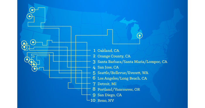
As the crow flies

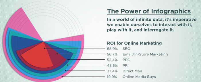
You know you’re in trouble when your design firm opts for the overlapping wedges for their homepage banner

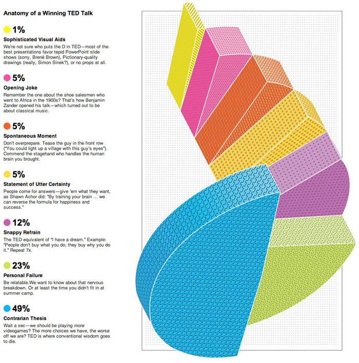
The spiral staircase

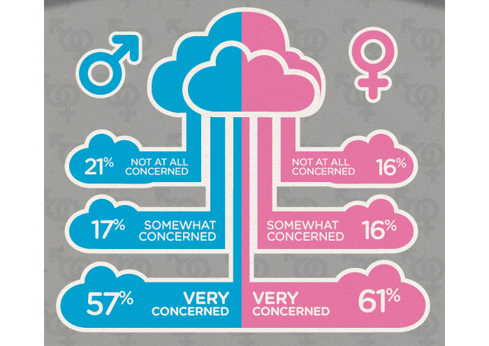
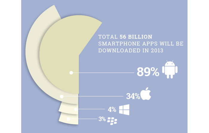
100% chance of cloudy data

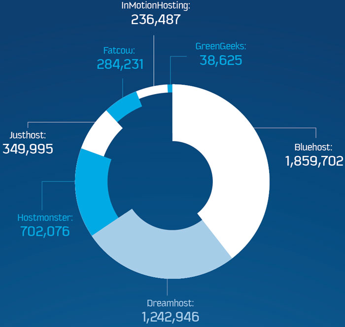
Donut charts are mostly for decoration, right?


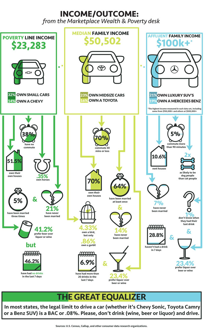
Ugh, poor people


Apparently we are supposed to make a connection between income, driving and ???

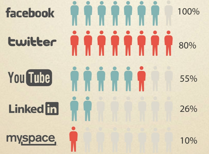
Lovely user humps

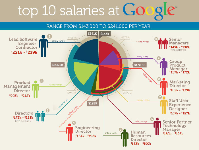
Top 10 salaries at Google

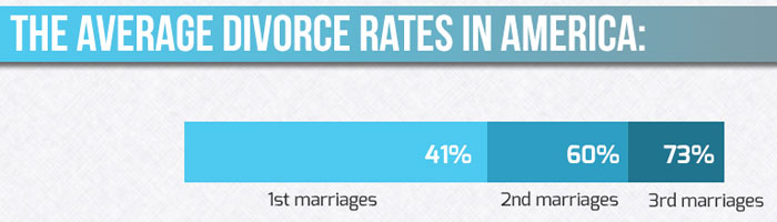
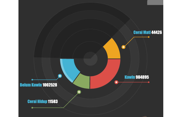
Divorced from data

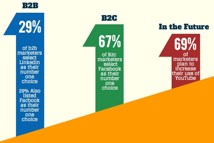
In the future

Parabolic labeling

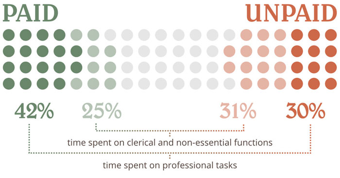
Unpaid design work

Blueberry pie

Recursive donuts

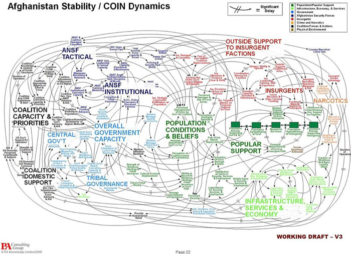
Just a working draft

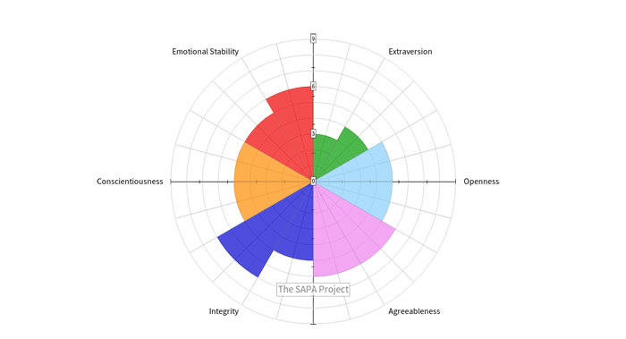
Personality circle

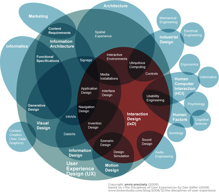
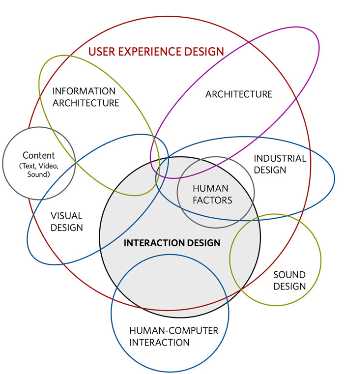
Mindmap mindfuck

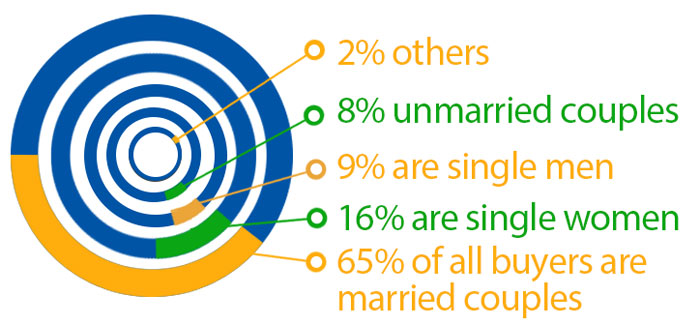
The donut ring explosion

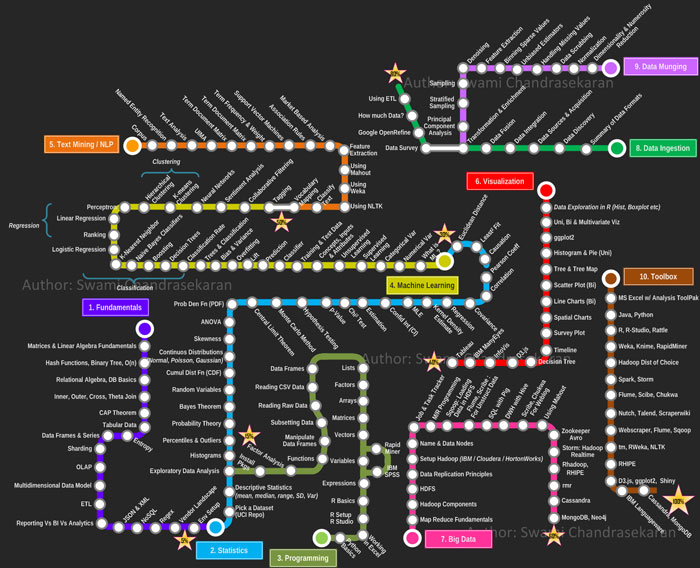
Disconnected subway map? Sequential, linear relationships?

Fantastically designed user experience. /s

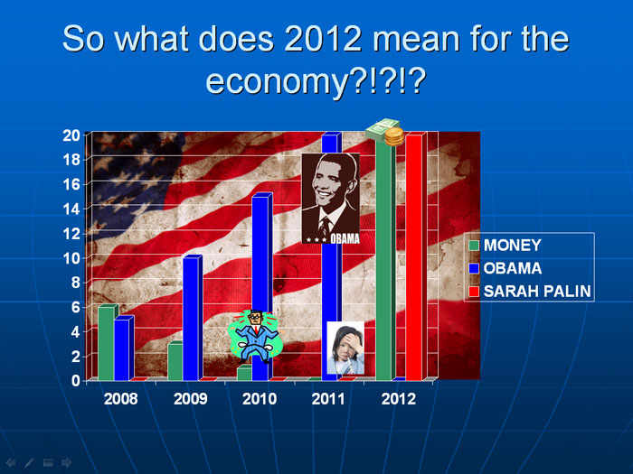
20 Obamas is just too much for our economy

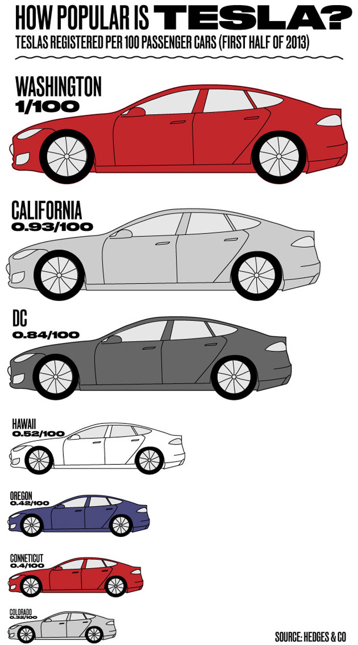
Honey I shrunk the car

Well, that clears things right up. /s

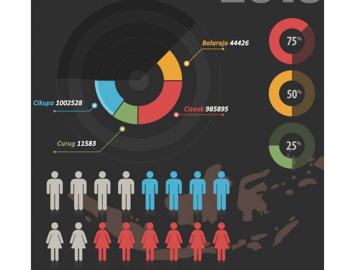
Pay close attention to the 75% donut chart

Data darkness

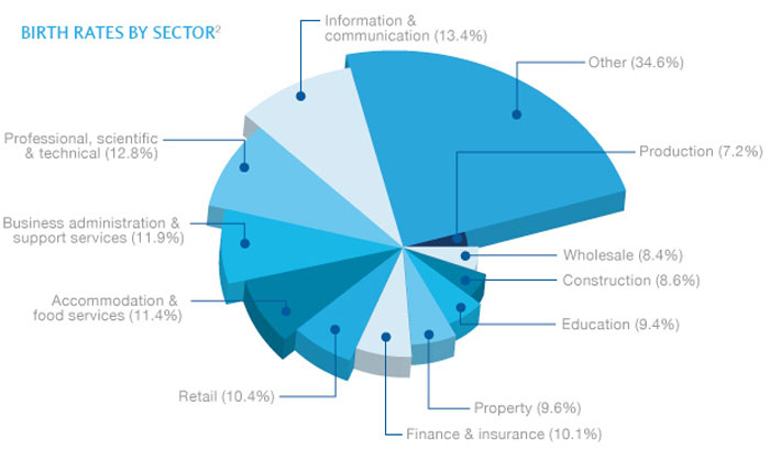
The layered pie slices

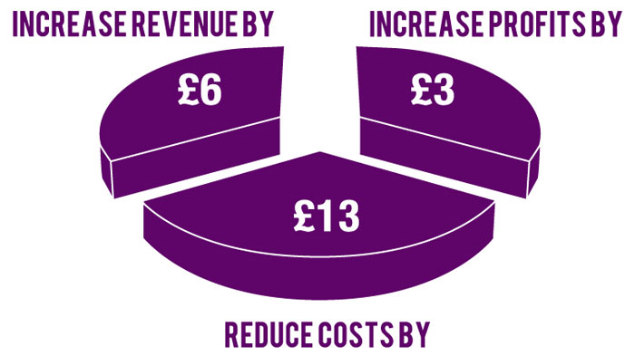
The percentages

The nautilus

The dehydrating donut chart

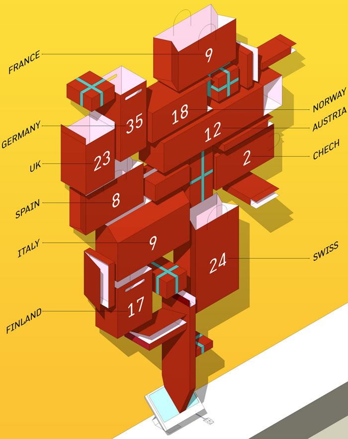
Let the data out of the bag

FAQ about badly designed infographics
Why are some infographics hard to understand?
Man, it’s crazy how some infographics can be confusing, right? The main reason is that they’re poorly designed. Sometimes, the creators try to cram too much info into a small space, making it cluttered. Other times, they use confusing visuals, bad color combinations, or inappropriate fonts. The goal should be to make info easy to digest, but bad design choices can really mess that up.
What makes an infographic “bad”?
A “bad” infographic is usually one that’s got a jumble of problems. Things like unclear hierarchy of information, inconsistent design elements, and an overall lack of focus can make it tough to understand. It’s like trying to read a book with no punctuation, you know? It just doesn’t flow right. A good infographic should be clean, visually appealing, and convey its message clearly.
How can I spot a badly designed infographic?
Well, you’ll know it when you see it! But seriously, some key signs include cluttered layouts, poor color choices, unreadable text, or visuals that don’t match the content. If you’re struggling to understand the message or you’re getting distracted by design flaws, then it’s probably a badly designed infographic.
Can I improve a poorly designed infographic?
Absolutely! To improve a poorly designed infographic, try simplifying the content, using a better layout, or adjusting the colors and fonts. Make sure the visuals accurately represent the data, and that the overall design is easy on the eyes. A little bit of tweaking can go a long way in making it more effective.
Why do people create badly designed infographics?
Oh man, that’s the million-dollar question! Sometimes it’s due to inexperience or lack of design skills. Other times, the creator might be trying to manipulate the data in a certain way, intentionally or not. And, of course, sometimes people just rush through the design process without giving it enough thought.
How can I avoid creating a badly designed infographic?
To avoid creating a bad infographic, plan ahead and think about the message you want to convey. Choose a clear layout, use appropriate colors and fonts, and make sure your visuals are accurate and easy to understand. And, you know, don’t rush it – take your time to create something that looks good and effectively communicates your message.
What are some examples of badly designed infographics?
Oh, there are plenty of examples out there! Some common ones include pie charts with too many slices, bar charts with uneven spacing, or infographics that try to show a complex data set with a single image. Just do a quick search online, and you’ll find a treasure trove of bad infographics to learn from.
Can a badly designed infographic still be useful?
Well, I guess it depends on the context. In some cases, a badly designed infographic might still convey important information, but it’ll probably take more effort to understand. It’s always best to aim for clear and effective design, though, to make sure your message gets across without any confusion.
How can I learn to create better infographics?
To improve your infographic game, try studying well-designed examples and learning from their techniques. There are also tons of resources online, like tutorials and design courses, to help you hone your skills. And, of course, practice makes perfect – keep creating and refining your designs to get better over time.
What should I do if I find a badly designed infographic?
If you stumble upon a badly designed infographic, try to figure out what’s wrong with it and how it could be improved. If it’s your own work, take the time to revise and enhance it. If it belongs to someone else, consider offering constructive feedback to help them improve their design. Remember, we all have room for growth, and sharing ideas can help everyone create more effective and visually appealing infographics.