

Picture this: A symbol, an icon, standing the test of time and banking revolutions—the Wells Fargo logo. It’s more than a mere design; it’s the heartbeat of corporate identity, a beacon of trust in the financial world.
Dive in and unearth the story behind the stagecoach that races across the financial plains of America. We’re traversing the intricate tapestry of design elements, from color schemes reflecting trust and stability, to typographic choices spelling out heritage. With each word in this article, discover how this emblem—a blend of tradition and modernity—echoes through the halls of banking history and into the digital age.
By the end of our journey, you’ll grasp not only the visual prowess of Wells Fargo’s brand aesthetics but also how they leverage their iconic emblem to galvanize customer perception.
Get ready to explore:
- Wells Fargo’s brand journey
- The logo’s impact on marketing campaigns
- Insights into the redesign process
- The pivotal role of graphic designers in shaping brand equity
Step into the stirrups; it’s going to be one heck of a ride!
The Meaning Behind the Wells Fargo Logo

Stagecoach – The Mark of Heritage
You see those six horses pulling the stagecoach in the old logo? This is the heart of the Wells Fargo logo. It’s not just an old-fashioned form of transport. No, it’s so much more. It’s the company’s DNA. The very roots.
Back in the mid-1800s, Wells Fargo was all about delivery services. The stagecoach is a nod to that original service, a tip of the hat to the old days. But it also shows where the company is going. Always driving forward, just like those horses.
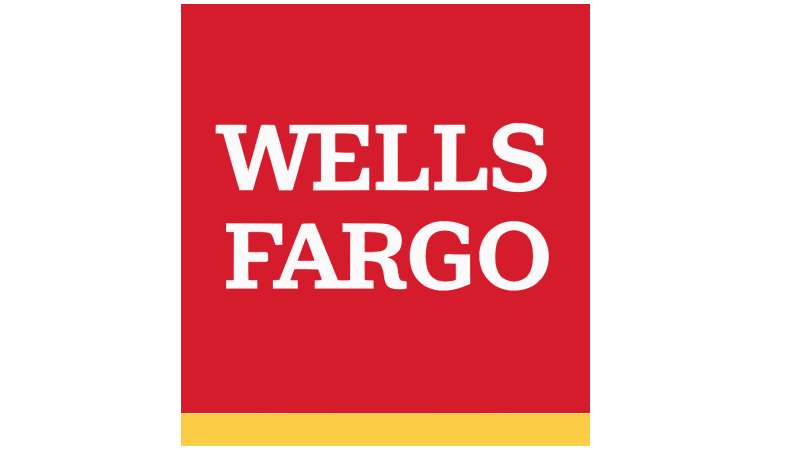
The Red Square and White Lettering
Let’s talk about that red square, the one holding the bold WELLS FARGO. That’s not just a pop of color. Nope. Red symbolizes strength, power, determination. It’s telling you that Wells Fargo is a force to be reckoned with.
Then you’ve got the white letters. Pure white against bold red. It screams stability, reliability. Wells Fargo is there, dependable, solid as a rock.
The History of the Wells Fargo Logo
![]()

Strolling down the memory lane of design…
The Pioneer Days
Let’s rewind back to 1852. The first Wells Fargo logo didn’t have a stagecoach, no shield, and no horses. It was a simple monogram, a merger of ‘W’ and ‘F’. Why? Well, back then, simplicity was key. Brands need to be easily recognized in a sea of illiteracy.
The Evolution
Fast forward to the 20th century. Wells Fargo reintroduced its historical symbols – the stagecoach, and the horses. It was a bold move, a nostalgic nod to their roots, and yet a promise of resilience and adaptability.
The Colors of the Wells Fargo Logo
![]()

Colors speak louder than words…
The Golden Yellow
Look at the logo. Notice the vibrant golden yellow? It’s there for a reason. It speaks of wealth, prosperity, and optimism. It reminds you of gold, right? That’s no coincidence. Remember, Wells Fargo started during the gold rush era.
The Deep Red
Now, focus on the deep red. It’s warm, it’s inviting. It’s a color that symbolizes passion, energy, and power. It’s a promise of commitment and dedication, a warm welcome to every customer.
The Font Used in the Wells Fargo Logo
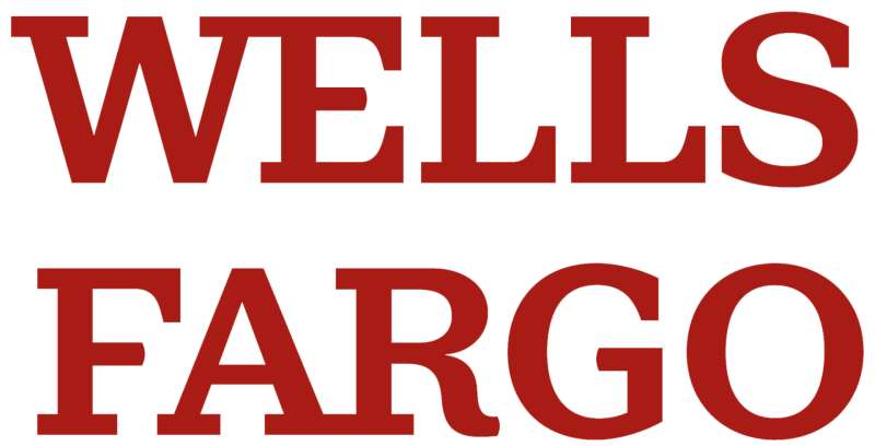

Fonts, the silent actors of design…
The Bold Typeface
Notice the bold typeface used in the logo. It’s strong, it’s visible. It exudes a sense of reliability and authority. Why is that important? Because in the banking world, trust is everything.
The Geometry of the Wells Fargo Logo
A closer look at the shape and form…
The Symmetry
Take a step back. Look at the logo as a whole. Notice the symmetry? The stagecoach, perfectly balanced, exudes a sense of harmony, stability, and equilibrium. This balance isn’t just pleasing to the eye, it also conveys a message of balance in business practices.
The Sharp Angles
Look at the sharp angles of the shield. They symbolize precision, accuracy, and efficiency. These are all essential qualities in banking. They reassure customers that Wells Fargo means business and that they value precision and efficiency in their operations.
The Impact of the Wells Fargo Logo
How a logo influences perception…
The Trust Factor
We’ve talked about symbolism, colors, fonts. But what does it all mean? How does it impact the customer? Well, it’s all about trust. A logo, through its elements and design, can inspire confidence. And in the banking world, that’s priceless.
The Recognition
A logo also plays a significant role in brand recognition. An effective logo like Wells Fargo’s, with its distinctive stagecoach and strong colors, stands out in the crowd. It becomes a familiar sign, a beacon that people can instantly identify and connect with.
The Future of the Wells Fargo Logo
Gazing into the crystal ball of design…
The Ever-evolving Landscape
Change is the only constant, and this holds true for logos too. The Wells Fargo logo has evolved over time, adapting to the changing landscape. So, what’s next? We can’t predict the future, but we can expect the logo to continue evolving, always staying true to its roots, yet adapting to the ever-changing world.
The Role of Technology

As technology permeates every aspect of our lives, it’ll also influence logo designs. We might see more dynamic, interactive versions of the Wells Fargo logo, designed for the digital age. But no matter how much it changes, the core elements – the stagecoach, the shield, the horses – they’ll always be there, reminding us of the company’s long-standing commitment to its customers.
That’s the story of the Wells Fargo logo – a tale of history, symbolism, and constant evolution. A logo isn’t just a design; it’s a narrative, a silent communicator, a bridge between the company and its customers. And the Wells Fargo & Company logo? Well, it’s a storyteller, whispering tales of resilience, trust, and progress.
FAQ on the Wells Fargo Logo
What’s the history behind the Wells Fargo logo?
The Wells Fargo logo boasts a deep heritage, rooted in the classic American West. The iconic stagecoach represents the company’s origin as a mail and banking service, rolling across rugged terrain to deliver goods. It’s a nod to the bank’s enduring legacy in American banking history.
Why does the Wells Fargo logo feature a stagecoach?
That stagecoach isn’t just for show. It’s a historical reference to Wells Fargo’s early days when they actually used stagecoaches to transport gold across America. So, it’s like a tribute to the bank’s pioneering spirit in the financial services’ wild west.
Has the Wells Fargo logo changed over time?
Oh, for sure! Like a good wine, it’s evolved. The bank has tweaked its branding elements over the years, ensuring the Wells Fargo logo stays modern without losing its symbolic representation. It’s all about marrying tradition with fresh corporate identity vibes.
What do the colors in the Wells Fargo logo signify?
Those colors are no coincidence. They ooze reliability and warmth. Deep red for confidence, and gold for a touch of prosperity and quality. It’s like visual branding with a purpose, aimed at building trust and affirming the brand’s prestige in the financial industry.
Who designed the Wells Fargo logo?
That’s a bit of a mystery. There’s no single graphic designer taking a bow here. Instead, it’s likely a collective brainchild of several brand managers and designers over time, each adding a stroke of genius to craft this beacon of brand recognition.
Is the Wells Fargo logo trademarked?
Absolutely. It’s a cornerstone of their visual identity, fiercely protected under intellectual property rights. The logo is a registered trademark, acting as a legal shield in the bustling world of brand aesthetics and corporate logo usage.
How do brand guidelines affect the Wells Fargo logo?
Brand guidelines are the Wells Fargo logo’s best friend. They lay down the law on how to flaunt the emblem in advertising materials, from print to the digital world. These are the non-negotiable rules that ensure branding consistency across the board.
What role does the logo play in Wells Fargo’s marketing?
Huge! It’s the silent ambassador of Wells Fargo & Company, popping up across marketing campaigns to whisper tales of stability and security. It’s how the bank plants its flag in the mind’s eye of potential and existing customers. Think visual identity meets strategic marketing.
Can the Wells Fargo logo be used by third parties?
Proceed with caution! There’s a fine line to walk when using this trademark symbol. Third-party use usually requires a nod of approval from corporate communications, ensuring the emblem’s usage aligns with Wells Fargo‘s branding policies and maintains the brand image.
How does the Wells Fargo logo impact customer perception?
Think of it as the visual handshake. The logo builds a bridge of familiarity and professional appeal, influencing customer perception every time it catches their eye. It’s an emblem that whispers, “Stick with us; we’re stable, reliable, and we’ve got history.”
Conclusion
Let’s wrap it up, shall we? The journey through the intricate landscape shaped by the Wells Fargo logo has been a dive into the fusion of history and modernity. The crescendo of this adventure unveils the true nature behind a brand’s visual handshake with the world.
Branding isn’t just about aesthetics; it’s about storytelling. Incorporating elements like logo history, trademark protection, and financial institution symbols into a narrative that resonates with customers, that’s the real deal.
Ensuring brand recognition and corporate identity through a logo like this one, it’s akin to spinning a yarn that wraps around the globe.
The takeaway is clear: the omnipresent stagecoach, flanked by colors that evoke dependability and prestige, isn’t a mere afterthought. It’s the result of deliberate choices made by those who understand the weight of visual identity in the corporate realm.
It stands as a testament to the power held by iconic logos—a beacon in the branding universe, guiding the Wells Fargo name through the ever-evolving landscape of financial services branding.
If you liked this article about the Wells Fargo logo, you should check out this article about the Bank of America logo.
there are also similar articles discussing the JP Morgan Chase logo, the UBS logo, the HSBC logo, and the Barclays logo.
And let’s not forget about articles on the Deutsche Bank logo, the Citigroup logo, the Societe Generale logo, and the ING logo.