


Picture this: you’ve got a killer app idea tumbling around in your brain. The design? It’s gotta pop, it’s gotta sizzle, but most importantly, it needs to connect with your audience, right out of the gate. Enter UI component libraries—the unsung heroes in the digital playground that can make that happen.
Here we are, bridging the gap between dream and reality. Tapping into front-end libraries and UX design elements isn’t just a shortcut to polish and finesse; it’s about creating experiences that stick. So, what’s the download on this design treasure trove?
By the end, you’ll be savvy to navigating the ocean of UI frameworks and hand-picking the gems that align with your project’s vibe.
We’ll dive into the goodness:
- Decoding the might of React component libraries for dynamic interfaces
- Unwrapping the elegance within Material UI components for that visual zing
- Leveraging accessibility in component design to embrace every user
Emboldened? You’re about to be, as these slick design arsenals aren’t just about looking sharp; they’re about crafting connections that last.
Detailed Review of Top React UI Component Libraries
| Library | Design Philosophy | Customizability | Component Coverage | Theming | Built-in Animations | Tree Shaking | Community and Support | Additional Utilities |
|---|---|---|---|---|---|---|---|---|
| MUI | Material Design | High | Extensive | Advanced | Yes | Yes | Large | Yes (e.g., hooks) |
| React-Bootstrap | Bootstrap | Medium | Comprehensive | Basic | No | Yes | Large | No |
| Ant Design | Ant Design Specs | High | Extensive | Advanced | Yes | Yes | Large | Yes (e.g., icons) |
| Reactstrap | Bootstrap | Medium | Comprehensive | Basic | No | Yes | Moderate | No |
| Semantic UI React | Semantic UI | Medium | Extensive | Advanced | Yes | No | Moderate | No |
| Chakra UI | Customizable | High | Extensive | Advanced | Yes | Yes | Growing | Yes (e.g., hooks) |
| Theme UI | Constraint-based | High | Limited | Advanced | No | Yes | Moderate | No |
| Rebass | Functional | Medium | Basic | Basic | No | Yes | Small | No |
| Blueprint | Blueprint Specs | Medium | Comprehensive | Advanced | Yes | Yes | Moderate | Yes (e.g., hooks) |
MUI (formerly Material-UI)


Overview
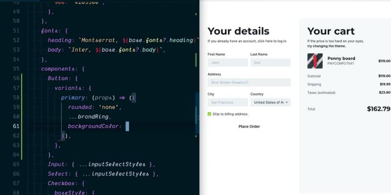
Welcome to MUI, one of the heavyweights in the React UI component libraries arena. The library, known previously as Material-UI, was born out of Google’s Material Design philosophy. It aims to provide a polished, sophisticated, and accessible suite of components, straight out of the box.
Features
MUI packs a whole load of features in its toolkit. You get pre-designed components that follow Google’s Material Design. You’ve got buttons, cards, dialogs, forms – pretty much anything you might need for your UI. And the best part? MUI is highly customizable. You can tweak components to suit your style, without losing the Material Design feel.
Pros and Cons
While MUI is a fantastic toolkit, it’s not without its pros and cons. On the plus side, you get a sleek design, a broad range of components, and flexibility. It has excellent documentation and a large, active community to back you up.
But on the downside, MUI can be a bit heavy. The size of the library might slow things down, especially for smaller projects. Also, if you’re not a fan of Material Design, MUI might not be your cup of tea.
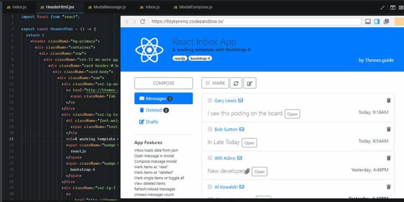
React-Bootstrap
Overview
Say hello to React-Bootstrap, the React version of the beloved Bootstrap framework. Bootstrap’s been around in the web development world for quite a while, and React-Bootstrap carries on the legacy, but with a React twist.
Features
React-Bootstrap offers a set of responsive, accessible components right from the Bootstrap framework, but re-imagined with React. You have the familiarity of Bootstrap combined with the power of React, giving you the best of both worlds.
Pros and Cons
React-Bootstrap brings the tried-and-tested reliability of Bootstrap to your React projects. It’s lightweight, flexible, and plays well with React. However, if you’re looking for a more modern or unique design, React-Bootstrap might not be the best fit. It could also feel limiting if you want more customization options.
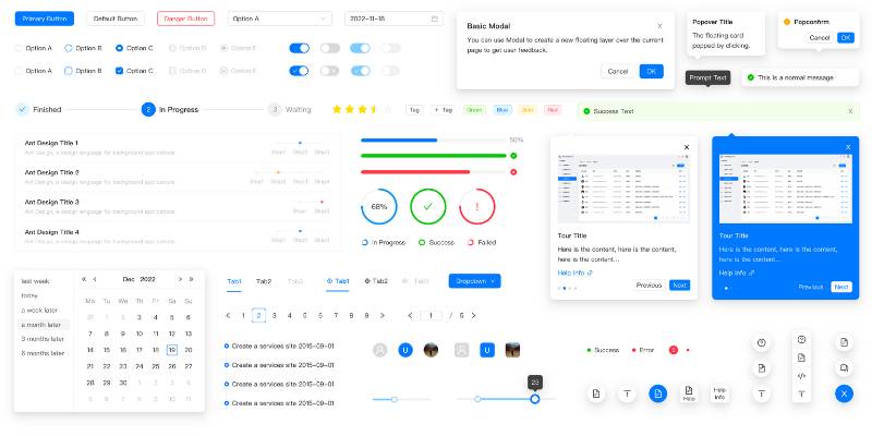
Ant Design
Overview
Next up is Ant Design. A design system hailing from China, with an impressive set of high-quality components and a modern aesthetic. It’s a library that values usability and accessibility, providing a consistent and engaging user experience.
Features
Ant Design comes with a plethora of components, each with a multitude of properties you can adjust. It also offers a design kit for several popular design tools, allowing for design and development cooperation.
Pros and Cons
Ant Design stands out with its modern, professional-looking designs and a vast range of components. However, its extensive customization options can also be a drawback, making it more complex and slightly overwhelming for beginners.
There’s a lot more to explore in the world of React UI component libraries, but that should give you a taste of what’s out there. Remember, the right library for you depends on your project’s needs and personal preferences.
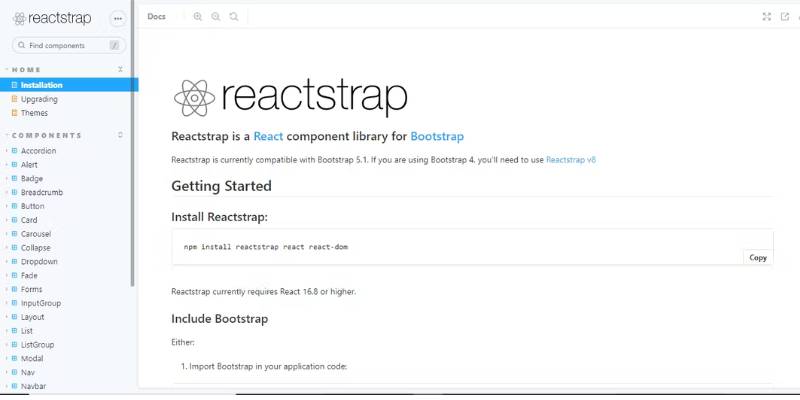
Reactstrap
Overview
Reactstrap stands as a beautiful bridge between Bootstrap and React. It’s all about simple, stateless Bootstrap 4 components. If you’ve been a fan of Bootstrap but crave the simplicity and power of React, this might be your match.
Features
Reactstrap provides a buffet of Bootstrap 4 components, reimagined for a seamless integration with React. It offers a set of responsive, accessible components that can quickly take the shape of what you need. Flexibility is the name of the game here.
Pros and Cons
On the positive side, Reactstrap inherits Bootstrap’s wide adoption and extensive documentation. It’s simple, easy to use, and you can create a clean, functional UI in no time. However, the library is somewhat basic. If you’re looking for something more extensive, with unique components, Reactstrap might feel a bit limited.
Semantic UI React
Overview
Semantic UI React, as the name suggests, is the official React integration for Semantic UI. It’s all about bringing the power of words to UI component design.
Features
Semantic UI React prides itself on its intuitive, human-friendly approach to naming conventions. The idea is to create a language around the UI that applies clear, meaningful names to components and their parts. It’s like a straightforward dictionary for your UI component needs.
Pros and Cons
Semantic UI React is user-friendly and intuitive, with a smooth learning curve, making it an excellent choice for beginners. It offers a wide range of components, and the semantic naming approach makes the code more readable. However, it’s not as widely adopted as other libraries, and some users find it less customizable and flexible.
Chakra UI
Overview
Chakra UI steps on the stage with its belief in simplicity, modularity, and performance. It’s a newcomer compared to others, but it has quickly gained popularity in the React community.
Features
Chakra UI provides a set of accessible, reusable, and composable React components that you can use to craft your UI. It’s a library that values accessibility and theming, allowing you to adjust the design to your needs while ensuring a high-quality user experience.
Pros and Cons
The shining points of Chakra UI include its focus on accessibility, the ease of theming, and a clean, modern design. It’s also relatively lightweight, which can help keep your app’s performance on point. However, as it’s newer, it may lack some components you can find in more mature libraries.
Theme UI
Overview
Let’s now meet Theme UI. Its key selling point? A robust theming specification for the UI. If you’ve got a project where you anticipate style changes or want to provide theming options, you’ll want to have a look at Theme UI.
Features
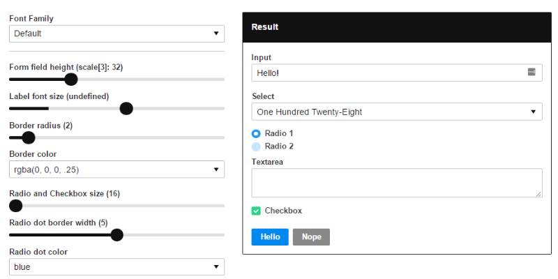
Theme UI brings a tight theme specification that works with the system-ui theme specification. It comes with a set of primitive components that accept values from your theme. It also boasts a “sx” prop, allowing you to style any component quickly.
Pros and Cons
On the upside, Theme UI provides an excellent system for creating themeable components, making it perfect for design systems. It’s lean, fast, and offers excellent performance. However, it’s a bit less comprehensive compared to others when it comes to pre-built components. So, you might need to pair it with another library if you need a full suite of components.
Rebass
Overview
Rebass is a library that embraces minimalism. It provides a small selection of flexible, themeable primitives that you can use as a base for a design system.
Features
Rebass provides eight primitive components based on the Styled System library, all of which accept theme-based style props. Each component comes with a handful of style variants, and you can customize them as much as you want.
Pros and Cons
The plus points of Rebass include its lean and fast nature, excellent theming capabilities, and ease of customization. It’s perfect for creating a custom design system from scratch. On the flip side, Rebass is not for you if you’re looking for a broad range of ready-to-use components.
Blueprint
Overview
Lastly, we have Blueprint, a UI toolkit built specifically for building complex, data-dense web interfaces. If your project revolves around data and requires a professional-looking UI, Blueprint could be a good fit.
Features
Blueprint excels at providing components specifically tailored for data-heavy applications. Think tables, menus, sliders, time pickers, and so on. It also includes icons and typography, maintaining a consistent look and feel across your application.
Pros and Cons
The advantage of Blueprint lies in its specialized components, a modern look, and its focus on desktop applications. However, it’s not as versatile for other types of projects and might be overkill for simpler apps.
FAQ about UI Component Libraries
What Exactly Are UI Component Libraries?
Think of it as your digital Lego set. These libraries, they’re collections where you pull ready-made elements—buttons, forms, navigation menus. Saves time, maintains consistency, and keeps the design tight.
How Do UI Component Libraries Enhance Web Development?
They’re like a power-up for your workflow. Grab a component, drop it into the mix, and voilà, the heavy lifting’s done. You’re crafting user experiences at lightning speed, and every piece just snaps together with precision.
Can UI Component Libraries Be Customized?
Absolutely, it’s where the magic happens. You take those base components and tweak them until they sing your brand’s tune. It’s the beauty of these libraries; they’re a canvas waiting for your personal touch.
Are There Any Popular UI Component Libraries I Should Check Out?
For sure! React has its own ensemble cast of winners—big shout-out to Material UI. Vue.js isn’t far behind with Vuetify. Each has its own flavor; just pick your potion.
How Do Component Libraries Handle Responsiveness?
They’ve got you covered. These days, it’s all about responsive design widgets. They flow and adapt like water, no matter the screen. Smooth, right?
Is It Challenging to Integrate UI Component Libraries with Existing Projects?
Let’s keep it real—it’s not always a walk in the park. But with a bit of elbow grease and understanding the inner workings of your chosen lib, you’ll mesh components into even the most complex projects.
What About Accessibility in UI Component Libraries?
Accessibility isn’t an afterthought; it’s center stage. Good libraries bake web accessibility right into their core. You’re reaching everyone, and that’s the whole point, isn’t it?
How Do UI Libraries Impact the Performance of a Website?
They’re designed to be lean and mean, but it’s a balancing act. Use them wisely, don’t overstuff your page, and watch those load times stay sharp.
Do Component Libraries Work Well with Agile Methodology?
Like peanut butter and jelly. Agility is their middle name. Fit for rapid prototyping, iterative design—you name it. Component-driven development is where they shine.
Can I Use UI Component Libraries for Mobile App Development?
Oh, you bet. Dive into the cross-platform UI modules realm, and you’ll be bringing component goodness to mobile in no time. It’s about being slick and quick on any device.
Conclusion
We’ve roamed through the playground of UI component libraries, right? Touched base with everything from the dazzle of Material UI components to the nitty-gritty of accessibility in component design. In our journey, we’ve seen how these toolkits aren’t just handy—they’re game-changers.
So here’s the takeaway:
- Remember: these libraries? Lifesavers when the deadline’s breathing down your neck.
- Customize: Flexibility’s their middle name, tweak ’em to your heart’s content.
- Accessibility: Making the web friendlier for everyone—a win-win.
- Performance: Keep it lean, keep it fast.
- Agility: They’re practically doing backflips with how agile they make your design process.
Jump in, explore, mix and match. Build something wicked, something that clicks like a well-oiled machine. And at the end of the day, know that these libraries are here to lift up your design, not shackle it. Experiment, evolve, and most importantly, have fun with it!
If you enjoyed reading this article about UI Component Libraries, you should read these as well:
- Adobe XD vs Sketch: Which one to choose and why
- UX design certification: The best programs where you can get one