
Picture this: It’s just a wall… until a typography poster breathes life into the space, transforming it into a canvas of visual communication.
Suddenly, the room speaks without uttering a word, all thanks to the meticulous craft of font manipulation and text design.
Now, here we stand—at the intersection between art and alphabet. It’s where typefaces tell tales and quotes come alive, not just whispered but boldly declared.
Typography is no mere afterthought; it’s the soul of every poster that yearns to engage and inspire.
Dive deep with me, as we explore the art of typography posters, from the subtleties of kerning to the punch of a well-placed serif. Together, we’ll uncover:
- The guiding principles behind this craft,
- How-to’s on creating your own typographic statement pieces,
- And the secrets behind choosing the perfect typeface for that indelible impression.
Stay tuned; by the end of this, you’ll see words in a whole new light.
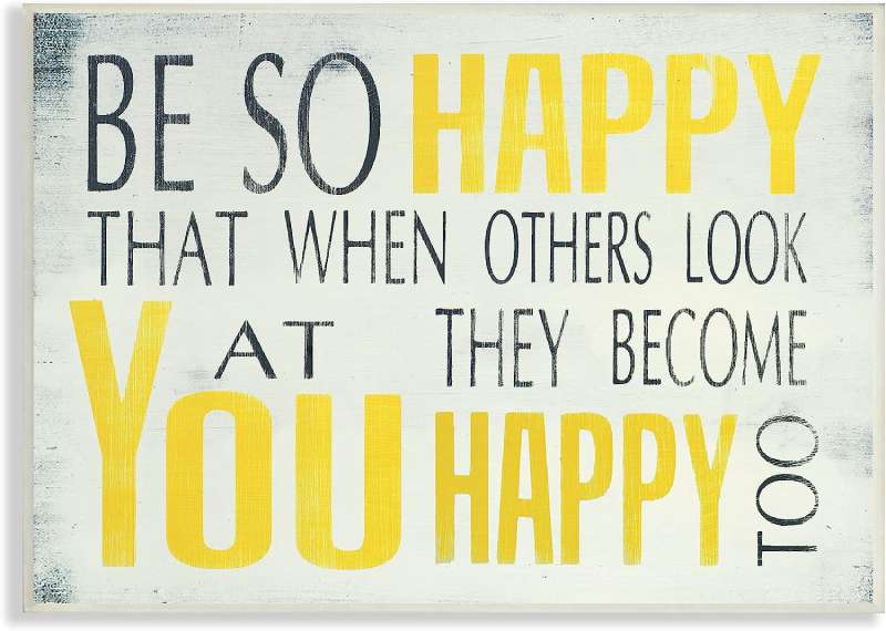
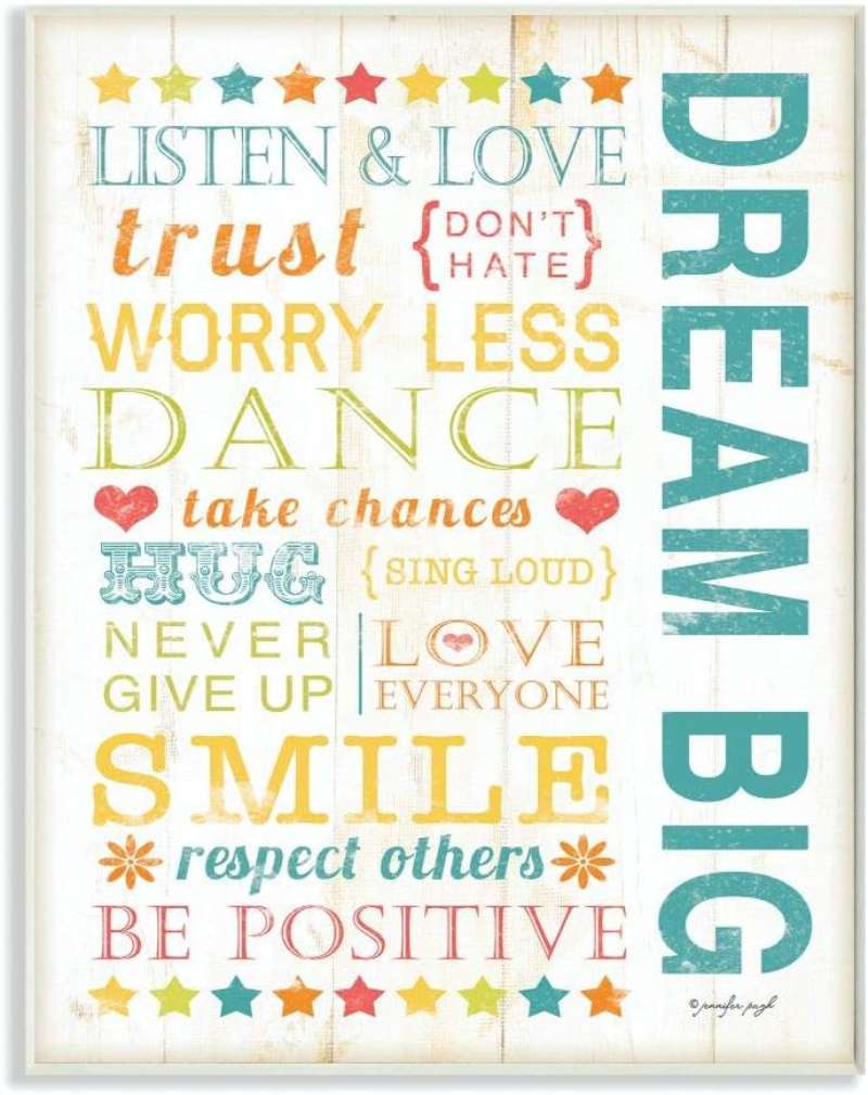
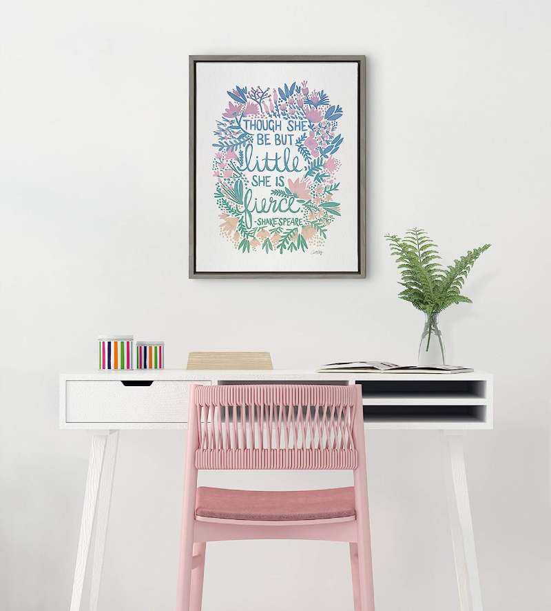
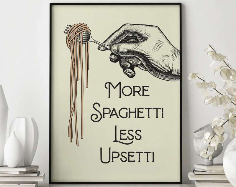
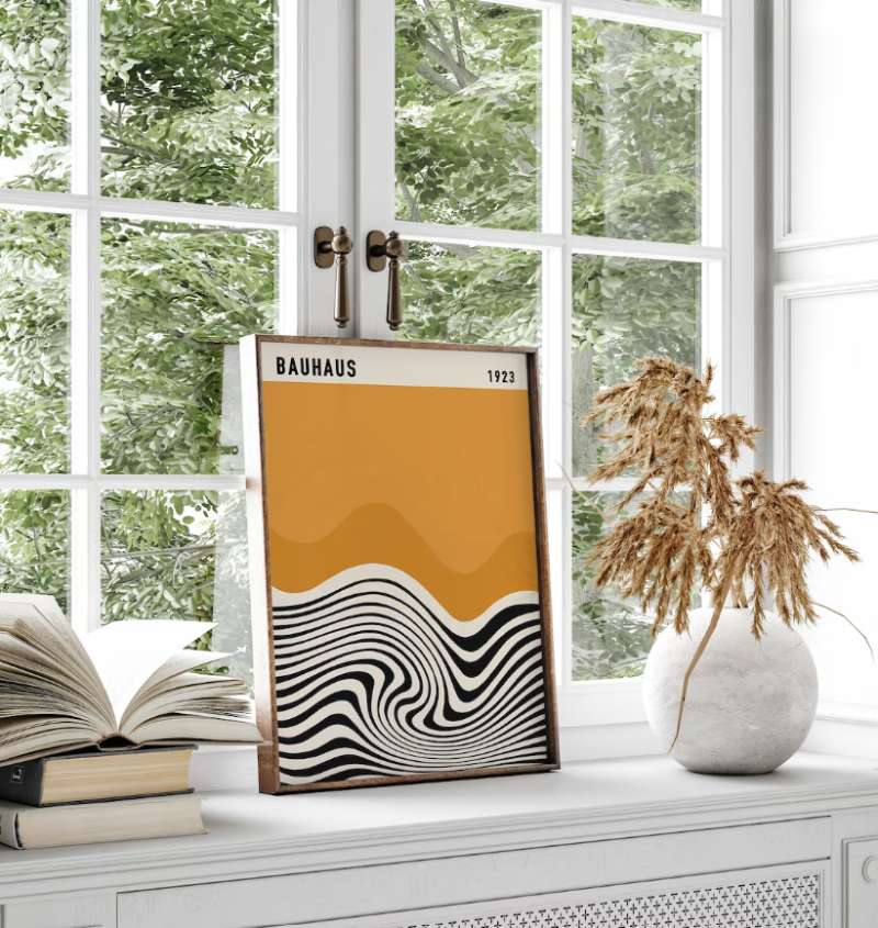
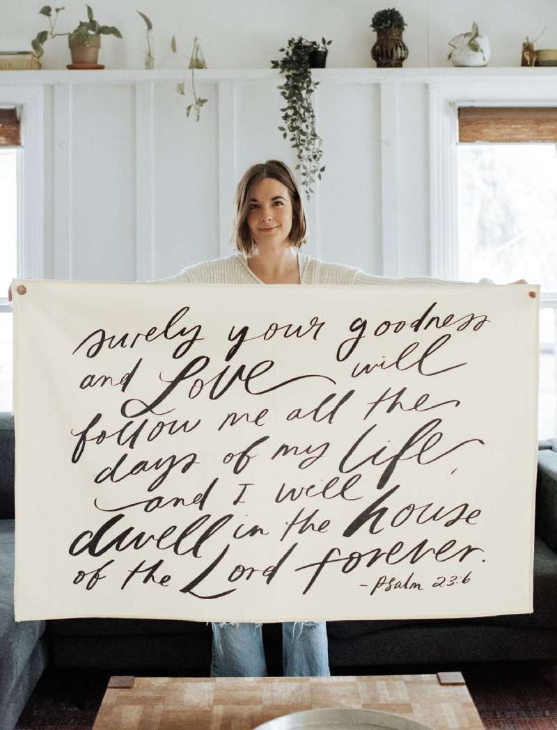
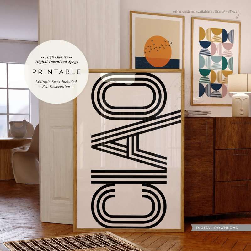
Typography Posters To Check Out
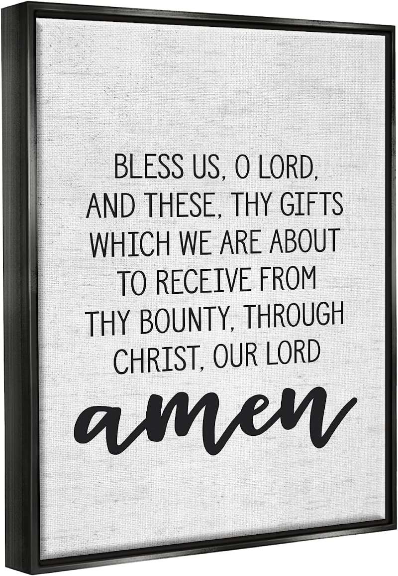
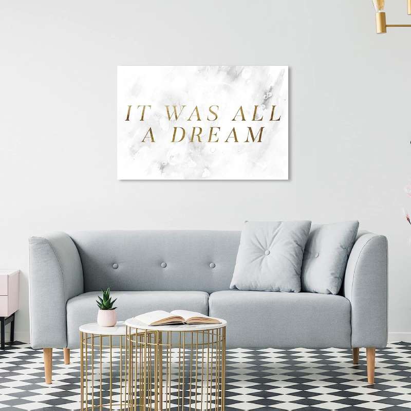
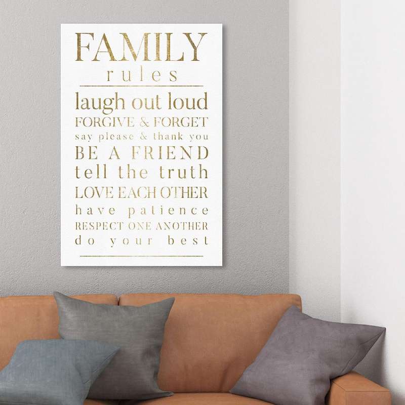
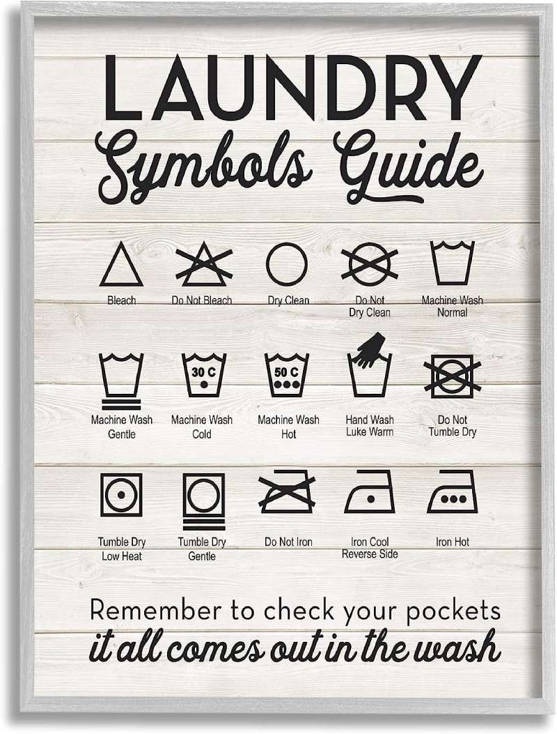
Typography Poster

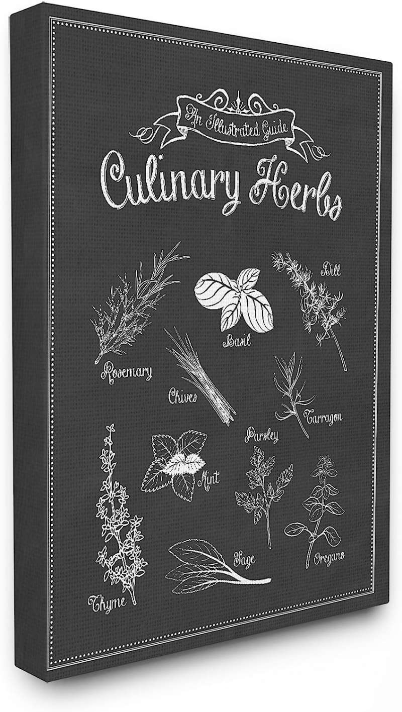
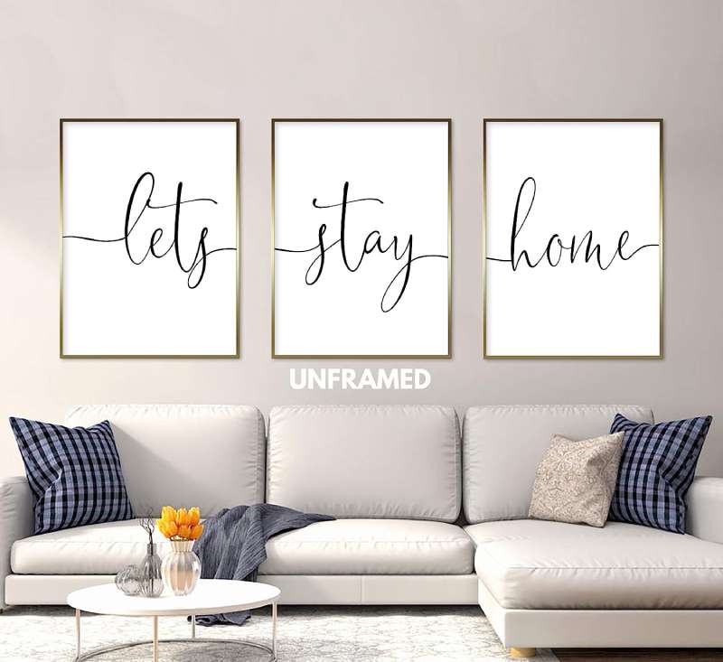
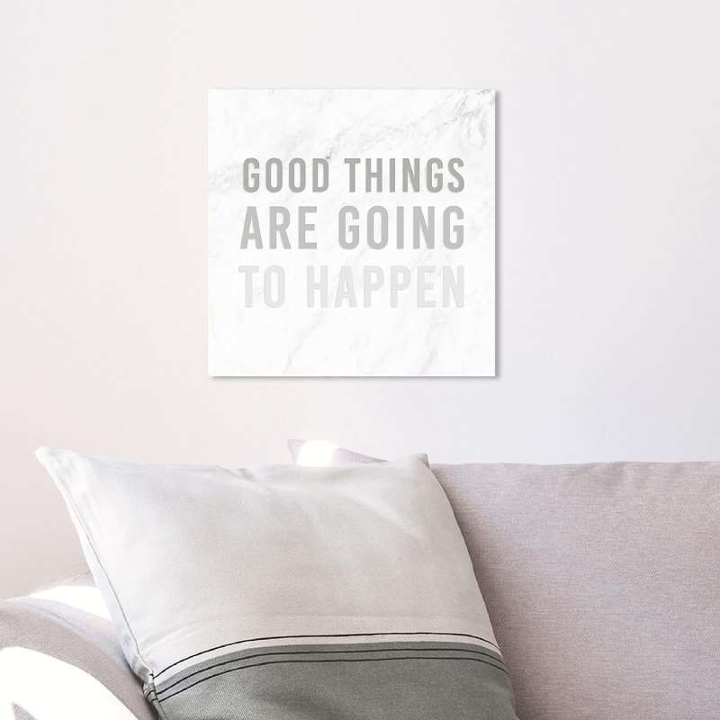
Typography Sign Canvas Wall Art

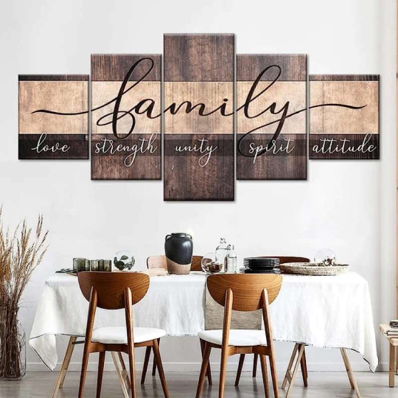
5 Pcs Painting Canvas Picture Poster

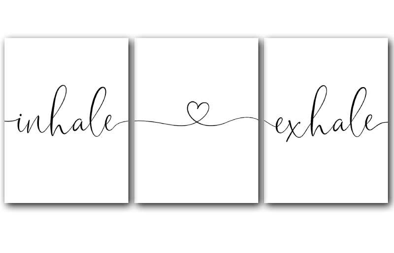
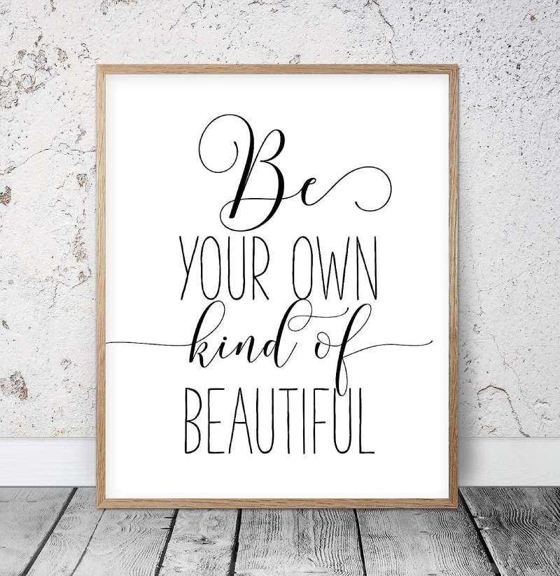
Home Wall Art Poster

Typography Wall Art Canvas
Typography Art

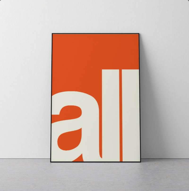
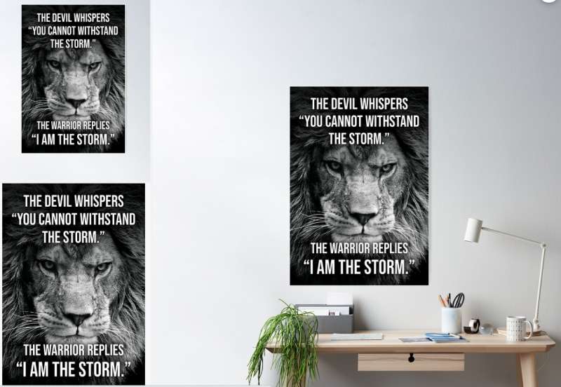
Typography Poster

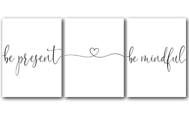
3, Posters, Minimalist Art Typography
Home Wall Art Poster

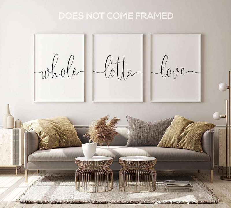
Set of 3, Posters, Minimalist Art Typography
Typography Oversized Stretched Canvas

Poster Typography
Typography Wall Art Canvas
Typography Wall Plaque

Typography Canvas

Canvas Wall Art

Typography, Beige

Typography Wall Art
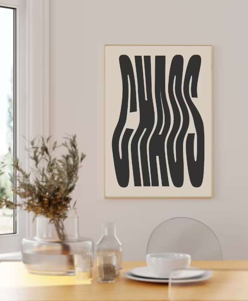
Typography poster

Poster Retro Typography

poster, Wall Art

Bauhaus Poster

Large Canvas Banner

Modern Bold Typography
Motivational Poster

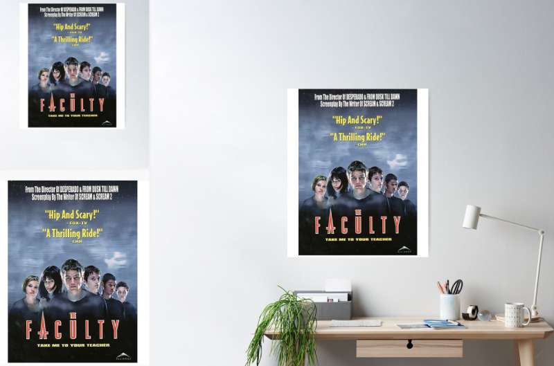
The Faculty Art Poster

FAQ On Typography Posters
What’s the big deal with typography in posters?
Typography isn’t just text on paper; it’s the heartbeat of design. Think about it—every font, every letter has a vibe.
Typography posters? They’re like silent communicators, speaking volumes with just visual elements. Captivating and impossible to ignore, that’s the power they wield.
How do I choose the right typeface for a poster?
It’s about the mood. Is it playful? Serif fonts can be traditional, yet warm. Going for modern? Try a sans-serif. Remember, it’s not just about looking good. Legibility’s key, especially from a distance. Get it right, and it’s like the typeface was made just for your message.
Can typography posters be considered actual art?
Oh, absolutely! Art is expression, and typography posters express with style. They’re the perfect blend of aesthetic fonts and design wizardry. It’s not just words; it’s how you frame them—color, layout, emotion. That’s visual art, no doubt.
Are there rules to follow when designing typography posters?
Sure, there are guidelines. Keep your hierarchy clear, your alignment tight, and balance your layout. But hey, creative typography is about breaking rules too. As long as it’s readable and packs a punch, feel free to experiment.
What does kerning mean in typography posters?
Kerning? It’s the spaces between characters. Get it wrong, and your poster can look amateurish. Nail it, and you’ve got a piece that flows and reads effortlessly. Proper kerning equals professional-looking text design, trust me.
Why are vintage typography posters so popular?
Nostalgia’s a powerful thing. Vintage typography posters hark back to a time when design principles were all about craftsmanship.
People love that authentic feel, the timeless elegance it adds to their space. Plus, those old-school typefaces and printing techniques? Unmatched character.
How important is color theory in typography poster design?
Color theory? Non-negotiable. It evokes the mood, highlights the message, and captivates the eye. Bold or subtle, colors in typography posters can dictate how the viewer’s eye travels, how they feel, and how well the poster’s graphics resonate.
What size should typography on a poster be?
This is about visibility. Too small, and it’s squint city. Too big, and it may overwhelm. Consider the poster’s purpose and where it’ll hang. A piece for close-up interactions can afford smaller font size, but distance-viewed posters need to go bolder and bigger.
How has digital design influenced traditional typography posters?
Digital’s changed the game. Typography software like Illustrator has expanded creative horizons big time. We’ve got a playground of digital fonts and tools at our fingertips. Traditional meets modern, and it’s nothing short of a design revolution.
What’s the best way to print typography posters?
Quality’s what we’re after. Digital printing’s great for vibrant colors and small runs. But for that hands-on, soulful touch? Screen printing or even letterpress—they’ve got a tactile beauty megabytes can’t capture. Go with what’ll do justice to your typography canvas.
Conclusion
Whew, what a journey through the world of typography posters we’ve had! You’re now armed with the know-how to decipher font personalities and with the ability to concoct visually stunning pieces that speak—even shout—without making a sound.
- It’s the typefaces that hold the power, the layout that directs the symphony,
- The colors that set the tone,
- And the kerning that fine-tunes the visual melody of your message.
So, let this be your springboard to dive headfirst into creating your text design prints. Harness the essence of graphic design principles, mix in a splash of color theory, and marry them with the Timeless Techniques of Typesetting.
Standing back, take in your masterpiece—a typography poster that doesn’t just hang there but hangs with purpose. This isn’t just print; it’s a piece of you, a snapshot of creativity made tangible. Go forth, and let the letters lead the way.
If you liked this article about typography posters, you should check out this article about environmental posters.
There are also similar articles discussing animal posters, beach posters, retro travel posters, and comic book posters.
And let’s not forget about articles on vintage advertising posters, fashion posters, advertising posters, and music festival posters.