

Picture your favorite app. Now, strip away the colors, the graphics… stuck on a list view, aren’t you? That’s the backbone, folks, the unsung hero of mobile app navigation. It’s where design either clicks or clunks.
Here’s the skinny: A snazzy mobile app list design doesn’t just bump up the app’s aesthetic; it cranks the user experience up to an 11.
It’s not sorcery; it’s smart design, and you’re about to get the inside scoop. Wanna create user interface inspiration that’s more satisfying than a perfectly popped bubble wrap? Keep your eyeballs here.
By the end, you’ll be crafting interactive elements in app lists that keep fingers scrolling, swiping, and tapping in glee— true story.
With the inspiration you’ll get from this article, you’ll still need to read about UI design trends, mobile user experience tips, or even gesture-based navigation.
Mobile App List Design Examples
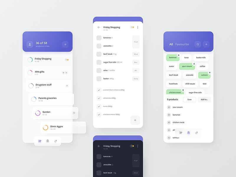
Shopping List App

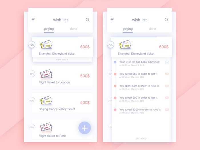
Wishlist page

Timer Picking
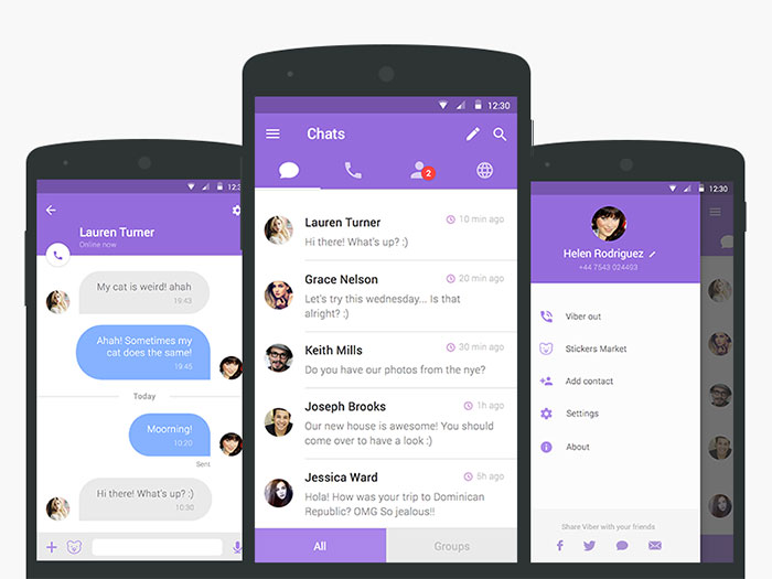
Viber redesign
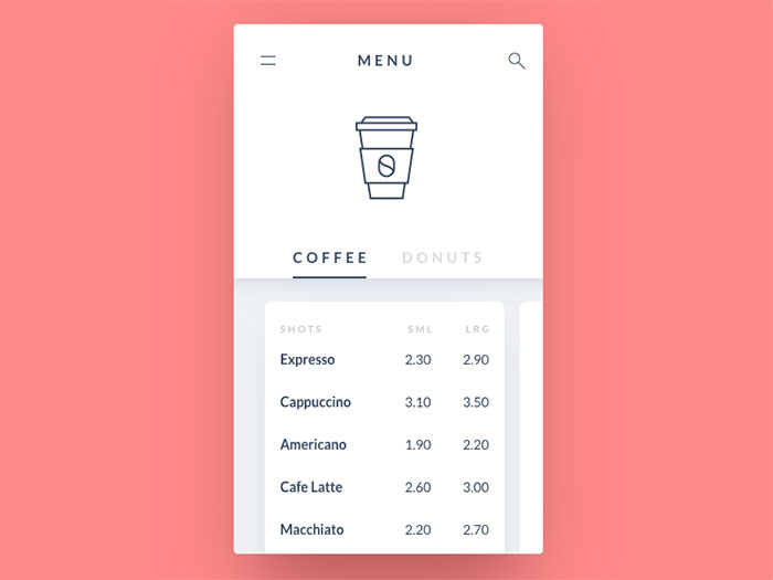
Coffee menu
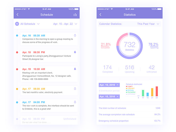
Schedule list design
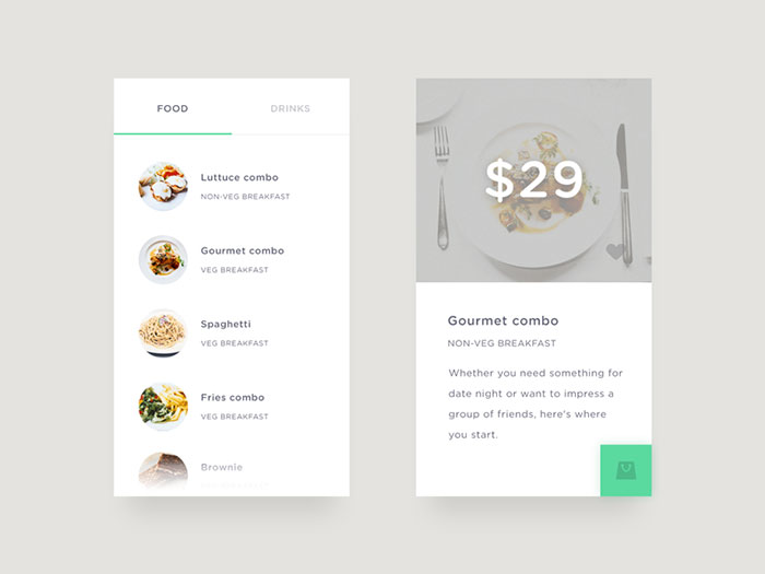
Food/Drink Menu
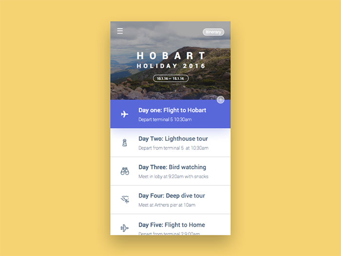
Itinerary listing design
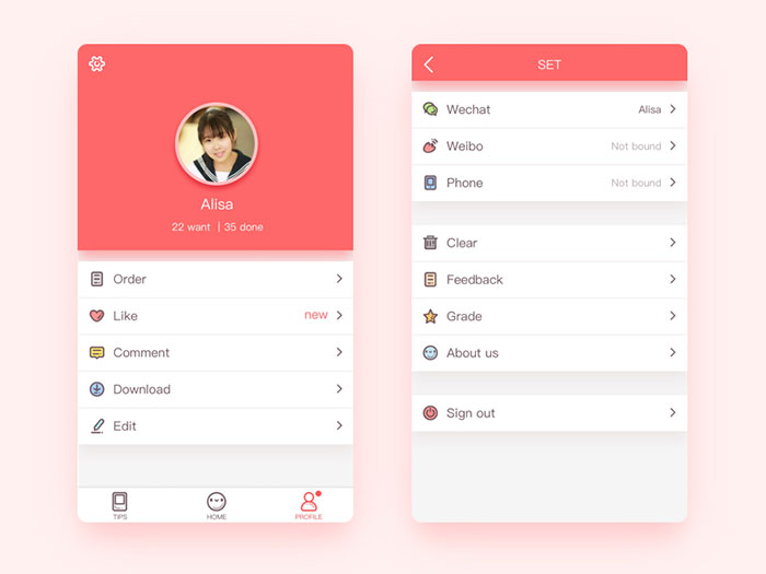
Profile list UI
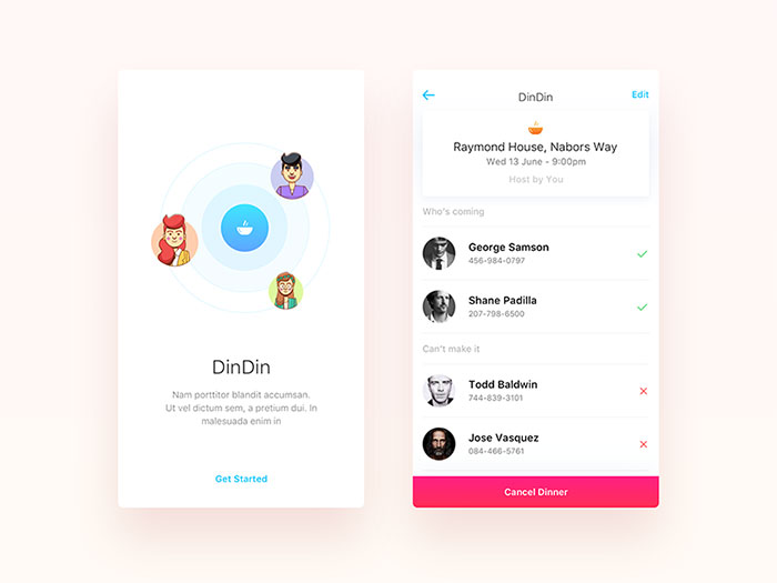
Dinner Calendar App
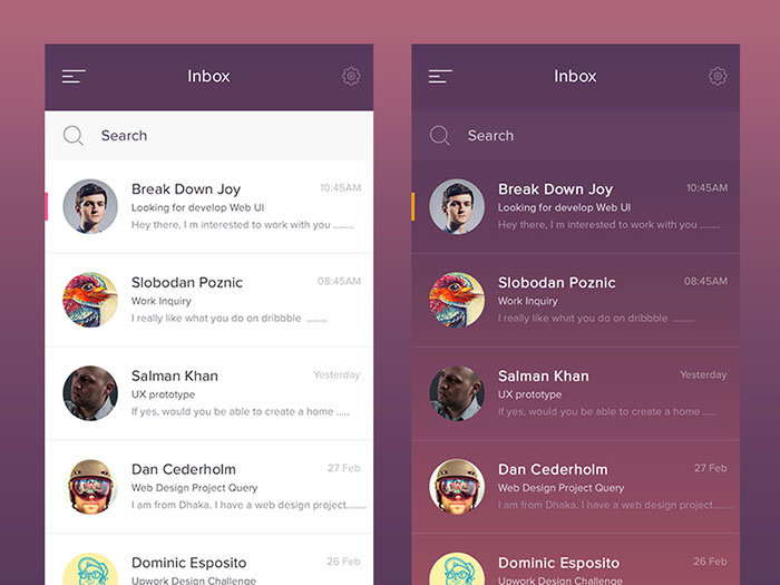
Inbox App
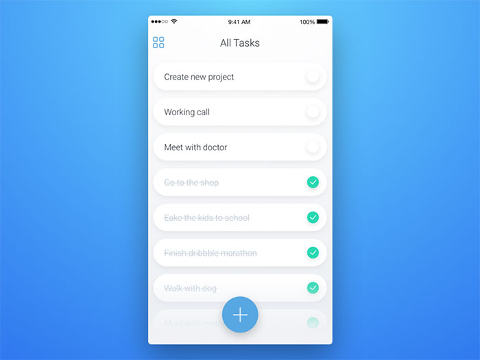
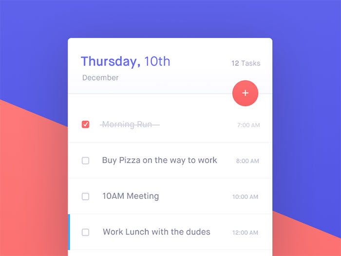
All Tasks list design
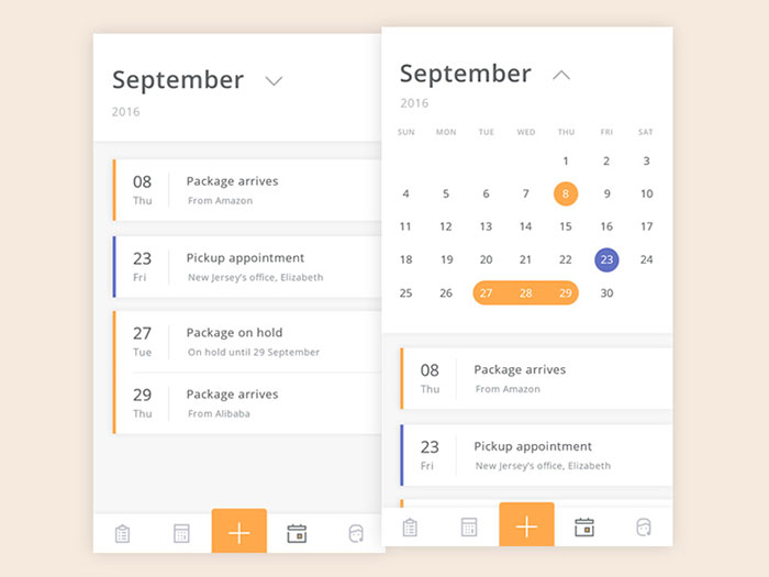
Shipp Calendar
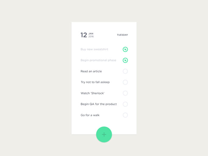
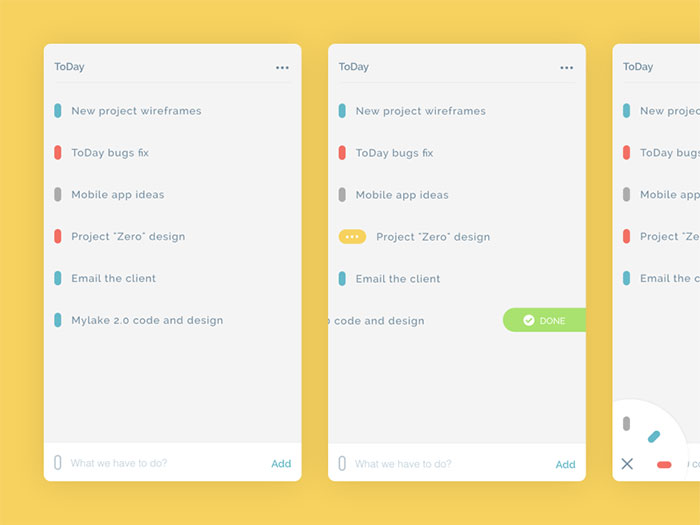
ToDo List
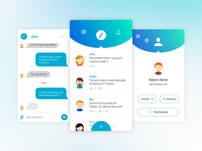
Sup! – App for friends
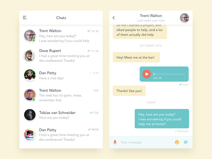
Simple chat app
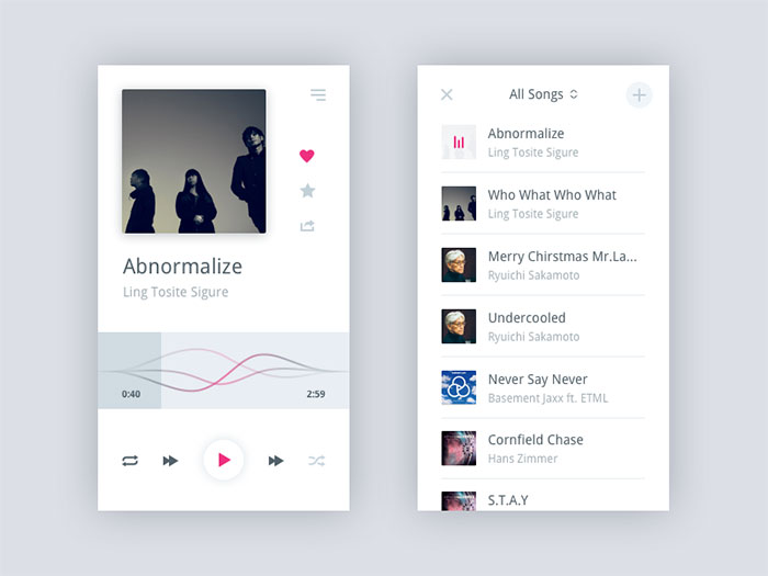
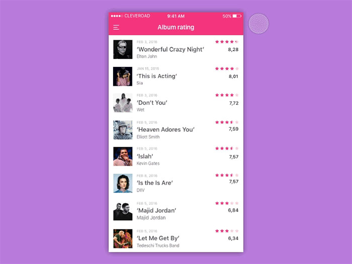
Music Player App
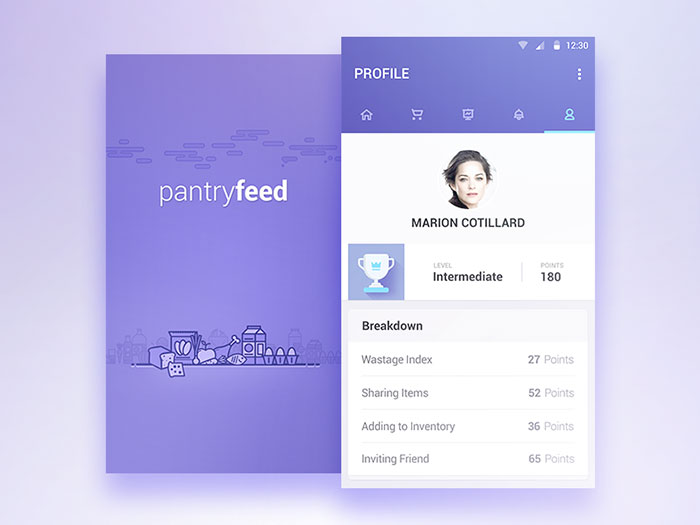
Pantryfeed Profile Splash
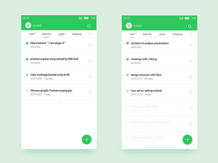
ToDo List
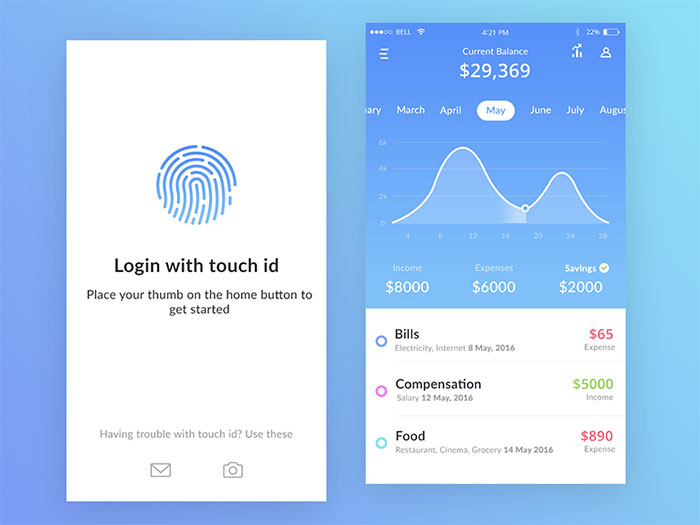
Bank app mock ups
Leaderboard Animation
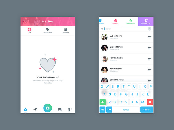
My Likes And Find People
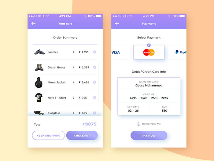
Credit Card Checkout
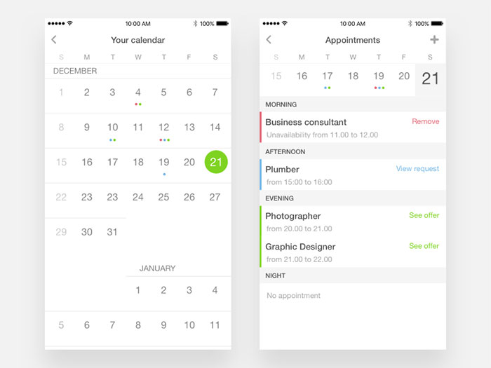
Appointments on calendar
Job listing
Daily UI #12
Updated ToDay app
FAQ about list UI design
What’s the secret sauce in mobile app list design?
Bold simplicity and intuitive navigation, that’s your ticket. You want your user to snuggle up to your app list like their fave blanket. Ease of use, friend, with thumb-friendly tap targets and crystal clear visuals. Cozy, comfortable, and looks like a million bucks.
Why does user interface inspiration matter for list design?
Well, imagine waltzing into a candy store; each treat is a visual feast. A mobile app list should give that same buzz. It’s all about creating a vibe that resonates. Spark joy with your layout. Make it the high note of their app-using symphony.
How crucial is the mobile user experience in list design?
Like a chef’s knife to a tomato, my friend. It’s all about that slice – precise, clean, and fuss-free. Nobody wants to wrestle with their phone. A smooth as silk experience is the ace up your sleeve—make every interaction feel like the cool side of the pillow.
Can list designs affect app ratings?
Bet your bottom dollar they do. A list design that’s a hot mess? Kiss those 5-star dreams goodbye. Ace it, and watch your ratings soar higher than your caffeine levels on a Monday morn.
What’s the best way to showcase a lengthy list in an app?
Infinite scroll meets lazy loading. It’s a match made in heaven, like peanut butter and jelly. Your users get that endless content feel without the waiting game. It’s fast, smooth, and keeps ’em coming back for more.
How does responsive design play into mobile app lists?
Think of a chameleon – always fits in, right? Your list should morph seamlessly across devices. A shapeshifter in the wild, making sure comfort is king no matter the screen size. Adaptability is the name of the game.
What’s the role of typography in list design?
It’s the maestro, conducting your user’s eyes through the symphony of content. Size, weight, spacing – each note hits just right, and bam, your content sings. Harmony between elements, that’s where the magic happens.
How often should I update the design of my mobile app list?
Trends change, pal. Like fashion – don’t get caught wearing last season’s look. Spruce things up regularly but keep it as familiar as your old high school jam. Balance innovation with that comforting “I’ve been here before” vibe.
Are there any specific color schemes that work best for app list design?
You’re painting feelings here, not just a list. Use color to evoke emotion, set the tone. A pop of color for calls-to-action, muted tones for the background. Make it a feast for the eyes but don’t overwhelm the senses.
How do you gauge the effectiveness of a mobile app list design?
Classic: user feedback and behavior. Look at the data – churn rates, session times, engagement. These numbers chatter about what works and what’s a flop. Keep your ear to the ground, iterate like it’s your life’s work. Because guess what? It is.
Conclusion
Alright, so we dove deep into the world of mobile app list design examples, flipped them inside out, and saw what made them tick. We talked about the biggies, like user-centered design, responsive layouts, and how to keep it all looking fresh, without drowning the user in a visual riptide.
Let’s land this plane.
Remember, a stellar list is your app’s heartbeat. You get this right, you’ve set the stage for those sweet, sweet five stars. Keep it simple, intuitive, and with just enough zing to light up those tiny screens.
Wrap those UI design trends around core principles, like legibility and quick load times. Sprinkle with some gesture-based navigation goodness. And don’t forget to listen to the crowd; their cheers (and boos) will guide your tweaks.
Done right, it’s not just a list. It’s an experience. That’s what they’ll remember. That’s how you’ll stand out in the booming app cosmos.
If you liked this article, you should also check out this page with lots of UI and UX resources.