


Ever stood on a mountain peak, gazed upon the vastness, and felt an unwavering sense of identity? Like a bold climb, the Patagonia font carves its distinctive presence into the world of typography and brand expression.
Here, in the digital canvas where creativity and conservation converge, a font is not just a tool—it’s the voice of the wild beckoning from the expanse of your screen.
Dive deep and emerge enlightened—as we unpack layers of typography that resonate with the echo of environmental stewardship.
Through the lens of a web designer’s eye, we explore how a typeface can encompass a brand’s heartbeat, shaping perceptions like rivers sculpting valleys.
Expect a journey through the aesthetics, the behind-the-scenes of graphic design, and the subtle art of visual identity crafting.
By article’s end, you’ll grasp:
- The essence that fuels Patagonia’s typographic choices
- How their typeface supports a globally recognized brand
- Key insights into creating a visual identity that resonates in every pixel and stitch
With each scroll, let your understanding of Patagonia’s logo typography and the world of sustainable branding expand as effortlessly as the landscapes that inspire them.
About The Patagonia Company and Its Logo
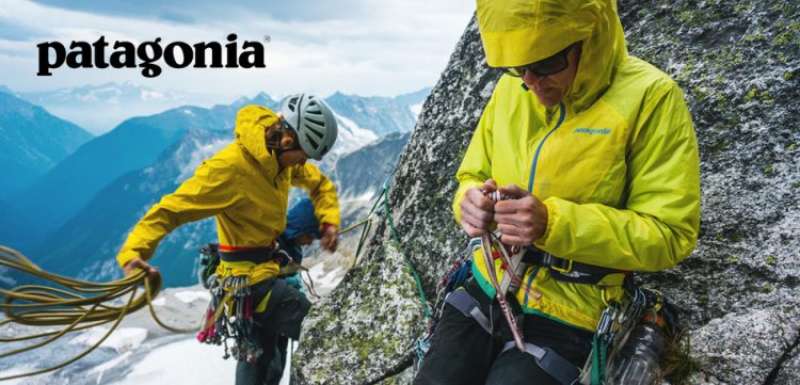
Yvon Choulnard, a skilled rock climber who intended to create and market his own mountaineering equipment, started the outdoor clothing company Patagonia in 1957 in California. The brand first worked out of the back of Yvon’s automobile, and only built up its first actual store site in 1973.
It is renowned for making excellent outdoor apparel and equipment. The business places a high priority on environmental responsibility and sustainability, and it actively supports a number of initiatives aimed at maintaining and safeguarding the natural world.
The Cerro Fitz Roy mountains (also known as the Fitzroy Massif), which are visible above the town of El Schalten, are depicted in the Patagonia logo in full accordance with the name. Over the years of its history, the trademark has experienced a few small adjustments, but the concept has remained distinctive and unmistakable.

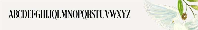
The Patagonia logo uses a unique font for the corporate name. The logo is a straightforward, modest style that has gained widespread recognition. It is frequently used as a symbol of quality and authenticity in the brand’s apparel and goods.
The Patagonia logotype’s color scheme consists of the following hues: black, white, blue, violet, and orange. The silhouette of Monte Fitz Roy is shown using black. A white line defines its outline. In contrast to the sky’s dark blue, violet, and orange tones, the nameplate is also white.
The Patagonia Font

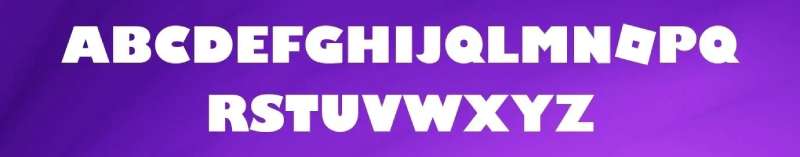
Do you want to use the Patagonia logo font in your personal design projects? If so, it’s significant to remember that the Patagonia logo makes use of a unique font that was designed especially for the corporation and isn’t offered for sale or public usage. Yet, there is a font called Belwe Bold that George Belwe created for the Schelter & Giesecke Foundry in Dresden that eerily resembles the Patagonia logo.
This typeface includes a wide range of unusual numbers and numerals in addition to punctuation marks, symbols, and icons in both upper and lower case. Moreover, this typeface has distinctive swashes, Latin, and Cyrillic characters.
Patagonia Font Family (Includes Total 5 Typeface)
- Patagonia Regular
- Patagonia Bold
- Patagonia Italic
- Patagonia Condensed
- Patagonia Semibold
The Patagonia Font Pairing with Other Fonts
Belwe Bold with Bodoni XT Font


If you want to use this fantastic font family for more sophisticated purposes, you must pair it with the Bodoni XT Font, which is an alternative.
The Patagonia Font with Grobold font


It is also well known for its partnering capabilities, and using it with the Grobold typeface will give designs a fantastic appearance.
Belwe Bold with Roblox Font

Because to its exquisite look, it makes your text and graphics more attractive and attention-grabbing. This font can be combined with other display fonts, such as the Roblox Font. Due to its distinctive characteristics, this typeface attained widespread renown.
Belwe Bold with Campton Font

This typeface gained popularity quickly due to certain distinctive qualities and also because of its crisp, clear texture. Most designers use it with the Campton font to create stunning graphics.
The Patagonia Font with Tripleta Font & Gandhi Sans Font
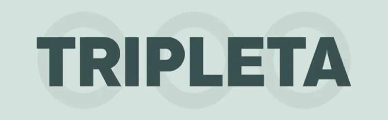


Together with Gandhi Sans and Tripleta, the Patagonia Font pairs gracefully in these situations.
The Patagonia Font with Fin Serif Display Font
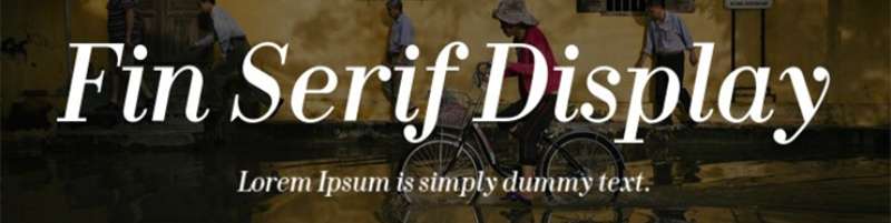

You may pair this typeface with other serif fonts like J Blake Harris’ Fin Serif Display Font.
Alternative And Similar Style Fonts To Patagonia Font
Karla Font
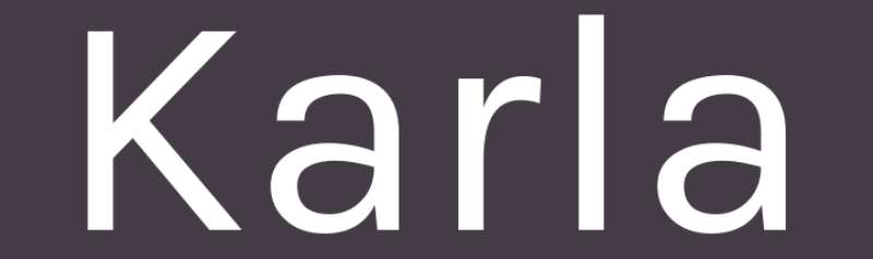

A sans-serif typeface called Karla Font was created for Tamil and Latin letters. The font originally just supported the Latin family, but over time it evolved and is now also a component of the variable font. From Extra-light to Extra-bold, it has a full range of weights and supports the most languages, including South-Eastern European, Central, and Western.
Interstate Font
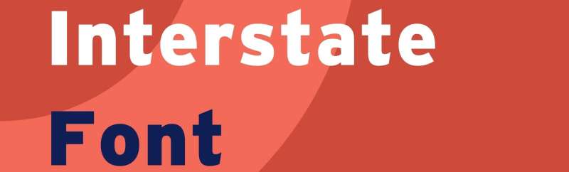

Interstate Font is an attractive sans-serif typeface that has very much popular due of its texture. Tobias Frere-Jones is the designer of this magnificent font. This font was made available from 1993 to 1999 by the renowned foundry Font Bureau. One of the best typefaces, Interstate, comes in three different weights, including Light, Regular, and Bold. Because to its pairing features, this typeface is also well known. This typeface also includes a large number of capital and tiny letters, numbers, special characters, and unusual symbols.
Desire Pro Font

This typeface was created by Charles Borges de Oliveira Borges Lettering and is a member of the serif typeface family. This is a high standard that many corporations and organizations have adopted. This typeface is renowned for its ability to copy and paste. This typeface comes with several weights and many innovative features that are very ideal for the current designs. This typeface includes capital, lowercase, numerals, punctuation, symbols, icons, and some special characters in addition to its distinctive glyphs and fashionable bold letters.
Alegreya Sans Thin Font
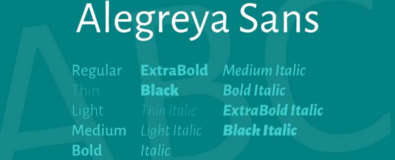

A humanist sans serif family called Alegreya Sans has a calligraphic aesthetic with a rhythm that is both energetic and varied. Long texts are enjoyable to read because of this. The italics emphasize the roman styles strongly and offer a wide range of typographic options with each having seven weights.
With OpenType Features including small caps, ligatures, fractions, four sets of figures, super and subscript letters, ordinals, and specialized accent forms for Catalan, Guaran, Romanian, Turkish, and other languages, Alegreya Sans offers advanced typography. The Alegreya type system is a super family, initially developed for literature, and comprises sans and serif sister families.
Chesterfield Font

Alan Meeks created the serif typeface Chesterfield, which ITC released in 1977. The font has an eye-catching uppercase M with drooping serifs and a lowercase g with a tail that points downward. Chesterfield is offered in both a traditional and an aged, distressed form.
Falling Sky Font


This font is a variation of the Adobe Source Sans Pro open-source font, which is SIL Open Font Licensed. This typeface has a number of new styles, a few new widths, a few extra characters, and some design changes.
Alternatives to Patagonia Font include:
- ITC Stepp Font
- Mermaid Font
- POE Sans New Bold Font
- Royal Font
- Souvenir Font
- Timeline Font
- Wishleman Font
- Bluebird Extended Font
- Bluebird Font
- Charger Sport Black Narro Font
Use of Patagonia Font
The typeface can be used to make stunning logo designs. This typeface can be used to create retro-styled websites, blogs, posters, book covers, emblems, catalogs, pictures, etc.
Also, you may use it for emblems, posters, book covers, websites, blogs, and more. Also, the typeface is suitable for all text designs, including those for headlines, titles, advertising, social media postings, and PowerPoint presentations.
FAQ On The Patagonia Font
What Font Does Patagonia Use for Its Logo?
Patagonia’s logo is decked out in a bespoke font. It’s a game of no copies, one that’s custom designed, mirroring the brand’s unique ethos.
This typographic choice whispers of the brand’s rugged independence and commitment to sustainability. Think of it, every letter, a stand for something more than itself.
Can I Download the Patagonia Font?
Truth? You can’t snag the Patagonia font. It’s exclusive, not up for grabs like a free flyer outside your favorite coffee shop. Designers craving that vibe might look to similar serif fonts for a touch of that Patagonian soul.
What Are the Characteristics of the Patagonia Typeface?
Bold, but not brash—just like the mountains it represents. The typeface sports a stature that’s clean and sturdy. It’s readability? As clear as a mountain stream. Don’t forget the font legibility, crucial for those eye-catching statements.
How Do I Choose a Typeface Similar to the Patagonia Font?
Eyeing something similar? Size up the typeface characteristics—note the sturdiness, clarity, and outdoor vibes. Seek a serif companion, one that’s robust yet approachable. It’s the typography quest for that wilderness whisper.
What Is the Importance of a Custom Typeface for a Brand Like Patagonia?
Patagonia’s visual identity is as epic as their mission. A custom typeface? It’s the brand’s flag on the marketing collateral peak. It breathes identity into every print and stitch, establishing credibility, much like a secret handshake. It’s intimate—brand/recognition intimate.
How Does Typographic Design Contribute to Patagonia’s Brand Image?
Think of it as visual communication—the font is Patagonia’s rally cry. It’s not just graphic design, it’s emotion in print, echoing the manifesto of sustainability.
The typographic design? It’s pure Patagonia, an apparel industry insurgent, resonating with the heartbeats of the wild.
Are There Any Legal Issues Around Using the Patagonia Font?
Waltz into using custom fonts like Patagonia’s without a care? That’s a no-go—legal barricades ahead. Font licensing isn’t just jargon; it holds the line between inspiration and infringement.
Always check the rulebook before you play with such distinctive corporate branding elements.
What Impact Does Patagonia’s Typography Have on its Online Presence?
It’s the digital handshake, my friend. Their typography on the web is a seal of authenticity, magnetizing eyeballs with its unique flair. It’s an online advertising hero, sending brand identity signals loud and clear across the digital marketing wilderness.
How Has Patagonia’s Font Evolved Over the Years?
Evolution? Sure thing. But think incremental, subtle shifts rather than complete font turnarounds. This steadfast logo evolution walks hand-in-hand with their environmental commitment—capturing the same soulful essence, just in fresh threads.
What Other Brands Have a Similar Typeface Approach to Patagonia?
Brands with tales to tell, those who march with ethics flag high—companies like REI or The North Face. They harness typefaces to tell their brand saga, to sculpt their visual identity much in the same manner—a strategy shared in the realm of the noblest branding strategies.
Conclusion
And there we have it, the journey’s end on the trail of the Patagonia font. We romanced the rugged serifs, tip-toed through branding’s fine line of inspiration and infringement, and emerged from the visual wilderness with a profound respect for typographic identity.
So, let’s sum it up, shall we? We’ve explored more than a font here, friends. We’ve discovered:
- A typeface as stalwart as the peaks that inspire it
- The unwavering connection between letters and brand ethos
- The notion that a typeface, much like a mountain, is something you feel
- That no matter what digital winds may blow, authenticity stands firm, legible and proud
When the screen dims and you’re left with the afterglow of ideas, remember: a brand’s typeface, like a good campfire story, is meant to endure, captivate, and ultimately, define the adventures to come.
If you liked this article about the Patagonia font, you should check out this article about the Louis Vuitton font.
There are also similar articles discussing The Godfather font, Wonder Woman font, League of Legends font, and Runescape font.
And let’s not forget about articles on Club Penguin font, Warcraft font, Candy Crush font, and The Sims font.