
You tap an icon and bam—you’re swept into another world. That’s the power packed in those few square inches of your smartphone, and a lot lies in the realm of mobile app navigation.
Navigating an app is like exploring a micro-universe where every swipe, tap, and scroll holds the key to seamless digital experiences.
From the bustling tab bars to the silent whispers of breadcrumbs in apps, we dance with design and functionality.
It isn’t just about eye candy visuals; we’re talking the nitty-gritty of interaction design that glues users to screens, making sure they find what they want, without the wishing for a breadcrumb trail to backtrack.
In this dive into the digital depths, I’ll unpack the essentials of stellar app navigation—think of it as your compass in the vast sea of pixels. By article’s end, you’ll unlock the secret to forging paths through apps that users tread effortlessly, all while savoring the journey. Expect to master the craft of:
- Designing intuitive menu layouts
- Leveraging touch gestures
- Prioritizing UX principles
Welcome to the blueprint of becoming a maestro in guiding thumbs on glass—the User Interface maestros, App Developers, and Smartphone Brands couldn’t have dreamt of a better guide.
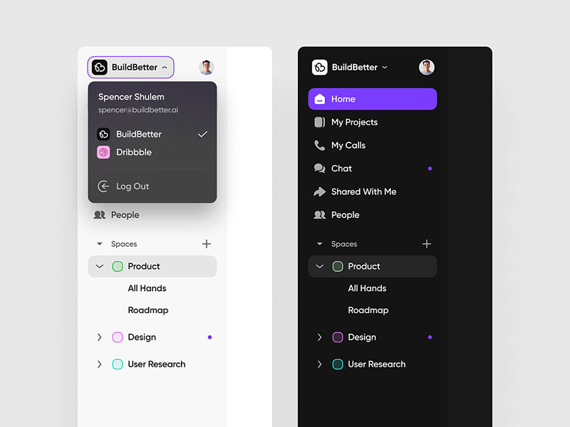
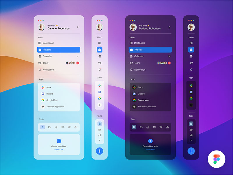
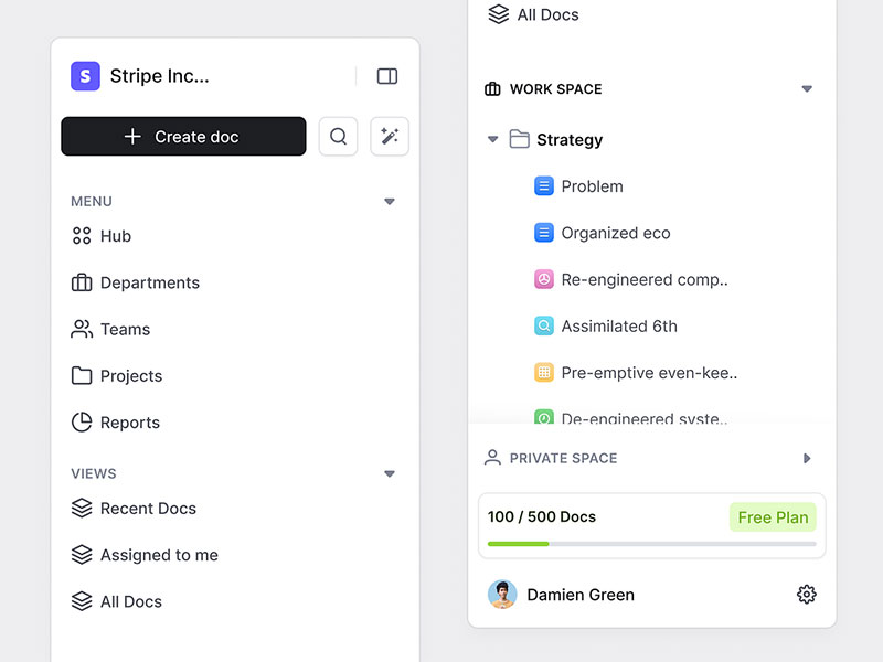
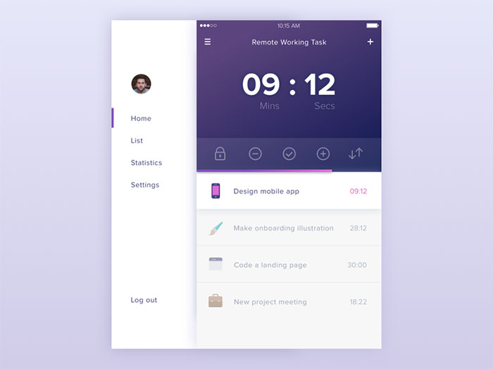
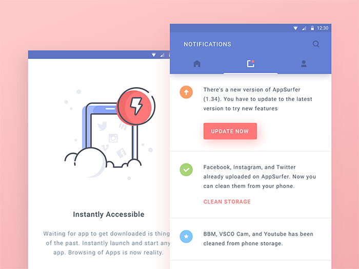
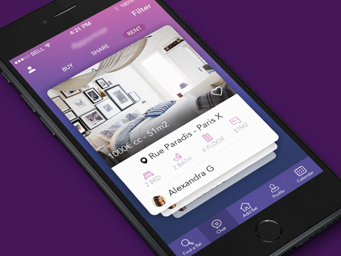
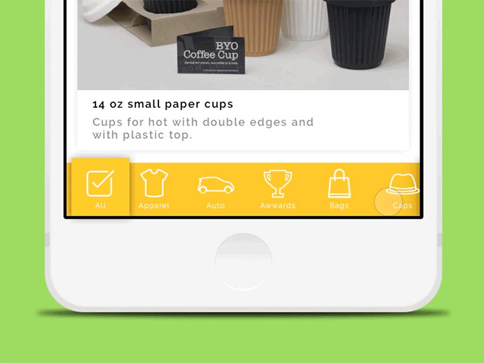
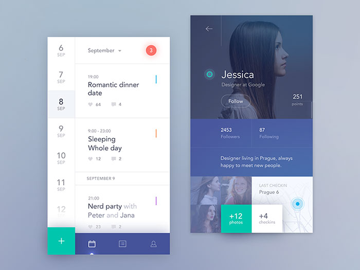
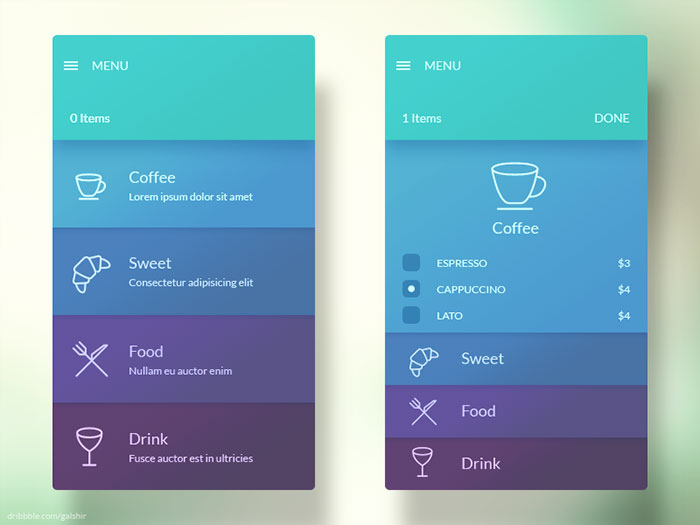
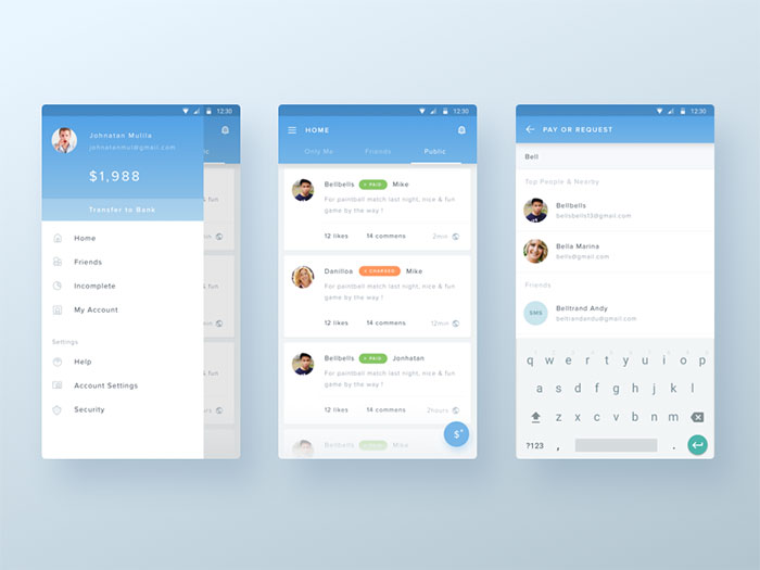
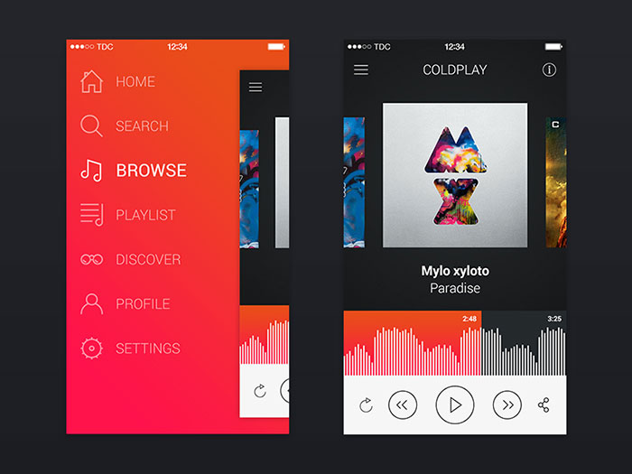
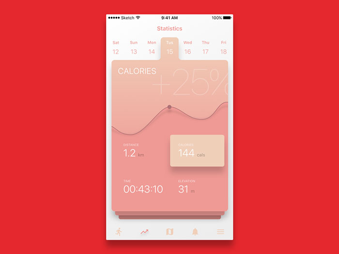
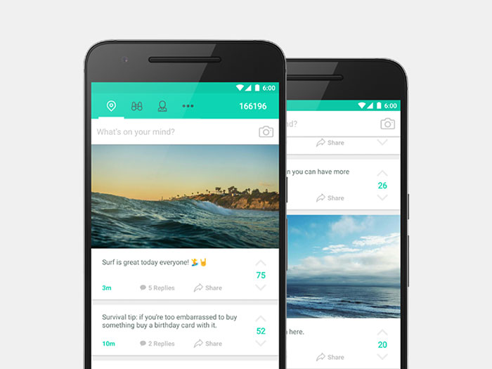
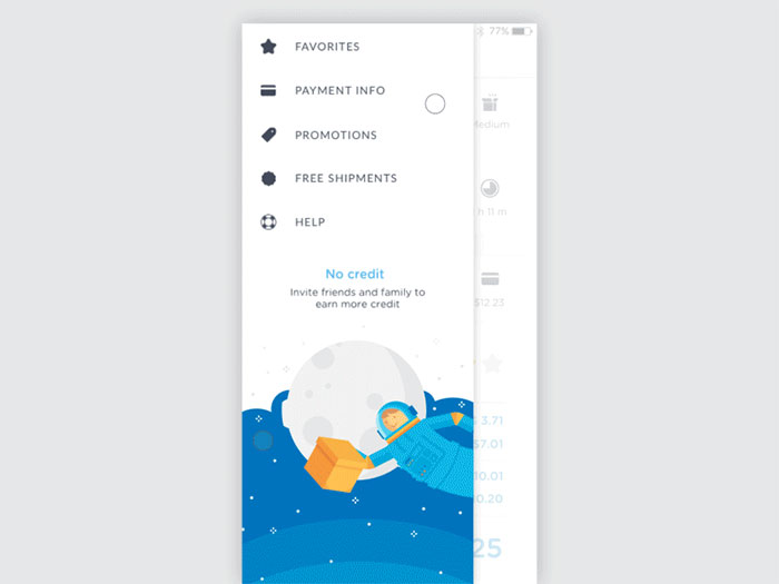
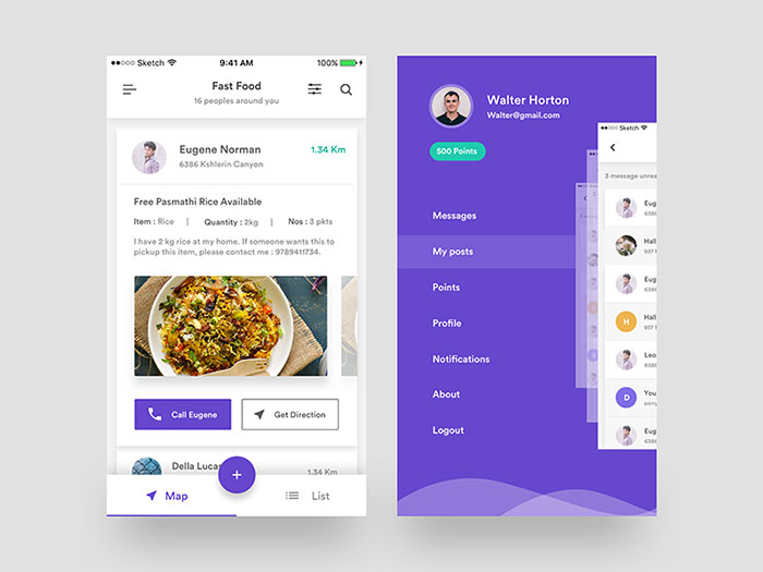
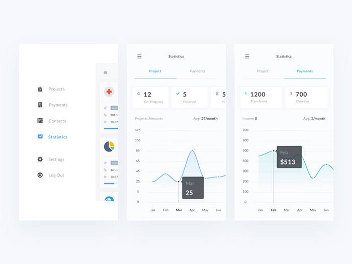
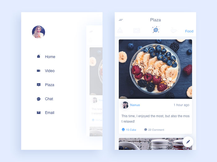
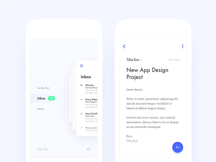
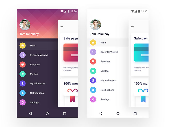
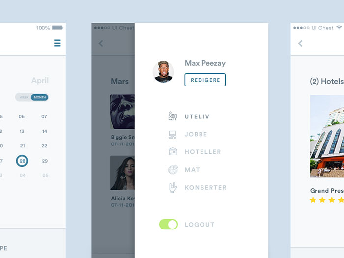
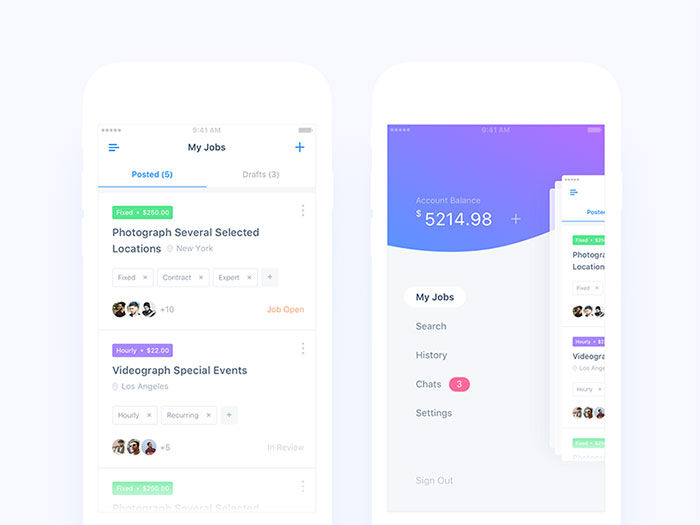
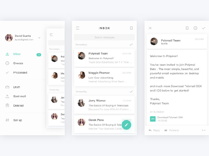
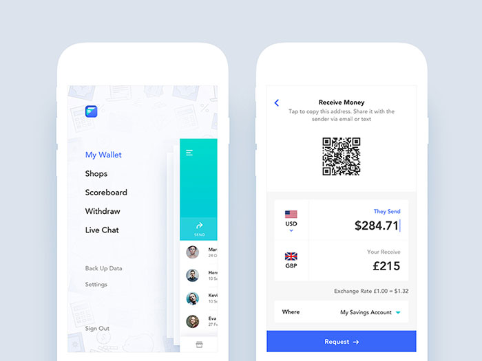
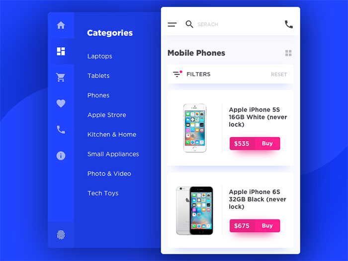
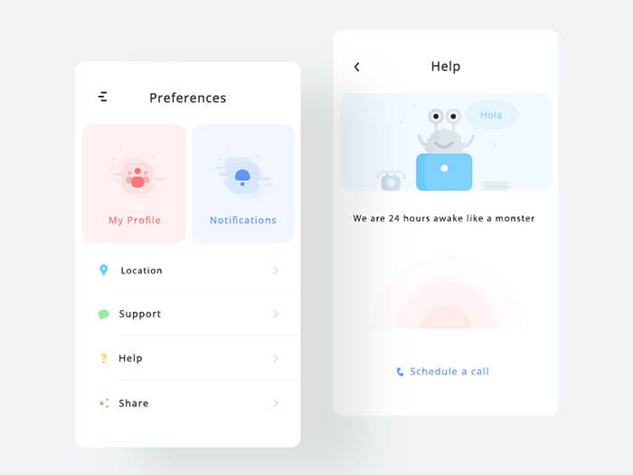
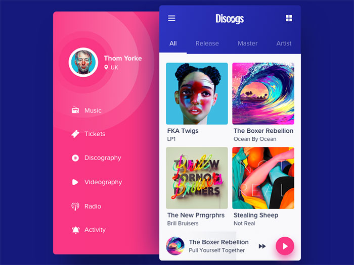
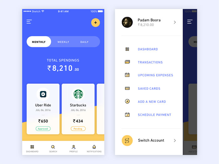
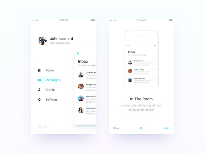
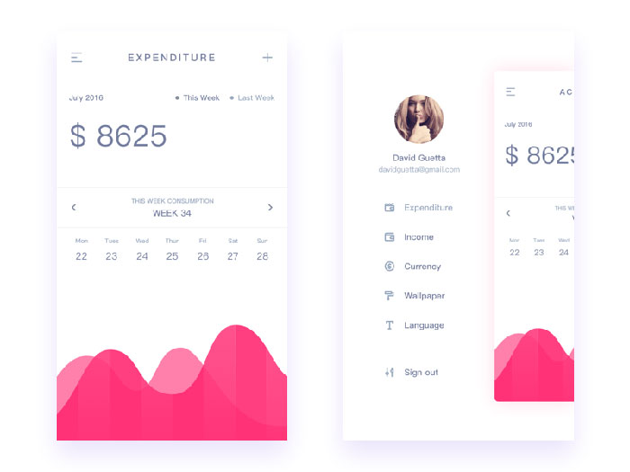
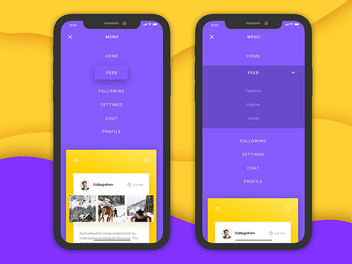
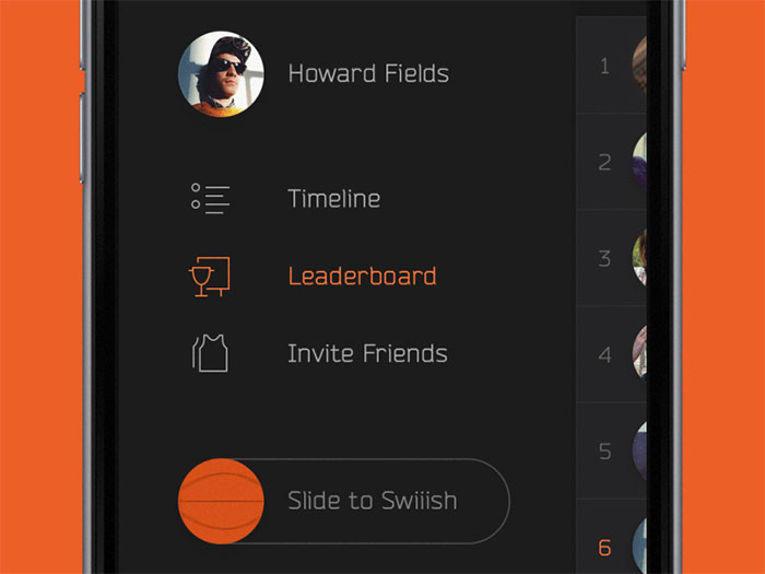
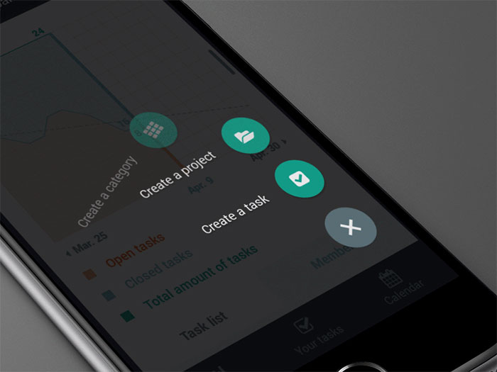
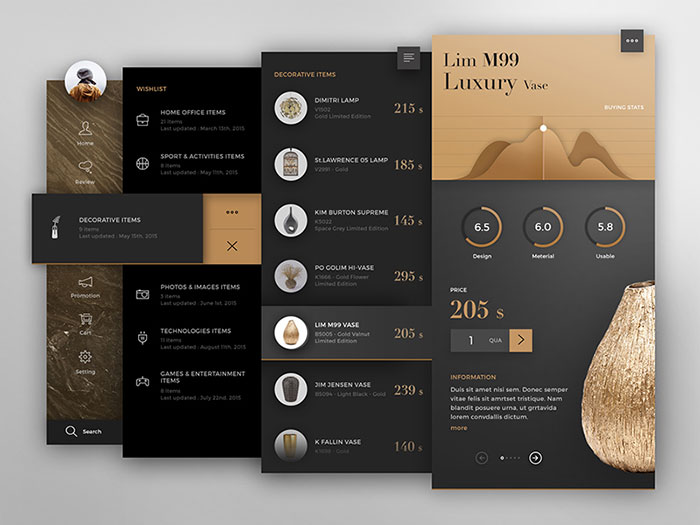
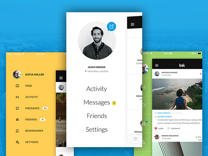
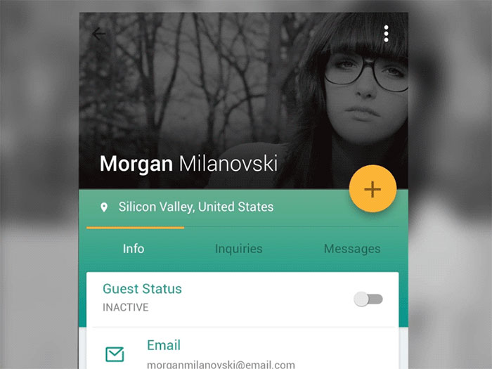
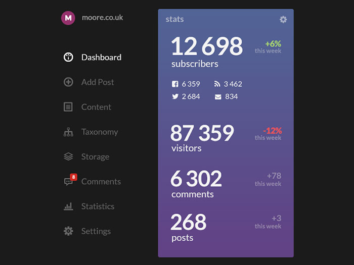
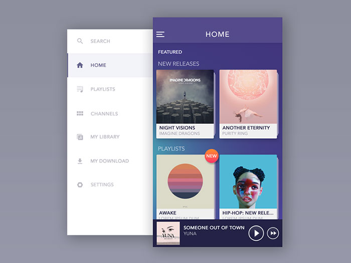
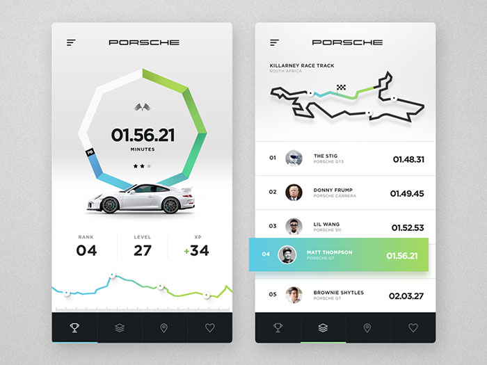
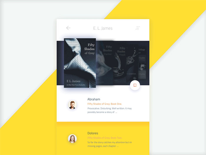
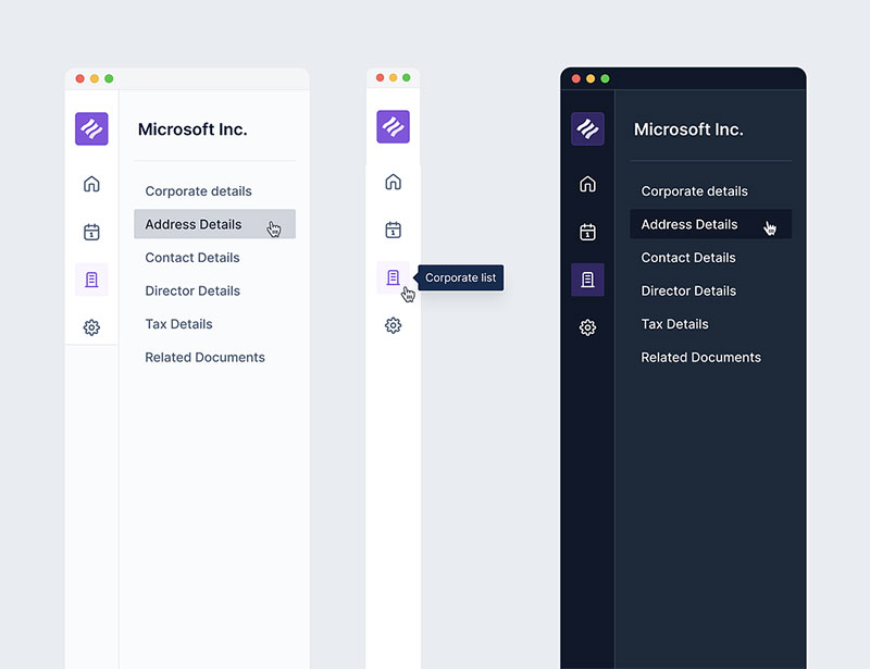
Mobile App Navigation Examples


FAQ on mobile app navigation
What Makes for Good Mobile App Navigation?
When ease meets intuition, you’ve hit gold in mobile app navigation. It’s about creating a flow that feels second nature to the user.
Good navigation should be invisible, guiding without shouting for attention. Think user-friendly UI and natural swipe gestures—that’s where the magic happens.
How Does Navigation Impact User Experience?
Massively. Imagine a map with no signs—that’s a no-go in app land. Navigation shapes the journey, colors user interactions, and defines satisfaction.
Get it right, and you’re a UX wizard, creating a seamless path that makes users stick like glue.
What’s the Role of Buttons in Mobile App Navigation?
They’re like tiny tour guides. Buttons should be easy to spot, inviting to touch, and clear on the promise of where they’ll take you.
They’re essential to a minimalist menu design, offering a mix of CTA buttons and icons for an uncluttered journey.
Is Hamburger Menu Still in Vogue for Apps?
Hamburger menus are the introverts of app design—there, but not in your face. They’re handy for decluttering but can hide crucial paths in their folds.
It’s a balancing act, so consider user engagement metrics before sticking it onto your app layout.
What is the Importance of Colors in App Navigation?
Remember traffic lights? Color in navigation cues reactions. Use color to highlight, to soothe, to call for action.
A splash here guides a tap; a dash there signals a rest. It’s that silent conversation between app and user, crafted through visual hierarchy.
Can Navigation Impact an App’s Conversion Rate?
Absolutely! It’s simple—frustrate with bad navigation, lose the user. Delight with intuitive design, you might just hear the ka-ching.
Good navigation eases the journey to the “buy” button, subtly driving those interaction design victories right into the conversion zone.
How Do You Design Navigation for Different Screen Sizes?
This is about thinking big and small, all at once. Whether it’s a responsive design or adaptive layouts, the mantra is clear—be consistent, be accessible.
Scale your elements, space them right, and let mobile design patterns guide your canvas.
Should Navigation Be the Same for Web and Mobile Apps?
Not necessarily. Each plays by its tune. Mobile is all for gesture, tapping into those touch interactions. Web might give you more space but demands just as much finesse. Adapt and sculpt your navigation to fit the device—it’s like tailoring a suit, fit to perfect.
How Complex Should App Navigation Be?
Less is more, they say. And they’re onto something. Strive for simplicity. The user’s patience is not a puzzle to be tested.
Aim for clean app usability, with breadcrumbs for the complex bits. That’s your recipe for a navigation that leads, not confuses.
What’s the Future of Mobile App Navigation?
Think voice commands, think AI, eyes on the road where gestures and minimal taps reign.
We’re cruising towards a destination where interaction design meets convenience at an intersection of technology. Keep an ear to the ground, and evolve with these mobile UX best practices.
Conclusion
So here we are, wrapping up this digital journey through the twists and turns of mobile app navigation. It’s like we’ve been on a road trip through the innards of a smartphone, cruising past menu designs and waving at CTA buttons.
- Those touch interactions? They’re the high-fives of the app world.
- The swipe gestures? They keep the pace peppy and fast.
- And let’s not forget the user experience—it’s the beat that all apps dance to.
The challenge is that when designing the best website navigation or app nav, you also need to embed a searching functionality, and they both take their toll.
Craft with heart, design with the user in mind, and stay fluid, because the landscape of interaction design keeps evolving, always ready for the next tap, the next swipe, and the next big thing in mobile design patterns.
You should also check out these user interface articles: