

How To Choose The Best Font For Your Custom Shirt
With various fonts available, choosing which ones would look perfect for your custom shirt can be a little tricky, even for experienced graphic designers. You have to balance out practicality and aesthetics.
There’s no perfect formula for selecting the best font style for a shirt. It requires creativity and knowledge of the concept of design. However, combining your vision with these valuable tips can help you narrow down your options.
That said, here are four simple tips and tricks on how to choose the best font for your custom shirt.
Consider Brand Identity
The first step to choosing the best font style for your shirt is considering your brand identity. This answers the question, ‘What type of brand am I designing for?’.
Looking at the brand identity can narrow down your font choices. You may look at your current logo as your foundation for designing a shirt. It contains the elements that define how the public perceives the brand.
For example, shirts for tech companies are known for their sleek and minimalist design. They often use sans-serif and slab serif fonts that are bold and straightforward. Popular minimalist fonts are Monserrat, Chivo, Comfortaa Light, and Helmet Neue.
In contrast, if your brand is in the creative field, you may choose from serif, script, and design fonts. These countless options can be overwhelming, so it’s best to try out different fonts yourself. If you want to customize your shirt with a beginner-friendly design studio, you may visit https://www.teejunction.com.au/.
Define The Message
The meaning of a text is influenced by the font style. Despite changing the content, the message can alter when the design is adjusted. This demonstrates how effective font style and design decisions can be in twisting and changing the message you’re attempting to express.
One good example is the font choices in band shirts. You can look at a shirt and know what type of music they play despite not knowing who they are. Most of the time, the less legible they are, the heavier their music is. Despite not flaunting their message straightforwardly, you’ll get what they’re trying to tell you.
Another example is the different fonts used for motivational and inspirational statement shirts. When your statement aims to motivate, use bold fonts. Make it strong and direct. In contrast, inspirational quotes need softer, flowy fonts that lead your eyes to read the full statement. Sometimes handwritten fonts can make the message feel more sincere and honest.
To test this tip yourself, you may pick a short quote that you’d like to print on a shirt. Then, go to a reliable design app and read it in different font styles. You’ll find out some fonts look good but do not represent the message accurately.
Weigh Out Readability Vs. Design
When selecting a font style for your shirt design, you have three options: focus on readability, focus on the decorations, or create a balance between both.
If your choice focuses on readability, sans-serif, slab serif, and serif font styles can suit your design. They’re great for minimalist statements or logo shirts. For comparison, serif fonts look more formal, while sans-serif looks more casual and plain.
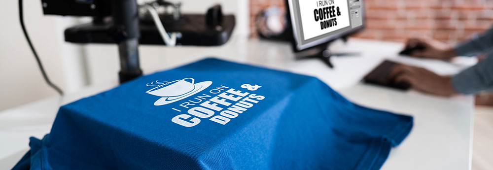
On the other hand, script and display fonts are perfect if you want to focus on the overall design instead of the legibility. Script font styles include calligraphy fonts. Since these font styles look handwritten, it’s easier to incorporate them with other decorative elements. You can freely express your creativity. These are commonly used for inspirational shirts.
Moreover, display fonts are also best for their decorative character. Display fonts are popular in the gaming community. They focus more on the shapes and decorative elements and thus appear more ‘playful.’ These fonts can also be customized to fill a specific area or to make a shape.
To set the balance between readability and design, you may choose a combination of two different font styles. You may pair a sans-serif font with a script, a serif with handwritten fonts, or a script with slab-serif. You’ll have to choose a perfect match that makes your statement easy to read yet very creative and eye-catching.
Who Will Wear The Shirt?
People often wear clothes that reflect their personality. Knowing who will wear the shirt is also a factor in design that you have to consider.
When designing for kids’ tees, you’ll have to put formal and minimalist fonts aside. You have to create a design that looks colorful and playful. Often, it’s more about the shapes and decorations than the texts themselves.
Suppose you’re aiming to make the shirt more wearable for all ages and genders. In that case, your best options are casual fonts like sans-serif, slab serif, and handwritten. They can blend in with a variety of designs and shirt colors.
Conclusion
Customizing a shirt is one of the best ways to unleash your creativity. Even if you’re an experienced graphic designer or someone who just loves personalized items, creating a wearable art piece is something you’d be proud of.
Bogdan Sandu, a seasoned designer with 15 years of diverse experience, has been designing websites since 2008.
Renowned for his expertise in logo design and visual branding, Bogdan has developed a multitude of logos for various clients.
His skills extend to creating posters, vector illustrations, business cards, and brochures. Additionally, Bogdan's UI kits were featured on marketplaces like Visual Hierarchy and UI8.
Latest posts by Bogdan Sandu (see all)
- The Sega Logo History, Colors, Font, And Meaning - 19 April 2024
- Light Up Your Designs with These Light Color Palettes - 19 April 2024
- How to Measure Brand Loyalty Effectively - 19 April 2024