


20 Logos That Have Withstood The Test Of Time
The best logos are highly recognizable, distinctive designs. After all, that’s what makes them work! The more enduring the logo, the more iconic its associated brand becomes.
Some logos made such a lasting impact that they’re now fixtures of pop culture. What gives a logo this iconic status? Is it a matter of great design, effective marketing, or something more?
To discover the answer, let’s explore 20 memorable logos that have passed the test of time.
Stella Artois
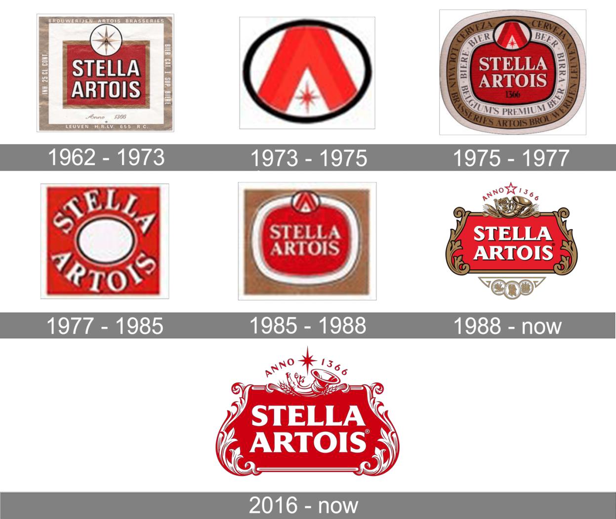
One of the world’s oldest logos, Stella Artois’ sophisticated emblem represents a long history of brewing. The brewery itself pre-dates logos, tracing its roots back to mid-14th-century Belgium! In the 20th century, though, Stella Artois achieved an international audience. Its distinctive red-and-white emblem proudly declares “Anno 1366,” referring to the year it was founded.
The Stella Artois is quite intricate compared to many modern logos, but customers definitely don’t mind. The decorative frame, adorned with a cornucopia and a timeliness typeface, perfectly captures this beer’s artisan taste and ancient history.
Coca-Cola
Coca-Cola’s wordmark features a distinctive red-and-white design that’s both eye-catching and recognizable. The script typeface and bold vermillion hue give this widely beloved soft drink quite the visual presence. Coca-Cola’s fans adore this logo so much that the company has released official merchandise — everything from t-shirts to keychains to household decor. Coca-Cola’s logo is so iconic that it can be recognized in any language — even alien ones!
(Photo by author)
While Coca-Cola’s classic font may seem timeless, the logo has actually changed a lot over the years.
Coca-Cola’s creator John Pemberton was stuck on names for his invention, so asked his bookkeeper, Frank Robinson, for ideas. Robinson hit it right on the mark, suggesting “Coca-Cola.” He added, “the two C’s would look well in advertising.” Clearly, Robinson was a smart guy. Throughout the Coca-Cola logo’s evolution, the two C’s have always stood out.
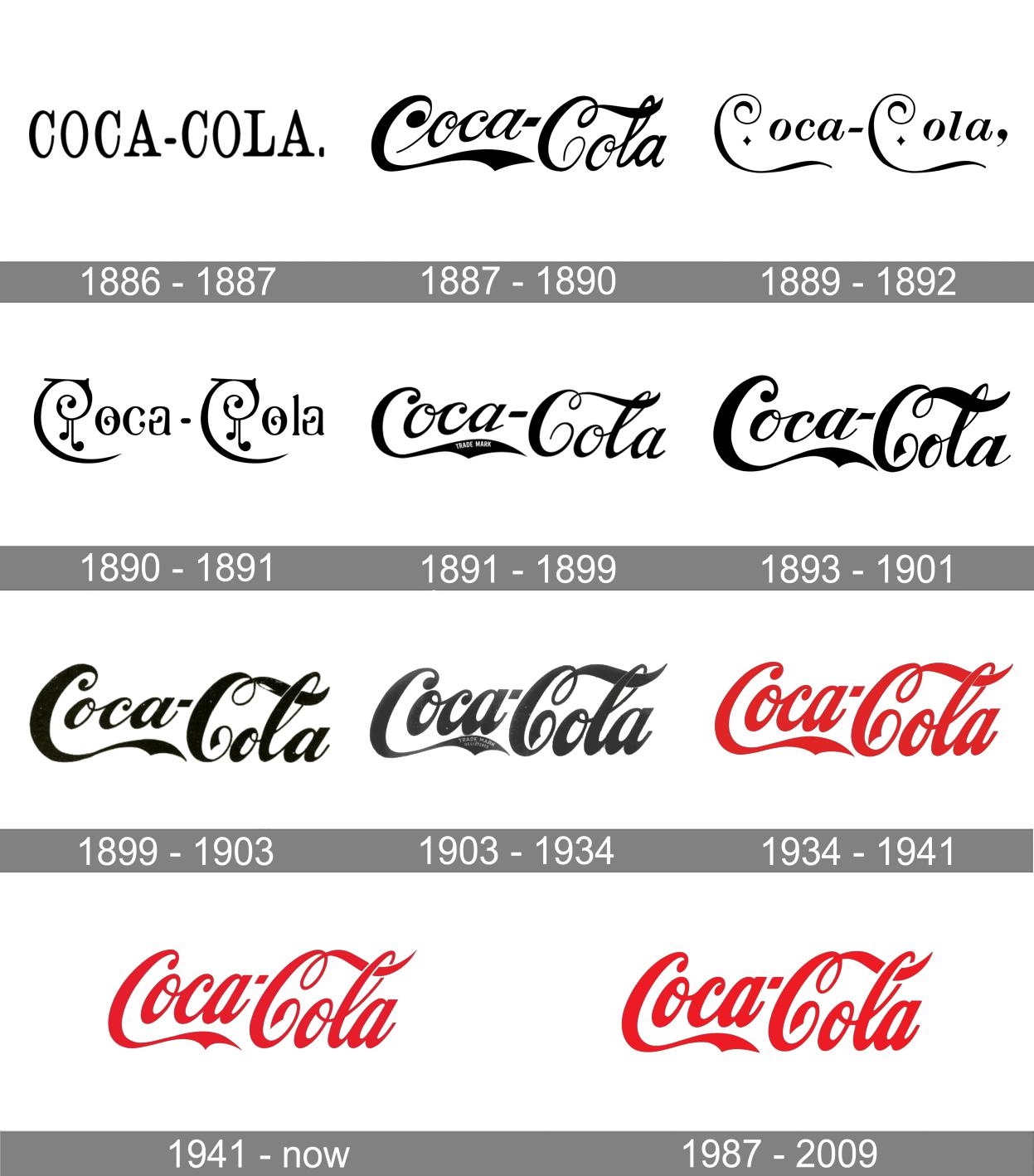
The original wordmark was a plain serif — not very memorable. In 1887, though, the new logo featured a bold, embellished script typeface. The first “C” had a waving pennant that underscored “Coca.” The second “C’s” tail coiled once before passing through the loop of the “L.” These design elements make the wordmark highly recognizable even as the typeface itself became slimmer and tighter.
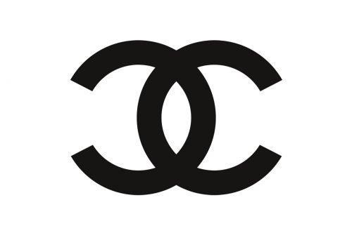
Chanel
Speaking of “Cs,” Coca-Cola isn’t the only brand to leverage double-Cs in its branding. Chanel’s logo features two interlocking Cs — the initials of founder Coco Chanel, who also created the logo. The image suggests sophistication, luxury, and the linkage between the two.
The design is so iconic that it has become a fashion element itself, appearing on Chanel’s bags, apparel, shoes, and accessories. It has remained unchanged since the company’s debut in 1925.
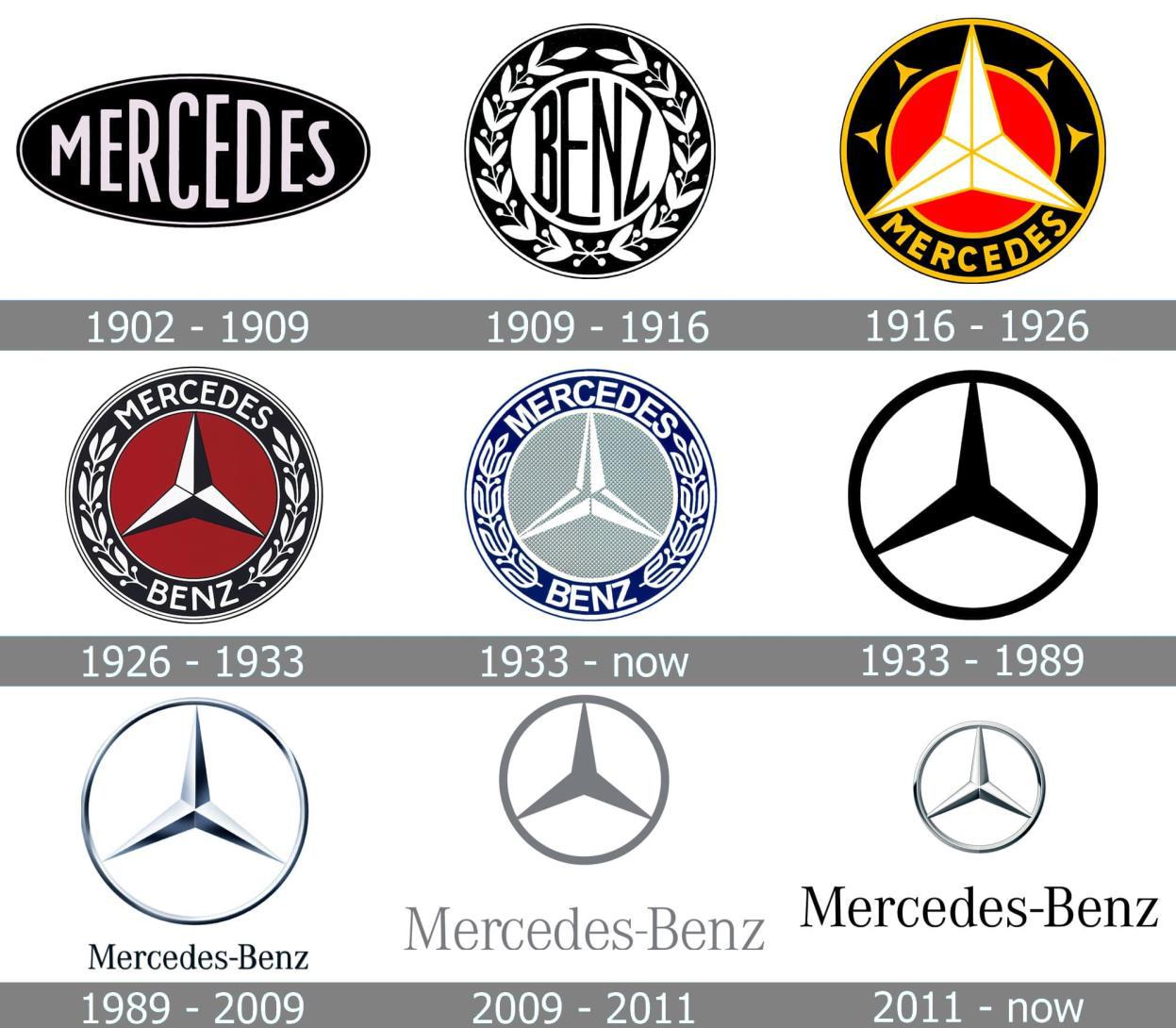
Mercedes-Benz
Mercedes-Benz is one of many automobile companies that relies on a symbol rather than a wordmark. However, their iconic three-point star is arguably more recognizable than many other insignia.
Founder Gottlieb Daimler drew the star over a picture of his home, wishing prosperity for his family and business. His wish clearly came true, as Mercedes-Benz is now a world-renowned luxury vehicle company. The star has appeared in every logo iteration since 1916, from the intricate seal to the streamlined symbol we see today. 
(Image via @artistmac with CC BY-SA 2.0)
McDonald’s
It’s hard to believe now, but McDonald’s started out as a barbecue restaurant. The original logo was little more than a wordmark, although a friendly chef character accompanied it for a while.
Everything changed, though, when the company built a new location with dramatic yellow arches. The 25-foot-tall structure attracted many new customers — and McDonald’s had a powerful new symbol of its brand.
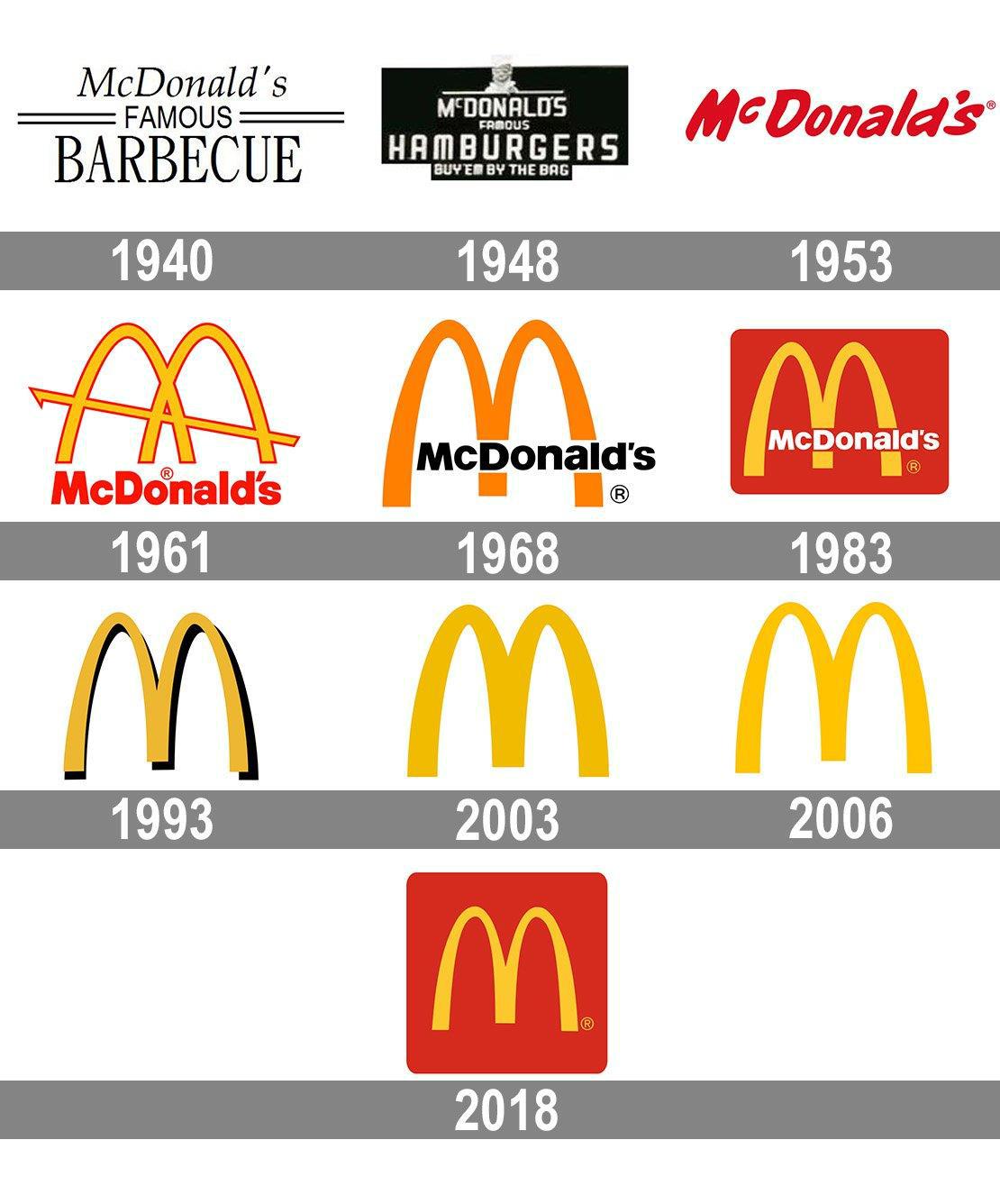
McDonald’s incorporated the famous Golden Arches into its logo and never looked back. While the exact proportions, color, and shape of the arches have evolved, they remain so iconic that people can recognize the logo even if the company name is absent. This enduring logo design is proof that a simple visual concept is critical to a memorable brand.
(Image modified from original)
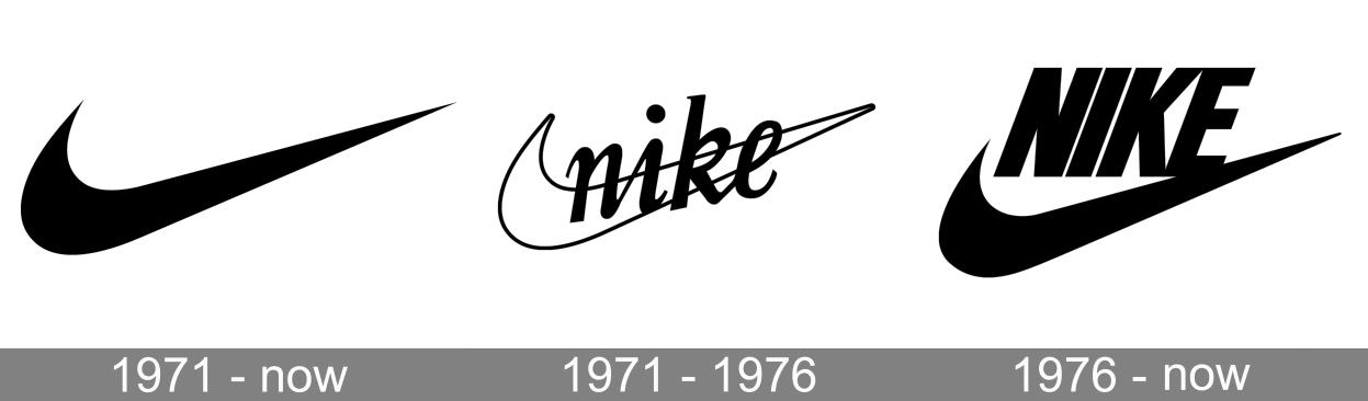
Nike
Commonly cited as one of the world’s most recognizable logos, the Nike swoosh is also the most enduring. A woefully underpaid design student created the swoosh in 1971. Since then, it has appeared in almost the same form in every logo iteration. Eventually, Nike dropped its name from the design and relied solely on the iconic shape to express its brand.
It worked. Designer Carolyn Davidson created the shape to convey both dynamic and upward movement, signifying ambition and achievement. The swoosh uses the mathematical proportions of the Golden Ratio, an aesthetic standard dating back to the ancient world. There’s a recipe for an enduring logo: go with what works well!

(Photo by Raymond Kotewicz on Unsplash)
Shell
When your fuel gauge is on “Empty,” you’re desperately looking for the nearest gas station. A bold, recognizable logo stands out as you scan the area: a red-and-yellow scallop shell that promises relief.
Shell takes a literal approach to their brand identity. Since the early 20th century, their logo has been a shell, referring to the ancient sea creatures that eventually become petroleum. The original design was a rather lackluster mussel shell. The company wisely switched to the dramatic scallop shape just a few years later.
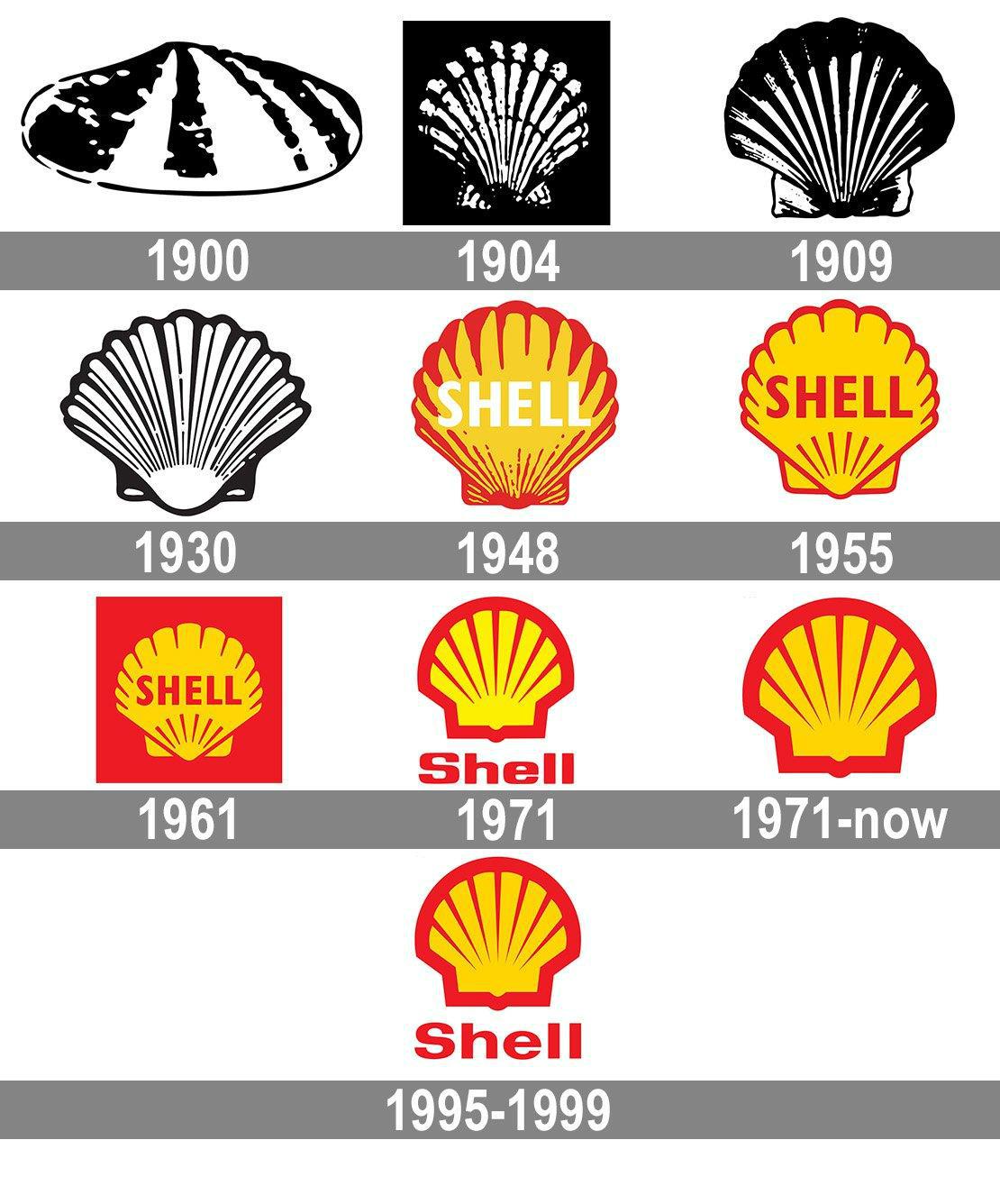
It wasn’t until the 1970s, the golden era of logo design, that Shell’s logo finally got the streamlined, vivid design we see today. The eye-catching combination of red and yellow attracted wayward motorists. As environmentalism grew throughout the ’70s and ’80s, the scallop shell also reflected the company’s commitment to (relatively) eco-friendly strategies.
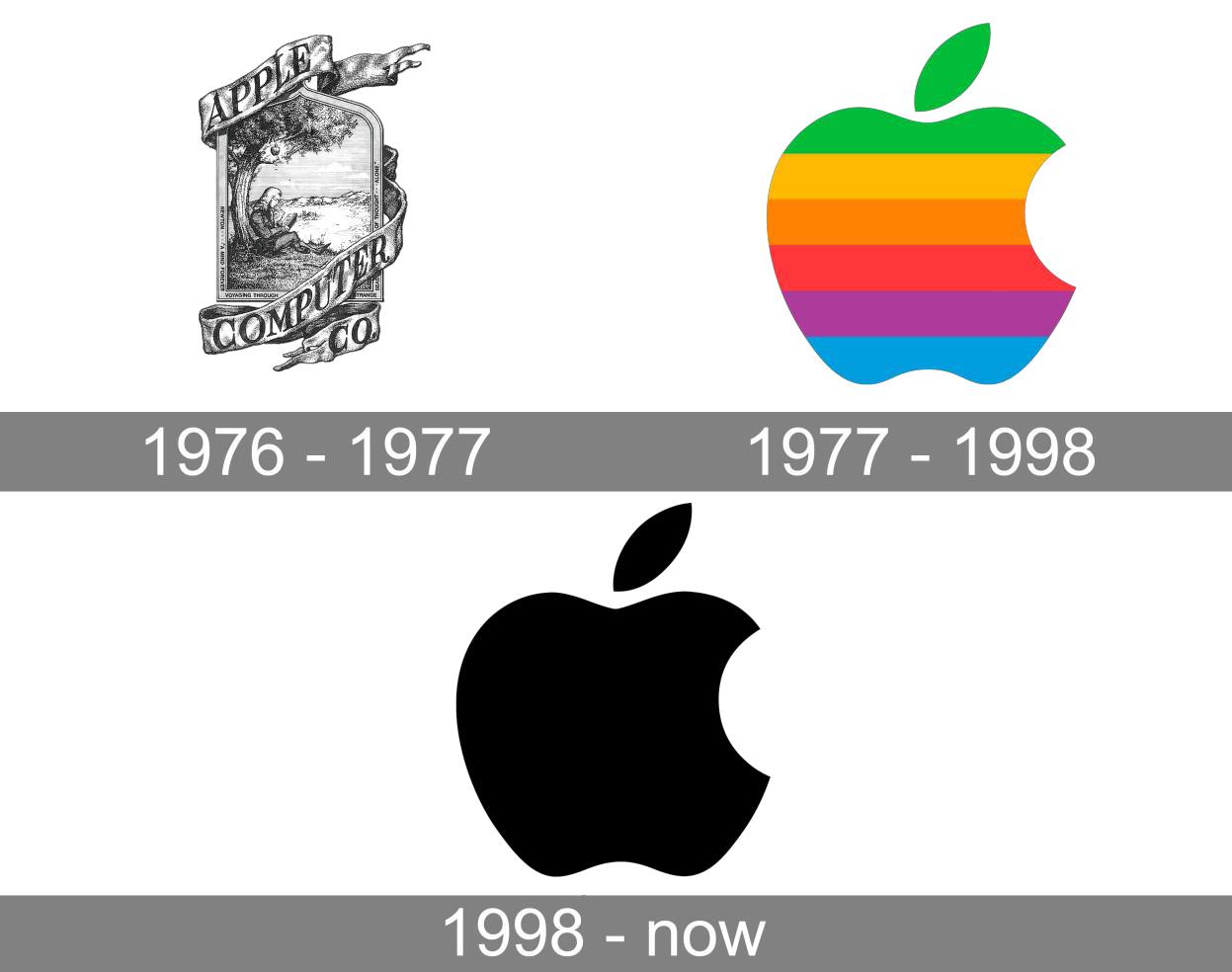
Apple
Another oft-cited iconic logo, Apple keeps it literal. Their logo is an apple, simple as that. The concept stemmed (pun intended) from founder Steve Jobs’ background as an apple farmer. Jobs found apples to be accessible and elegant, just like the personal computer he’d invented. He also appreciated the story of Sir Isaac Newton, who created his laws of motion when an apple fell on his head.
While the original logo was a complex drawing of that incident, Apple wisely switched to something simpler. The Apple logo was debuted in color to indicate the display quality, but over time, became a sleek, silhouetted apple that connotes knowledge and discovery.
Pepsi
You may be surprised to see Pepsi on this list, as it has changed its logo more than 10 times over its 100-year history (with some disastrous results). But bear with us.
Pepsi’s earliest logo featured a sweeping script typeface, similar to a certain other soft drink company’s wordmark. However, that design endured for more than 50 years. 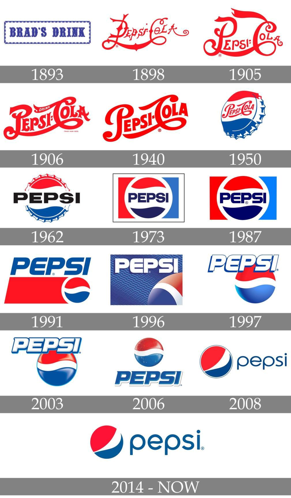
In 1950, the company positioned the wordmark on a bottle cap, sandwiched between red and blue waves. This striking design became so iconic that people could recognize the logo even if the word “Pepsi” was absent. While the typeface has changed over the years, customers can easily spot the “Pepsi wave” — even after it tilted in the brand’s 2008 redesign.
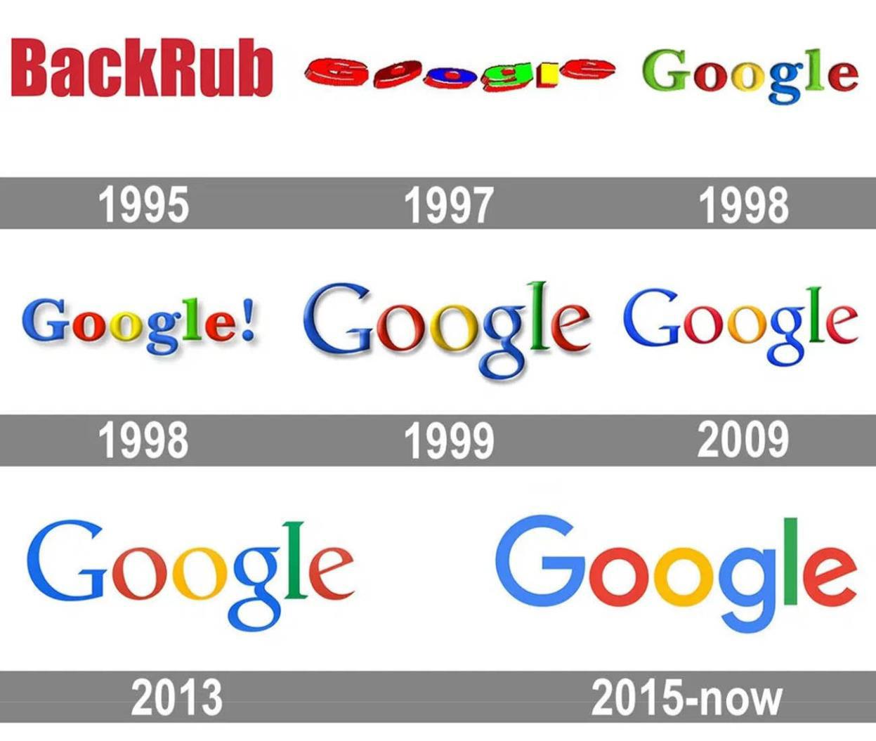
Google relies on its distinctive name for recognizability. Its logo has always followed suit, depicting the word in a multi-colored design. The search engine giant is also famous for rolling out customized versions of the logo for various holidays and historic events.
The basic wordmark, though, is more than meets the eye. Reportedly designed by Google co-founder Sergey Brin, the logo uses primary and secondary colors to signify the mix of information users can obtain. The letters appeared in alternating colors: blue, red, yellow, blue again, green, and red again. Brin deliberately defied the conventional ROYGBIV order because “Google doesn’t follow the rules.” While the typeface has changed over the years, the color scheme remains the same.
Volkswagen
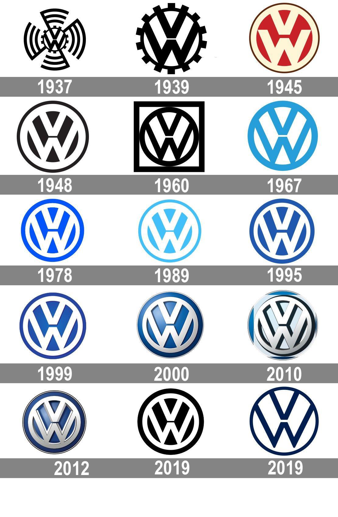
Automobile companies tend to use abstract symbols as their logos, which doesn’t always boost their recognizability. Volkswagen smartly uses the initials “VW” in a visually striking way.
The original logo design was eye-catching, if a little busy. The bottom point of the “V” nearly touches the top middle point of the “W.” This creates a nice symmetry, especially when embedded in a circle. In early logos, the circle was a gear, symbolizing the company’s brilliant engineering.
Over time, the cogs were removed and the pattern was inverted. While the colors and gradients have changed, the iconic “VW” pattern has endured.
Sherwin-Williams
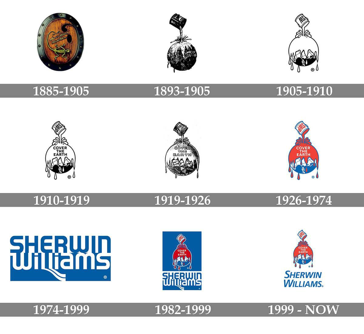
To say something is “like watching paint dry” means it’s boring. But paint company logos don’t have to be dull. Sherwin-Williams debuted their provocative logo back in 1893. Per their tagline, “Cover the Earth,” the illustration depicts a can of paint being poured over the globe.
Except for a couple of decades where they used a wordmark instead, Sherwin-Williams has retained this visual concept. After all, it’s anything but boring!
Disney
Disney’s massive influence on the entertainment industry cannot be overstated — and deserves an iconic logo to match. Thankfully, the company’s namesake, Walt Disney, had a famously whimsical signature. This inspired the highly recognizable wordmark with the “Disney font.” The “D” is so recognizable that it appears alone on some branded materials.
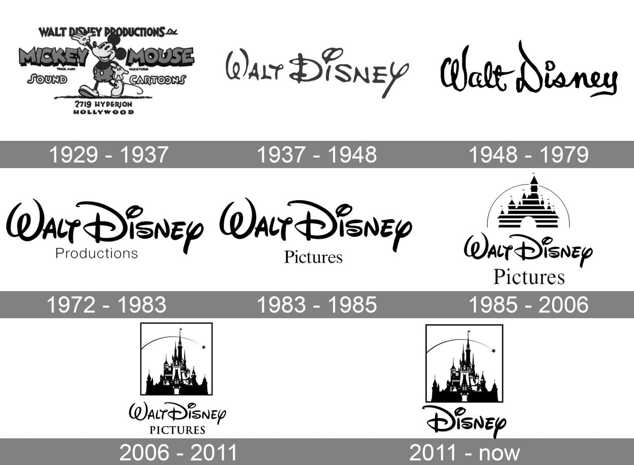
In 1985 as part of the “Disney renaissance,” the company added Cinderella’s castle to the logo, complete with a shooting star a la Pinocchio. This design honors their classic films while ushering in a new era of magic. Plus, it was excellent cross-branding for their theme parks.
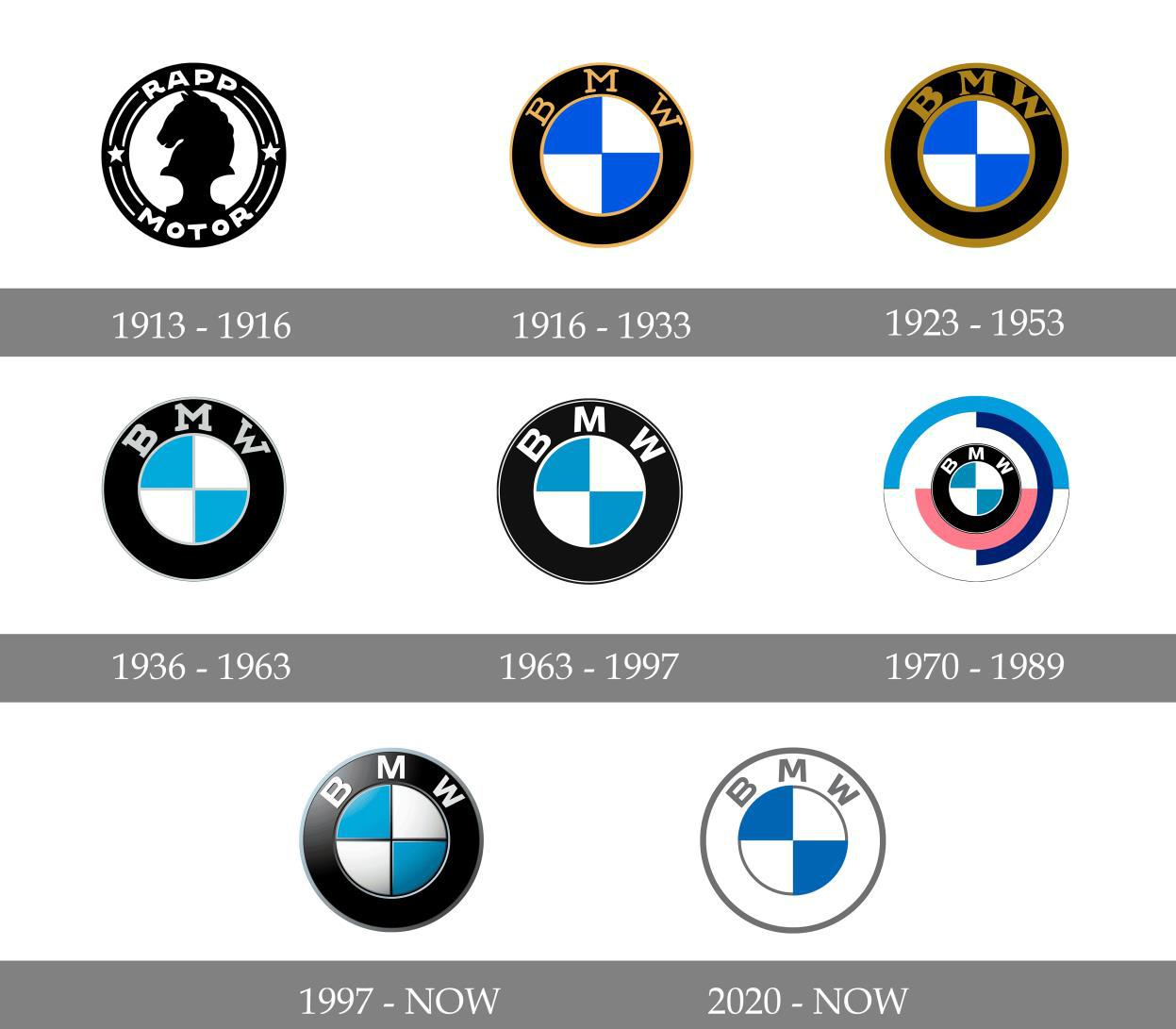
BMW
Since the early 20th century, BMW has used the same blue-and-white checkerboard in all iterations of its logo. These are the colors of the Bavarian flag, and the company was eager to express its national pride. The circular design symbolized propellor blades, dually representing the auto manufacturer’s origins and commitment to innovation.
Meanwhile, the initials BMW, for “Bayerische Motoren Werke,” appeared above the checkboard insignia. While the logo has evolved from a gold-trimmed emblem to a flatter, more modern design, the basic image is as iconic as ever.
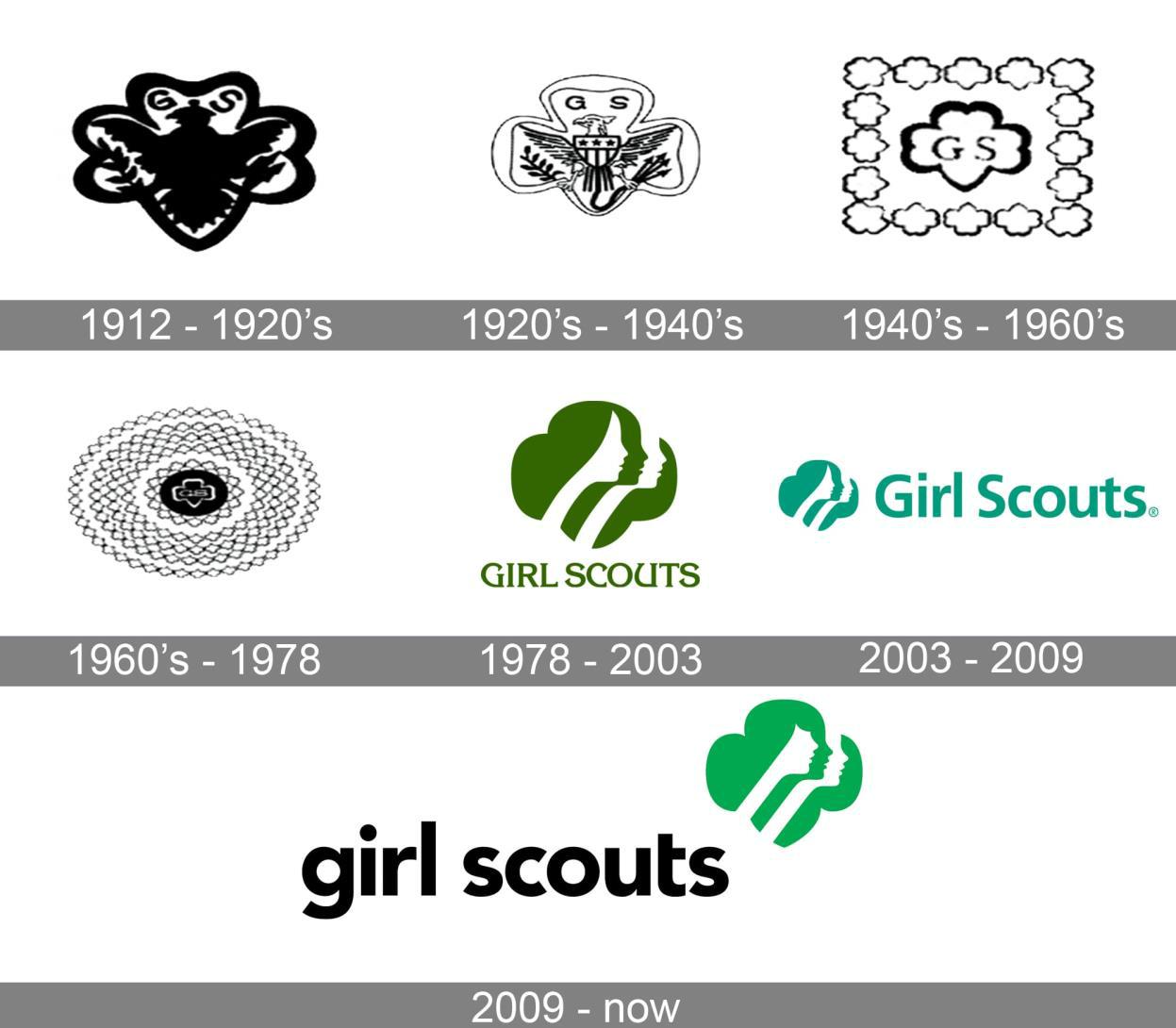
Girl Scouts
The Girl Scouts’ iconic logo may feature a four-leaf clover, but its lasting success is anything but luck. Esteemed graphic artist Saul Bass created this clever design, which combines several female silhouettes within the clover shape. At first glance, we see one girl, but then realize that her hair contains a second face, then a third. This illusory effect symbolizes the Scouts’ dual focus on teamwork and individual achievement.
While the 2010 re-brand changed the girls’ hairstyle and face shape, the overall concept remains the same. The Girl Scouts’ logo instantly connotes female empowerment and youthful aspiration — and of course, delicious cookies.
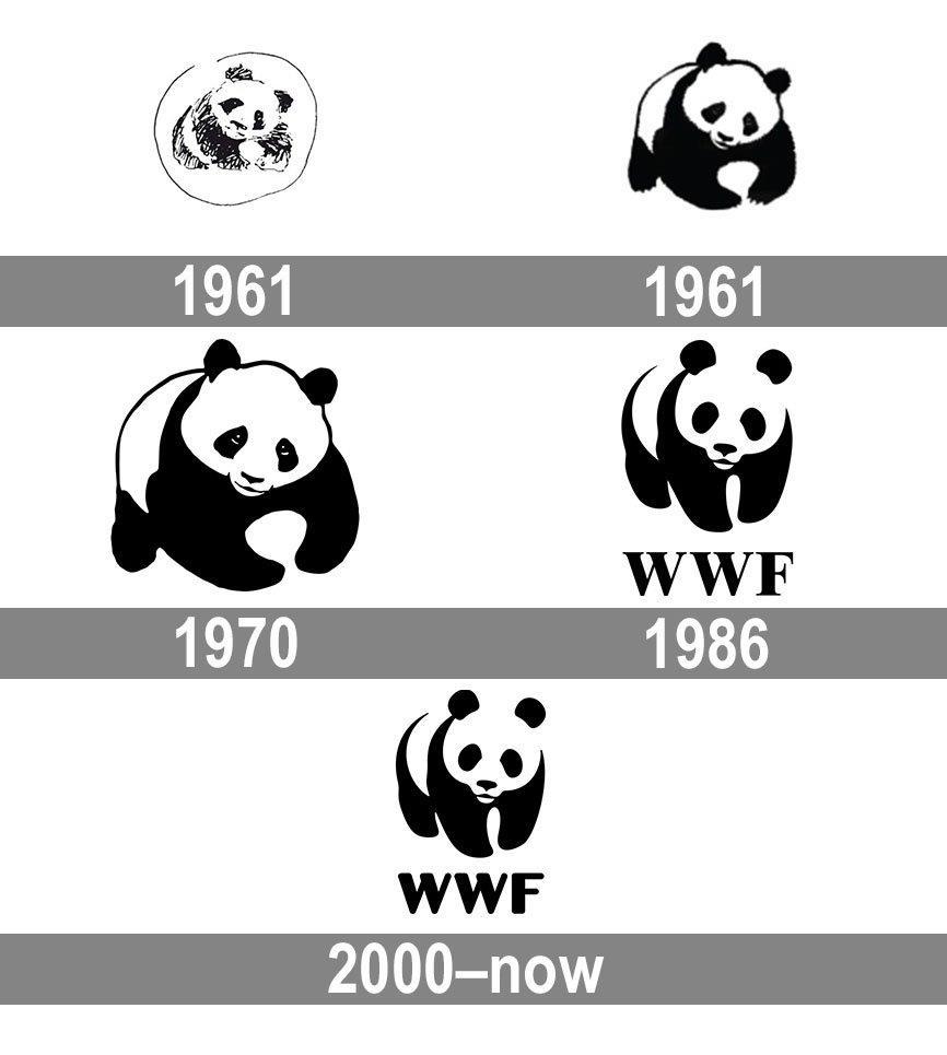
World Wildlife Fund
The World Wildlife Fund also appreciated the silhouette look. As one of the world’s top nonprofits, they needed a logo that instantly captured people’s attention — and made them want to give money.
What better choice than the adorable panda? This famously black-and-white animal lent itself well to logo design. Inspired by the London Zoo’s beloved Chi Chi, WWF created one of the most enduring brand images. The original 1961 design was highly illustrated, but over time, the design made excellent use of negative space to bring the panda to life.
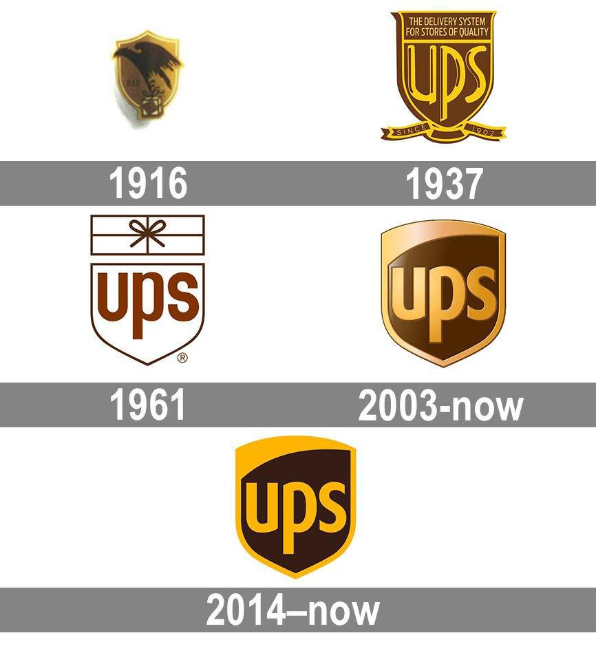
UPS
UPS was founded in 1907, and its logo evolution demonstrates a consistent aesthetic. The design has always incorporated a shield. The original logo featured an eagle to signify the courier’s speed and power. In 1937, the eagle was replaced by a lettermark. Over the years, the typeface and colors changed, but the overall design retained the initials “UPS” against a bold shield shape.
The message is clear: we’ll defend your package. The modern logo is flat and streamlined yet still has the classic colors and trustworthy look of the original design.
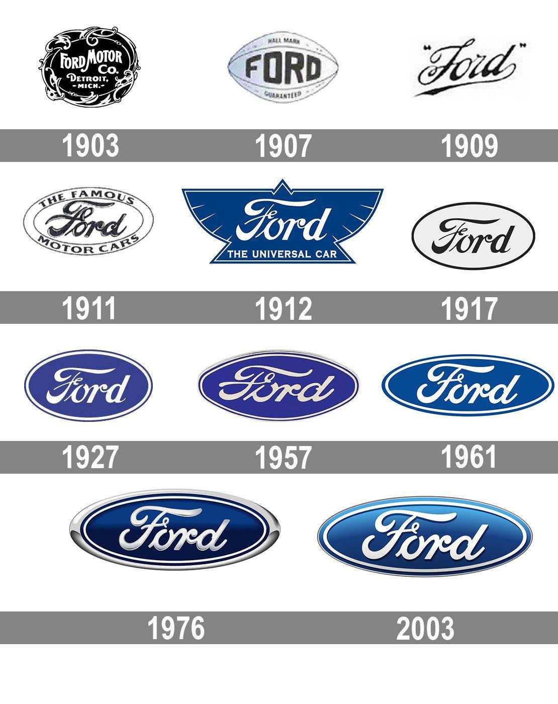
Ford
While many automobile companies rely on an abstract design to symbolize their brand, Ford keeps it literal. Their logo has always featured their name. After an early Art Nouveau design went out of style, Ford introduced a script typeface with a stylized “F,” and the wordmark has remained virtually the same ever since.
Ford’s wordmark is highly legible despite being in cursive, which certainly contributes to its success. Paired against a deep blue that connotes working-class America, the logo retains its old-school pride in modern society.
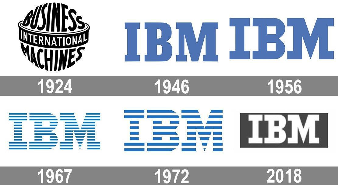
IBM
In the late 1960s, the International Business Machine company was rebranding. As a longtime innovator in computing and engineering, IBM needed a logo that truly captured their significance. Esteemed designer Paul Rand took on the task. His now-iconic lettermark depicted the company name as a series of parallel lines, meant to connote speed and dynamism.
Clearly, he succeeded, as IBM still uses this distinctive logo nearly 60 years later. While the number of lines has changed, the overall impression remains the same. People enjoy seeing letters made out of images, which has certainly helped this logo become so memorable!
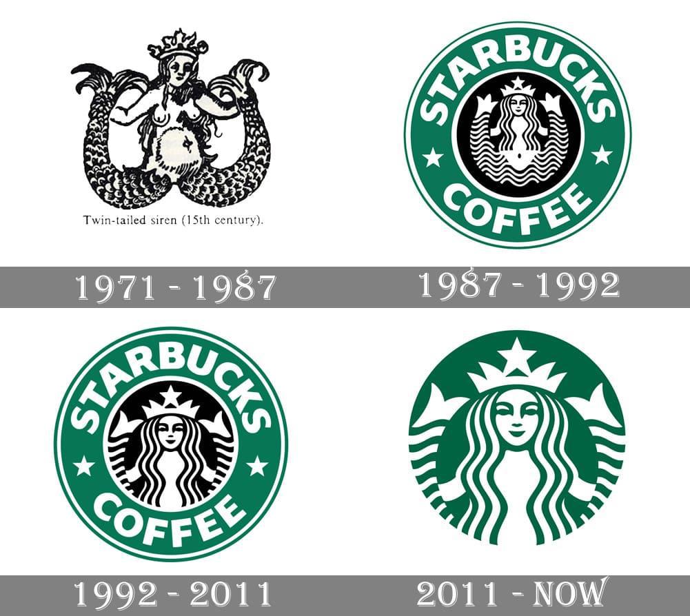
Starbucks
Who could have imagined that an obscure mythological creature would become the symbol of a global brand? That’s exactly what happens with Starbucks. Inspired by a 16th-century Norse woodcut depicting a siren, one of the Seattle coffee chain’s founders saw a compelling symbol. The port city was known for its maritime history, as was coffee itself. Plus, who hasn’t felt the craving for coffee as powerful as the siren’s song?
The original 1971 design was an ornate, NSFW illustration of the two-tailed mermaid-like creature. Over time, she became more clearly illustrated and extraneous elements were dropped. The current logo is much more streamlined with a deep green hue that signifies comfort and creation. However, the siren remains intact, holding her tails and gazing serenely upon the viewer. (Great, now we need some coffee.)
Wrapping Up
Each of these time-tested logos offers valuable insights into what makes a successful design. Which one stands out to you the most?
Bogdan Sandu, a seasoned designer with 15 years of diverse experience, has been designing websites since 2008.
Renowned for his expertise in logo design and visual branding, Bogdan has developed a multitude of logos for various clients.
His skills extend to creating posters, vector illustrations, business cards, and brochures. Additionally, Bogdan's UI kits were featured on marketplaces like Visual Hierarchy and UI8.
Latest posts by Bogdan Sandu (see all)
- The Epic Games Logo History, Colors, Font, And Meaning - 24 April 2024
- Spread Joy: Happy Color Palettes for Uplifting Designs - 24 April 2024
- The Konami Logo History, Colors, Font, And Meaning - 23 April 2024