
Layout Design for A Magazine Page and Printing Tips

Creating a great layout design should be your objective when you are given a print project.
Balance is the key aspect of every design project, be that a website or a printing layout.
la
In both cases, designers apply several common principles you must know before you launch a successful project.
All page layout designs, including the ones of mobile apps and modern printed brochures have the same objective – to deliver your message in an effective and clear way.
The best way to achieve that is to please users with a balanced graphic design layout, where they won’t have to ‘wander’ to locate important details.
A balanced and well-composed page will be both appealing and functional, and attract the attention of target audiences.
To support your page layout design efforts, we’ve listed the best tips and practices from recent years. If you abide to them, you will be able to produce a structured layout design regardless of your mediums and resources.
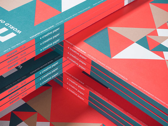
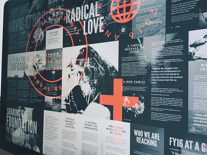
Work with grid
Grid systems are layout designs’ best friends. They are in charge of balancing the page, both when used traditionally on printed materials, and migrated to the digital world to help complete some online work.
Grid is used to inform viewers where different elements stand on a page, and to connect them visually so that there is an understandable hierarchy. Grid introduces a sense of order and thoughtful arrangement, and helps viewers get a grasp on how that layer works.
Why is grid so important? Without it, the page will miss the feeling of connectivity between elements, look less appealing and less effective, and make the user less comfortable with the content being provided to him. The most effective designs in history are those that are easy to access, in particular in terms of content.
Focus on a single point
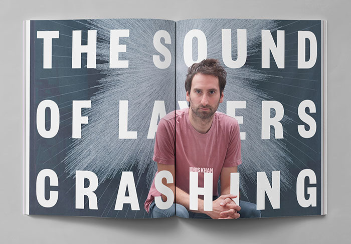
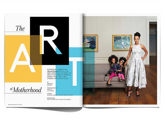
Another trick that can help you create a balanced page is to focus on a single point on the layout design, as for instance a large heading or a high quality image. Basically, the focal point will be the first thing viewers notice when looking at your design.
Impactful visuals will guide the user on your page, and work as powerful structural elements when it comes to arranging remaining pieces of content. The process will be more difficult with more content to display, but you can always turn to Gestalt Theory’s proximity principle and align elements in the same way to arrive to a balanced result.
In the same way, you can pull quotes and use headlines to attract more visual interest to the image, and do so without disturbing the balanced structure of your layout design.
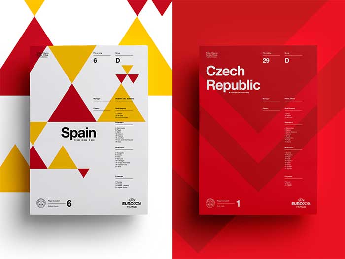
Consider the rule of thirds
Printing layouts have a lot to teach to prospective digital designers. The rule of thirds is a core lecture, also known as the Golden ration.
Used to balance layout designs, this rule indicates that you should divide pages in three parts (both horizontally and vertically), and depict the natural focal points of your composition in the points where the grid lines intersect.
Next, you will need to align the main elements to these four points, and you will have a much more appealing composition that one where all elements are perfectly centred.
Yet, you can’t expense the rule of thirds to do its own magic bringing your layout design to work. Instead, you can tweak it and extend it any way you want, until you locate the natural focal point, and let users know what your design is all about.
The easiest way to adopt the rule of thirds is to choose the main elements on the page, and place them in the upper/lower third of the page. The main focal point, meanwhile, should be aligned in a way that matches the intersections.
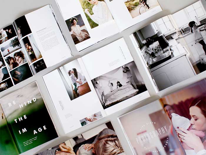
Make use of white spaces
The common misconception of novice designers is that they should make use of every single inch of page estate, and stuff in as much content as possible. Experience designers, on the other hand, will agree that the best designs are those that leave elements out, and manage properly the blank space they have available.
Printed mediums are the role models of white space usage. Thanks to the space they’ve left unfilled, they manage to enlarge the page gutters and margins.
Negative spaces are just perfect for designers with a clear structure looking to anchor content together (as done with grid), having in mind that white spaces can create a disconnection between elements if not used the right way.
Repeating design elements
A useful Gestalt principle is also repetition, thanks to which your composition will look more balanced and connected. What you’re supposed to do is to identify an appealing motif for your design, and re-use it throughout the entire layout so that readers can turn it into their reference.
The same technique helps with identifying a focal point, as you can break the similarity pattern without disturbing the balance.
Adhere to hierarchy
For an even clearer sense of hierarchy and structure, you should approach your layout in a way which showcases the level of importance of different content portions. Headlines, for instance, are always more meaningful than the body text, and certainly made to look like that.
Give the elements on your page a look, and choose the leader. Once done, give this element the role of a structural hook and arrange the rest of your elements accordingly.
Remember harmony, scale, and contrast
Scale queues up as another efficient method that could give your layout design a nice visual balance. The same sense of hierarchy and order we discussed can be achieved also by making certain elements larger than the others.
Such page layout designs are often perceived by viewers as more comfortable, as they eye is naturally attracted to the larger elements of the layout, and naturally led to the smaller ones as they read.
A similar principle is contrast, as contrast helps hide and isolate less important elements to the advantage of the main ones, and represents a great starting point for designers not sure how to structure their pages.
When applied on a single element, contrast and scale help meaningful elements stand out. Harmony, in the meanwhile, ensures that other elements are connected as well, while accentuating even more the focal point you’ve chosen.
The multiples-of-fours rule
As we all know, saddle-stitched booklets consist of several folded sheets. Basically, each of the folded sheets inside the booklet corresponds to four regular pages in the booklet. What this tells us is that a regular booklet’s page count should always consist of multiples of fours, and that you can’t create a 10-page or a 30-page saddle-stitched booklet instead.
This is an important thing to keep in mind when planning a booklet, together with the fact that blank pages also count as regular ones. .
As expected, the next thing to worry about is to design the booklet’s layout properly, so that you will optimize its press run and marketing power. With adequate planning, you will save effort, time, and expenses, in particular when you’re using an appropriate software solution.
We suggest Printer Spreads or Reader Spreads, as both tools provide a number of layout choices. The production methods, of course, will depend on the print shop you’ve chosen, so choose wisely – don’t pick a specific configuration or spread before you’ve informed the printer on the booklet’s intended use.
Layout design tips
The minimalism treat
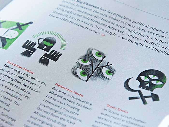
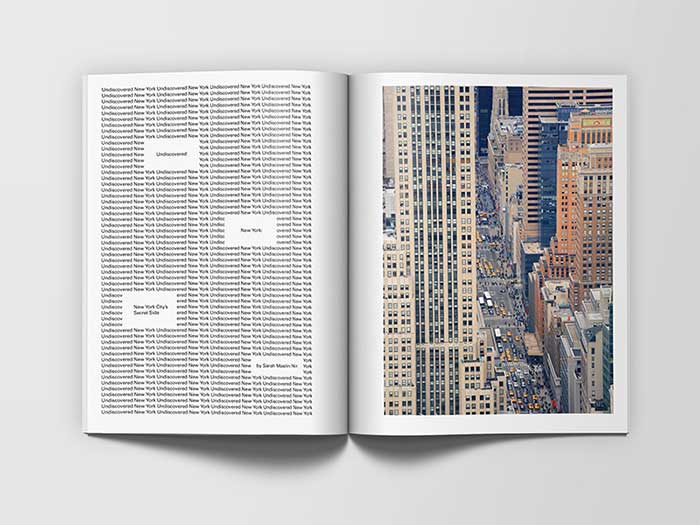
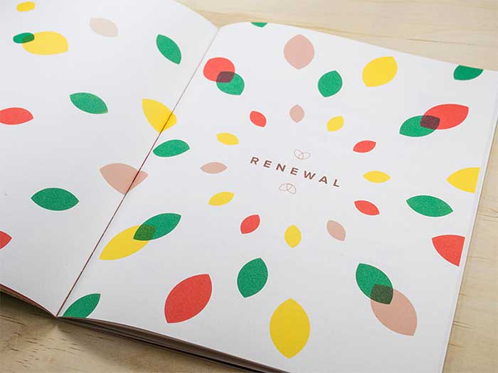
Look at today’s newspapers – do any of them look too busy? Crowded is no longer an option in print design, and we see many layouts relying big time on the use of white space. Unlike traditional newspapers where the idea was to stuff content and save estate, modern samples accentuate way more on images and shorter text sections.
Here is a good example – picture a page with a single word on it, ideally placed in the middle. Let’s say the word is ‘Desire’, and that the designer’s intention is to capture attention on it, and all related connotations. The example is pretty extreme, but it showcases clearly why the concept of working with white spaces is valid and successful.
There should always be enough space between the images and the text. Ideally, you should be using white spaces to distinguish between paragraphs, columns, or other types of text boxes.
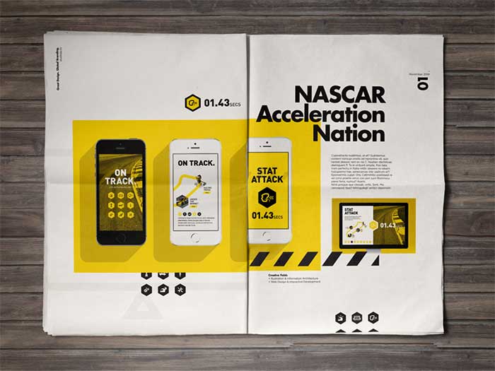
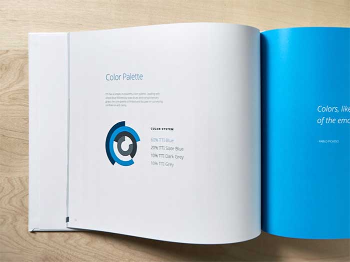
Work with the right color palette
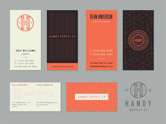
In page layout design, less is more. Too many colors will look too messy, especially if you didn’t pick the right combinations. You should inform yourself on the best colour matches and clashes, and follow the basic rules – the print in newspapers is always darker than the colors you see on a computer screen, so keep it a bit lighter.
A flat look
As tempting as they seem, try to avoid overdone shadowing, bevels, or 3D effects. These styles are already in the past and their novelty is long worn off, and all readers are looking for now is cleanness and elegance.
Geometric patterns
Grids, images, and geometric patterns are also quite frequent in modern newspaper designs, again used to refresh and clean the look, and to help readers understand your content.
Fonts that are easy-on-the-eyes
It is always a good idea to align your layout design with your stories and articles. This also entails choosing an easy-to-read and recognizable font that attract immediate attention, ideally a single one or two of them.
With too many fonts in your design you can confuse your readers, so make sure each text grouping has a font of its own (the titles, the subtitles, the body text, and the headings).
Consistent font size
While the possibility to use different font sizes is not excluded, you should keep your work consistent. Texts whose size boosts out of the blue don’t have such a pleasant impact on the reader – in most cases, they look messy, and cause a visual detraction.
Nothing matters more than alignment
Alignment may not bother you much at the beginning of your design, but it is certainly worth of your time. If you get it right, it will help your newspaper stand out, and ideally count as the better alternative to messy and unorganized competitors. Here are the alignments points you should be considering:
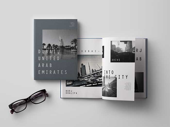
- The columns — All of your columns should have the same width, and be aligned at the top/bottom, and neatly divided with white spaces.
- Images — Images should also be aligned to each other, including the text featured by each of them. You should at best try to preserve completely straight lines.
- Titles & headings — Vertical and horizontal alignment will do for titles and headings. A smart tip is to try and centre them over your columns.
- Vertical and horizontal spacing — always try to have the same amount of blank space on the left and right side of the page. The same goes for the textbox and the title (once set, the spacing between them should be the same for all titles and textboxes).
- Keep the picture aspect ratios — when trying to shrink an image only on the one side (vertical or horizontal) so that it would fit in the desired space, be aware of the fact that it may affect the natural looks of the image. As a result, you will get a skinny/fat looking or artificial images, and the only way to avoid this is to crop it in advance.
Free space management
As we already mentioned in several occasions, blank spaces matter just as much as the space you actually use. Of course, this doesn’t mean you should leave the website half-empty, but stuffing it up won’t help either. The secret is to position white spaces in an elegant and organized manner, so that important elements will stand out.
Preparing and printing content – a guide for beginners
Truth is a tip-top layout with the perfect typography and imagery is nowhere close to an absolute guarantee for a pitch-perfect print. In fact, there may not be such guarantee altogether.
Yet, leave panic aside. The next part of our article will guide you through the basics and main checklists of proper artwork print design. Read them, try your skill out, and you will definitely feel more confident to create beautiful and functional documents.
Prepare yourself
The printed version of your documents is an idea you should have in mind at the beginning of the design process, and keep it there all along regardless of how much time it takes to complete it.
Work with the right software
To start with, you need a software application tailored to your needs. The choices of such applications are endless, but you should narrow them down to few reliable samples with the right features and reputation.
We suggest the timeless CorelDRAW, Adobe InDesign, and Illustrator. They are all perfectly equipped to create flexible page layout designs, and to have them ready for printing against minimal effort.
Don’t forget the bleed
Did it happen to you to have a file ready for printing, and notice only then that there is no bleed? Well, it happened to all to us.
Give the printer a head, and include the bleed as you’re setting up the document for printing. By bleed, we have in mind the additional space around the layout’s perimeter that goes beyond the edges of the page.
Bleed should always be included on layouts where the elements (coloured backgrounds, images, and so on) cross the trim edges, so that trimming errors won’t be visible once the page is printed.
What about the folds? Got any?
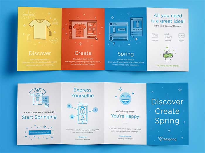
In case you’re preparing documents that will be folded upon printing (booklets, brochures, leaflets, and so on), choose an exact position for the fold (mark them by dragging out the guides on your digital layer).
Here’s some additional advice: Tri-fold brochures and booklets (the ones that have a pair of folds per page and split the brochure in 3 parts) should come with doubled margin space on the fold. Applying the usual margin space may cause the fold to slice the margin in half, and make the overall layout look uneven and cramped.
How will you bind them?
Booklets, brochures, and similar multi-page compositions will also require you to think of methods for binding pages together once you’ve printed them.
Consult experts to check which type of binding works the best for your product – most of the time, it will depend on the paper weight, number of pages, available budget, and desired appearance, according to which the expert will suggest the best options.
There are plenty of binding services to choose from, among which saddle-stitch, fastback, velo, perfect, sewn, glued, case, side-stitch, Wir-O, and lay-flat. You may as well be referred to a binding specialist in case your product is more complex, and can’t be bound in-house.
Go for Reader’s Spreads, not Printer’s Spreads
Before you print a product with several pages, a good idea would be to check the actual looks of the product in advance, and get a hard-copy example. An interesting thing you will notice is that there is a physical connection between a page from the first chapter and one from the last chapter, and that in such way they form a single spread.
Yet, it doesn’t have to mean that you have to take this road (the printer’s spread). Both you and your printer will find it easier to set up the document as ‘reader’s spread’, namely in the way it will be displayed to the end reader (page 1, page 2, page 3, and so on).
In all cases, the best way to go is to let printers do their job. Their experience will help them make the right choice for your products, and prevent you from explaining why page 15 comes right after page 2.
Remember to include blank pages
Another common feature of multi-page compositions is blank pages. They are usually displayed at the beginning, but one can also encounter them as dividers between chapters, or on the reverse side of reports.
Why does your booklet need blank pages? Including few of them will help your readers get acknowledged with the structure of your work, so feel free to add as many of them as you deem necessary.
Learn a thing or two on colours
Colours can make or break a print design. This is why it is important for every designer to learn how to combine them, and to understand the message each of them conveys. With a balanced colour scheme, you will create an attractive layout and become more confident for your future projects.
The mantra to repeat is as follows: CMYK Not RGB
All colours in print layouts should be set in CMYK mod. This mode stands for 4 inks present in 4-colour printing, namely Magenta, Cyan, Yellow, and Key (black). What this means is that every colour you will use in the printed design will be produced combining these four inks.
Print documents should never be set in RGB colour mode (in case it is, make sure to export the final sample as CMYK). This is because RGB (rendered by combining red, green, and blue) works only for online layouts that will be displayed on digital screens.
Use spot colours wisely
Spot, or solid colours, are the ones made of either pure or mixed ink, and printed within a single run of the printer. Basically, had you decided to use a spot colour (Pantonecolor, for instance, or fluorescent or metallic inks), you will need a specially prepared plate to print them.
There are many advantages to using spot colours in printed artwork. One of them is arriving to a more accurate result with not-that-subtle variations, or even cutting expenses on larger print runs as you’re using fewer than three colours.
With shorter runs, nevertheless, spot colours happen become the more expensive alternative, which is why you need to get a quote before you’ve made a commitment.
Learn to distinguish between tints and transparencies
It gets difficult at times to distinguish between tints and transparencies, so let us explain how that works: tint refers to the percentage of colour being combined with white to arrive to a slightly paler shade without affecting its opacity. In such way, the opacity of the coloured element placed below a transparent element helps it become more visible.
What you should know when working on your printable document is that tinted colours turn out opaque and solid on the paper, and block all colours positioned below them.
If you overlap shapes (the so-called atomic regions), you may get a semi-transparent colour. At that point, the colour of the atomic region is rendered from the colours of the overlapping elements, and helps maximize the graphic’s resolution.
With graphics to include in the final product, your first and only concern is to get such that have high quality. Images with low resolutions look pixelated and blurry on paper, while their high-tier counterparts have the opposite crystal-clear effect.
Forecast the result of different image formats
There is no such thing that can make a print layer as miserable as poor imagery. This happens due to photos being created as bitmap graphics rather than vectors, and comprised out of multiple tiny pixels.
When you try to resize TIFF, PNG, JPEG, or any other bitmap graphic, the original image loses its quality, and turns into a pixelated mess. This is why the images should be given the highest DPI possible before they’re included in a print design.
The smarter options are, of course, vector graphics, such as EPS files and Illustrator formats. They are comprised of fully scalable objects; which mean that resizing won’t affect their quality. Using vector and bitmap graphics in the same layout is possible as long as both come with high quality.
Understand the meaning of different image sizes and quality considerations
Let’s say you just received a decently sized JPEG image from your colleague (3 to 5 MB), and it looks like a perfect option for your printing design. Next thing you know, the image looks burry and completely pixelated and it makes no sense to proceed with it. What can you do?
Size is (most of the time) a decent quality indicator, but we can’t always follow it blindsided. The appearance of a printed bitmap image doesn’t depend much on the file’s original size, often not even from its dimensions. What defines quality is DPI (dots-per-inch) – a metric used to describe the resolution number of dots that create all colours and tones to appear on that image.
The DPI count in printed designs should always be as high as possible, in particular for beautiful images that will have a central position in your design.
Choose a legible font
Your work doesn’t finish with resolving technical issues! Even with all colours and image resolutions brought to order, you may still encounter problems choosing the right typeface, and planning the impact and appearance of text once the layout is printed. The challenge here is that typeface errors may only become visible once the layout abandons the screen.
Recheck the sizing
Regardless of how hard you worked to adjust sizing before sending the layout for printing, you may face a situation where the size of your type is just not adequate. If you don’t correct it, you will get an illegible document that may look pretty, but doesn’t really do the work for your reader.
What should you do? Apply the right font sizes that suit your document and your audience, and try to walk a bit in your reader’s shoes – would you devote time to read that document, or will you rather give it an uninterested glance?
For books, on the one hand, you are perfectly justified to use smaller fonts; but for flyers, on the other, you will be expected to amp the size of the typeface, and ensure readers are captured and engaged.
To leave confusion aside, make a layout sample in the planned size, and consult your friends on it. As good as the 10 pt font size looks to you, not everyone will find it easy to read.
The weight of the typeface is another important aspect you have to consider. Different formatting help different portions of your text stand our (such as Bold or Semi-bold), as for instance with headers which should never be too faint or thin-looking. Another good example of proper text formatting is making clarifications or explaining matters with an Italic weight.
Recheck the margins
The margins of your layout have the same role as a frame does on a picture – it accentuates its content, and provides it some breathing space.
Are the margins as generous as they should be?
Working with margins is that part of the design process when you make the core judgement, and that’s why you will need a printed proof of the current state of your layout.
Have the layout printed, and leave it like that for a while. Give it a look afterwards, and you will have a pretty good picture of whether there is room to increase the margins. If the space affords it, make them more generous, and your layout will look dramatically improved and easier on the reader’s eye.
Leave some room for error…and corrections!
Regardless of how hard we try, the trimming of our printed documents will hardly ever be perfect. This is not a disaster though, since trimming errors can easily be corrected by narrowing the margins of the layout. What matters is to give your document a detailed look and examination before you submit it for printing.
Your best bet to avoiding trimming mistakes is to be more generous with margins, as all margin widths lower than 12.7mm (the standard set by Adobe InDesign) will be very narrow for accurate trimming.
Choose the best paper
Choosing paper is a very important decision, and you must keep it in mind from the very first draft of the final product. The effects of different weights and finishes are dramatic to the printed results, and dictate more or less how readers will feel about your product.
Weight considerations
Paper weight is a fairly wide category. Experts measure it in GSMs (grams per m2), and take into consideration the effect it has on the way the paper feels. If it is thicker, for instance, it weights more and it has better quality, which is obviously reflected in its price.
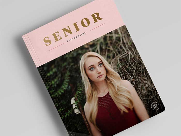
The weight of your paper will depend on the type of document you’re preparing, and the budget you have at your disposal. Newspapers, for example, work well with low GSM (somewhere between35 and 55 GSMs). If it is a magazine, you have to remember to include a heavier cover of approximately 180 GSMs, or even a high-gloss one with 250 GSMs.
Compared to them, flyers need a thicker choice of at least 110 GSMs (up to 160). Same goes for business cards, which sometimes use 350 GSM paper to create a sturdy and luxurious feel.
Suitable finishes for your print designs
Once the weight of the paper is all set up, you have to think of a suitable finish. Your main choices are: coated or uncoated paper.
Uncoated paper works well for almost all types of documents, including stationery, flyers, leaflets or letterheads. Yet, depending on your design, you may be expected to use pages that are stronger and smoother than standard copy paper.
Coated paper, on the other hand, has two subcategories: gloss-coated and matte-coated.
Matte-coated is the more common option, as it is used for pared-back and modern documents, and gives them a smoother appearance.
The king of paper smoothness, namely gloss-coated paper has a reflective, high-end finish. This is because the ink on its surface has not been absorbed by the paper, and colours seem (at least visually) richer and more vibrant.
Additional folds considerations
We discussed fold accommodation several times (check the first section), but we didn’t share much on the differences in fold rendering for diverse paper weights and finishes. If the paper you’re using is heavy and gloss-coated, for instance, folding will not be as hassle-free as with standard, uncoated pages.
This is why the designers of fold-out maps and booklets usually pick a lighter option, and ensure their product remains compact even after it has been folded.
Still, there are cases in which folds benefit from heavy paper solutions, as when you’re preparing a greeting card or a calendar to look nice on someone’s desk. As you already imagine, this task is not that simple with light-weight paper.
How to get print files exporting right from the first attempt
Once sure that your work is error-free, you can export the pages as print-ready files. You can do that in several different ways, depending on the nature of your work.
Ending thoughts on layout design
When working on a page layout, you have to think of formatting, placement, and rearrangement of all your elements. For most talented designers this is an organic process where they only follow their own train of thoughts, and still get to a breathtaking final result.
Yet, design is rarely a game of chance, and the free-form methodology won’t always work – you may be expected to give your ideas a second look until you arrive to the long-awaited balanced page.
If you liked this article about layout design, you should check out these as well:
- Poster Printing: How To Print A Poster Flawlessly
- Nike Print Magazine Ads That Boosted The Brand’s Popularity
- Adidas Ads in Print Magazines and The Company’s Marketing Strategy
- Fashion magazine covers: Inspiration and tips to design one
Bogdan Sandu, a seasoned designer with 15 years of diverse experience, has been designing websites since 2008.
Renowned for his expertise in logo design and visual branding, Bogdan has developed a multitude of logos for various clients.
His skills extend to creating posters, vector illustrations, business cards, and brochures. Additionally, Bogdan's UI kits were featured on marketplaces like Visual Hierarchy and UI8.
Latest posts by Bogdan Sandu (see all)
- The Konami Logo History, Colors, Font, And Meaning - 23 April 2024
- Summer Color Palettes for Hot Designs: 40 Examples - 23 April 2024
- Corporate Identity Examples Any Designer Should See - 23 April 2024