

Japanese Graphic Design: Artwork and Typography To Check Out
Buckle up, we’re diving into a world where every stroke, pattern, and palette whispers a story. This isn’t just design; this is where the heart of tradition meets the pulse of the modern – Japanese graphic design. Picture this: minimalist beauty fused with bursts of pop culture, where the delicate balance of Zen meets the vibrant chaos of a Tokyo street at midnight.
There’s a universe to explore here, from ukiyo-e inspired palettes to cutting-edge manga illustrations.
Why should you care? Because design isn’t just about looking pretty – it’s a language. And the Japanese dialect is one epic conversation starter.
I’ll guide you through the shibui of simplicity, all the way to the bold statements of Harajuku style graphics.
By the end of this neon-lit expedition, you’ll be fluent in not just understanding Japanese typography and Kawaii design elements, but in applying them to breathe life into your creations. We’ll unravel this intricate tapestry together, one sumi-e stroke at a time.
Table of Contents
- Key Characteristics of Japanese Graphic Design
- Distinctive Styles and Trends
- Modern Interpretations and Innovations
- Traditional Influences and Patterns
- Contemporary Japanese Graphic Design
- Application in Branding and Marketing
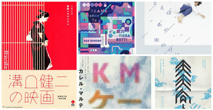
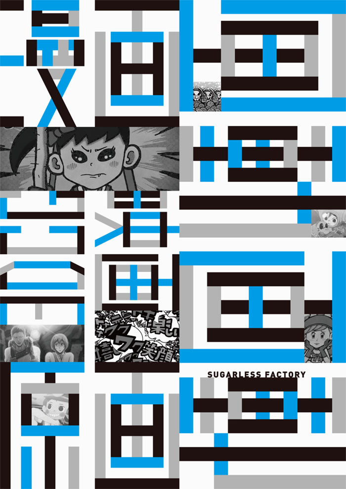
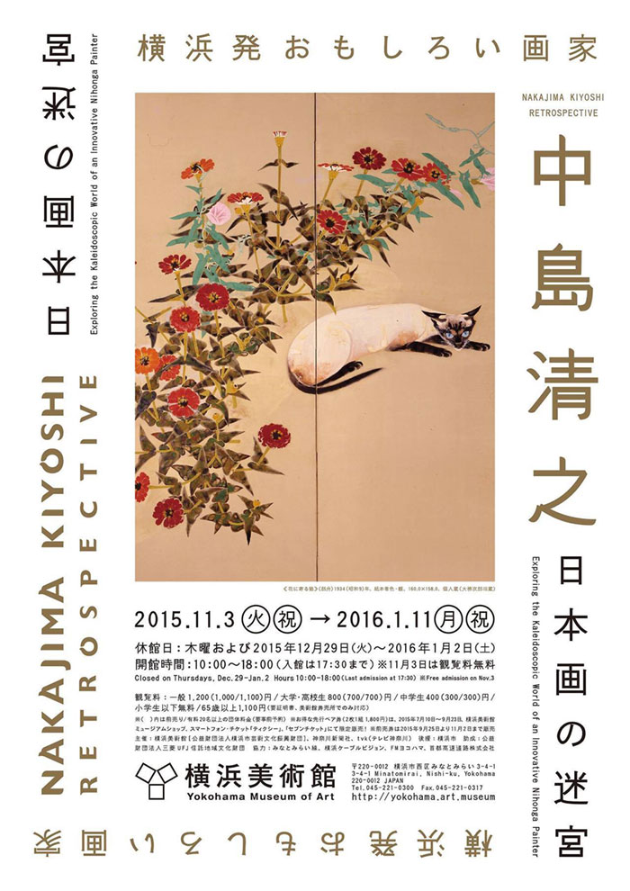
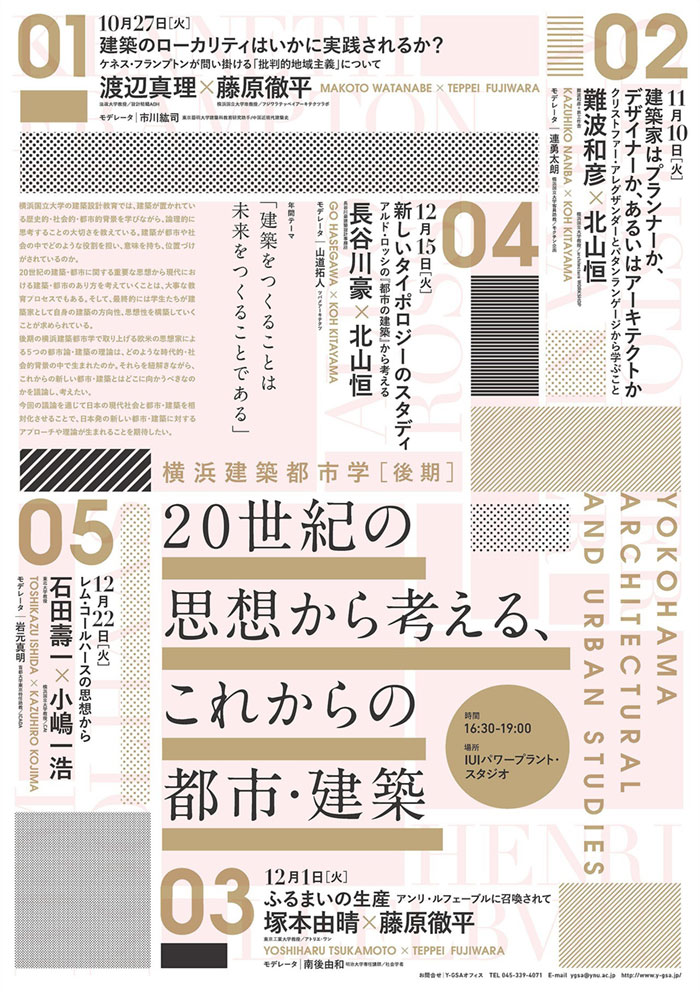
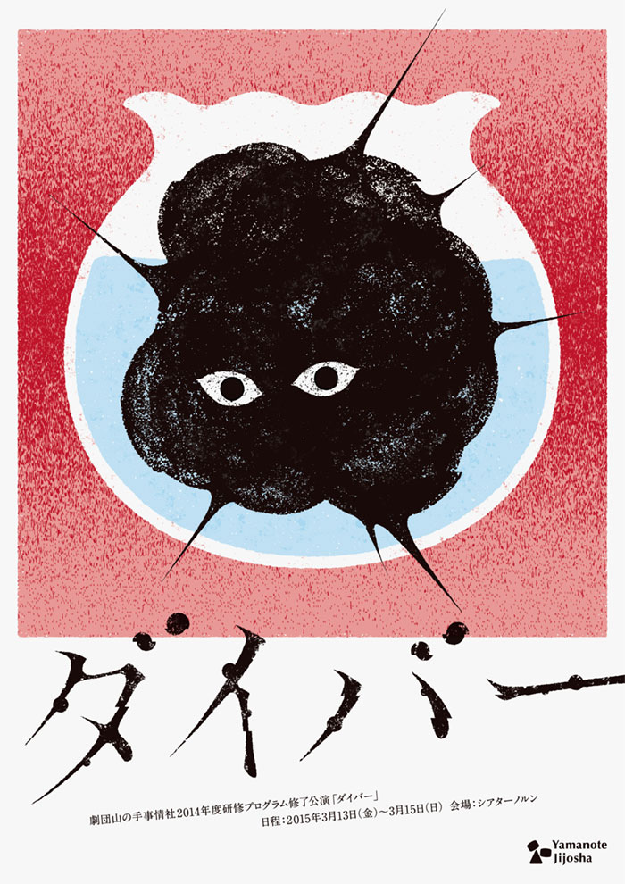
- Japanese Graphic Design Examples
Key Characteristics of Japanese Graphic Design
Minimalism
Influence of Zen Buddhism
Diving right into it, Japanese graphic design has this unique minimalism vibe, you know? It’s not just about less is more; it’s deeply rooted in Zen Buddhism.
Think about those tranquil Zen gardens; they’re simple but profound. That’s the essence right there—designs that are clean, uncluttered. They just feel right, you know?
Principles of Simplicity and Functionality
And here’s the kicker: this minimalism isn’t just about looking good. It’s practical. Every element in a design has a purpose.
This approach taps into those principles of simplicity and functionality. It’s like when you see a simple logo or a web layout, and it just clicks. It makes sense. Everything works together seamlessly.
Kawaii Culture
Emergence and Influence in Pop Culture
Alright, let’s switch gears to something fun—kawaii culture. This stuff is everywhere, and not just in Japan. Think about those cute characters, vibrant colors. I
t’s a whole vibe that’s taken the world by storm. It’s not just about being adorable; it’s a whole cultural phenomenon.
It’s about expressing personality, emotion, and, honestly, it just makes things more enjoyable.
Application in Commercial Design
So, how does this play into commercial design? Big time! From packaging to ads, kawaii elements make products stand out.
They’re eye-catching, memorable, and, let’s be honest, they make you want to buy stuff. It’s a clever way to connect with people on an emotional level.
Custom Typography
The Complexity of The Japanese Language
Now, let’s talk type. Japanese language? Complex. The characters, the scripts—there’s a lot going on.
This complexity opens up a world of creativity in typography. Designers get to play around with kanji, hiragana, katakana, creating something that’s not just text, but art.
Use of Custom Lettering and Typeface
And this isn’t just about looking pretty. Custom lettering in Japanese graphic design serves a purpose.
It’s about creating a connection, a feeling. When you see a beautifully crafted word or phrase, it’s more than just reading; it’s an experience.
Nature and Symbolism
Cultural Importance of Nature
Japanese culture and nature are like two peas in a pod. This connection spills over into graphic design big time.
It’s about harmony, balance, and respect for the natural world. Think about designs that incorporate elements like leaves, water, mountains. It’s not just about aesthetics; it’s a reflection of cultural values.
Use of Natural Elements and Symbolism in Design
And the symbolism? Oh, it’s deep. Every natural element in a design tells a story, conveys a message. It’s like visual poetry.
This use of nature and symbolism isn’t just about making something look good; it’s about telling a story, sharing a piece of culture.
Distinctive Styles and Trends
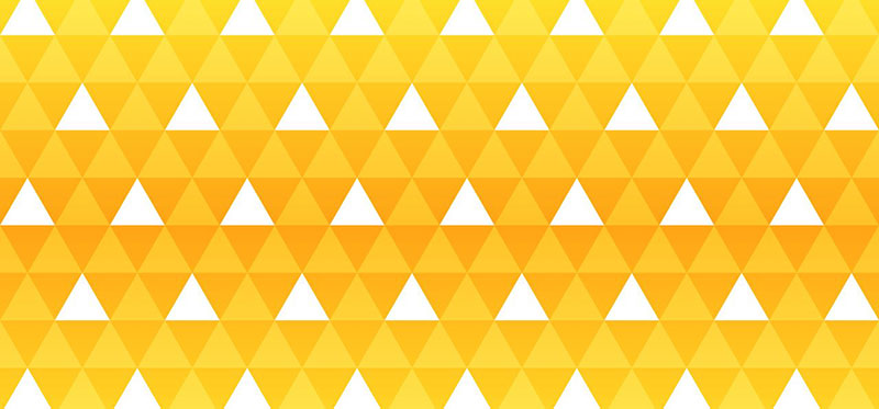
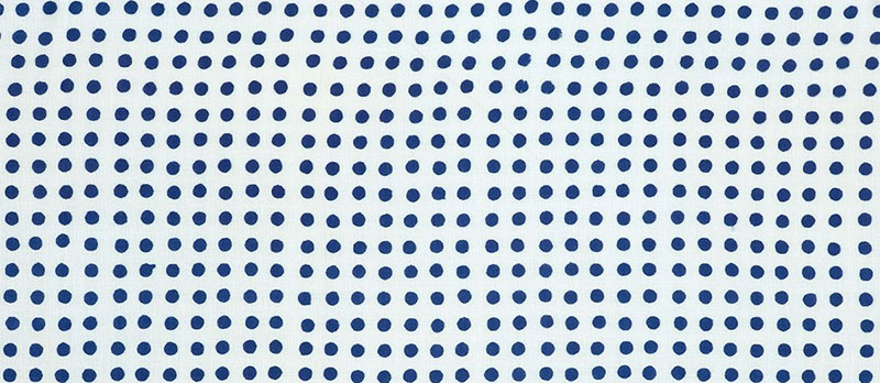
Geometric Shapes and Patterns
Let’s talk about those crisp lines and eye-popping patterns. In Japanese graphic design, geometric shapes aren’t just shapes.
They’re like a language of their own. You see them in traditional art and, boom, they’re still rocking in modern designs. It’s like connecting the past with the present, in the most stylish way possible.
Cultural Meanings Behind Shapes
So, you see a circle, a square, or some intricate pattern in a design, and guess what? They’re not just there to look pretty.
These shapes are like a nod to cultural stories, meanings, and even beliefs. It’s like each shape is whispering a piece of history.
Use in Traditional and Modern Art
Now, this blend of old and new is where it gets really cool. You’ve got these age-old patterns showing up in the slickest modern ads, websites, and more.
It’s like a cultural fusion, right there on your screen, making everything look so fresh yet timeless.
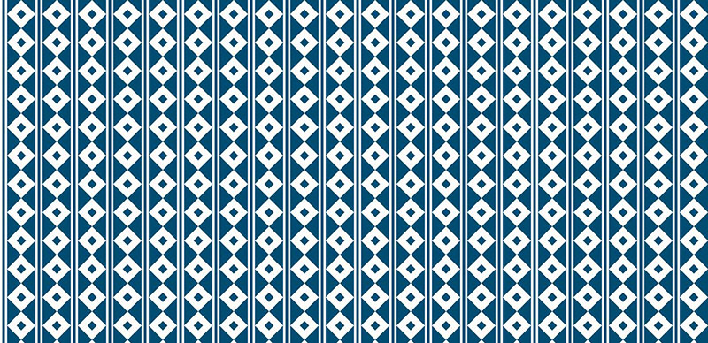
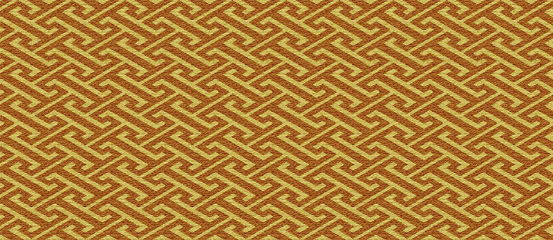
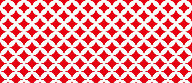
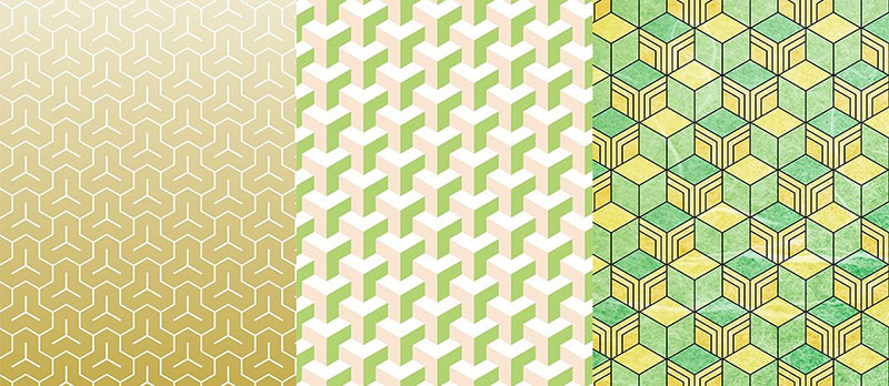
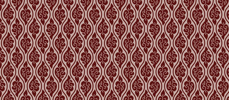
Traditional Japanese Patterns
Kuginuki (Nail Puller)
A samurai-favored pattern in kamon, Kuginuki symbolizes life success. Its design, resembling washers used in nail pulling, echoes the wordplay of ‘removing suffering’ and ‘capturing nine castles’.
Asanoha (Hemp Leaves)
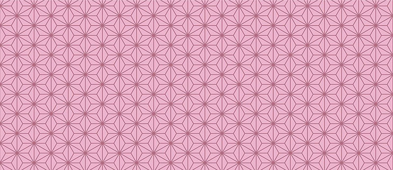
Asanoha, depicting hemp leaves, symbolizes robust growth. Traditionally used on children’s kimonos, it wishes strength and vitality.
Kōjitsunagi (Interlaced Kō Characters)
Kōjitsunagi uses the 工 (kō) character in endless interlocks, signifying infinite good fortune. A popular kimono material pattern, reflecting traditional Japanese design.
Uroko (Scales)
Uroko, resembling fish or snake scales, was a samurai talisman pattern for protection, blending historical Japanese symbolism and practicality.
Yabane / Yagasuri (Arrow Feathers)
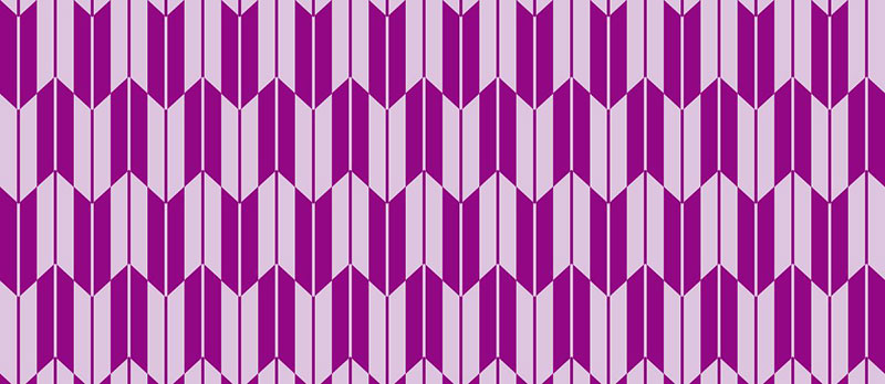
Reflecting arrows’ target-hitting symbolism, Yabane is auspicious, symbolizing no return. Its popularity in bridal kimonos and in ’70s manga culture highlights its cultural significance.
Same Komon (Shark Skin)
Featuring small dots forming arcs like shark skin, Same Komon was a pattern of the Kishū Tokugawa family, blending heritage and design.
Seigaiha (Blue Ocean Waves)
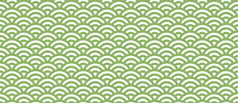
Seigaiha, depicting ocean waves, represents continuity and the boundless sea. A pattern in ancient court dances and The Tale of Genji, it’s rich in cultural narrative.
Shippō (Seven Treasures)
Shippō, with overlapping circles forming stars, is a symbol of prosperity and harmony, often seen in traditional Japanese art and design.
Kikkō (Tortoiseshell)
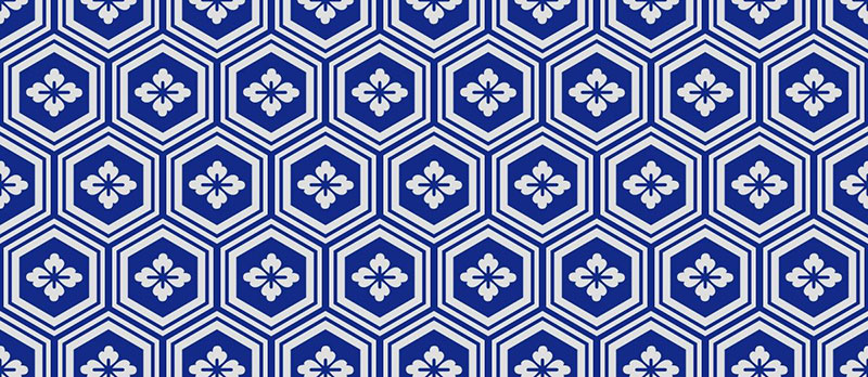
The hexagonal Kikkō pattern, inspired by tortoiseshell, signifies longevity. Its variants, like komochi kikkō, blend tradition with creative design evolution.
Bishamon kikkō / Mitsumori kikkō (Triple Combination Tortoiseshell)
This three-dimensional pattern, found in Bishamonten’s armor, combines hexagons thrice for a visually striking design, blending art with historical reference.
Ichimatsu (Checkered)
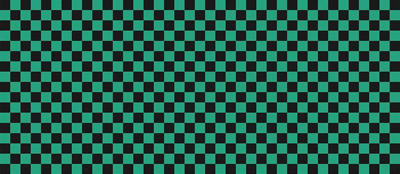
Ichimatsu, a checkered pattern made famous by kabuki and manga characters, represents traditional and modern Japanese art intersections.
Tachiwaki / Tatewaki (Rising Steam)
Tachiwaki, symbolizing rising steam, was a status symbol in the Heian era. Variants like Kumo tatewaku highlight its adaptability in Japanese aesthetics.
Karakusa (Winding Plant)
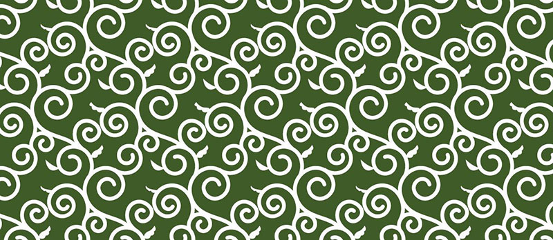
Karakusa, a vine-inspired pattern symbolizing prosperity, entered Japan through the Silk Road, demonstrating cultural exchange and longevity.
Kanoko (Fawn)
Resembling a fawn’s back, Kanoko is a luxury tie-dye pattern, showcasing the labor-intensive, traditional Japanese dyeing technique.
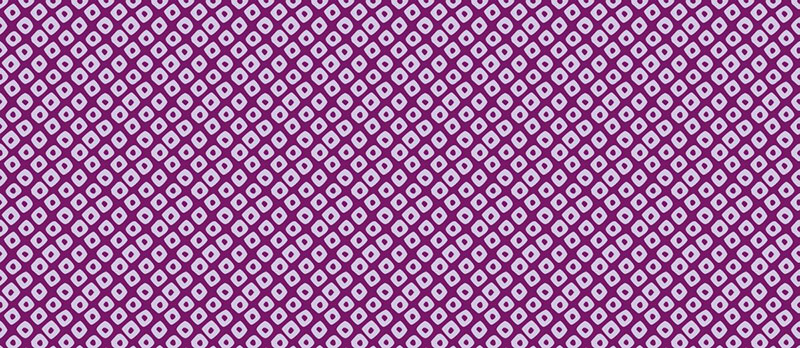
Hishi (Diamond)
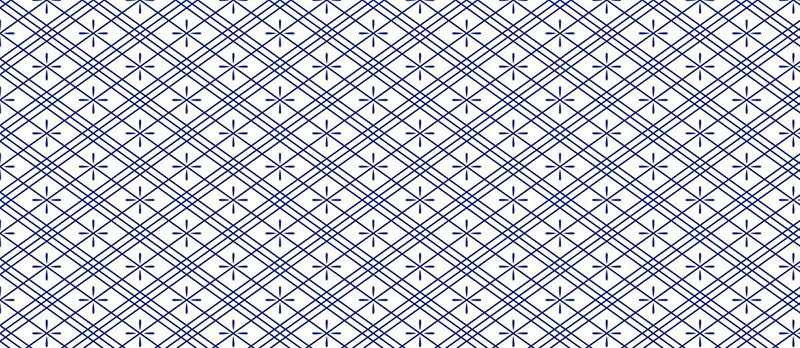
Hishi, with intersecting parallel lines forming diamonds, dates back to the Jōmon period, showcasing Japan’s ancient artistic heritage.
Mameshibori (Pea Tie-dye)
Originally a tie-dye pattern symbolizing health, Mameshibori, now often stencil-dyed, reflects adaptability in traditional Japanese textile practices.
Image credit for the patterns: nippon.com
Bright and Vivid Colors
Okay, ready for some color talk? Japanese graphic design doesn’t shy away from colors. I mean, just take a stroll through Tokyo’s neon-lit streets, and you’ll get it.
The colors are loud, proud, and they totally set the mood.
Colorful Urban Landscapes
Think about how these colors reflect the bustling life of cities like Tokyo or Osaka. It’s like the designs are mirroring that energy, that vibe of the streets.
It’s a color palette that’s alive, dynamic, and always on the move.
Diverse Color Palettes in Design
And it’s not just about being bold. There’s this whole palette of subtlety, elegance, and everything in between.
The way these colors play together in a design, it’s like they’re telling a story, setting a scene. It’s mesmerizing, really.
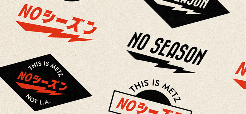
Language Mix
Now, here’s something super interesting. The mix of Japanese and Roman characters in designs?
It’s not just about being multilingual. It’s a style statement, a way to bridge cultures.
Combination of Japanese and Roman Characters
This combo is like a dance of alphabets. It’s visually intriguing and kind of challenges the way we see and read things.
It’s blending tradition with globalization, and the result? Pure art.
Aesthetic and Functional Aspects
But hey, it’s not just for the aesthetics. This mix makes designs super accessible, reaching out to a global audience while staying true to Japanese roots.
It’s like saying, “Hey world, check this out,” in the most stylish way possible.
Modern Interpretations and Innovations
Complex Gradients
Subtle Color Transitions
Okay, so let’s dive into the world of complex gradients. It’s like watching the sky at dusk, you know?
Those subtle color transitions are a big deal in Japanese graphic design right now. It’s not just about blending colors; it’s about creating a mood, an atmosphere.
You see it on websites, in apps, and it’s like they’re telling you a story through hues.
Application in Backgrounds and Fonts
And it’s not just backgrounds getting this gradient magic. Fonts are joining the party too! Imagine a headline that fades from a deep ocean blue to a soft sky blue.
It’s not just eye-catching; it’s an experience. This trend is taking Japanese graphic design to new levels of cool.
Brush Strokes and Calligraphy
Incorporation of Shodo
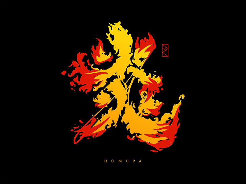
Now, let’s talk about something traditional yet totally hip – brush strokes and calligraphy, or as the Japanese call it, Shodo.
This ancient art form is making a massive comeback. It’s raw, it’s authentic, and it adds this personal touch that’s just captivating.
Fusion of Tradition and Modernity
This fusion of old and new is where Japanese graphic design really shines.
You’ve got these traditional brush strokes showing up in the most modern designs. It’s like they’re bridging centuries, connecting the dots between the past and the present.
Minimalist and Functional Design
Influence on Web and Digital Design
Alright, minimalist and functional design – this is where Japanese design gets real sleek.
Websites and digital platforms are stripping down to the essentials. It’s clean, it’s efficient, and man, does it look good.
This style isn’t just about aesthetics; it’s about usability, making sure everything is user-friendly.
Global Adoption and Adaptation
And here’s the thing – this minimalist vibe is going global. It’s not just a Japanese thing anymore.
Brands and designers around the world are catching on, adopting this style because, well, it works. It’s effective, it’s appealing, and it’s here to stay.
Traditional Influences and Patterns
Traditional Japanese Designs
Patterns in Kimonos and Other Items
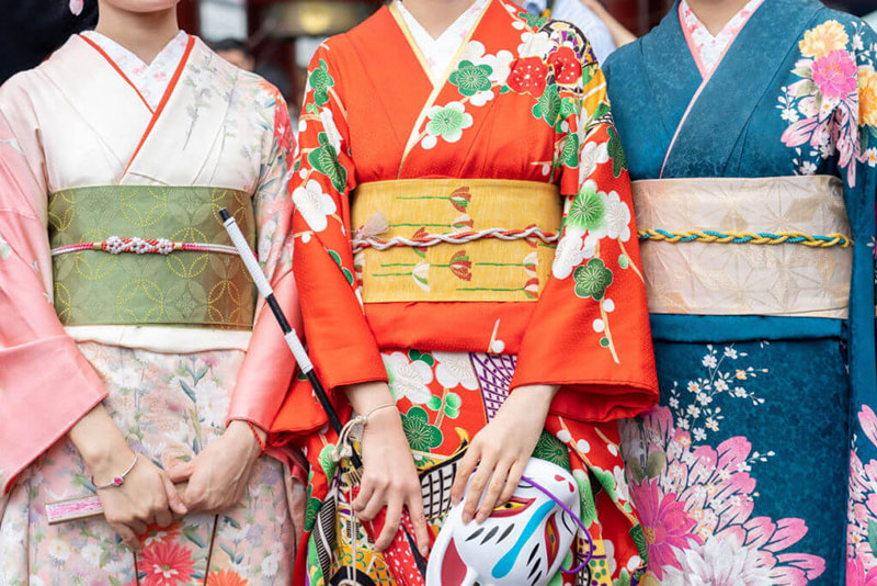
You know what’s cool about Japanese graphic design? It’s like a time machine, taking us back to traditional roots. Take kimonos, for example.
Those patterns aren’t just random. They’re stories, traditions, whispers from the past. And it’s not just kimonos. It’s in pottery, in scrolls, in every bit of traditional art. Each pattern has a rhythm, a reason, and man, do they look stunning.
Symbolic and Cultural Significance
And these patterns, they’re more than just pretty designs. They’re like cultural DNA, you know? Each swirl, each line has a meaning, a purpose.
They’re symbols of beliefs, of history, of a way of life. It’s amazing how these age-old designs are still so relevant, still speaking to us in the language of art.
Floral Motifs
Hanakotoba (Language of Flowers)
Okay, let’s talk flowers. Not just any flowers, but Hanakotoba – it’s the Japanese language of flowers.
Each flower in Japanese graphic design is a word, a message. Like, cherry blossoms for transience, chrysanthemums for nobility. It’s poetic, it’s deep, and it’s beautiful.
Emotional and Spiritual Meanings
And it’s not just about looking good. These floral motifs tap into emotions, into spirituality.
They’re a bridge between the visible and the invisible, the said and the unsaid. When you see a design with these motifs, it’s not just catching your eye, it’s touching your soul.
Contemporary Japanese Graphic Design
Modern Japanese Designs
Kintsugi Art and Its Interpretations
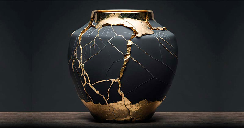
So, let’s chat about modern Japanese designs. Ever heard of Kintsugi? It’s this rad art form where they fix broken pottery with gold. It’s all about embracing flaws and creating something new.
This concept? It’s huge in contemporary Japanese graphic design. It’s like a metaphor for life, turned into art. You see it in posters, digital art, everywhere. It’s about finding beauty in imperfection and, man, is it inspiring.
Botanical and Nature-Inspired Elements
And then, there’s this whole nature thing. Japanese graphic design today is like a walk in a serene forest. You see botanical themes, nature-inspired elements.
It’s calming, it’s refreshing. It’s like designers are bringing the outdoors inside our screens.
This connection to nature? It’s a big deal. It’s about grounding the high-speed digital world in something real, something tactile.
Japanese Art Designs
Influence of Nature and Landscapes
Speaking of nature, let’s dive deeper. Nature isn’t just a theme; it’s a muse. The way contemporary Japanese graphic design uses landscapes, natural elements—it’s mind-blowing.
It’s like each design is a window to a tranquil world, a break from the chaos. These designs make you pause, make you feel something. It’s powerful stuff.
Nihonga Painting Technique
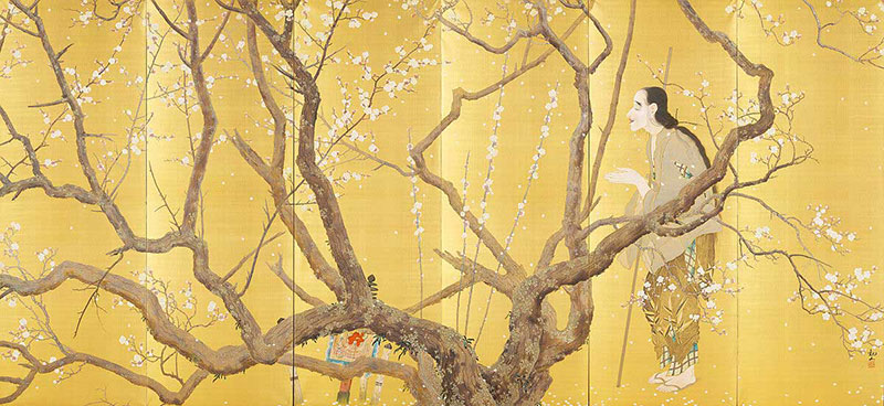
Now, let’s talk Nihonga. It’s this traditional Japanese painting technique, and guess what? It’s making a comeback in graphic design.
It’s like a blend of old-school skills with new-age ideas. The textures, the colors—it’s a feast for the eyes. Nihonga in digital art? It’s like a love letter to Japanese heritage, and it’s absolutely stunning.
Application in Branding and Marketing
Branding with Japanese Design Elements
Logo Design Ideas
Alright, let’s dive into how Japanese graphic design plays a huge role in branding. Take logos, for instance.
They’re not just logos; they’re like mini-stories. Incorporating Japanese design elements into logos? Genius move. It’s about making brands stand out.
Think minimalist vibes, a dash of kawaii, or maybe some sleek calligraphy. It’s all about creating an identity that’s memorable, that speaks to people.
Website Design Concepts
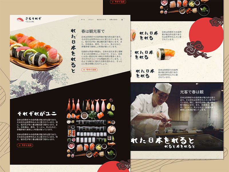
And then, there’s website design. Imagine a site that feels like a serene Zen garden or a vibrant Tokyo street.
That’s the power of Japanese design elements in web design. It’s about creating an experience, not just a webpage. It’s engaging, it’s different, and guess what? It works.
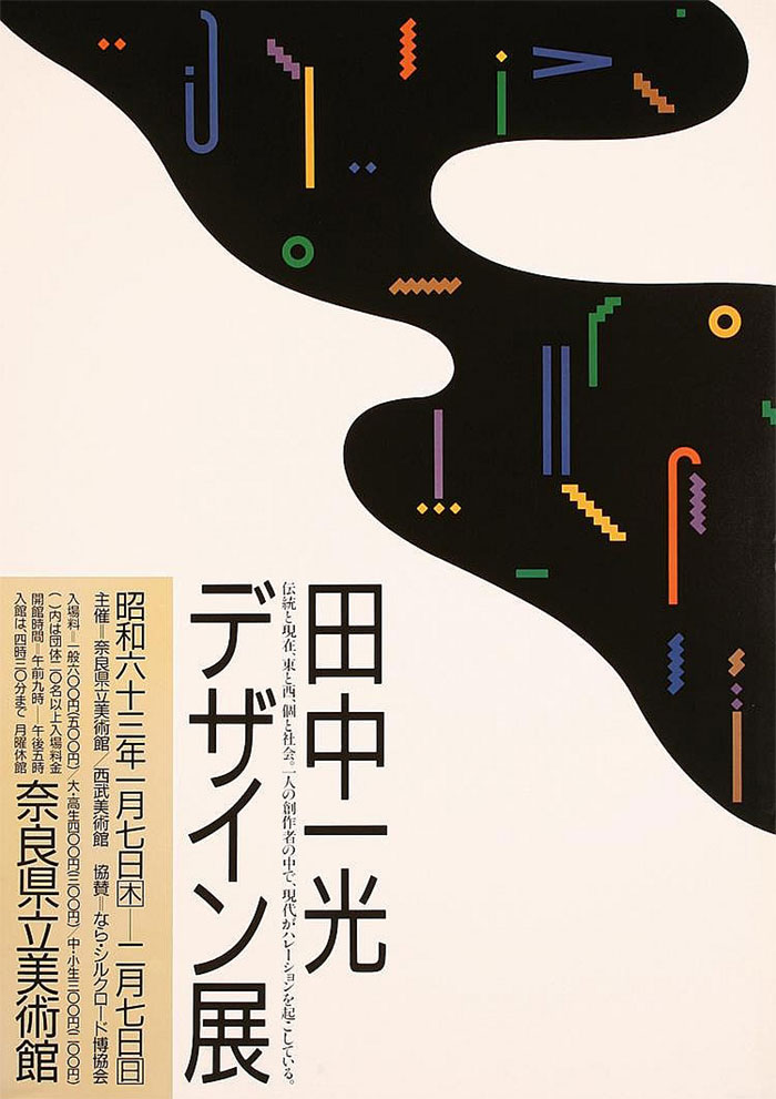
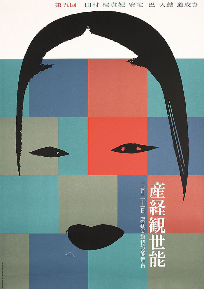
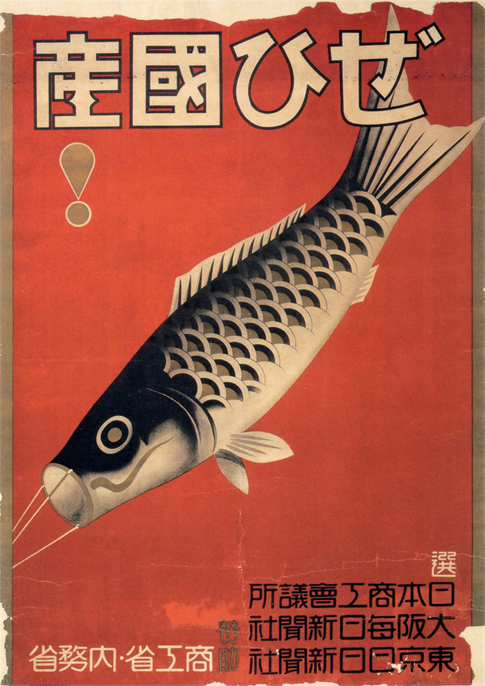
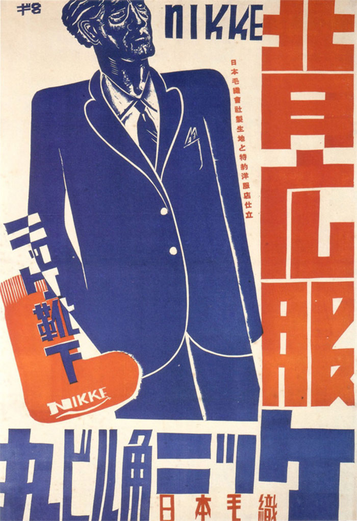
Poster and Advertisement Design
Incorporating Japanese Art and Culture
Now, let’s talk posters and ads. Japanese art and culture in these spaces? It’s like a breath of fresh air.
You see a poster with traditional patterns or a hint of Nihonga, and you stop. You look. It’s captivating. This blend of art and culture in marketing isn’t just about selling; it’s about storytelling, connecting.
Utilizing Traditional and Modern Elements
And it’s not just traditional stuff. The fusion of traditional and modern elements in Japanese graphic design?
It’s a game-changer.
Imagine an ad that mixes old-school Ukiyo-e art with modern typography. It’s bold, it’s fresh, and it bridges worlds. It’s about creating a visual language that speaks across time and cultures.
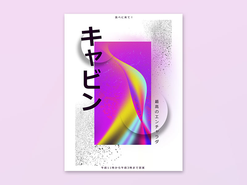
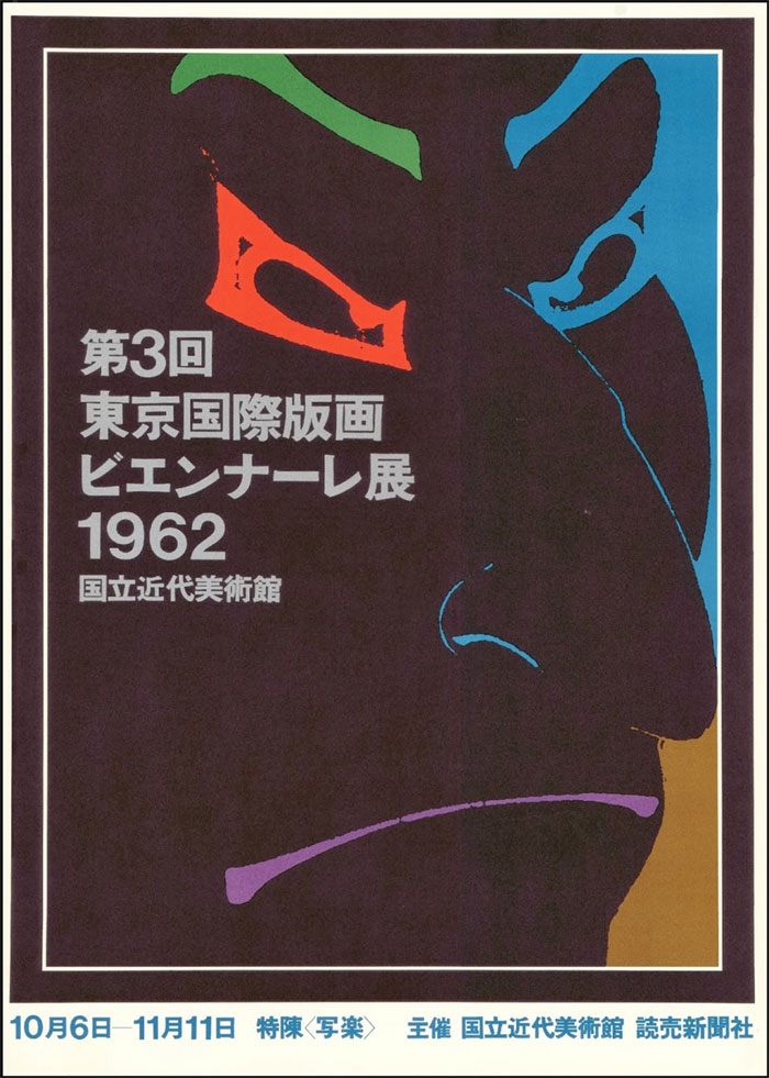
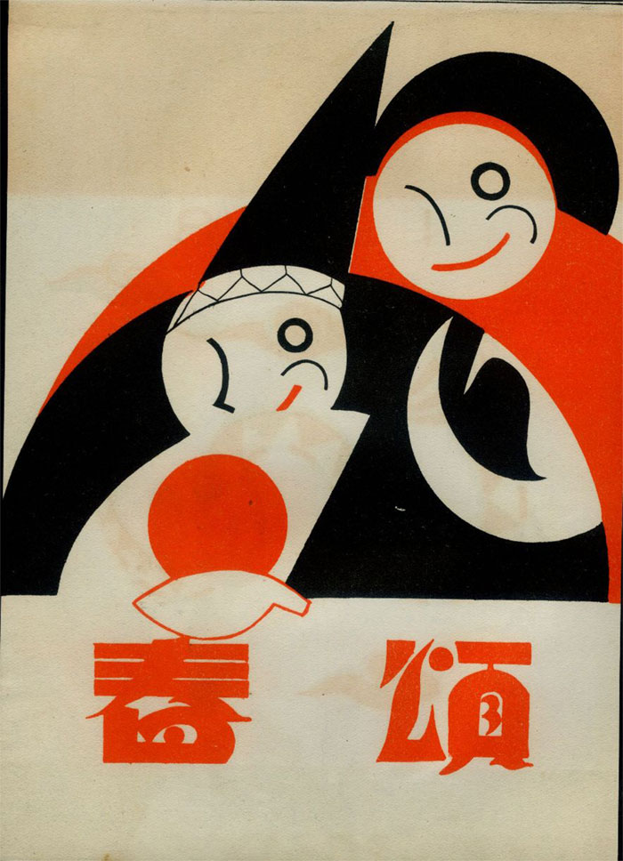
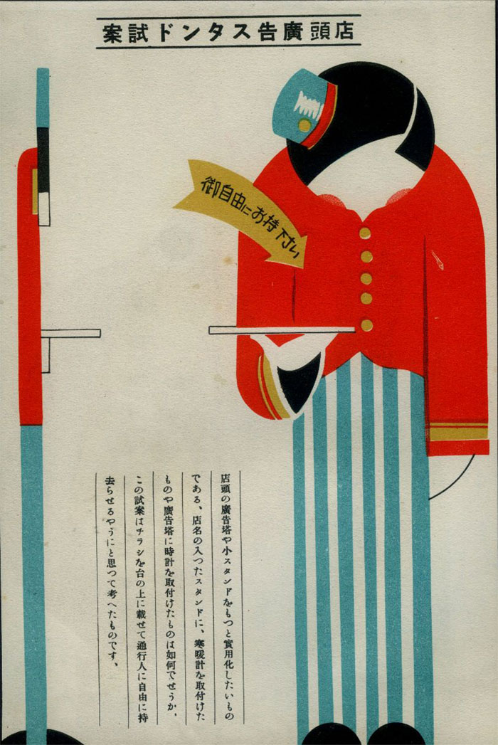
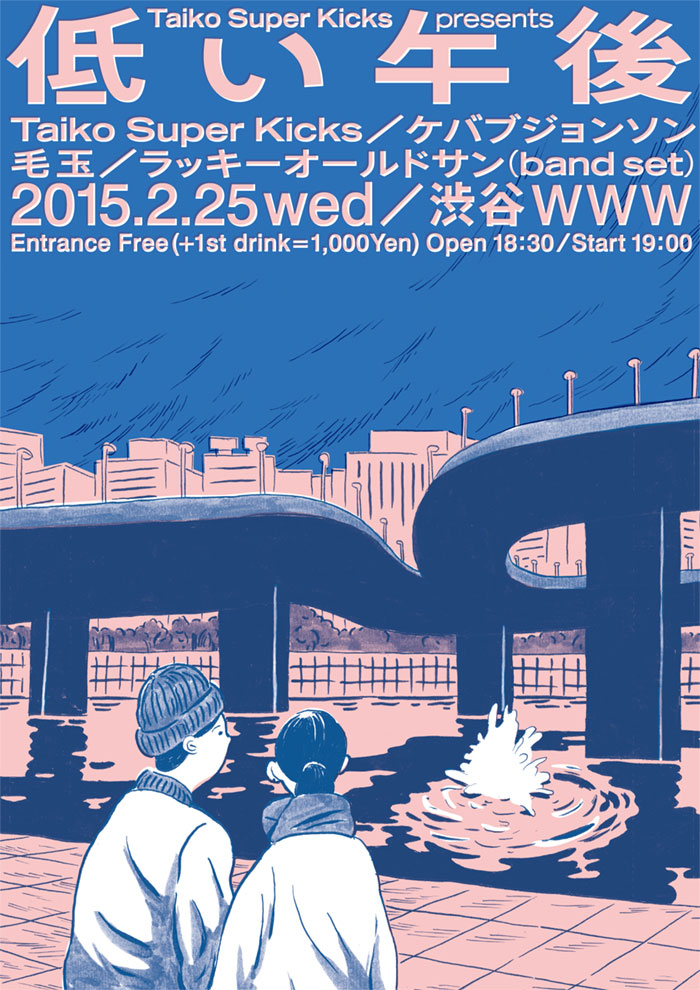
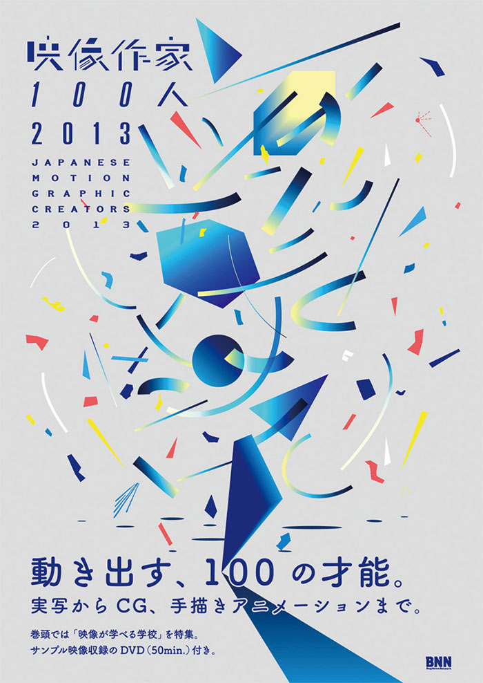
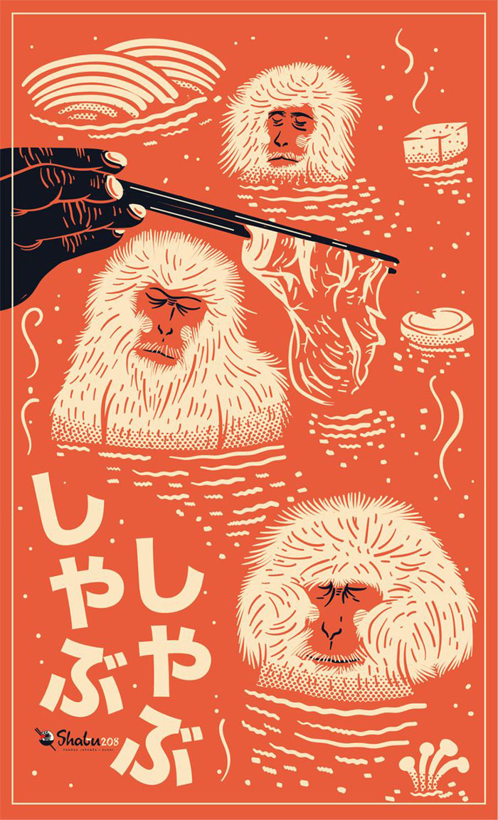
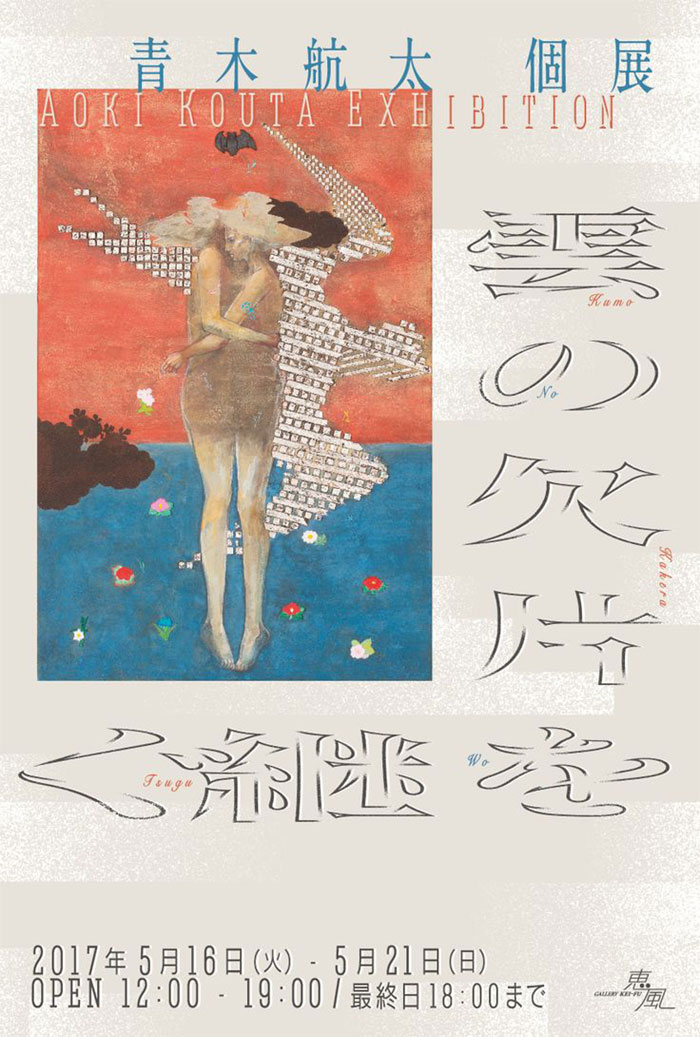
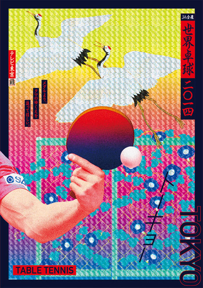
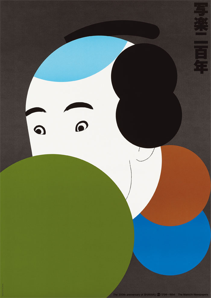
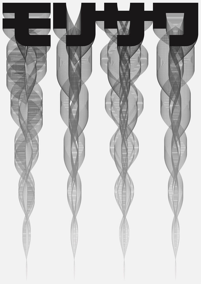
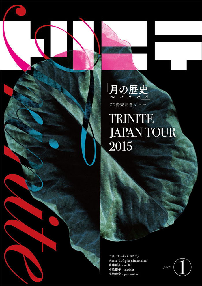
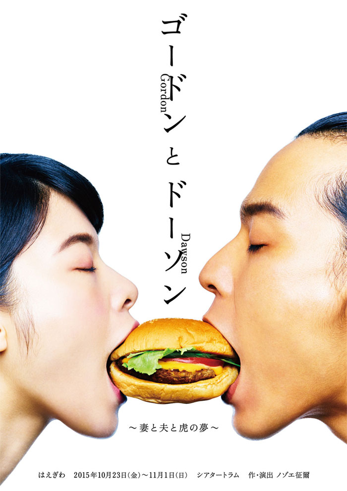
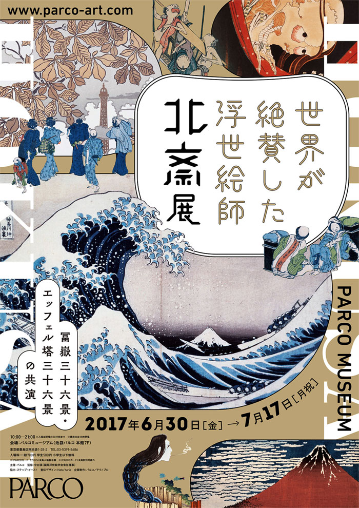
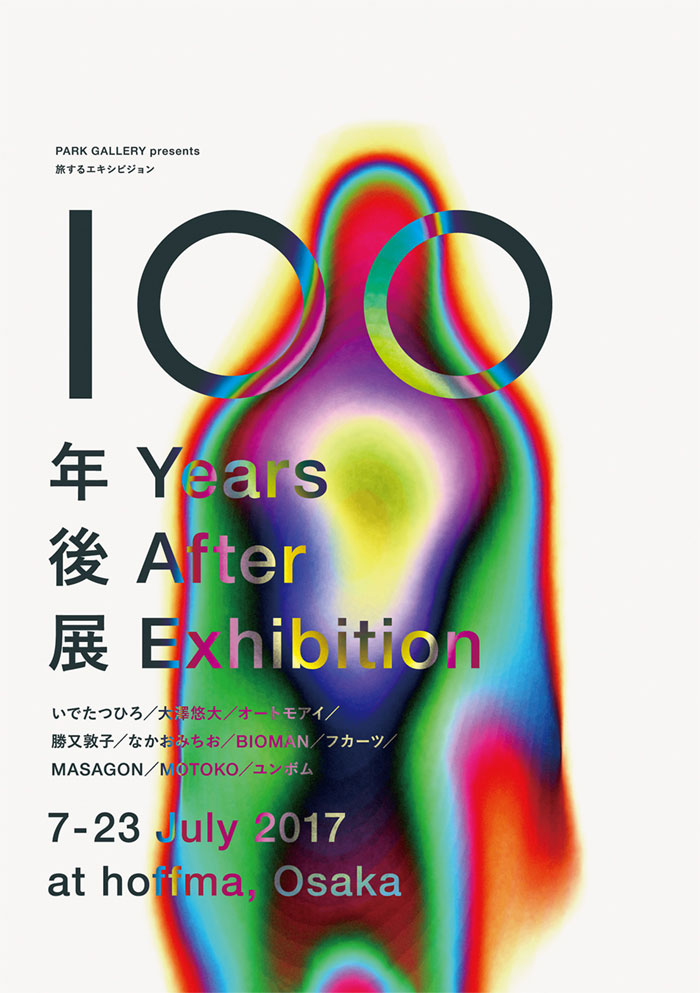
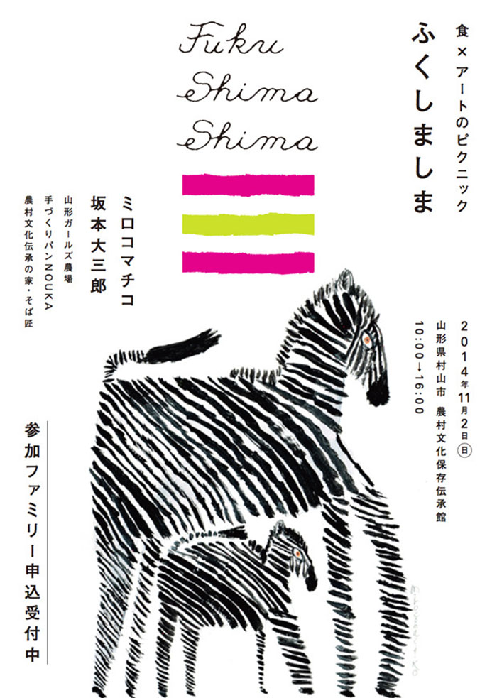
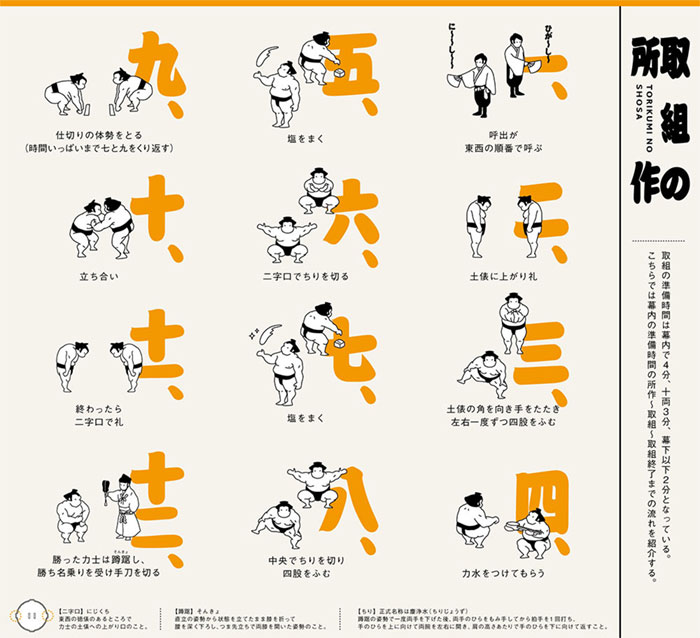
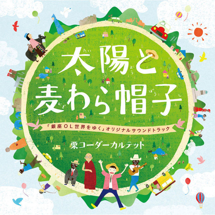
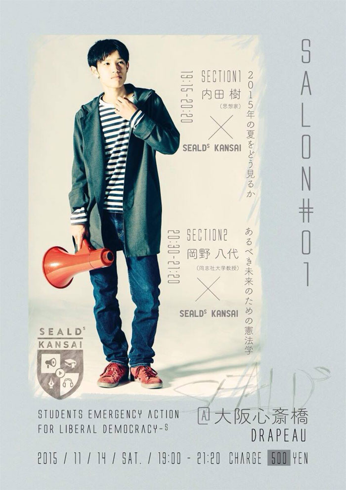
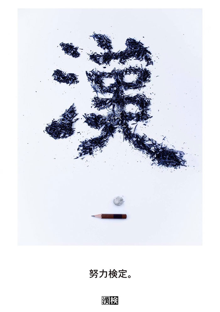
Japanese Graphic Design Examples
FAQ on Japanese Graphic Design
What is Japanese Graphic Design?
Japanese graphic design is a mix of minimalist aesthetics and cultural richness that pops. Japanese graphic design takes history, like the flat yet profound essence from Ukiyo-e, and marries it with the quirkiness of modern life in Japan.
How Does Japanese Culture Influence Its Graphic Design?
Culture is the design’s backbone here. From zen principles to expressive Japanese typography, every piece tells a cultural tale.
Influences stretch from the serenity of wabi-sabi to the playful spirit of kawaii – it’s tradition and innovation in a visual dance.
What Are the Key Elements of Japanese Typography?
Precision meets artistry in Japanese typography.
It’s not just about the text; it’s the craftsmanship and choice of kanji or kana characters, the balance on the page—elements crucial for conveying subtle nuances and deep meanings within the design.
Can You Explain the Use of Minimalism in Japanese Graphic Design?
Sure thing. Minimalism in Japanese design? It’s the art of saying more with less.
Stripping the superfluous, elevating the essential—a harmonious blend of simplicity and function that’s deeply rooted in the Japanese design principles.
How Are Modern and Traditional Designs Integrated?
It’s a delicate art, fusing timeless motifs from, say, Ukiyo-e paintings with bold, modern expressions.
Think ancient calligraphy fluidly merging into sleek, contemporary layouts—a visual time travel that’s quintessential to the evolving face of Japanese art.
What Role Does Nature Play in Japanese Graphic Design?
Nature’s more than a mere motif – it’s a muse. From delicate Sakura blossoms to the rugged lines of mountains, it shapes design philosophies, with natural elements often symbolizing life’s ephemerality, manifesting vividly in a spectrum of designs.
How Has Japanese Graphic Design Impacted the Global Scene?
Hugely. Japanese design principles have been a magnet for global aficionados, inspiring a universal adoption.
The minimalist aesthetics and poignant visual communication strategies have resonated worldwide, fueling cross-cultural creativity.
What’s Unique About Color Usage in Japanese Graphic Design?
Color in Japanese design isn’t random. It’s steeped in symbolism and history—an almost poetic usage that ties the hues to emotions, seasons, even spirituality.
The subtlety of pastels or the dramatic contrast of red and white, each choice tells a story.
How Do Manga and Anime Influence Japanese Graphic Design?
Manga and anime? They’re the heartbeat of contemporary Japanese visuals. The impact is colossal, branding everything with their dynamic characters and vibrant narratives, lending an energetic and emotionally engaging dimension to the broader design scape.
What Future Trends Are Emerging in Japanese Graphic Design?
Looking ahead, we’re seeing a push towards digital technology while holding onto tradition—a fusion creating new experiences. Expect more boundary-pushing, innovative takes on Japanese design tenets like minimalism and functionality, but with a fresh, tech-savvy twist.
Conclusion
And there you have it, the journey through the vibrant streets of Japanese graphic design draws to a close.
It’s more than just visual pleasure—it’s steeped in centuries of culture, from the tranquility of Zen to the playfulness of kawaii, all while embracing the future with both arms wide open.
From ukiyo-e echoes in modern prints to the daring adventures in manga illustrations, we’ve seen it all.
Whether it was the minimalist aesthetics catching your eye, or the dynamic Harajuku style graphics firing up the imagination, each element showed us a story. It’s a realm where each color, line, and shape is deliberate, and nothing is accidental.
What we’ve unpacked here is the essence of design that’s uniquely Japanese – a tapestry interwoven with tradition, nature, and the unstoppable march of technology. It doesn’t just stand out; it speaks. It inspires. And it sure leaves a mark.
If you liked this article about Japanese graphic design, you should check out these as well:
- Negative Space Design: What it is, Logos and Art Use
- Graphic Design Resume: Best Practices and 51 Examples
Bogdan Sandu, a seasoned designer with 15 years of diverse experience, has been designing websites since 2008.
Renowned for his expertise in logo design and visual branding, Bogdan has developed a multitude of logos for various clients.
His skills extend to creating posters, vector illustrations, business cards, and brochures. Additionally, Bogdan's UI kits were featured on marketplaces like Visual Hierarchy and UI8.
Latest posts by Bogdan Sandu (see all)
- The Epic Games Logo History, Colors, Font, And Meaning - 24 April 2024
- Spread Joy: Happy Color Palettes for Uplifting Designs - 24 April 2024
- The Konami Logo History, Colors, Font, And Meaning - 23 April 2024