


Here’s a fresh take with your unique demands shaping every sentence:
Ever wonder why some dietitian websites make you nod along eagerly to schedule a consultation, while others just make you yawn? It’s all in the design, friend. Visual storytelling, mixed with a splash of tech-savvy charm, has the power to transform a humdrum webpage into a nutritionist’s most potent ally in health promotion.
As you dive into the digital world of dietitian website design examples, there’s a feast of creativity to savor. Each site tells a tale: the crisp interface of a weight management program or the warm palette inviting you to a holistic wellness blog. You’ll learn the secret sauce that makes for an engaging online presence; think responsive design, user experience finessed for seamless interaction, and content that springs up at just the right moment.
By the time you reach the last full stop of this article, you’ll have a toolkit bristling with clever hacks to carve out your niche in the buzzing digital health space. From SEO-friendly layouts to call-to-action buttons that actually beckon, get ready to level up your website game.
Dietitian website design examples
Plant Centered Nutrition
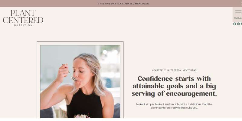

The first one of these dietitian websites comes from Ashley Kitchens. She is popular for its healthy lifestyle and nutrition tips. The coach works only virtually and relies entirely on online communication to improve the way people eat. The website uses many out-of-the-box effects, such as strong textures, outlines, and powerful illustrations. We also like the non-distracted videos on the homepage.
Street Smart Nutrition
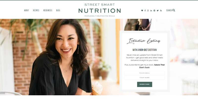
Cara Harbstreet is also a registered dietitian and nutrition expert who works mostly online. As of recent, the brand pairs with brands and corporations rather than individuals. The website was therefore transformed into an elegant blog that will inspire you to live healthier.
Melissa Landry Nutrition
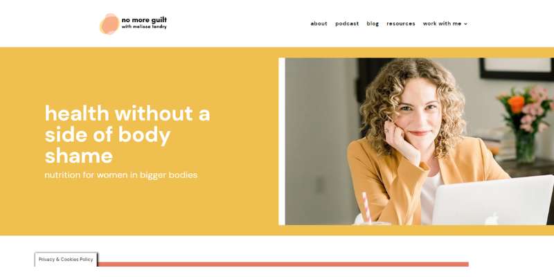
Melissa Landry is an expert on food freedom who aims to inspire women to feel good in their bodies. The website replicates the message: colors are cheery and bright, even though there are only two of them. What this shows you is that you can have a fun website for your private practice without overdone design.
The Hormone Dietitian
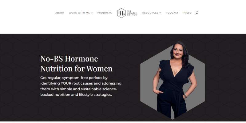
Melissa Groves Azzaro is the registered dietitian nutritionist behind this website. She offers women medical advice on improving their figure by identifying the cause of their symptoms. What we like the most about this website is how it plays along with the branding. Both the design and the message are the same and introduce a more luxurious feel.
Designers achieved this through the heavy use of black, white, and metallic tones, as well as serif fonts. The site is focused on usability, and tailored to the adult audience visiting it.
Truly Real Nutrition
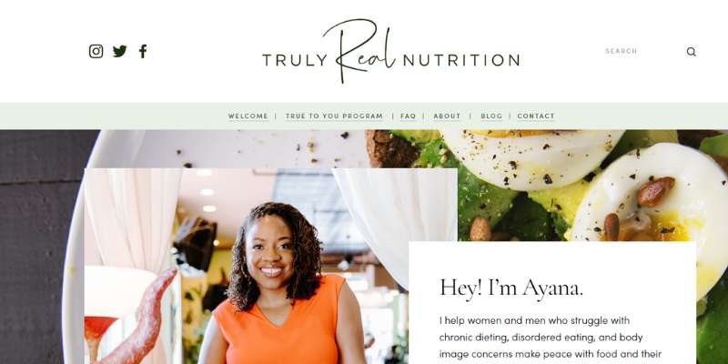
Ayana Habtemariam is a nutrition therapist and registered dietitian nutritionist. She is also a certified counselor for health with years of experience. That being said, we’d all expect a huge website with loads of information.
And yet, Ayana’s website is, in essence, a one-page-only website. It is as simple as possible in the technical sense of the word but compensates with some great photos and light illustration backgrounds. If you want to save on the costs of your new background, you’ve got yourself a winner!
Nutrition Moderation
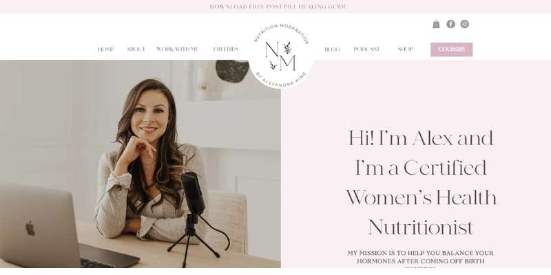
The expert in nutrition moderation Alexandra King also has a website to learn from. The nutritionist specializes in hormone nutrition and advises women on how to overcome the effects of birth control. With this in mind, we are talking of a website that is truly tailored to its audience.
Let’s peek into the details. Alexandra only works with two colors (beige pinks) and ensures the website is cohesive. These colors are also a 1:1 match with the brand identity of the private practice, which ensures visitors won’t be confused.
Greenlee
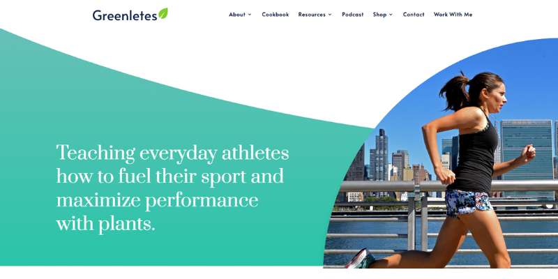
Everyone in NYC is familiar with the work of Natalie Rizzo, a registered dietitian for athletes. Her programs help maximize performance and improve fitness. While you can’t book a private session on the website, you get access to a library of useful resources. Examples include e-books, courses, podcasts, and more.
Natalie also loves to be involved and shares all info on her media appearances. Her web pages are as dynamic as her career, and they will certainly keep you engaged!
Colleen Webb Nutrition
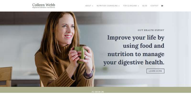
Colleen Webb works foremost with people suffering from inflammatory bowel disease. Her scope of work is very wide, from personal appointments to media appearances and interviews. And yet, she managed to pack all of this neatly on a simple, but resourceful website. The streamlined design and subtle color scheme will make you feel better right away.
On this website, you can learn how to showcase expertise. Colleen chose to introduce herself with a large, welcoming portrait photo. As you scroll down, you can learn more and more about who she is and what she has to offer.
Last but not least, Colleen’s website features exact pricing information for all of her services. This is something visitors appreciate a lot.
Methodd Nutrition
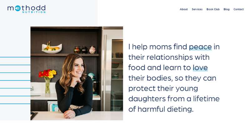
Gabi Kahn is a registered dietitian whose work targets newbie moms. The website focuses on the only service offered by the dietitian, and that’s its distinctive advantage.
If you only specialize in a particular area, learn from this modern and sleek website. As you will see, simply doesn’t have to mean boring.
Alix Turoff Nutrition
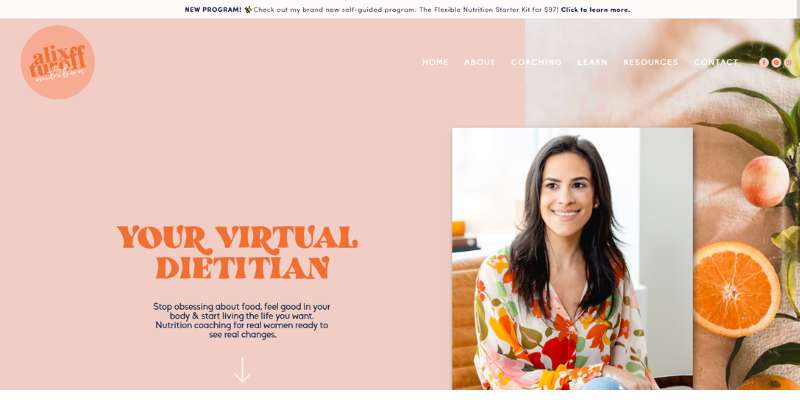
Alix Turoff is a certified personal trainer and virtual dietitian who offers personal and group coaching. He will provide you with the perfect example of a colorful, fun website that lures visitors in!
Culina Health
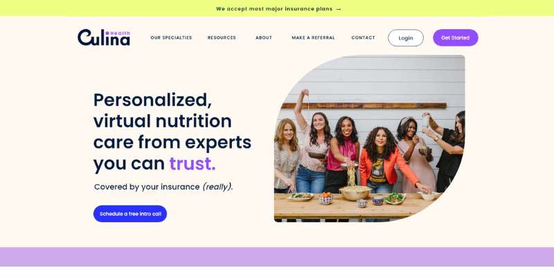
Culina Health is a private practice that belongs to dietitians Vanessa Rissetto and Tamar Samuels. Their website is among the most beautiful ones on this list. It is clean but colorful, and there are brush strokes on all pages. The texture is simple but present enough to ensure contrast and cohesion.
The Tasty Balance
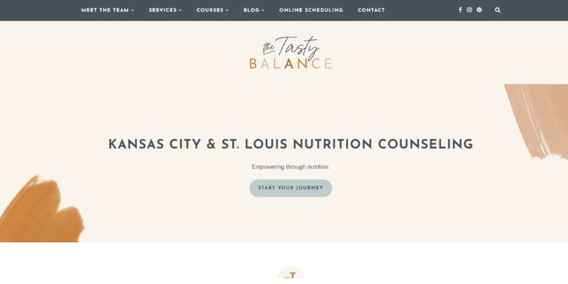
Ariel Johnston is a certified intuitive eating counselor who helps fight eating disorders. Her website is calm but very illustrated and sets a very professional tone. This is the perfect example of a website that can reinforce your reputation.
The Doc’s Kitchen
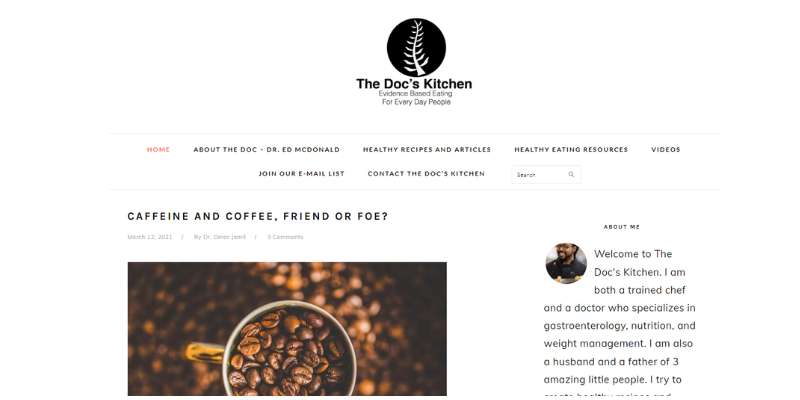
The Doc’s Kitchen is a very resourceful website that uses lots of white space to keep the looks fresh. It gives the visitor a feeling of control and power and leads him intuitively to topics that he could find interesting.
This website offers plenty of content: recipes, videos, articles, and even links to foreign resources. Sounds overwhelming, but you wouldn’t believe how well it has been executed!
Nutrition by Robyn
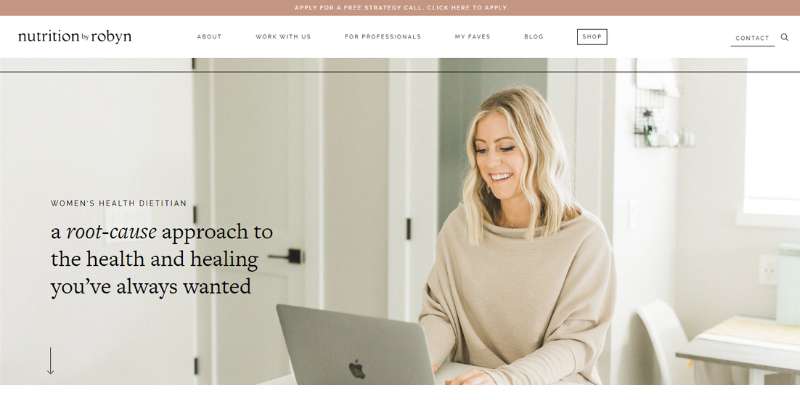
Robyn Johnson works as a health strategist and functional medicine dietitian. He mostly treats hormone and skin problems. His website screams elegance and caters in particular to female audiences. Who said plain text and images are boring?
Side by Side Nutrition
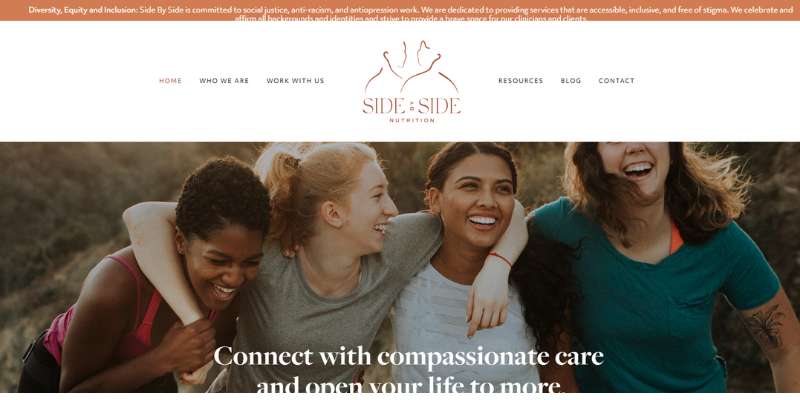
Side by Side Nutrition specialist Jamie Magdic also has a web design to wish for. Interestingly enough, this website doesn’t offer any images or info on dietitians but focuses on the services they provide.
The Healthy Shine
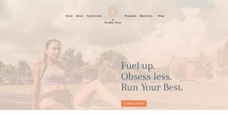
Another one of these dietitian websites comes from Starla Garcia. Starla is an Olympic Trials marathoner and, as of recently, a registered dietitian. She advocates culture and body diversity and works closely with athletes and runners.
What we recommend the most is the color scheme she used. There is dominant blue to inspire calmness and professionalism. Next comes striking orange which stands for energy and motivation. Starla also uses lots of images, including scenes of her personal life that help her get to know her.
Lynn K Wagner
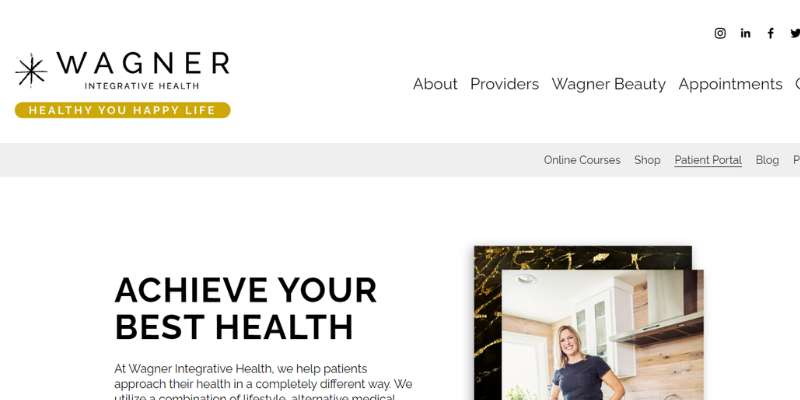
Lynn K Wagner’s website has a full-screen background image with a centralized CTA button. The main menu is a transparent vertical drop-down enabled with parallax scrolling. Within this menu, visitors can subscribe to a newsletter, make an appointment, or read a blog post.
If you click on the About Us page, on the other hand, you see a page so well designed that it reminds you of a magazine section. An overlay of customer testimonials is available on all pages, as well as a link to a robust gallery. This must be how nutrition services will be provided in the future!
Summer Tomato
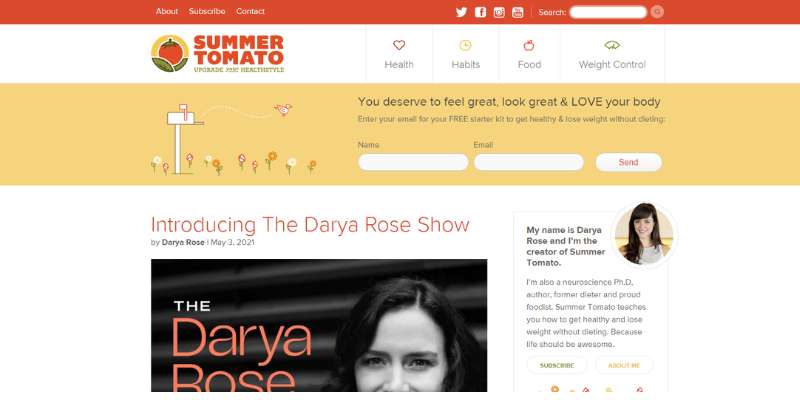
Summer Tomato has one of the best homepage menus on this list. You can connect to any page from the homepage, including the social accounts of dietitian Darya Rose. A striking CTA will greet you and ask you to subscribe to a newsletter before you’ve explored the content. This might be a good idea for those looking to expand their email lists.
Lose the Body Fat
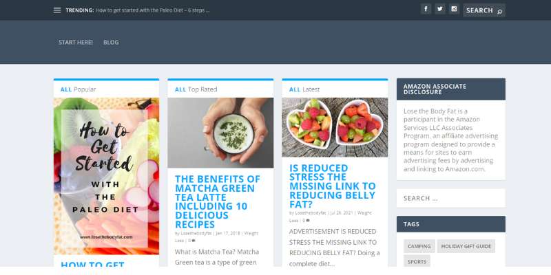
Let’s look at this blog for nutrition services and healthy eating. Diets are tough as it is, so why not make the experience fun? The blog will greet you with a funny animated character and tagline overlay, and eliminate all your worries.
Once you dive deeper, however, the dieting info gets more serious. Information on healthy eating is delivered on clean and well-structured pages. This is to ensure that there are no distractions for the visitor.
First Step Nutrition
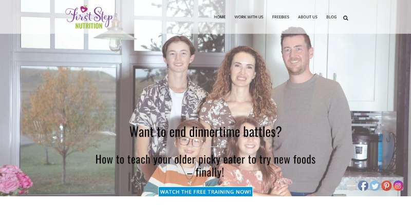
First Step Nutrition specialist Jennifer House can brag with one of the best dietitian websites on the web. She strokes the perfect balance between resourcefulness and simple design. Her pages have lots of text and images but are packed on a continuous background scheme that doesn’t overwhelm the user. It is the perfect hub for busy parents who don’t have time to look for information online.
Results Food Coaching
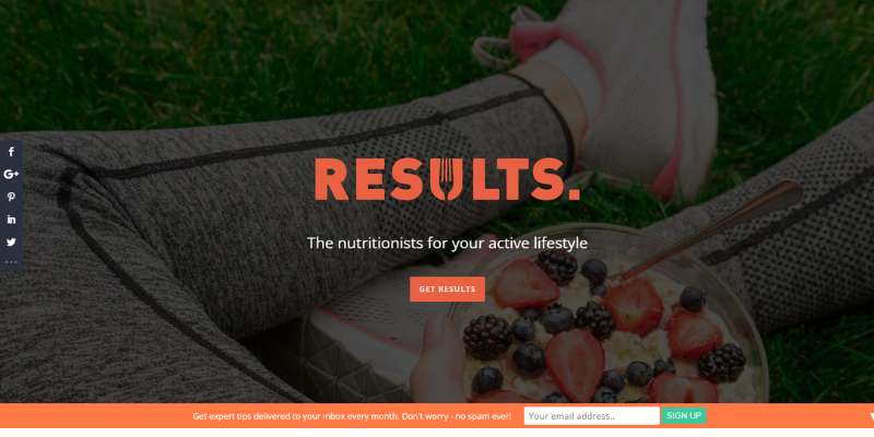
Two things matter the most to this website: the CTAs and the full-screen overlay in parallax scrolling. The two of them make up the most elegant nutrition websites out there.
To support this, the website introduces blurbs of familiar branding colors. It makes resources available in the footer section of each page. Images are ‘randomly’ thrown here and there, but they seem to be in the right place at the right time. The visitor has multiple customization possibilities, even to dismiss the footer section completely.
Dr. Nina
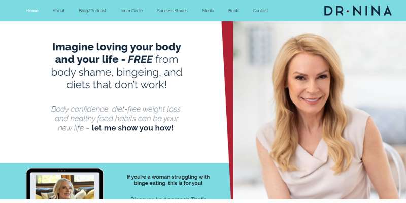
This website shows us once again how important it is to have clear calls to action. In this particular case, the CTA is incorporated into a full-screen image. It is also accompanied by positive testimonials that motivate the visitors.
Text is available in three different colors, making it possible to distinguish between types of content. We also like the widgets in the bottom section which feature the brand’s logo.
Last but not least, this website is integrated with WooCommerce to enable users to buy products and subscribe to courses.
Kris Carr
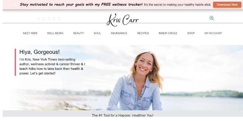
You can describe this website with a single word: positive! Being a cancer survivor herself, Kris Carr stands for joy and positive energy. The colors and images on her website stand for this attitude. They convey the same message: there is something awesome for everyone, and they should subscribe to get it!
FAQ about building a dietitian website
How do I ensure my dietitian website is user-friendly?
Think like a visitor; simplicity is your friend. Navigation should be intuitive—no one likes a food label they can’t understand, right? Same with websites. Clear headings, a responsive design for all devices, and speedy load times are crucial. Incorporate a search function for easy access to info.
What features are must-haves for a dietitian’s website?
A credible dietitian website needs clear service listings, an ‘About Me’ section with qualifications, and contact info. Don’t forget client testimonials—like reviews on a new blender, they hold weight. Add a blog to share knowledge, and an online booking system to lock in consultations.
How can I optimize my dietitian website for mobile?
Your site should shape-shift like a chameleon to fit any screen. Prioritize a mobile-friendly layout—big buttons, easy-to-read fonts, and condensed navigation menus. Test your site on various devices, because if it doesn’t work on mobile, it’s like serving a salad without the dressing—unfinished.
What’s the best way to showcase my services online?
Visualize a buffet—everything looks so good you can’t choose. Your services should be the star of the show: clear, professional photos of your sessions, detailed descriptions, and highlight success stories. Add videos or infographics for zest, and remember, a good user experience keeps them coming back for seconds.
How can I improve my dietitian website’s SEO?
Serve up fresh content as regularly as healthy meals. Use relevant LSI keywords without overstuffing—think seasoning, not brining. Ensure meta descriptions and alt tags are on the menu, and remember, search engines love a site that loads as fast as a smoothie blends.
Can social media be integrated into my dietitian website design?
Absolutely! Social media feeds on a website are like sprinkles on a cupcake—eye-catching and engaging. Add follow buttons, live feeds, and share features to make your content as viral as a diet fad. Plus, it’s real-time interaction with your community. So, link ’em up!
What’s important to consider for the visuals on my site?
Visuals are your handshake, smile, and outfit at a first meeting, all rolled into one. Keep it professional, clean, and reflective of your brand. Use high-quality images, preferably of your own work, and ensure they align with the branding for dietitians—consistent colors, fonts, and logo usage.
How should I handle website content updates?
Think of your website as a garden—it needs regular tending. Update your blog with current nutritional trends, tweak your services based on feedback, and refresh testimonials. A content management system (CMS) is your gardening toolkit here, making updates a stroll in the park.
What considerations should I make for website accessibility?
Inclusive design invites everyone to the table. Use alt text for images, text transcripts for videos, and make sure your website is navigable via keyboard. Remember to check contrast ratios for those with visual impairments—a GDPR-compliant website is like a meal that everyone can digest.
How do I convey my professional credibility on my website?
Layer your site with certifications, detailed education history, and professional dietetic association memberships. Let your experience speak through blog posts and articles showcasing your expertise. Patient testimonials and case studies are the cherry on top, solidifying trust as readily as a firm handshake.
Conclusion
We’ve sauntered through a garden of dietitian website design examples, haven’t we? Eyes feasting on layouts as varied as patients’ dietary needs. Reinforcing what we know:
- Visual appeal? Key.
- User experience? More than just buzzwords.
- Responsive design? Non-negotiable.
Here’s the takeaway: whether it’s about putting a spotlight on a user-friendly interface or planting a testimonial at just the right cross-section of content, it all boils down to crafting experiences that resonate. Your online space should mirror the core of your practice—an embodiment of personalized care, seasoned with expertise.
As the curtains draw on this showcase of digital canvases, remember that a website is more than a placeholder—it’s the heartbeat of your professional identity. Let it pulse with clarity, breathe with fresh content, and grow with your evolving brand. Take inspiration, mold it with purpose, and watch your presence flourish in the vast space of the Internet.
If you liked this article about dietitian websites, you should check out this article about VR websites.
There are also similar articles discussing coaching websites, bakery websites, manufacturing websites, and surfing websites.
And let’s not forget about articles on plumber website design, artsy websites, kindergarten websites, and wellness websites.