


Picture a digital showroom polished to perfection, every car gleaming under the spotlight—a place where the virtual is nearly tangible, and the first impression is both enduring and compelling.
That’s the gold standard for any car dealer website design, a silent salesman working around the clock. In a landscape where clicks can rival the busiest shop floors, your online presence needs to both captivate and convert.
As an artisan of the web, shaping experiences and constructing digital canvases, I present a blueprint that bridges aesthetics with analytics.
By the close of this discourse, you’ll have a canvas of car dealer website design examples that not only showcase stunning visuals but also embody the mechanics of user engagement and conversion optimization.
We’ll embark on a voyage through layouts that lure, features that fascinate, and functionalities that forge paths to purchase.
From interactive car site features to mobile-optimized delights, our excursion will detail how to transform a mere webpage into a powerhouse—ultimately, handing you the keys to drive your auto dealership ahead of the pack.
Car Dealer Website Design Examples
Creamfields
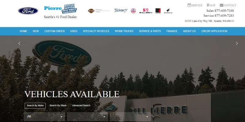

As a go-to destination for Seattle’s automotive aficionados, Creamfields showcases what digital car lot artistry is all about. Its simplified navigation and punchy, high-resolution visuals confidently stage a gallery of new and used cars, catering to savvy searchers. Noticeably, the user-friendly inventory management system is a testament to the website’s keen focus on a streamlined user experience.
The harmonious marriage of aesthetics and functionality at Creamfields’ online showroom isn’t just eye-candy—it’s the strategic placement of contact details, complementing the online vehicle “compare and contrast” at a click’s convenience. This dealer’s site isn’t simply good-looking—it’s chock-full of interactive features and customer-first design elements.
For seekers of unique automotive experiences, Creamfields offers a digital responsible showroom. The high-end usability of this dealer’s site powers a tailored journey towards the perfect ride.
Infiniti
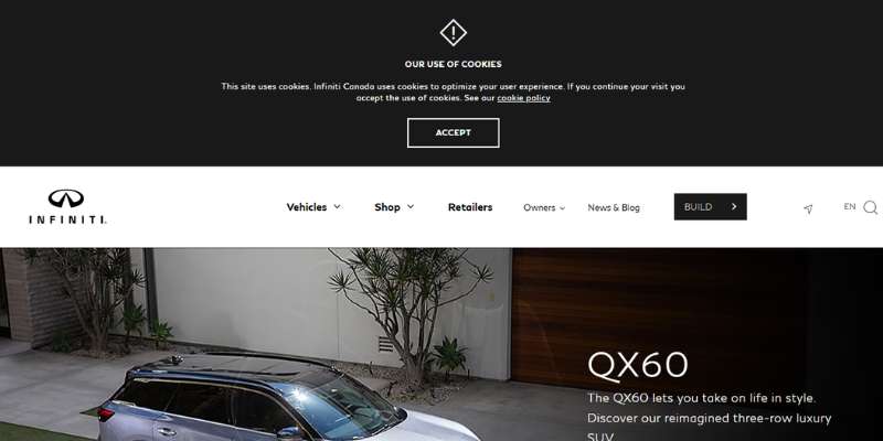
Gleaming from the screen with a spacious layout, Infiniti’s cyber presence exudes class. A sleek carousel of full-width banners, complemented by a pristine white backdrop, rolls out the virtual red carpet, beckoning to luxury seekers. The site’s car finder is as efficient as it is stylish, presenting its fleet through organized tabs that are guaranteed to captivate and convert.
Eye-catching CTAs directly intertwined with the hero images align perfectly with the website’s SEO-friendly structure. Each featured model stands out with its dedicated page—a thoughtful touch ensuring a personalized customer journey. Infiniti marries responsive design with the elegance of swipe-friendly image sliders, enhancing the luxury within reach.
Tapping into the minimalistic power of whitespace, Infiniti’s website doesn’t just reflect its brand identity—it elevates it, setting the stage for an interactive, chic car shopping expedition.
Toyota
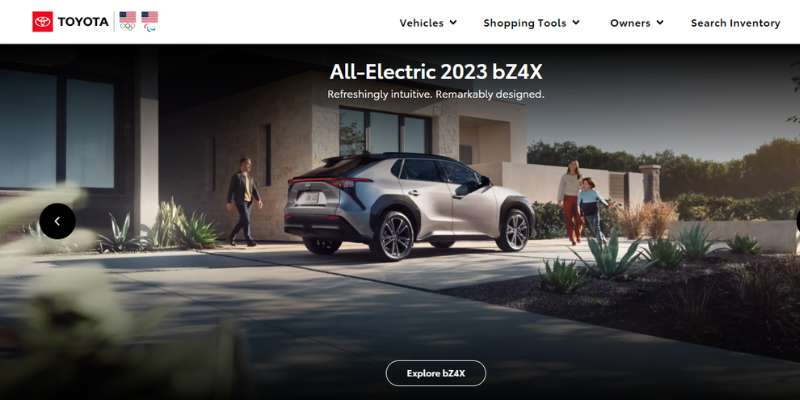
Lean and robust, Toyota’s site underlines the marriage of minimalism and functionality—it’s authentically branded with recognizable red and white hues. You can peruse an expansive inventory, with dropdown menus cleanly categorizing various car types and local specials. An arsenal of user-friendly perks awaits, from price estimators to a treasure trove of detailed brochures.
The site isn’t merely a storefront; it’s a veritable automotive encyclopedia, with a side of social media savvy. By neatly integrating a blog, a slick slider, and social elements, Toyota propels itself in search engine standings, turning their online space into a magnet for car lovers.
Dive in, the water’s fine! Explore Toyota’s digital domain, where every user interaction is meticulously plotted to transition from casual browsing to confident purchasing.
Volvo Cars New York
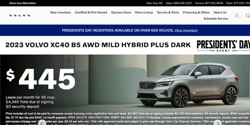
A haven of modern design and user-centric functionality, Volvo Cars Manhattan’s digital space is a masterclass in online dealership finesse. Their homepage is a beacon of potent CTAs. “Peek at this model. Browse that inventory.”—every pathway is a streamlined route to your future car.
Tailored contact options are presented on a silver platter, making communication with the dealership as smooth as their vehicles. Have a dialogue via chat or text; they’re at your service. Sporting a sticky navigation menu, the site confidently enables car enthusiasts to explore its categorized offerings without a hitch. Every detail, from the vehicle-specific sliders to the mobile-friendly layout, is a meticulous stitch in this dealership’s digital fabric.
Peering at Volvo’s site is a glimpse into automotive web prosperity—a journey accompanied by a seamless digital guide.
Chrysler
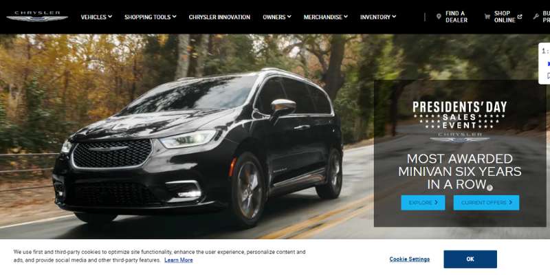
Dive into Chrysler’s world, where keyboard navigation unfurls a cinematic car universe—each slide a new scene. The site grabs you, with special offer banners fighting for your attention atop spectacular video backdrops. It’s easy to envision oneself within these cars, as the brand magnificently spotlights prominent models right at the outset.
This isn’t simply a gallery; it’s an immersive digital experience where users can personalize their vehicle down to the last stitch. Building, pricing, and customization tools interlock with effortless inventory navigation, showcasing the art of an online presence that sweeps customers into action.
Chrysler’s masterstroke? A website design that leads by example, boldly transforming a marketplace into an engaging storyline where every user is the protagonist.
Tesla
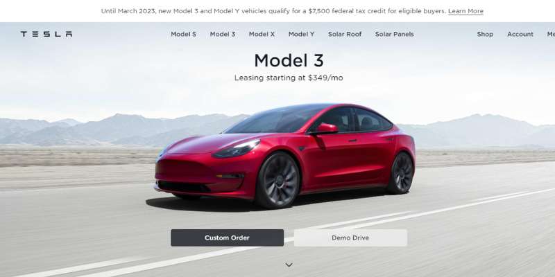
Tesla, the trailblazer, crafts a distinctive digital outpost as sleek as its cars. Minimalistic? Yes, but don’t let that fool you—its impactful visuals, crystalline CTAs, and an uncluttered off-canvas menu achieve more than cluttered counterparts. The homepage stands as a benchmark in contemporary design, with full-width images that allure and captivate.
Tesla casts a hypnotic spell as you explore. Behold the price pages, marvel at the inventory, witness the subtle genius of video backgrounds—each a chapter in this electric narrative. Tesla’s interface isn’t just a visit; it’s a voyage—a palpable, pulse-quickening brush with innovation.
Dodge
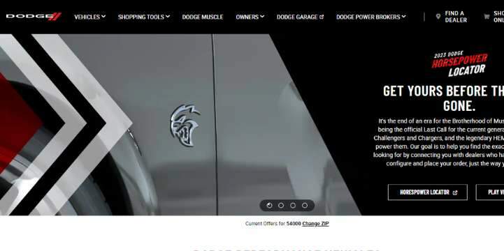

Brace for impact. Dodge comes at you with a heady blend of asymmetry and edge. Slide into their hero header, where dynamic visuals dance alongside punchy CTAs—every frame designed to arrest the senses. The Dodge encounter is tactile, almost visceral, as each showcased model springs to life with vibrant fidelity.
Powertrain, interior, exteriors—sculpt your dream car with the finesse of a digital blacksmith. A duo of calculators—financing and pricing—await to demonstrate practicality amidst the allure. Dodge’s enigmatic site design isn’t merely effective; it’s a purveyor of desire, marrying usability with a daredevil spirit.
Chevrolet
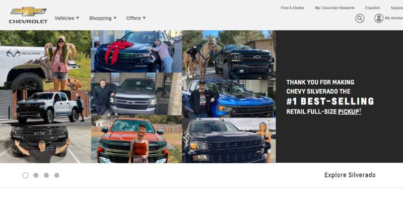
Chevrolet’s digital garment is cut from a different cloth—multilingual with a global reach. Hero header sliders present a view as vast as the open road, while monochrome icons elegantly designate the website’s search inventory and build & price tools.
A showcase of striking accolades fosters trust at a glance, each emblem a testament to Chevy’s legacy. Clean design harmonizes with functionality, birthing a digital platform that serves as a trophy case as much as a marketplace—a nexus where awards and eCommerce find common ground under the Chevy banner.
USA Alfa Romeo
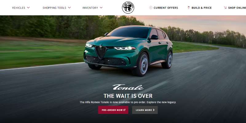
USA Alfa Romeo’s homepage is a visual symphony composed in minimalism, its sticky menu navigation a conductor’s baton leading you through automotive sonnets. The mega menu unfolds a catalog of shopping tools—the build & price, dealer locater, and a glittering carousel of new offerings.
Center stage, the Alfa Romeo insignia anchors the page—a marque of legacy and luxury. There’s elegance in its restraint, a command of design that seizes the eye, imparting the brand’s storied heritage through every pixel.
Royce Automobiles
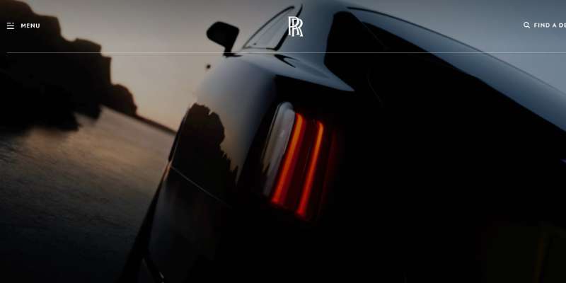
Rolls-Royce Motorcars’ homepage is an odyssey of elegance, with the video background in the hero header setting an opulent tone. The cursor effect—a touch of digital magic—complements an interface that’s a nod to innovation, a wink at sophistication.
A layout that employs box style and lavish whitespace, exuding a polished, rich veneer—yet it’s within the sticky menu’s reach where the true journey begins. Navigate to custom inquiries with ease, and bask in the glow of an interface that’s a categorical breakthrough in digital sumptuousness.
CarDekho
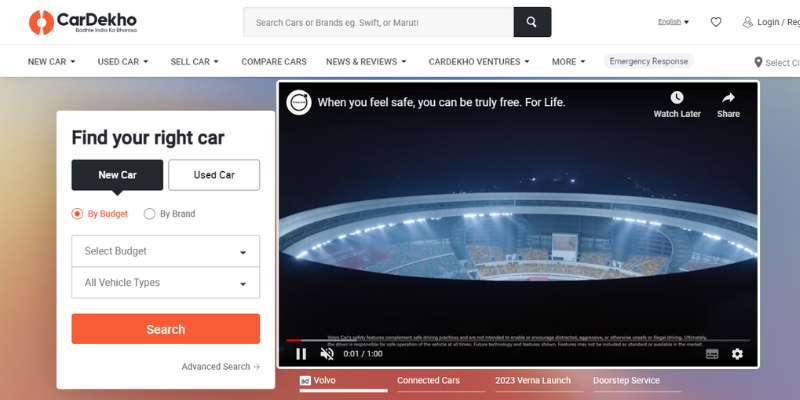
At CarDekho’s core is a zest for the search—a signal flare in the sea of options. The sticky header beckons, guiding you, while the site’s use of white space with pops of orange captures a vibe that’s contemporary, cool.
Embracing a concise, intuitive form, the website lets users unearth the depths of its offerings. CarDekho beautifies a data-driven process, categorizing trending, new, and upcoming cars, delivering a boxed layout—an ode to both symmetry and searcher’s delight.
Las Vegas Lexus
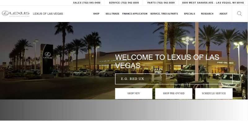
Elegance meets accessibility at Las Vegas Lexus, where a search-feature-forward hero header looms over a landscape of automotive dreams. A sticky menu grants passage through the digital estate, its convenience only rivaled by its design. With a click, engage with the slider, social media, and a drop-down menu that flirts with perfection.
This website doesn’t just list luxury vehicles; it curates an encounter, presenting both preference and practicality within a user-centric framework. Your journey through the Las Vegas Lexus site is a sojourn of discovery, each interaction a checkpoint to your next high-end ride.
Subaru
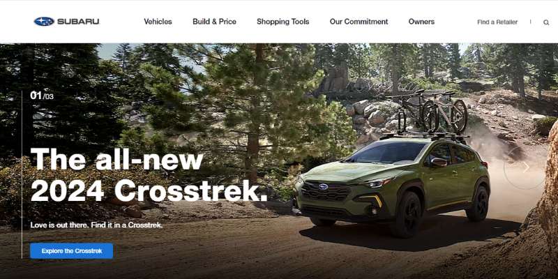
Subaru’s digital footprint is a harmonious blend of interactivity and clarity—a web canvas that beckons exploration. Sporting a full-width image and engaging scroll-triggered animations, the site’s design aligns with the inventiveness that the brand embodies.
The steady pulse of the sticky menu, complemented by the backdrop’s box contents, sets a stage that’s as immersive as it is informative. Here, potential buyers are presented with a visual and visceral narrative, a composition that marries the thrill of exploration with the satisfaction of discovery.
Land Rover Tampa
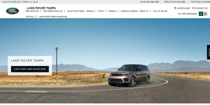
Land Rover Tampa synthesizes tradition with a modern twist. Their homepage slider—a tableau of the latest automotive offerings—has a command that’s neatly bolstered by translucent CTAs.
Delve deeper to find a showcase tailored to the connoisseur’s taste, a catalog beckoning personalized exploration. The site’s header—a repository of comprehensive services—complements a content narrative that’s as informative as it is navigable, offering a window into the essence of vehicle maintenance and tailored financing solutions.
The Elite Cars
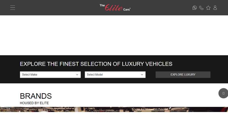
Step into the digital showroom of The Elite Cars, flaunting luxury vehicles with a bold red and black theme. Intuitive site search and a live chat feature stand ready to attend to visitor inquiries, present at every corner of the journey.
Here is a domain where deals and opportunities don’t just exist—they are celebrated. This car dealership website is an epitome of its luxury cars on offer, enveloping potential customers in a world where style is not just seen but experienced.
Segrex
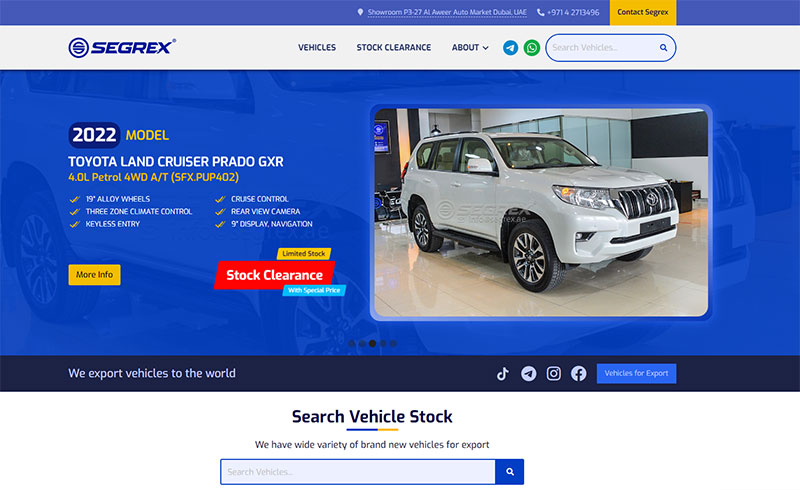

The Segrex website’s heading spellbinds with sleek design elements—a logo that’s an emblem of trust, a map accessing stories of drives and dreams, and social integration bridging buyer sentiments with community ethos.
Within its hero header, sliders parade an anthology of cars, each testimony to Segrex’s grasp on aesthetic brilliance and marketplace savvy. The deals shine bright, each slider story a siren’s call to the seeker of automotive treasures.
AAA Auto
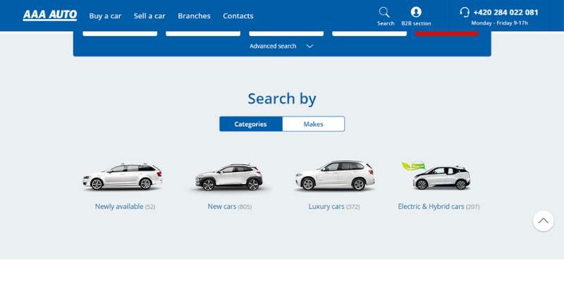
AAA Auto stands, a monolith of minimalist web design, its whitespace tailoring sophistication with every scroll. For individuals looking to streamline the process of selling an old or unwanted vehicle, incorporating information on how to junk my car can provide customers with a convenient solution to explore.
The advanced search features are a beacon, guiding users to their desired automotive match with an elegance that’s pure AAA Auto.
By highlighting brands and categories, AAA Auto presents clarity in abundance—a sticky menu tying the narrative together, icons, CTAs, and sliders crafting a visual melody of automobile exploration.
Anderson Lincoln
Your entry into Anderson Lincoln’s world is flanked by opulent imagery, an invitation to the brand’s soul. Their search tool—sharp, focused—leads the charge, complemented by “Sale” and “Service” CTAs that aren’t just buttons, but gateways.
The elegance continues with a detailed query menu and a paced narrative that delves into the dealership’s creed, distilling its philosophy into an enriching directory of top-tier auto services.
FAQ on designing a car dealer website
What makes a car dealer website effective?
Okay, imagine this. A site’s effective if it’s a digital extension of the showroom—clean, user-friendly, loaded with quality pics and info. It should hook potential buyers with an intuitive layout, deliver the deets on cars, and hey, smooth sales funnels never hurt. It’s about driving those views into sales, virtually.
How important is mobile optimization for these sites?
Huge! It’s like, everyone’s got a smartphone glued to their hands, right? So, if a buyer’s cruising your site on their phone and it’s a mess? They’ll bounce. Period. Mobile optimization means easy nav, quick loads, and a slick shopping vibe—because no one likes pinching and zooming just to view a car model.
What kind of features should a car dealer website include?
Features should be all about keeping eyeballs on the page and wallets open. Things like high-res galleries, detailed specs, comparison tools, financing calculators, and convenient lead gen forms. That’s the money mix. They help buyers feel like they’re right there, kicking the tires even if they’re just kicking back on the couch.
Can website design influence car dealer sales?
Oh, for sure. It’s the silent pitch—every pixel matters. A well-crafted site hits visitors with the right impression. Eye-popping visuals, easy navigations, the works. This digital curb appeal can grip a visitor’s interest and potentially flip that ‘just looking’ mentality into ‘where do I sign?’
What are the benefits of having a responsive car dealer website design?
Responsive design means your site works like a dream across gadgets—big screens, little screens, whatever. And that’s vital ’cause, let’s face it, we’re not just on desktops anymore. Responsive design adapts to the device, meaning a seamless experience wherever. It’s about not losing a lead just ’cause they switched screens.
How can I ensure my car dealer website ranks well on search engines?
Alright, SEO is the name of the game and content’s king here. You need the right keywords, but not too spammy, and content that actually says something. Throw in some solid back-end SEO mojo—like meta tags, alt text for images, and making sure your site is lightning-fast. Quality content + smart SEO = friends with search engines.
What role do high-quality images play on car dealer websites?
They’re everything! You know when you see a picture and you can almost feel the leather seats? That’s the goal. Stellar pics can whisk buyers away. They should be drooling over those images and imagining that new car smell. It’s visual storytelling, and a picture’s worth a thousand specs.
Should I include customer testimonials on my car dealer site?
Absolutely! Think about how we shop. You’d trust the word of a buddy who says, “This is the place,” right? Testimonials are your digital word-of-mouth. They build trust and credibility. Show off those happy-buyer selfies and glowing reviews; let your customers do the talking.
How often should I update my car dealer website?
Keep it fresh! Regular updates mean there’s always something new for visitors. New deals, latest models, a blog on car care tips—keep ’em coming back for more. Plus, search engines love that fresh content—helps keep you on their good side.
What’s the best way to incorporate financing information on the site?
Balance is key. Sure, have your financing deets, but make ’em clear, transparent, and digestible. No one wants to need a dictionary just to get through the terms. Include a loan calculator, explain the process, and maybe some FAQs. Make it less overwhelming, and you’ve got a winner.
Conclusion
We’ve just cruised through a showroom of car dealer website design examples that pretty much redefine virtual curb appeal. What’s clear is that to turn that casual click into a lead—and eventually a sale—it’s all about crafting that perfect blend of visuals and functionality.
The journey doesn’t stop with just ogling sleek car galleries or spinning 360-degree views.
It’s about that interactive user experience, the navigational ease, and mobile optimization—making sure shoppers can slide through your site like it’s the smoothest ride they’ve ever had.
Now, armed with a trunk full of insights and inspiration, tweaking that digital strategy is less daunting, right?
Think of it as adding the horsepower to your online presence. It’s time to take the key insights—from responsive design that melts into any screen to SEO smarts that rev up your rankings—and gun it towards the future of digital dealerships.
If you enjoyed reading this article about dealer websites, you should check out this one with woodworking website designs.
We also created similar articles like these with museum website designs, pet care website designs, ice cream website designs, and funeral website designs.
And there are several more that you can check out like jewelry websites, conference website designs, makeup artist website designs, and hair salon website designs.